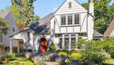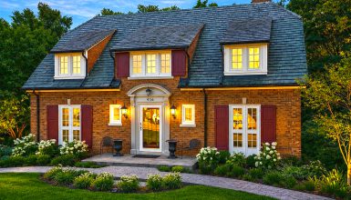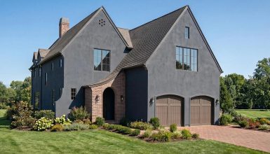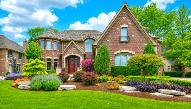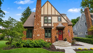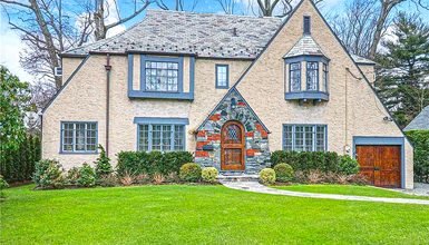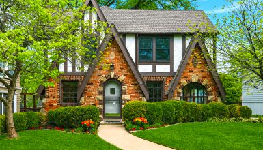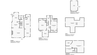
What makes a Tudor house feel so warm, rich, and full of character? It starts with steep gables, brick walls, dark wood trim, and charming arched details. Inside, those classic features continue with wood beams, built-ins, curved openings, and cozy rooms. At the same time, white walls, simple furniture, and soft colors keep the home fresh and easy to live in.
Here is a closer look at the exterior and interior design cues that make it work.
1. A Storybook Tudor Exterior With Strong Curb Appeal
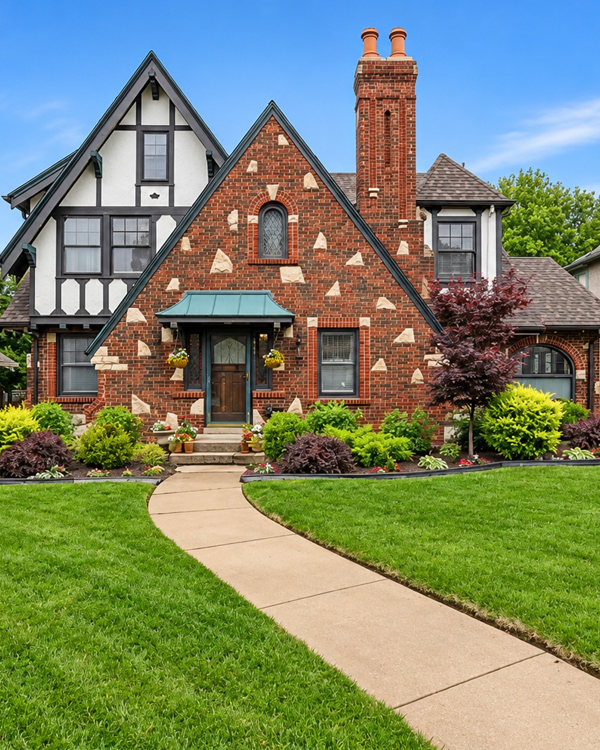
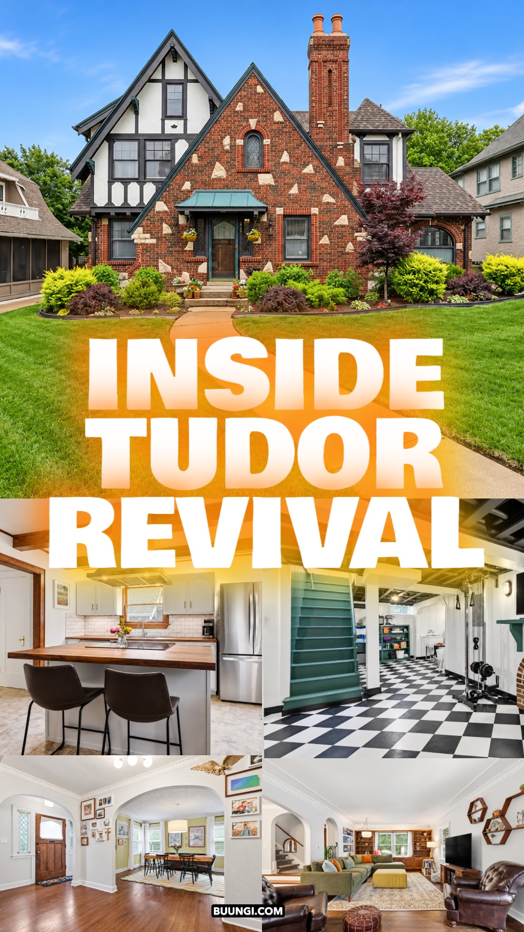
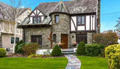
The front of the house delivers the Tudor look before you even reach the door.
The steep front gables create a tall, dramatic shape. Rather than using one simple roofline, the facade rises in several sections. This gives the house the irregular outline that makes Tudor Revival homes so easy to spot.
Brick covers much of the lower exterior. However, it is not plain red brick from end to end. Lighter stone accents break through the brickwork. Those pale pieces add texture and make the facade feel handcrafted.
The upper section changes again. White stucco-like walls sit between dark timber details. This contrast creates the familiar half-timbered Tudor effect.
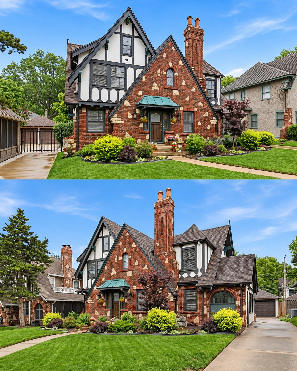
Then there is the chimney. It rises well above the roof and becomes part of the architecture, not something hidden at the side. Decorative brickwork gives it even more presence.
Dark green-gray trim ties all these elements together. It outlines the gables, windows, and roof edges without looking as harsh as black.
The landscaping also helps. Low shrubs frame the facade while keeping the architecture visible. A curved front walk pulls the eye toward the entry.
Design cues
- Steep front-facing gables
- Red brick facade
- Light stone accents within the masonry
- Dark decorative half timbering
- White upper-wall finish
- Tall patterned brick chimney
- Deep green or charcoal trim
- Mixed roof heights
- Small covered front entry
- Curved walkway
- Low, layered foundation planting
- Open front lawn
2. A Backyard That Feels Casual and Family-Friendly
The backyard takes a much softer approach.
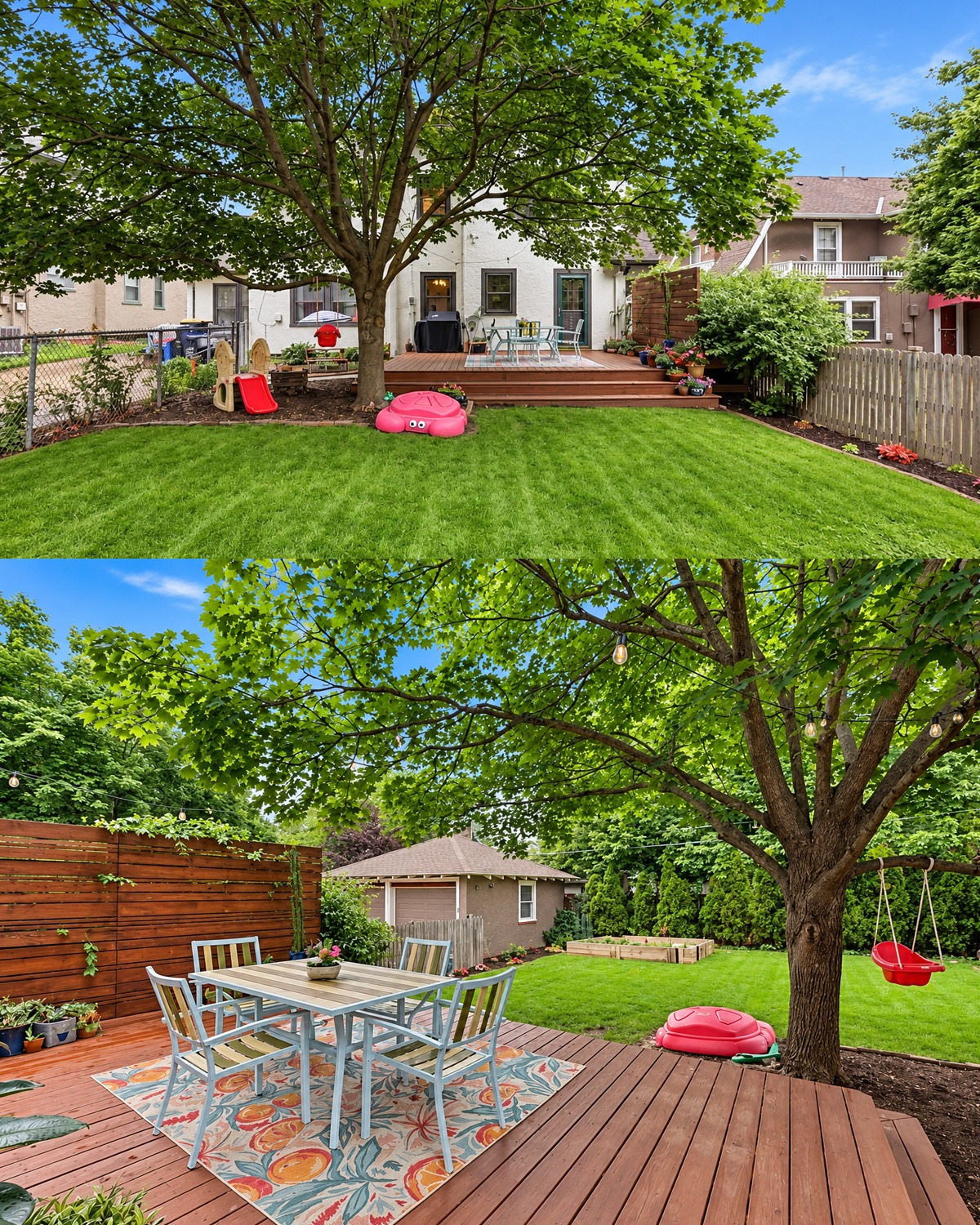
Unlike the formal front facade, this area feels relaxed. A large mature tree becomes the main feature. Its broad canopy creates shade and gives the yard a settled look that new landscaping cannot easily copy.
The lawn stays open. That makes the space flexible for play, pets, or simple outdoor gatherings.
A low wood deck sits close to the house. Since it is only a few steps above the lawn, the deck feels connected to the garden rather than separate from it.
The fencing is also practical. Different fence styles create privacy without making the yard feel overly designed.
This is a useful lesson for Tudor homes. The backyard does not need to repeat every formal detail from the front. It can be simpler.
Design cues
- Mature shade tree
- Open grass lawn
- Low wood deck
- Simple backyard fencing
- Soft garden borders
- Informal planting
- Space for children or pets
- Easy indoor-outdoor connection
3. A Simple Deck Built for Everyday Outdoor Dining
Moving closer to the house, the deck becomes a clear outdoor room.
A dining table and chairs define the main zone. An outdoor rug sits beneath them. This small move makes the deck feel more like an extension of the interior.
The warm reddish-brown deck boards work well with the house’s older character. They also blend with the surrounding trees.
A horizontal wood privacy screen runs along one side. Its clean lines feel more modern than the Tudor exterior, yet the natural wood keeps the contrast gentle.
String lights overhead add another relaxed layer. During the day, they almost disappear. At night, they can turn the deck into a cozy gathering space.
Design cues
- Wood deck boards
- Outdoor dining table
- Simple metal dining chairs
- Patterned outdoor rug
- Horizontal privacy screen
- Potted plants
- Overhead string lights
- Mature tree incorporated into the deck area
4. A Bright Living Room That Lets Old Architecture Breathe
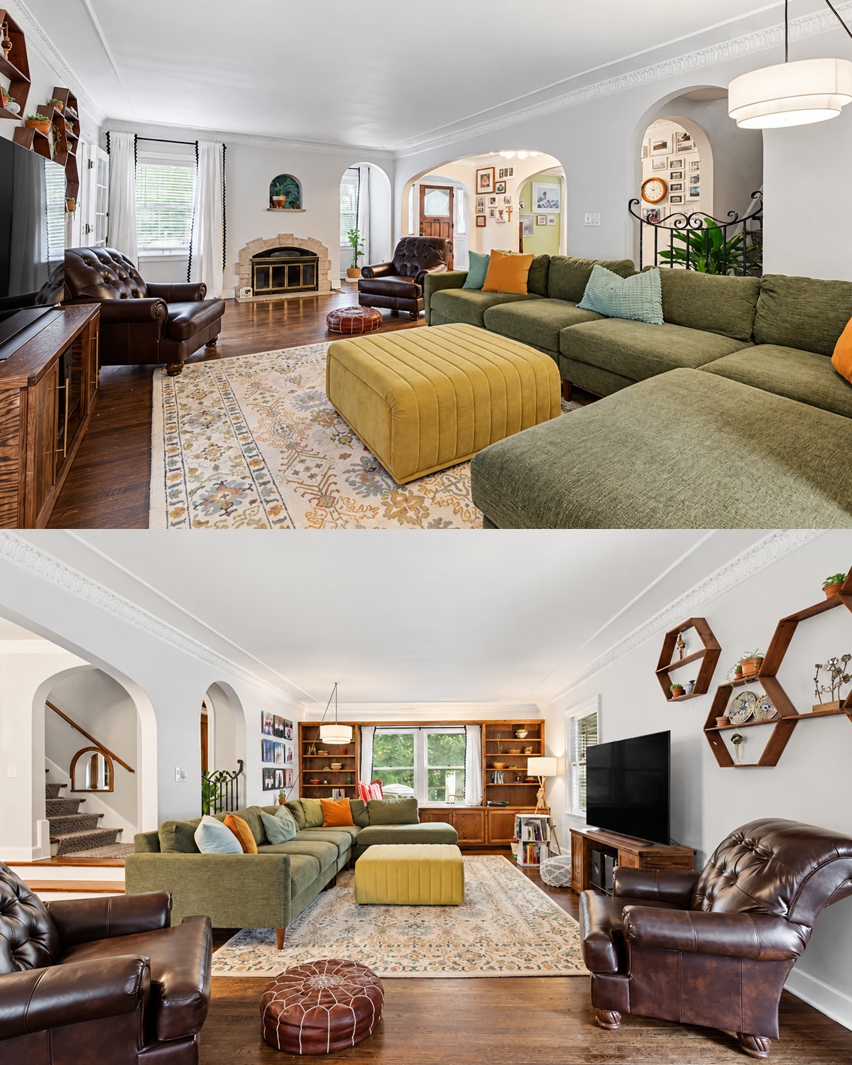
Step inside and the house changes mood.
Instead of filling the living room with heavy Tudor-style furniture, the design uses white walls and a mostly open layout. This makes the room feel larger and brighter.
Dark hardwood floors preserve warmth. They also create a strong base for the lighter walls.
The furniture mixes eras. A large green sectional feels casual and modern. Brown leather chairs bring in a deeper tone and a more traditional texture.
This mix works because it does not match too closely. Tudor homes often have many architectural details already. Furniture can stay simpler.
Large windows bring in natural light. Built-in wood shelves frame them. Rather than painting every old feature white, the design allows those wood built-ins to remain visible.
That decision gives the room depth.
Design cues
- White walls
- Dark hardwood flooring
- Green sectional sofa
- Brown leather chairs
- Large soft area rug
- Warm wood built-ins
- Window-centered furniture layout
- Simple media console
- Mixed old and new furniture
- Neutral background with earthy color
5. Rounded Arches Create Flow Between the Main Rooms
One of the strongest interior details is not furniture at all. It is the series of arches.
Wide rounded openings connect the living and dining areas. Smaller arches also frame passages near the stairs.
These curves soften the layout.
In a modern house, large square openings can feel clean and crisp. In a Tudor interior, arches give the house a more handcrafted feeling.
They also help divide rooms without closing them off.
You can see one space from another, yet each area still feels distinct. That makes the floor plan feel both open and traditional.
The white paint keeps these arches light. Had they been dark wood or deep paint, they would feel much heavier.
Design cues
- Wide rounded archways
- Small arched passages
- Open views between rooms
- White-painted walls and trim
- Defined spaces without full walls
- Curved architectural details
- Traditional shapes with a lighter finish
6. Built-In Shelving Adds Warmth and Character
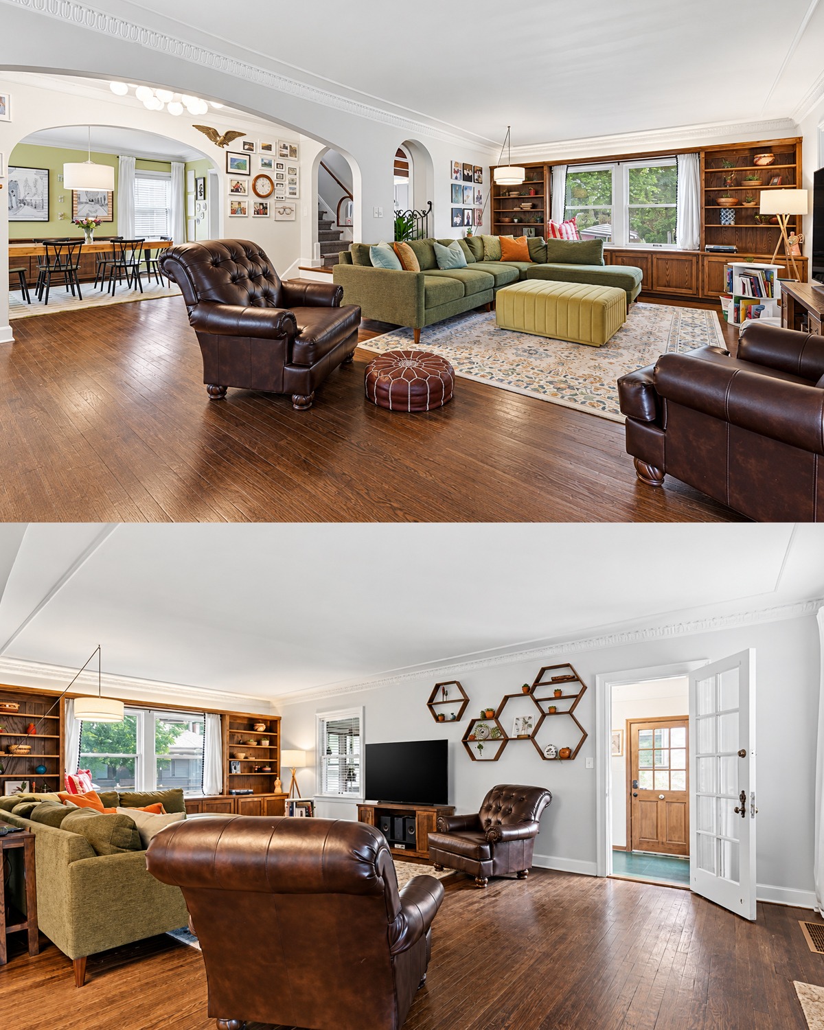
The living room built-ins are another key feature.
They run around the windows and create a full wall of storage. The dark wood stands out against the pale walls.
This contrast gives the room a focal point without needing a large piece of art or dramatic wall treatment.
Open shelves provide space for books, bowls, small art, and collected objects. Lower cabinets hide less attractive items.
That mix of open and closed storage is especially useful in an older home. It keeps character while improving function.
The built-ins also make the windows feel more important. Rather than floating alone on a blank wall, they become part of one large composition.
Design cues
- Floor-to-ceiling wood storage
- Open book shelves
- Lower cabinet storage
- Built-ins framing windows
- Natural or medium-dark wood
- Simple collected decor
- Warm wood against white walls
7. A Tudor Kitchen Brightened With White Cabinets
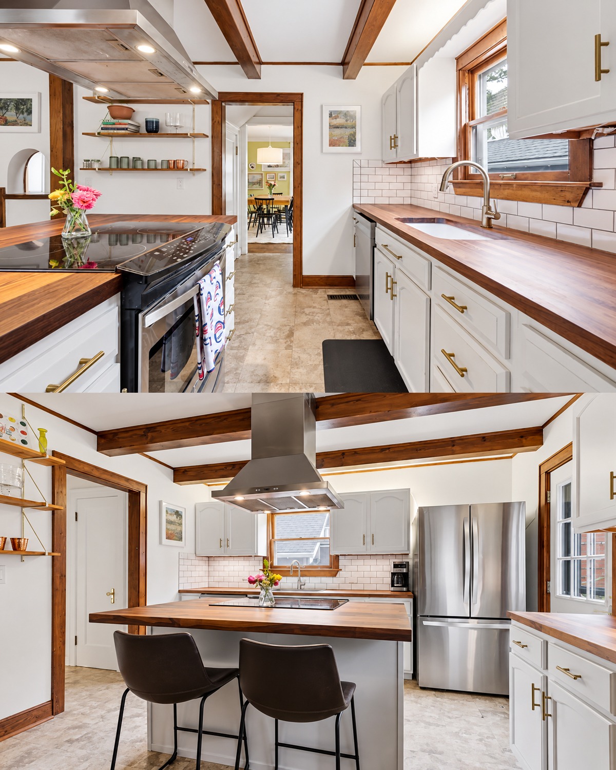
The kitchen takes a smart approach to updating an older home.
White cabinets make the room feel bright. Yet enough wood remains to keep it connected to the house.
Natural wood trim frames the windows and doors. Exposed ceiling beams repeat that color overhead. Wood countertops add another warm layer.
This keeps the kitchen from turning into an all-white modern box.
A white subway tile backsplash is simple and familiar. It works because it does not compete with the beams, trim, or counters.
Stainless steel appliances introduce a modern finish. They look clean but do not dominate the room.
At the center, a compact island provides prep space and seating. Its size fits the kitchen rather than overwhelming it.
Design cues
- White Shaker-style cabinetry
- Warm wood countertops
- White subway tile
- Natural wood window trim
- Exposed ceiling beams
- Stainless steel appliances
- Central island
- Simple dark bar stools
- Brass-toned cabinet pulls
- Mix of painted and natural wood surfaces
8. Wood Beams Give the Kitchen Its Personality
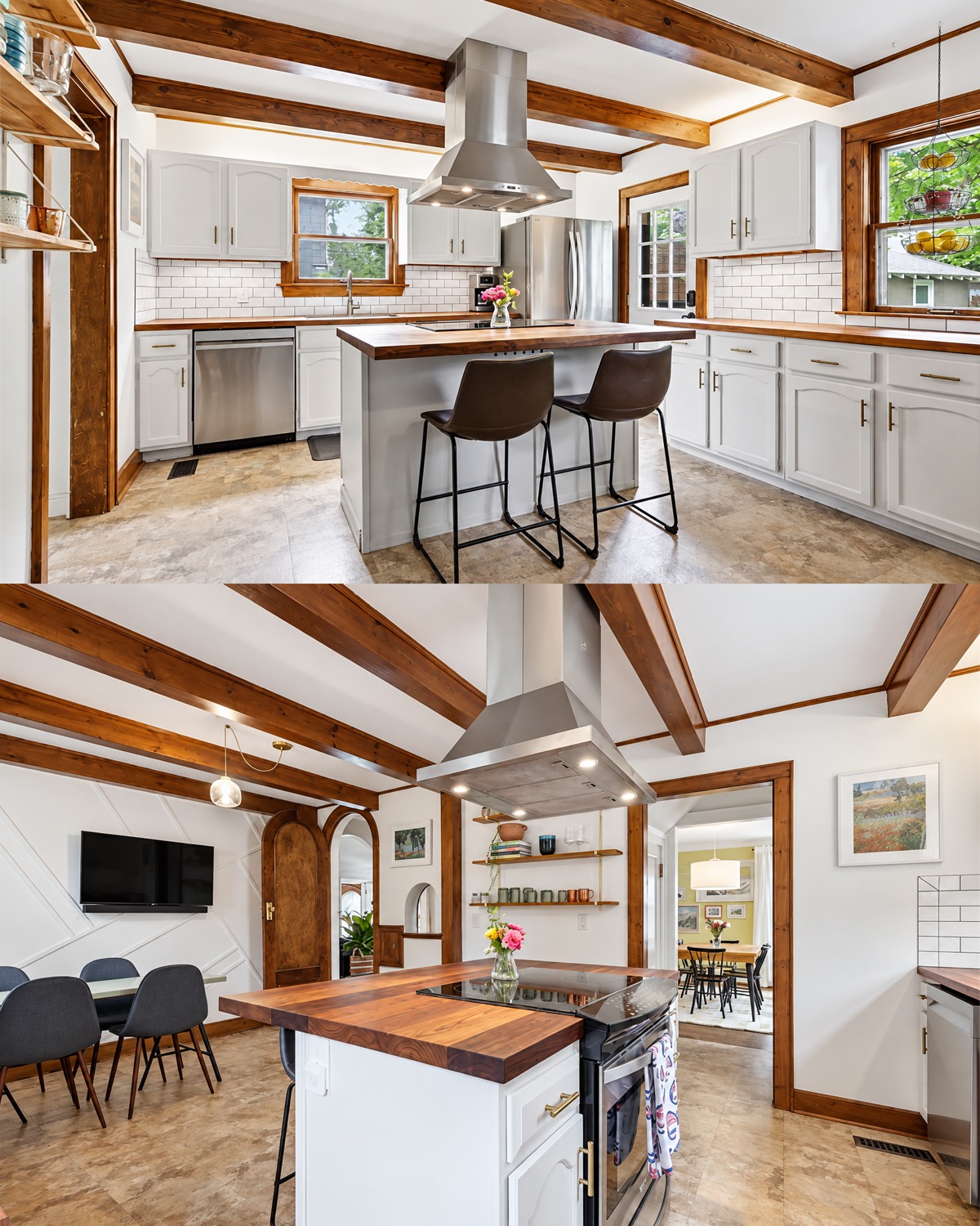
The ceiling beams deserve extra attention because they do much of the design work.
Against the white ceiling, the wood stands out clearly. The beams make the kitchen feel older and more grounded.
They also create a rhythm across the ceiling.
This is a good example of why you do not need dozens of rustic accents in a Tudor interior. One strong architectural feature often has more impact than a room full of themed decor.
The beams connect with the countertops, window casings, door trim, and open shelves. As a result, the kitchen feels cohesive even though several finishes appear in the room.
Design cues
- Exposed dark wood beams
- White ceiling between beams
- Repeated warm wood tones
- Simple ceiling details
- Natural materials used as accents
- Modern kitchen framed by older-looking architecture
9. The Dining Room Uses Color Without Fighting the Architecture
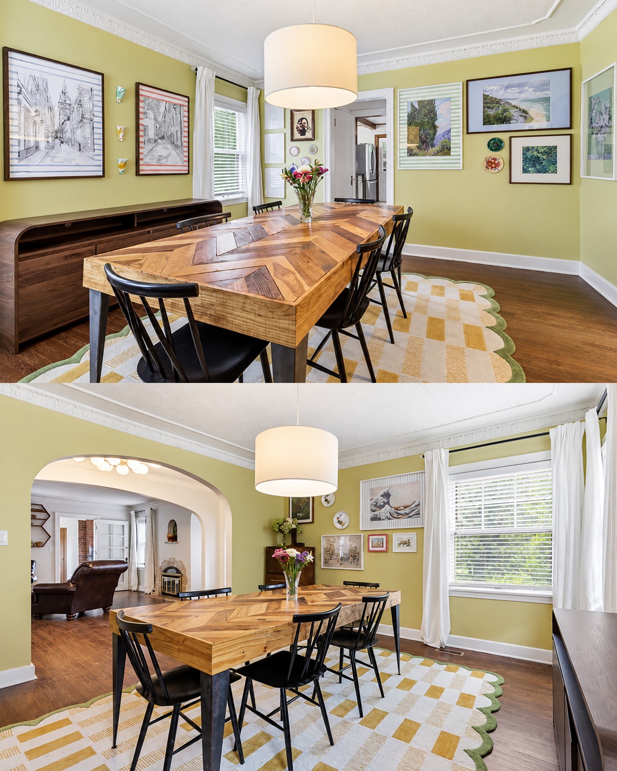
The dining room introduces a gentle green wall color.
It is a smart choice.
Tudor homes can handle rich shades, but deep colors are not the only option. This muted green brings nature indoors while keeping the room light.
A large wood table provides the main visual weight. Its top has a strong grain and pattern. Black chairs create a crisp contrast.
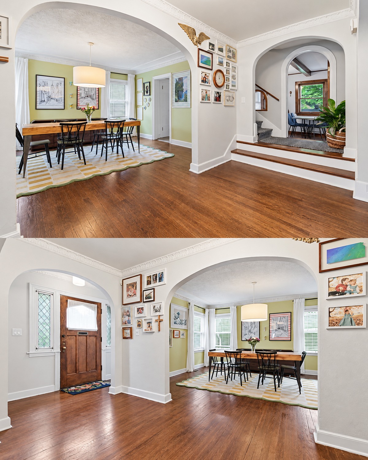
The rug adds cream, tan, green, and soft gold. It connects the wall color to the warm wood floor.
Meanwhile, white curtains keep the windows bright.
The large drum pendant is simple. It does not compete with the arch between the dining and living rooms.
Design cues
- Soft sage or olive-green walls
- Warm wood dining table
- Black dining chairs
- Patterned area rug
- White curtains
- Simple drum pendant
- Gallery-style wall art
- Wide arched doorway
- Dark hardwood floor
10. A Small Breakfast Nook Makes Use of an Awkward Space
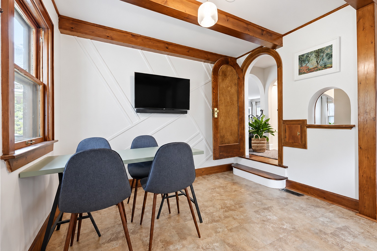
Older homes often have rooms that do not fit modern furniture in an obvious way.
Here, a small eating area uses that challenge well.
A compact table and four chairs fit against one wall. The furniture stays simple so the room does not feel crowded.
The real star is the architecture.
Wood beams cross the ceiling. Heavy wood trim frames the doorway. Then a large arched wood door creates an unexpected focal point.
A small curved wall opening nearby repeats that shape.
These details give the room far more personality than its size suggests.
Design cues
- Compact dining table
- Four slim chairs
- Exposed wood beams
- Thick natural wood trim
- Arched wood door
- Small curved wall opening
- White walls
- Minimal furniture
- Simple pendant lighting
11. A Sunroom or Home Office With Playful Historic Details
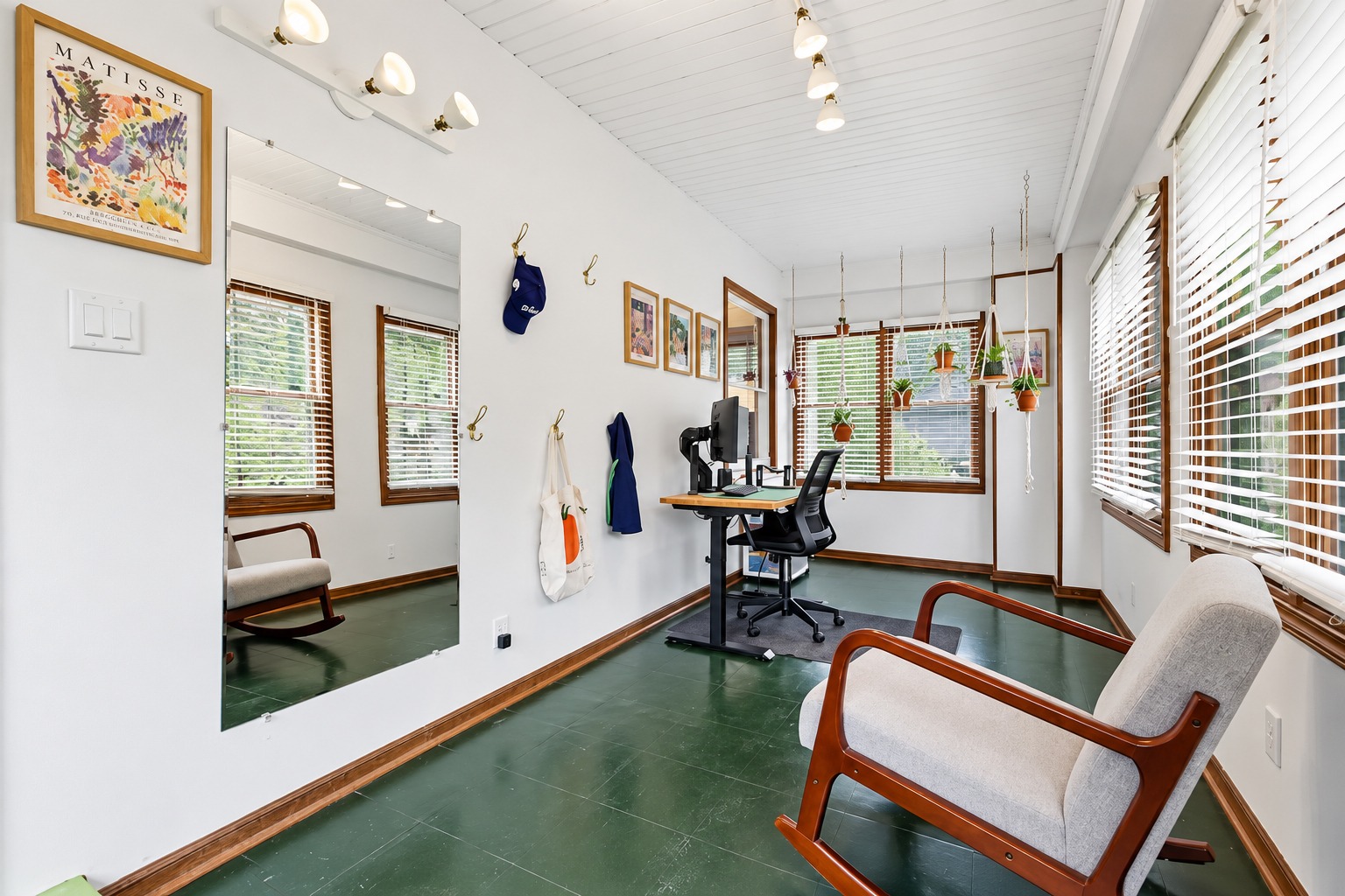
One of the most interesting spaces is the bright side room used as an office.
Rows of windows make the narrow room feel open. White walls reflect the daylight. The green floor adds character without requiring more furniture.
There is also a dramatic brick arch around a large window. This detail gives the space a direct visual link to the home’s brick exterior.
The ceiling has a beadboard-like texture. Small adjustable lights keep the room practical.
A large mirror reflects more light and makes the narrow plan seem wider.
The furnishings stay sparse. A desk, office chair, lounge chair, plants, and wall hooks are enough.
This room shows how an older enclosed porch or sunroom can become a flexible work area without losing its original charm.
Design cues
- Large banks of windows
- White walls
- Green painted floor
- Brick arched window surround
- Wood window trim
- Beadboard-style ceiling
- Compact work desk
- Large wall mirror
- Hanging plants
- Wall hooks
- Minimal furniture
12. The Upstairs Hall Keeps Original Character Visible
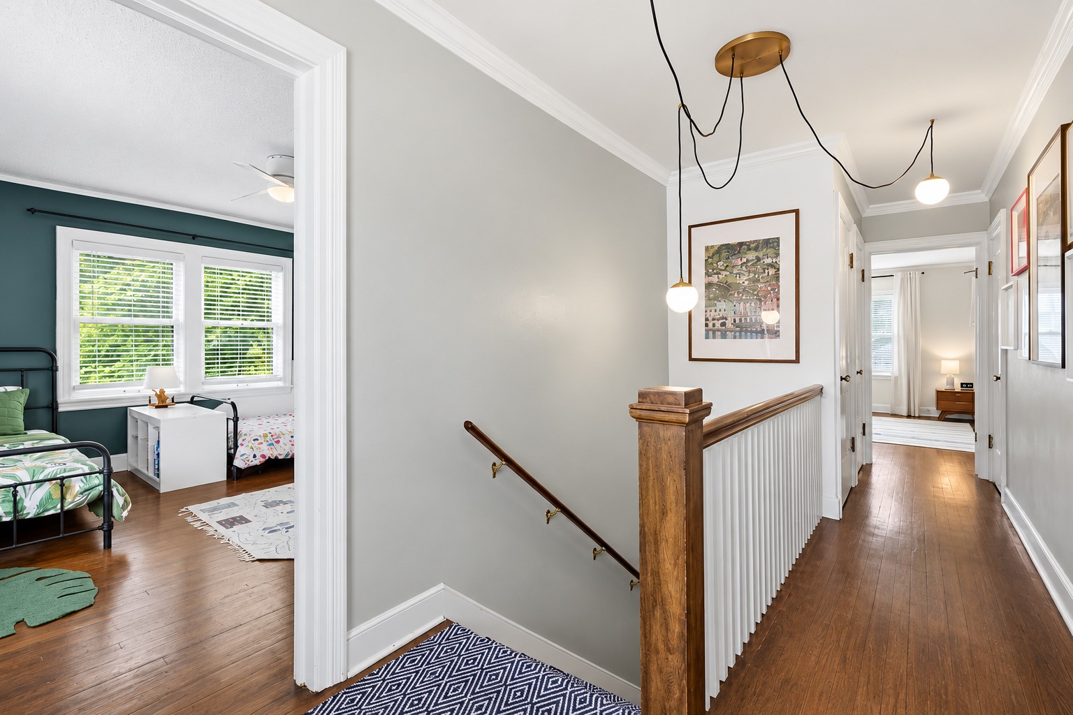
The upper hall is simple, but several small details make it memorable.
Warm hardwood runs through the corridor. White doors and trim brighten the narrow space.
The stair railing combines white spindles with natural wood. This is a classic way to preserve warmth without creating too much darkness.
A gray wall tone gives the hallway some contrast.
Then the lighting becomes playful. Small hanging globe lights drop from long cords. They add a modern note to an otherwise traditional setting.
Rather than trying to copy historic Tudor lighting, the design uses something fresh.
That contrast helps the house feel lived in today.
Design cues
- Hardwood flooring
- White trim
- Light gray walls
- Natural wood newel post
- White stair spindles
- Dark wood handrail
- Small pendant lights
- Framed wall art
- Simple bedroom doors
13. A Calm Primary Bedroom With Minimal Decoration
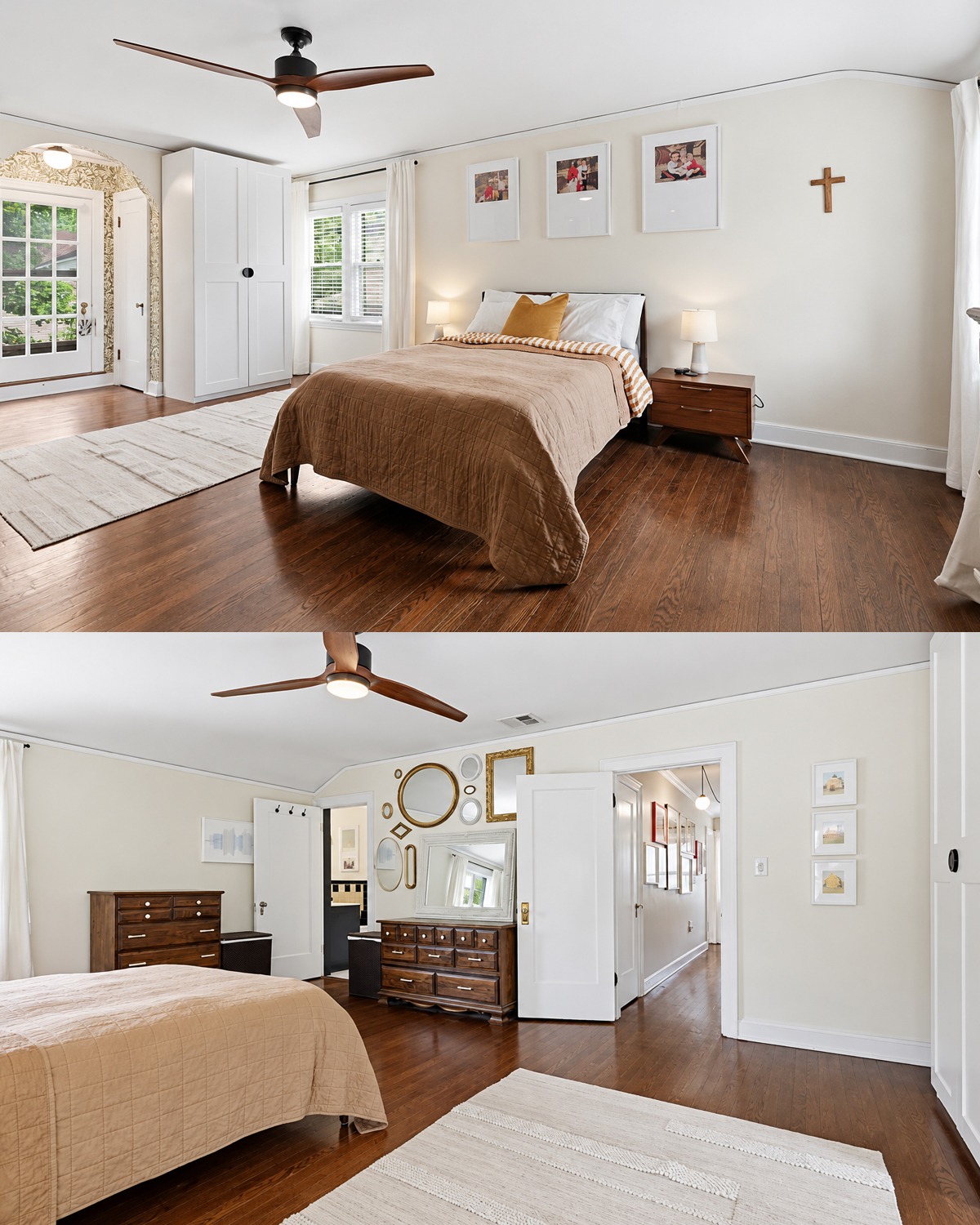
The main bedroom takes a restrained approach.
White walls allow the wood floor to provide warmth. A tan quilt adds another soft earth tone.
The furniture is simple. Mid-century-style wood nightstands sit beside the bed. Small table lamps add symmetry without becoming too formal.
A ceiling fan makes the room practical.
The room also appears to include more than one window or door opening. White curtains soften those edges and keep the palette consistent.
This is a useful lesson for Tudor interiors. Not every bedroom needs dark beams, paneled walls, and antique furniture.
Sometimes the best approach is to let the architecture around the room tell the home’s story.
Design cues
- Warm white walls
- Hardwood floor
- Tan or camel bedding
- White sheets and pillows
- Wood nightstands
- Small bedside lamps
- Simple ceiling fan
- Pale area rug
- White curtains
- Minimal wall decor
14. The Bathroom Uses Black and White for a Crisp Update
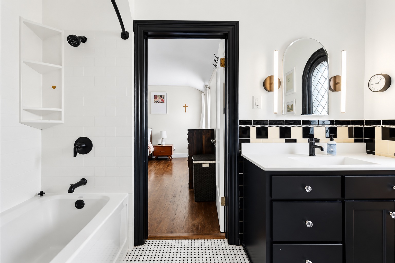
The bathroom brings a bolder contrast.
Black trim frames the doorway. A black vanity anchors one side of the room. Black fixtures repeat the color around the tub and sink.
Against those dark accents, the white walls feel bright and clean.
The backsplash includes black and cream tiles in a geometric band. This nods to the graphic tile patterns often seen in older homes without forcing the room to look like a strict restoration.
A small arched mirror continues the curved shapes seen elsewhere in the house.
That repetition matters. It makes the bathroom feel connected to the rest of the interior.
Design cues
- Black vanity
- White countertop
- Black plumbing fixtures
- White bathtub
- Black-and-cream tile band
- Small mosaic floor tile
- Arched mirror
- Dark doorway trim
- White walls
- Modern vertical sconces
15. Attic Bedrooms Turn Tudor Rooflines Into an Asset
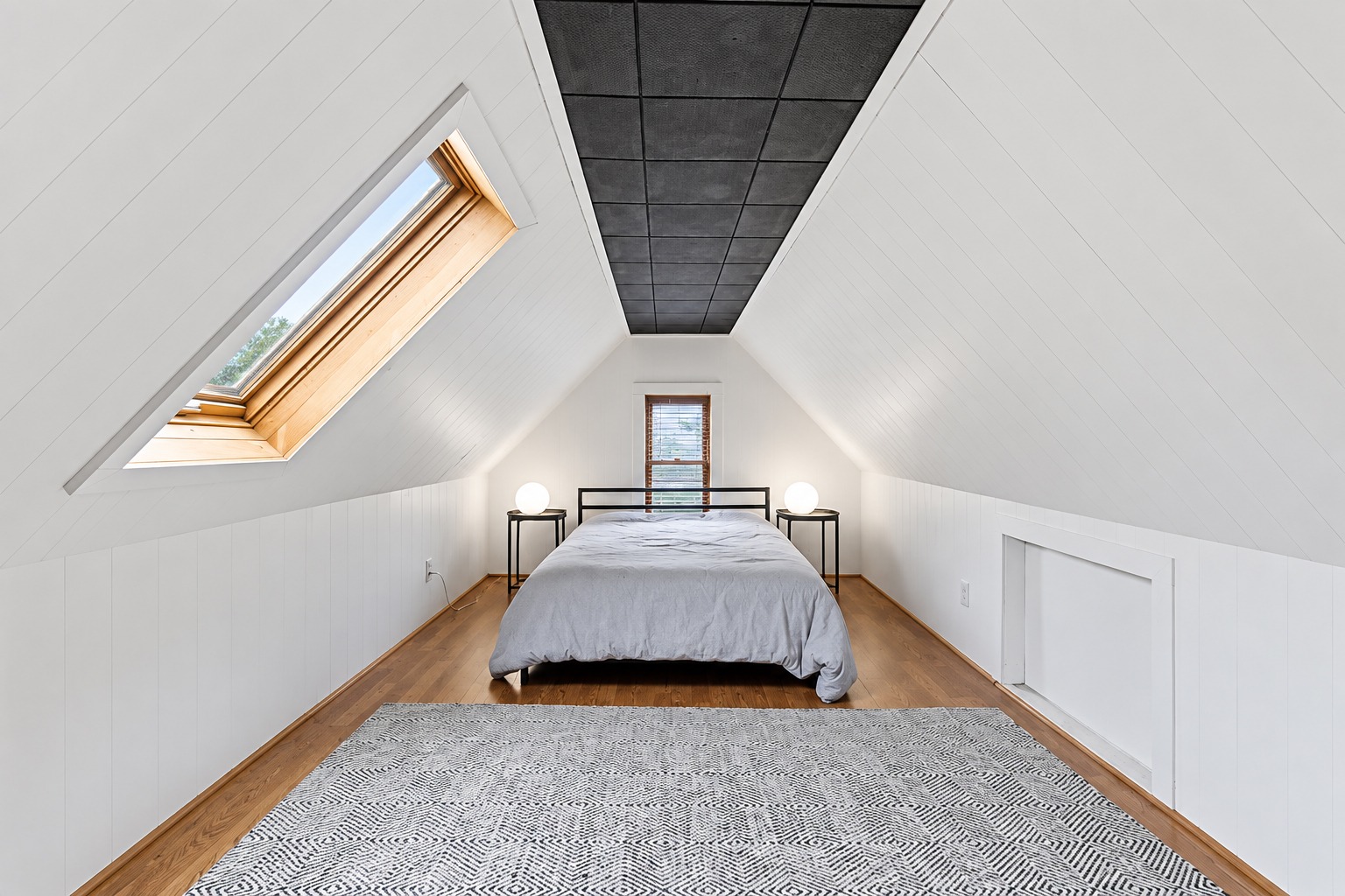
The steep roof that looks so dramatic from outside creates unusual spaces upstairs.
Instead of hiding those angles, the attic bedroom puts them on display.
The walls slope sharply toward the floor. A simple bed sits beneath the highest section. Small knee-wall doors provide access to storage.
A skylight brings daylight into the room.
The pale walls make the narrow attic feel larger. Meanwhile, a dark ceiling panel creates a bold stripe down the center.
Furniture stays minimal. That is important in a room where the roof shape already creates plenty of visual movement.
Design cues
- Steep sloped ceilings
- Finished attic space
- Low knee walls
- Built-in storage access
- Skylight
- Small end window
- White walls
- Warm wood floor
- Simple low bed
- Dark ceiling accent
- Minimal furniture
16. A Flexible Attic Lounge Adds Valuable Living Space
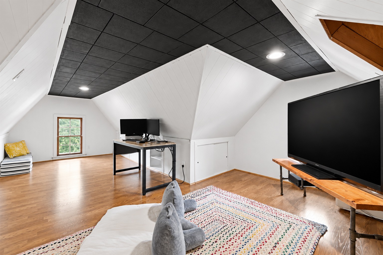
Another attic area works more like a bonus room.
A desk creates a small office zone. A large TV and soft seating turn the other side into a casual media area.
Again, the ceiling shape leads the design.
Dark ceiling panels highlight the ridge while white walls keep the lower parts bright. Small recessed lights provide even light without hanging into the limited headroom.
This room does not fight the unusual angles. Instead, it uses them to create character.
That is often the best approach in a Tudor attic.
Low sections can hold storage or small furniture. Full-height areas should stay open for walking and larger pieces.
Design cues
- Multiuse attic layout
- Low-sloped walls
- Dark ceiling panels
- White wall finish
- Recessed lighting
- Wood flooring
- Small work desk
- Media zone
- Low storage areas
- Simple furnishings
17. The Basement Takes a Fun Black-and-White Approach
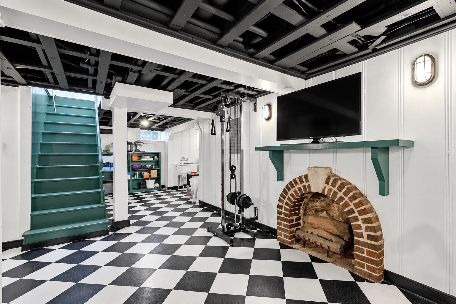
Downstairs, the design shifts again.
A black-and-white checkerboard floor gives the basement a playful, almost retro feel. The graphic pattern works well in a space with fewer decorative architectural details.
The exposed ceiling is painted dark. This makes pipes and framing visually recede while preserving ceiling height.
White walls keep the basement from becoming too gloomy.
Even the fireplace gets attention. Its brick arch remains exposed, which adds warmth and a clear link to the masonry seen outside.
A green-painted mantel adds a small shot of color.
The stairs repeat that green. It is a clever way to connect different parts of the room.
Design cues
- Black-and-white checkerboard floor
- Dark exposed ceiling
- White paneled walls
- Arched brick fireplace
- Green mantel
- Matching green staircase
- Wall-mounted television
- Open workout or hobby area
- Utility storage zone
- Industrial-meets-vintage character
Conclusion
This Tudor house shows how old-world charm can work beautifully with modern comfort. The brick exterior, steep rooflines, wood details, arches, and warm finishes give the home its strong Tudor character. Meanwhile, lighter walls, simple furnishings, and updated rooms make it feel bright and inviting. The key is balance. Keep the best historic details, then add clean and comfortable pieces around them.