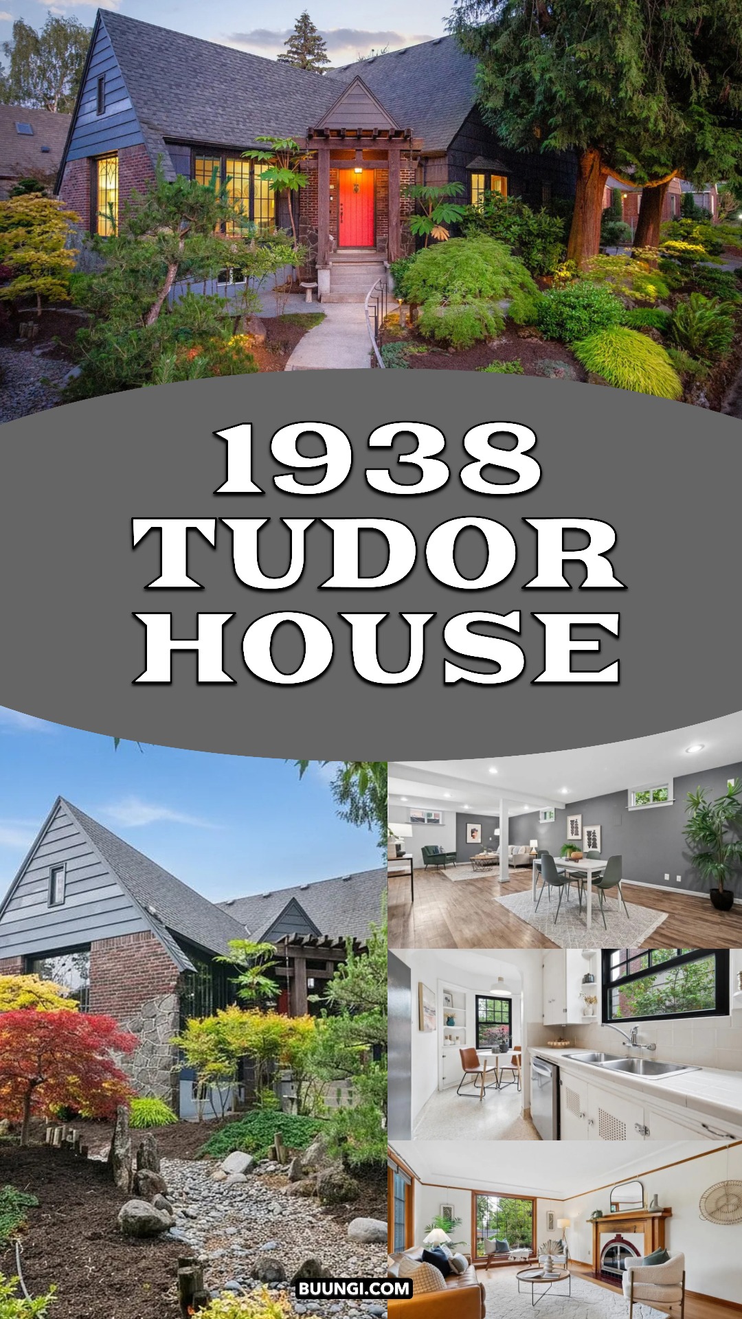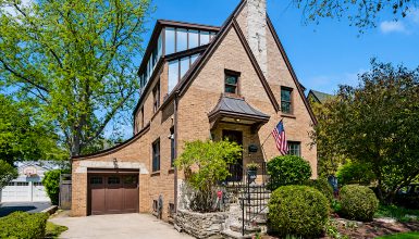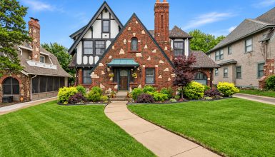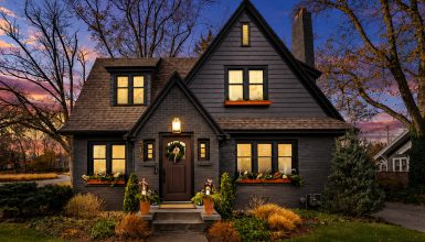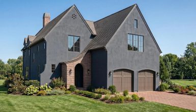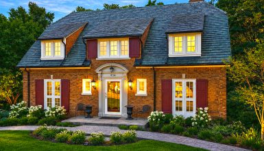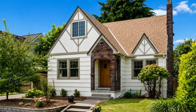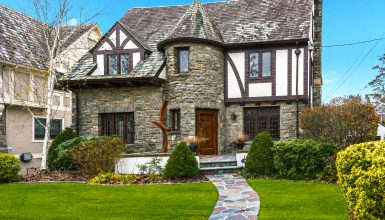
What happens when a storybook Tudor gets a fresh start? This 1938 home pairs steep gables, brick accents, and leafy gardens with bright rooms, wide windows, and modern comforts. Its old-world shape still sets the mood. Thoughtful updates make the house feel light and easy to live in.
1. A Tudor silhouette with a fresh look
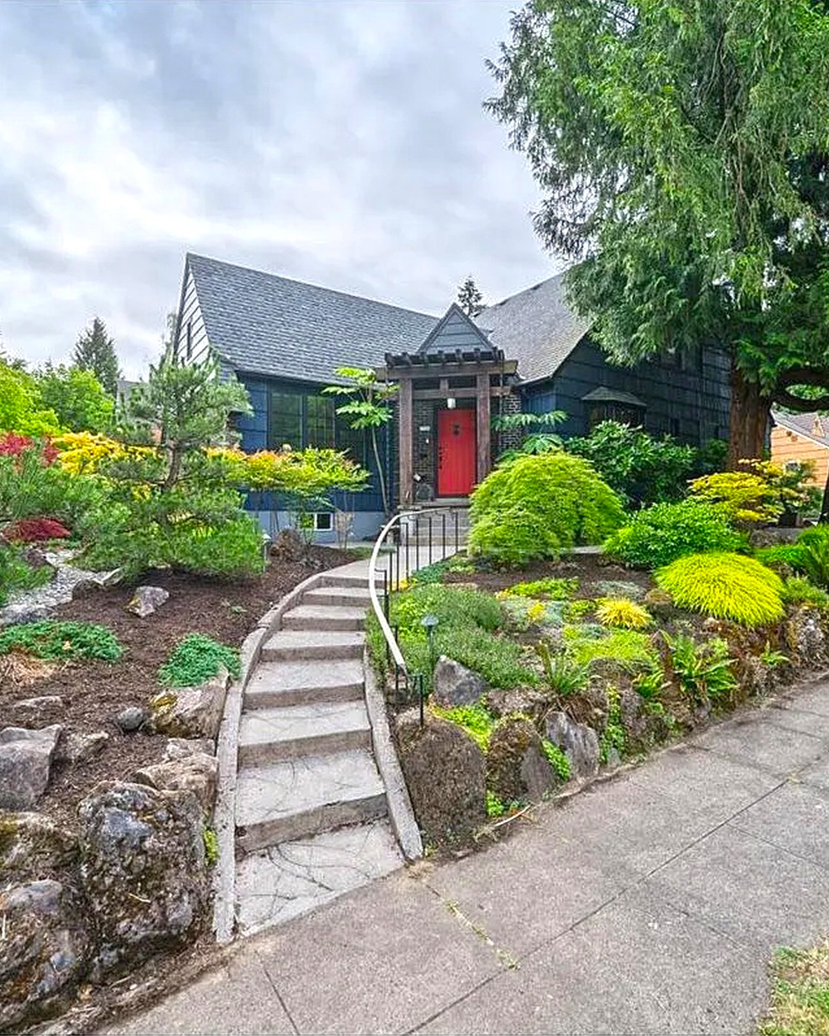
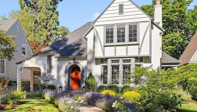
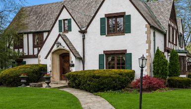
Tudor homes often stand out for their steep rooflines, tall chimneys, and mix of materials. This home keeps that character, then gives it a new look with blue-gray siding, dark roof shingles, and crisp trim. The result feels rooted in the past without looking frozen there.
The front does not rely on one grand feature. Instead, several details work together: the sharp gable, brickwork, layered rooflines, and windows set into the walls. Each piece adds depth. The contrast between blue siding and warm brick also helps the house stand out from the trees and shrubs around it.
This approach offers a useful lesson for anyone updating an older home. Keep the shape and details that give the house its identity. Then use paint, lighting, and landscaping to make those features feel current.
Design cues
- Steep, prominent gables
- Blue-gray lap siding
- Brick accents
- Dark roof shingles
- Light trim around windows and roof edges
- Several materials used across the exterior
2. Blue siding that gives the facade depth
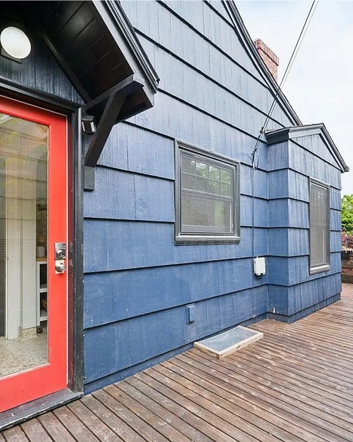
The blue-gray siding is one of the home’s strongest design choices. It has enough color to feel distinct, yet it sits close to nature. Against green trees and garden beds, the house feels settled into its setting.
A muted blue also makes the brick easier to notice. The brick brings warmth and texture, while the siding creates a clean backdrop. Neither material overwhelms the other. This balance matters on a Tudor home, where the facade often combines several shapes and finishes.
If you want to use a similar palette, look at your home in different light before choosing a paint color. A blue that looks soft in a store can appear brighter under direct sun. Test a large sample near brick, stone, or roof shingles. Check it in the morning and late afternoon, too.
Trim can help tie the colors together. Here, light trim marks the roof edges and window openings. It gives the darker siding a neat outline and keeps the facade from feeling heavy.
Design cues
- Muted blue-gray siding
- Warm brick for contrast
- Light trim against dark siding
- Colors that work with nearby trees and shrubs
- Paint samples checked outdoors in changing light
3. Brick adds a sense of age
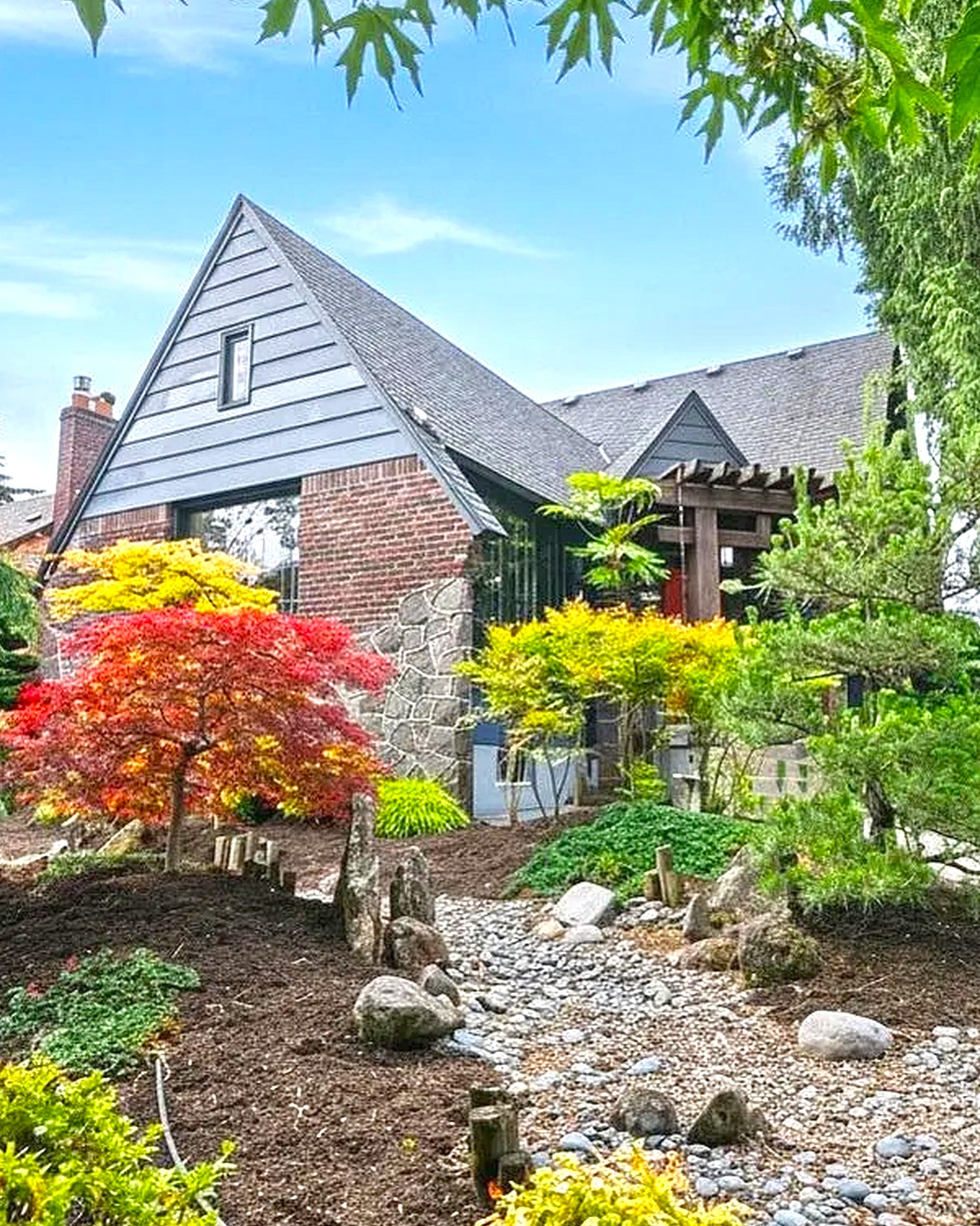
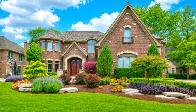
The brick gives the house a grounded, lasting feel. It also fits the Tudor look, which often uses masonry as a key part of its design. In this home, brick sits beside painted siding rather than covering every wall. That mix keeps the facade from feeling too dark or heavy.
Brick has its own patterns and color shifts. Even when the pieces share a similar tone, mortar lines and slight surface changes add depth. The material can also link the house to the garden, especially when paths, edging, or retaining walls use stone nearby.
When updating a house with brick, treat it as a fixed part of the color plan. Choose siding and trim that suit its undertones. If the brick reads red or rust, warm whites and muted blues often sit well beside it. Avoid picking a color from a small paint chip alone. The brick may make that color look brighter, cooler, or more intense.
Design cues
- Brick placed alongside siding
- Red and brown tones that warm the facade
- Visible mortar lines
- Masonry that echoes stone in the garden
- New paint chosen to suit existing brick
4. A welcoming entry with a bold accent
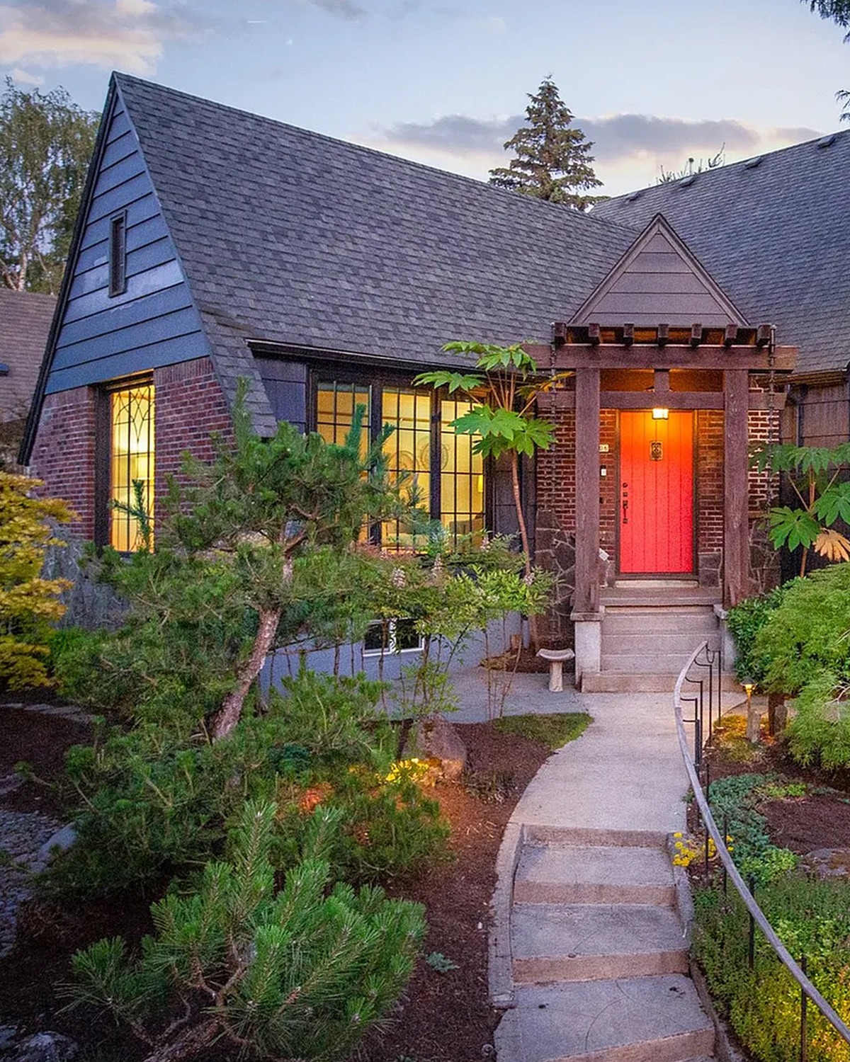
The entry offers a small but memorable burst of color. A red door stands out against the blue siding, making the entrance easy to find. It gives the house a friendly, personal touch without changing its overall palette.
A bright door works best when the rest of the facade stays calm. Here, blue, gray, white, and brick form a quiet base. The red door can then take the lead. The covered area above it also gives the entrance a sense of shelter, while a light near the door helps mark the path after dark.
For a similar update, think about the door as a focal point. Pick a shade that suits the home’s brick and roof. Then repeat that accent in a small way, perhaps with a planter or porch cushion. A single strong color often does more than several competing accents.
Design cues
- Red front door
- Dark siding around the entrance
- Small covered entry
- Exterior light near the door
- One bright accent against a restrained palette
5. Garden paths soften the house
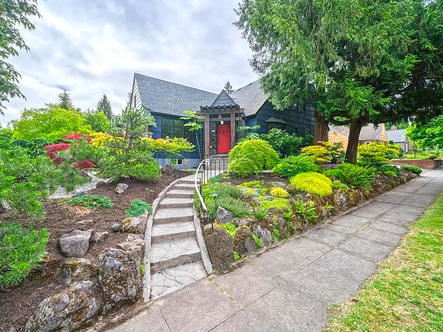
The garden makes the house feel welcoming before you reach the door. Curved paths lead through layered plants, rocks, and small changes in height. The effect feels natural, as if the landscape grew around the house over time.
This softer style suits the Tudor shape. The rooflines are angular, so rounded planting beds and winding paths add contrast. Shrubs, ornamental grasses, and low flowers create layers without hiding the home’s best features. The garden frames the facade rather than covering it.
Stone steps and paths also help connect the house to the yard. They give visitors a clear route while adding texture underfoot. If a yard slopes, short steps can make the climb feel more gradual. Low plants along the edge can soften the hard lines.
A garden like this does not need a long plant list. It needs a mix of heights and textures. Use taller shrubs near the foundation, smaller plants by the path, and open areas where the eye can rest.
Design cues
- Curved garden paths
- Stone steps and rock edging
- Plant layers at different heights
- Shrubs and flowers that frame the house
- Open views of the siding and windows
6. A quiet driveway and practical garage
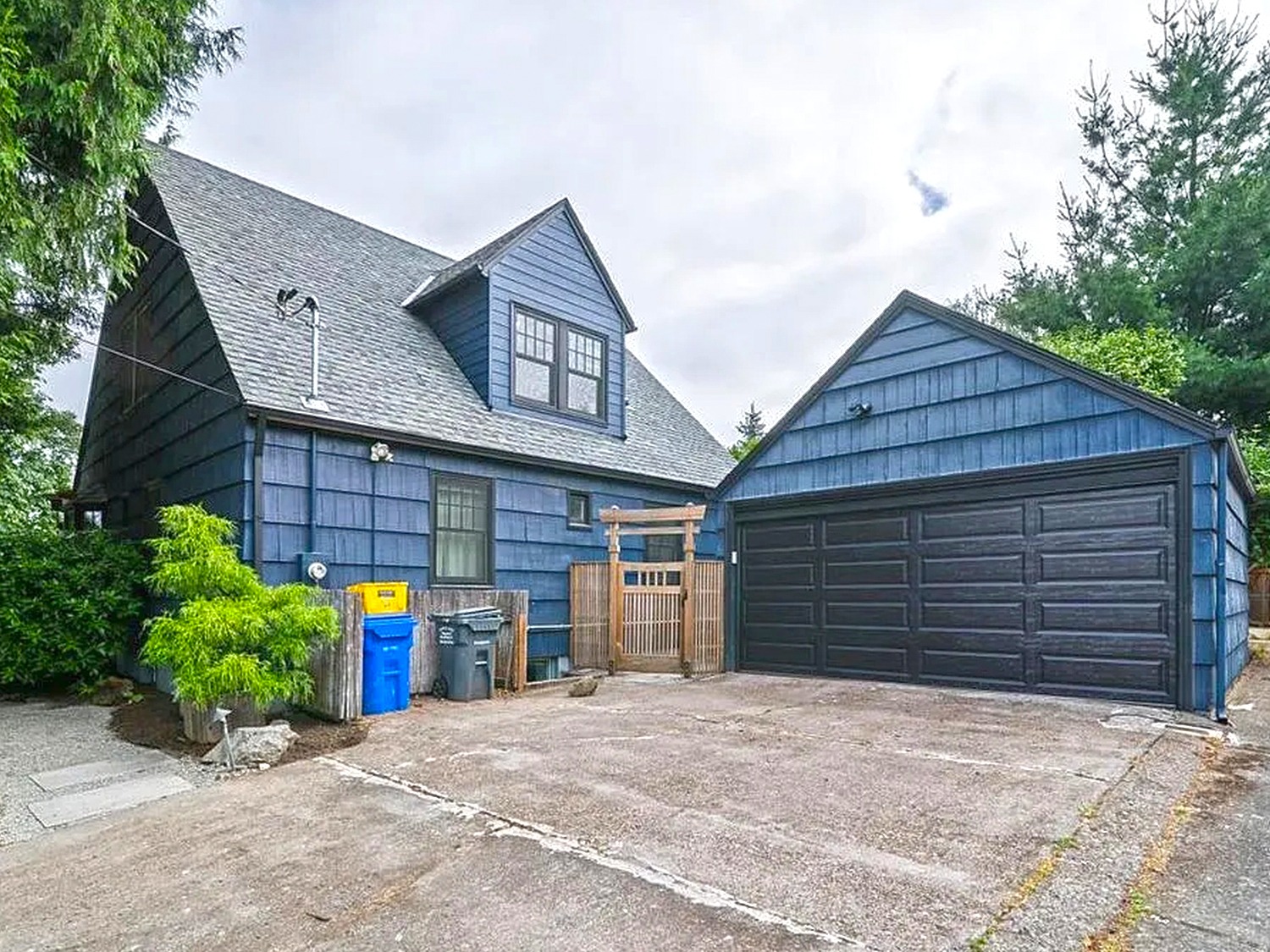
The driveway and garage have a simpler look than the front garden. That contrast makes sense. A driveway needs to work well, while the garden can carry more detail.
The garage uses the same blue-gray siding as the house, so it feels connected to the main structure. Its roofline and trim also suit the home’s style. A paved drive offers a clear approach and enough open space for parking and turning.
If you are updating a garage on an older home, matching the siding and trim can help it blend in. You can add character with the door style, lanterns, or plants near the edge. Keep those details simple. The house should remain the main focus.
Design cues
- Garage siding that matches the house
- Clear paved approach
- Dark roof shingles
- Light trim for definition
- Simple planting beside the drive
7. A deck for outdoor living
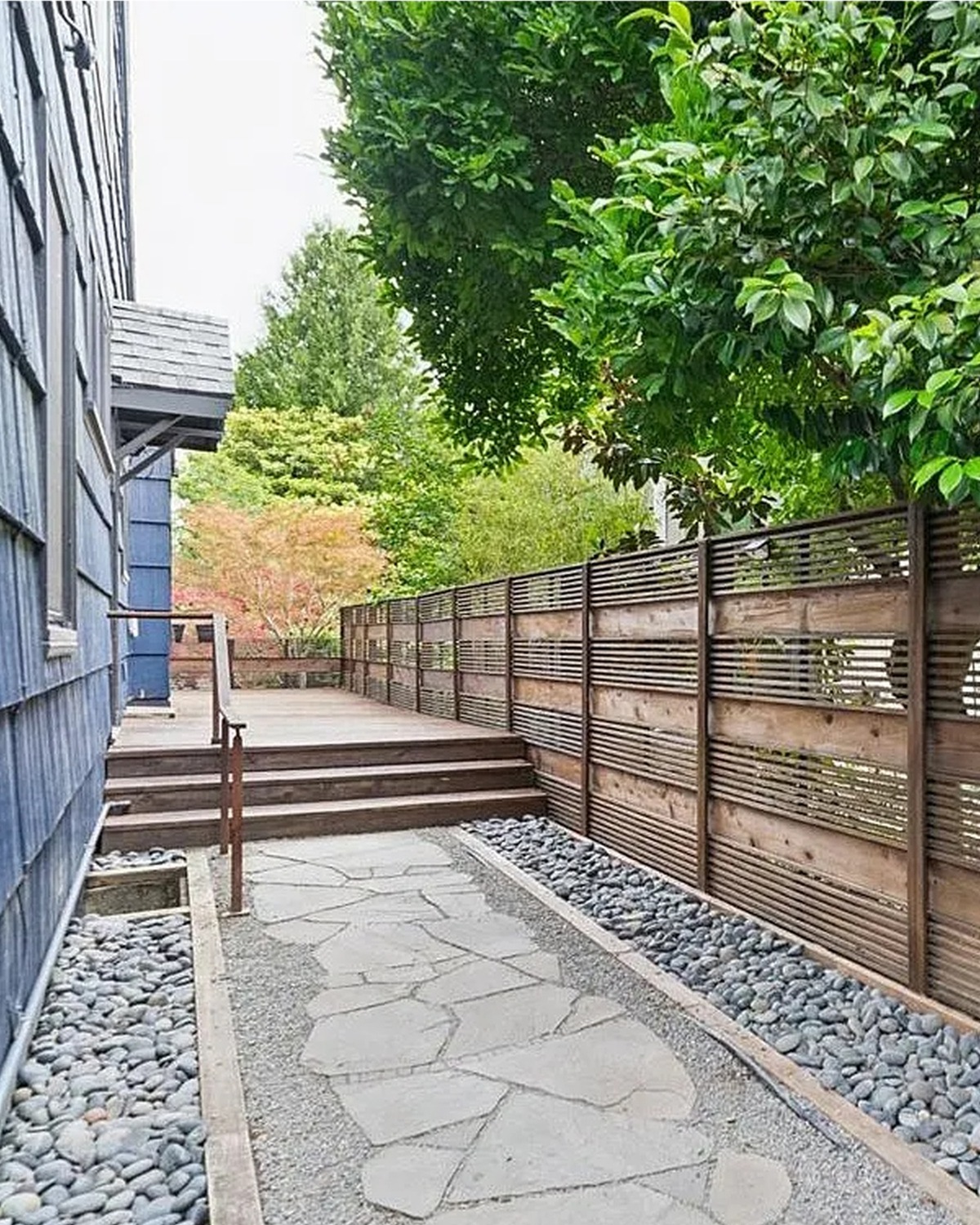
At the back of the house, a wood deck creates a relaxed outdoor room. It offers space to sit, dine, or step outside from the home. The long boards also bring warmth beside the cool blue siding.
A deck can make an older house work better for daily life. It gives the family a place to gather without changing the home’s main footprint. In this design, the deck sits close to the house and connects to a path through the yard.
Wood tones look good next to blue paint because they add natural warmth. A fence can offer privacy, while trees and shrubs soften the edges. If you are planning a similar space, think about how people will move between the door, chairs, and steps. Leave room for a clear path around the furniture.
Design cues
- Wood deck beside blue siding
- Outdoor space close to the house
- Fence for privacy
- Trees and plants at the deck edge
- Clear paths between doors and seating
8. A living room built around the fireplace
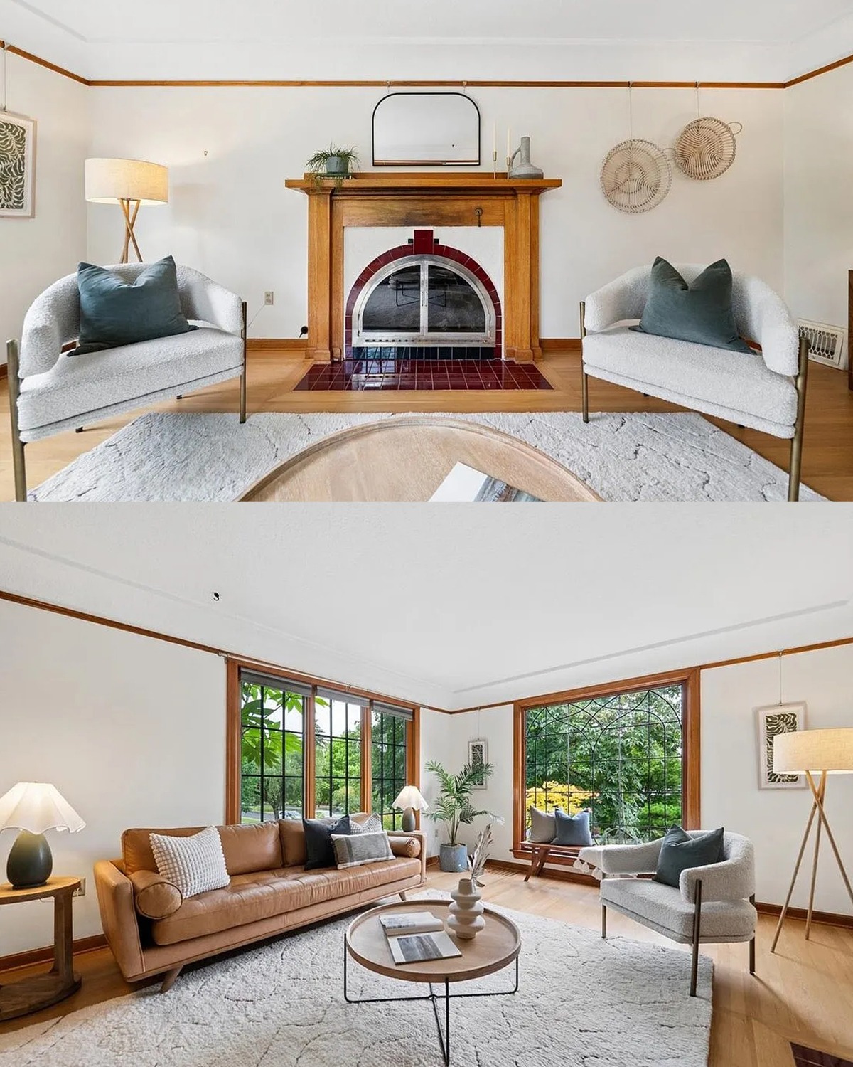
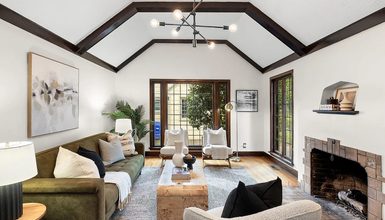
Inside, the living room feels bright and calm. A fireplace anchors one wall and gives the room a natural gathering point. The white mantel and surround keep the feature light, while a dark firebox adds contrast.
The furniture supports conversation. A pair of chairs faces the fireplace, with a small table between them. This arrangement works well in a room that may not have space for a large sectional. It also leaves a clear route through the room.
The palette is simple: white walls, pale upholstery, warm wood, and a few dark accents. That mix lets the fireplace stand out without making the room feel formal. A rug adds softness and helps define the seating area.
Older homes can have rooms that feel closed off or small. Light wall colors and open sightlines can make them feel larger. Keep furniture close to the scale of the room. A few comfortable pieces often work better than filling every corner.
Design cues
- Fireplace as the room’s focal point
- Light mantel and surround
- Compact seating group
- Pale upholstery and neutral rug
- Clear walking paths
9. Wide windows bring in the garden
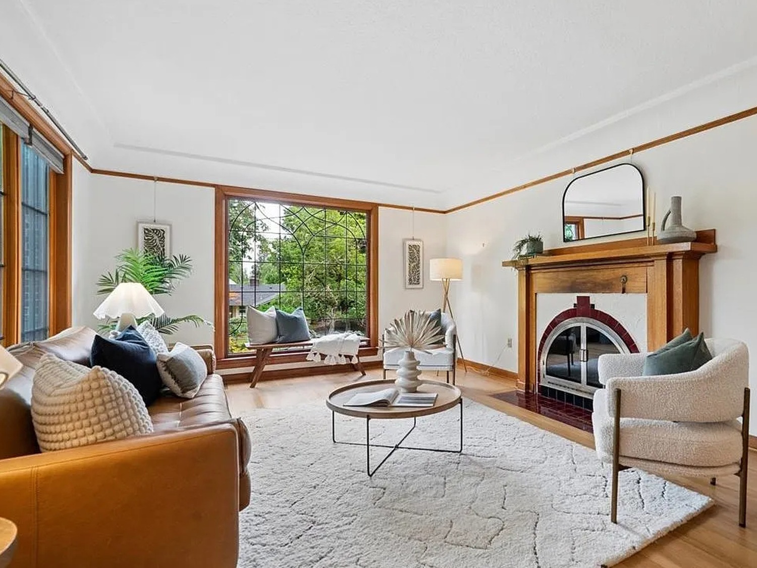
The large windows help connect the rooms to the landscape. Black frames create a crisp outline, while the greenery outside adds color. In some rooms, warm wood trim gives the windows a softer, more traditional feel.
That mix of dark frames and wood details helps the interiors feel current without losing warmth. Black frames can sharpen a bright room. Natural wood keeps the effect from feeling stark.
Window placement also shapes how a room works. A large window near the living area brings in daylight and gives the seating group a view. A smaller window above a kitchen sink makes everyday tasks feel less enclosed. In the dining room, windows help the table feel connected to the garden.
If you replace windows in an older home, consider the size and pattern of the originals. New frames can improve comfort, but the proportions still matter. Match the style of the home, then choose a finish that suits both the exterior and interior.
Design cues
- Large windows with dark frames
- Views toward trees and garden beds
- Natural wood trim in select rooms
- Daylight near seating and work areas
- Window styles that suit the home’s proportions
10. A dining room that feels open
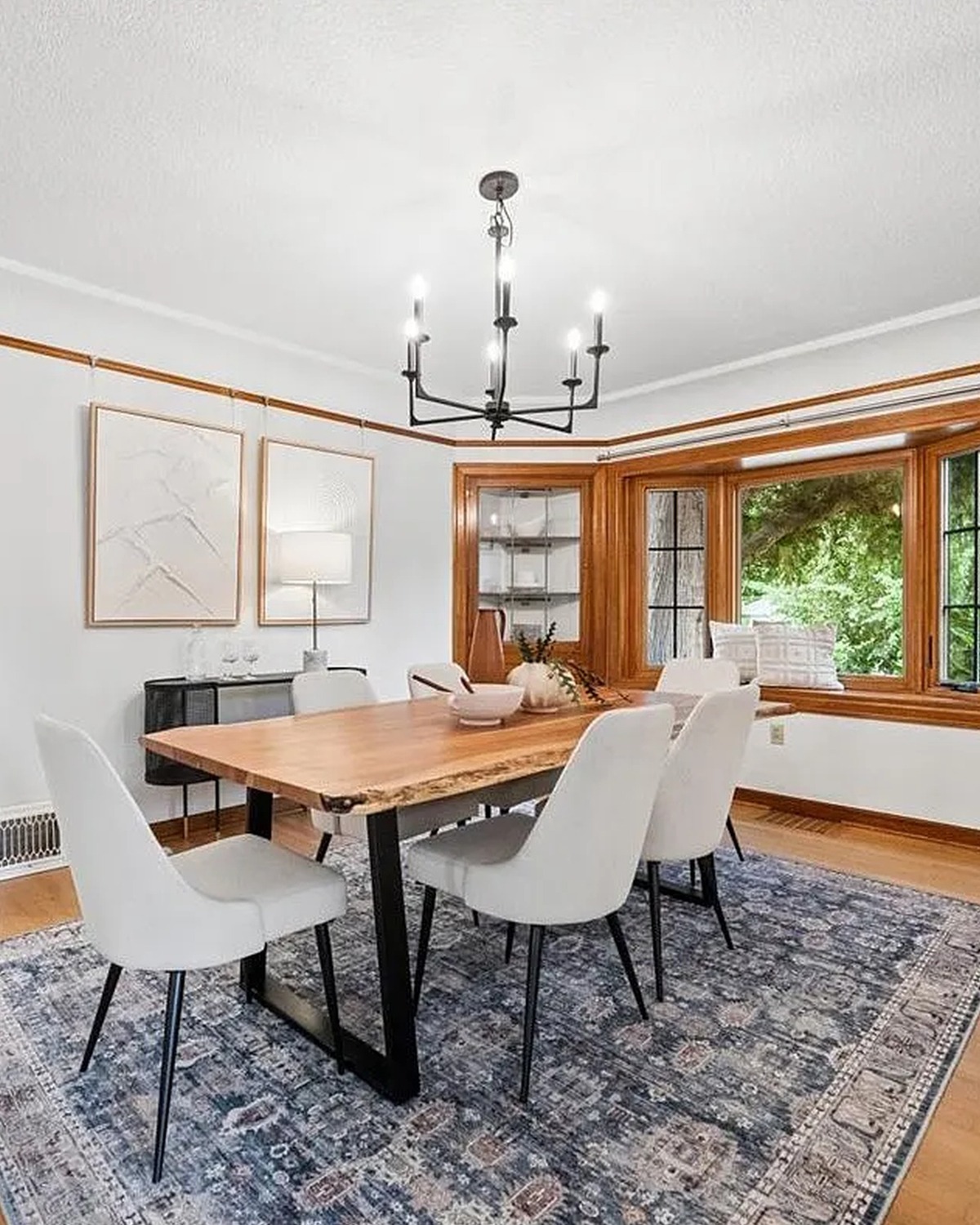
The dining area has a bright, uncluttered look. A wood table adds warmth, while simple chairs keep the room from feeling heavy. A chandelier marks the center of the space and gives the table a clear place in the room.
The room also benefits from the open view into nearby spaces. It feels connected to the living area, yet the table still has its own zone. A rug beneath the dining set can help define that zone. It also softens the sound of chairs moving across the floor.
A wood table is a smart choice in a light room. It adds contrast and can handle daily use. Keep the centerpiece low so people can see across the table. A bowl, small vase, or branch arrangement is enough.
Design cues
- Wood dining table
- Light, simple chairs
- Chandelier centered over the table
- Rug to mark the dining area
- Open views into nearby rooms
11. A bright kitchen with useful storage
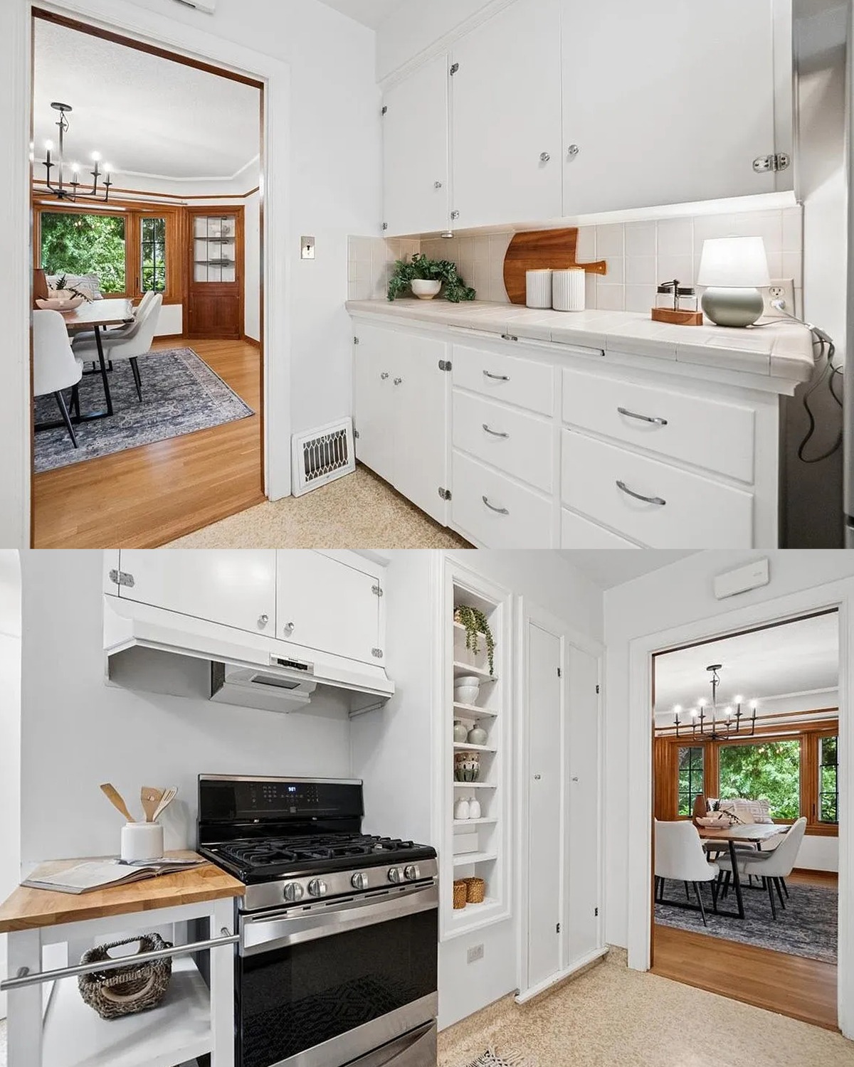
The kitchen uses white cabinets and pale surfaces to keep the room bright. Dark appliances add contrast, while open shelves and counter space make the room feel ready for daily use. The design favors clean lines over ornate details.
A white kitchen can suit a historic home when it keeps some warmth. Wood floors, a wood dining table, or natural accents prevent the space from feeling cold. Here, the nearby rooms bring in those warmer tones.
Good storage matters as much as color. Cabinets keep dishes and supplies out of sight. Open shelves can hold a few useful items, but they work best when kept tidy. Leave some counter space clear for cooking and prep.
When updating a kitchen in an older home, look at how people move through it. Keep the route between the sink, stove, and refrigerator easy. Add task lighting above work areas. A fresh finish should make the kitchen easier to use, not just more polished.
Design cues
- White cabinets and pale counters
- Dark appliances for contrast
- Wood tones nearby for warmth
- Open shelves used with care
- Clear prep space and good task lighting
12. A small breakfast nook
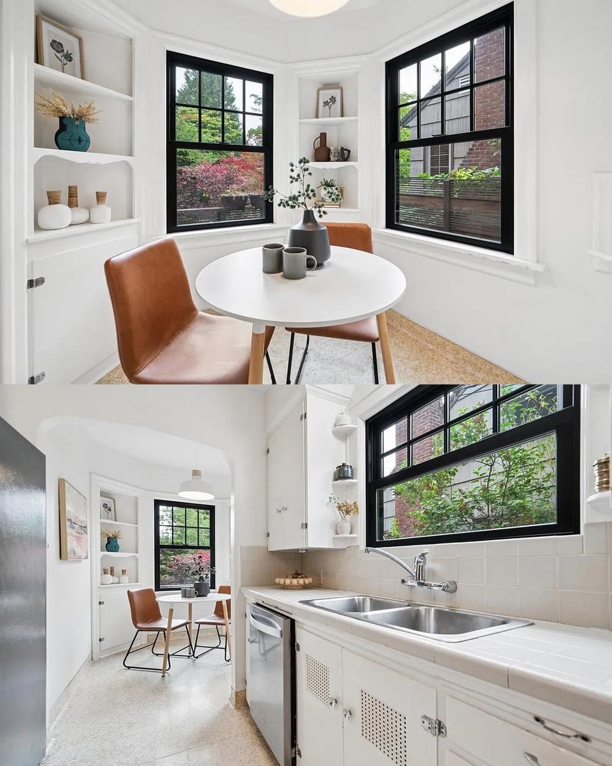
A window nook turns a simple corner into a place to pause. A round table fits the compact space, and a built-in bench makes use of the wall. Dark window frames give the area a neat outline.
This kind of nook works well for breakfast, coffee, or a quick meal. It can also serve as a work spot when the table is not in use. The round shape makes it easier to move around than a large rectangular table.
A small table does not need much decor. A pendant or ceiling light, a few cushions, and a plant can make the space feel complete. Keep the window area clear enough to enjoy the view.
Design cues
- Built-in bench below the windows
- Small round table
- Dark window frames
- Simple overhead light
- Minimal tabletop decor
13. A calm, practical bathroom
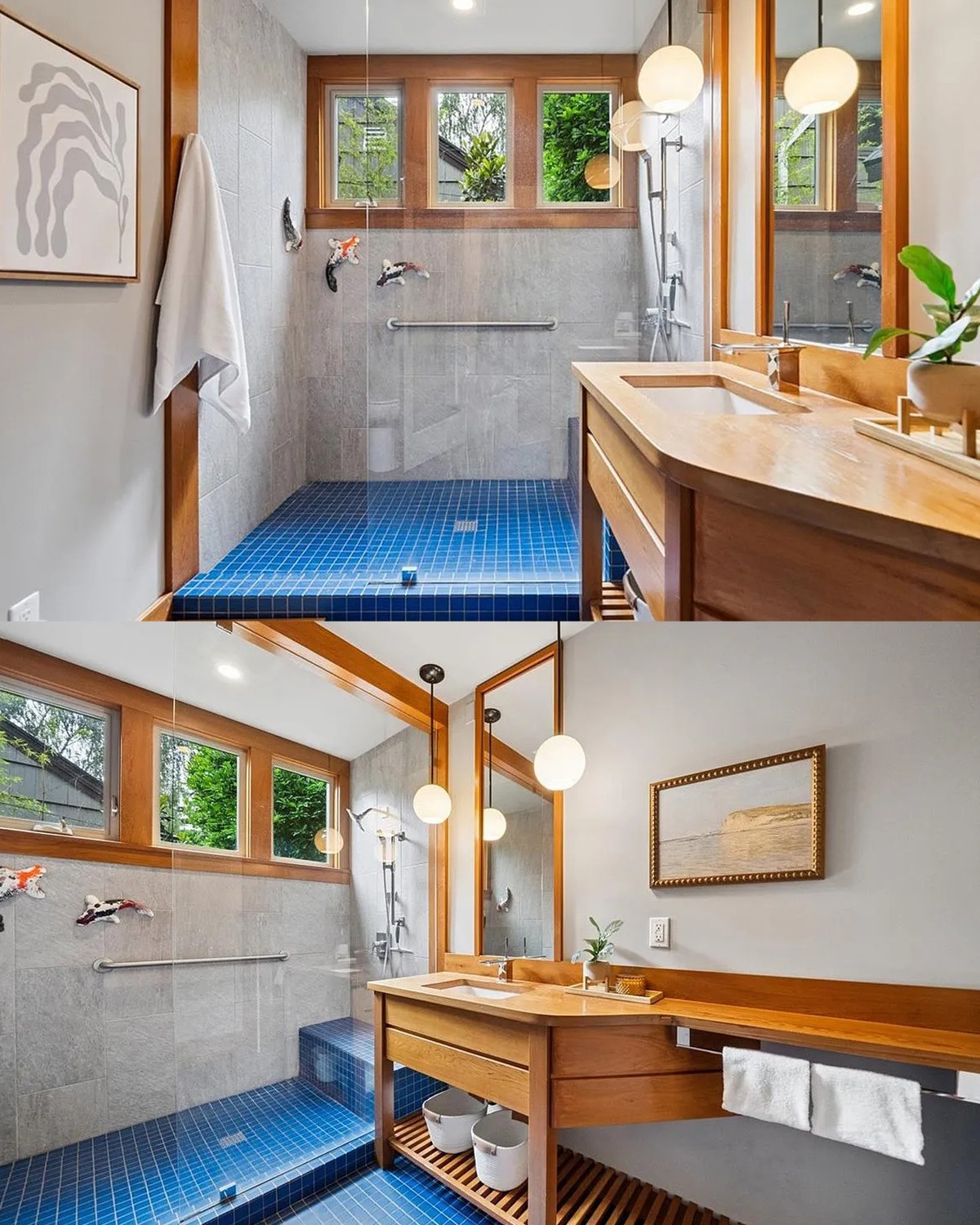
The bathroom combines pale tile, clean surfaces, and warm wood. A walk-in shower with blue tile adds a clear color note. The wood vanity brings warmth and gives the room a natural focal point.
The shower feels open because it uses a glass panel rather than a full curtain. That choice lets more light move through the room. A built-in niche keeps soap and shampoo close at hand, while the tile gives the shower wall visual interest.
The long vanity offers storage and counter space. Open shelving below can hold towels or baskets, though a mix of open and closed storage often works best. Closed drawers hide daily items. Open shelves keep folded linens easy to reach.
A bathroom should feel good to use, not only good to look at. Add bright task lighting near the mirror. Choose slip-resistant flooring. Make sure the shower controls sit within easy reach.
Design cues
- Walk-in shower with glass panel
- Blue tile as a feature
- Wood vanity with a broad counter
- Built-in shower niche
- Practical storage and clear mirror lighting
14. Bedrooms with room to rest
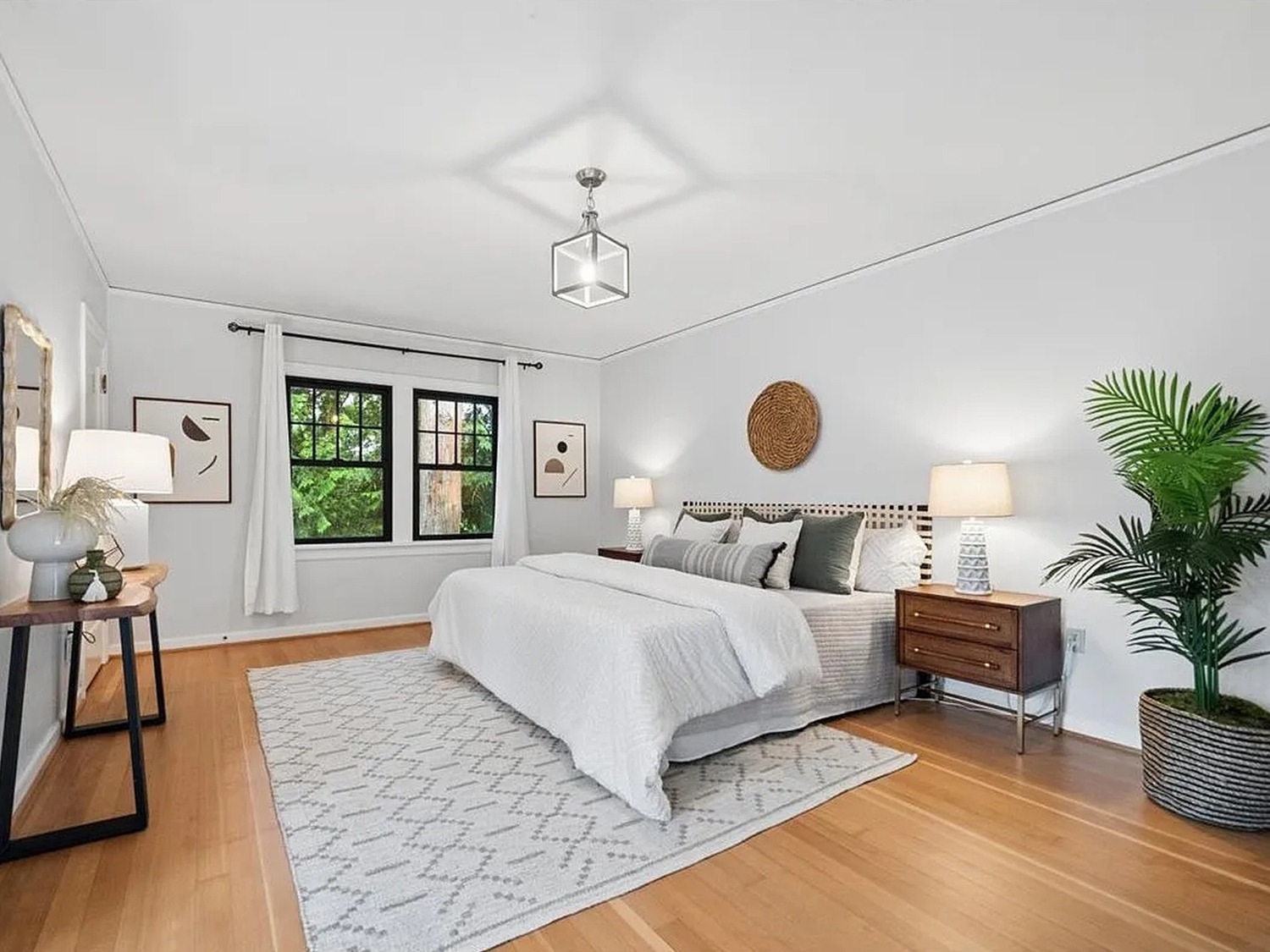
The bedrooms use a quieter palette than the main living areas. White bedding and light walls keep the rooms calm. Wood floors and small dark accents add depth without making the space feel busy.
A simple bed can become the focal point with layered pillows, a textured blanket, and a rug underfoot. Keep bedside tables useful. A lamp, book, and small tray can be enough. Too many decorative items may make a restful room feel crowded.
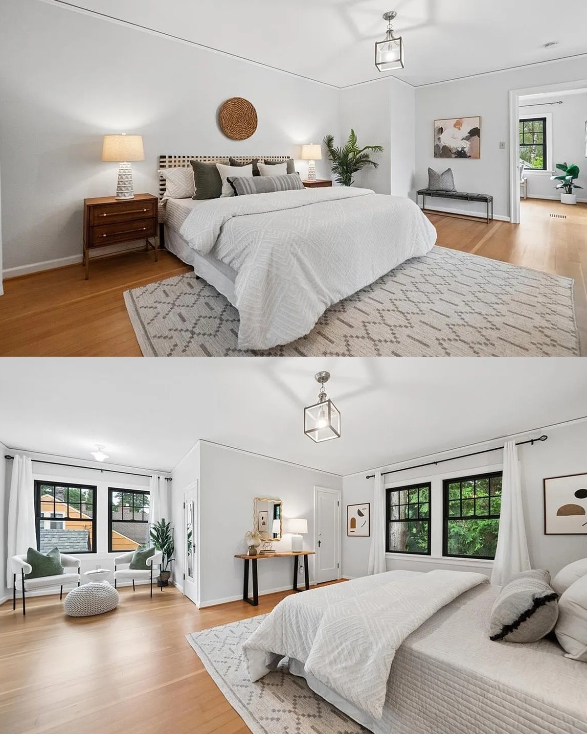
The windows bring in daylight and help the bedrooms feel open. Curtains or shades add privacy while allowing the homeowner to control light. A ceiling fan can help air move through the room, especially in warm weather.
Design cues
- White or pale bedding
- Wood floors
- Simple bedside tables and lamps
- Light window coverings
- A few dark accents for contrast
15. A lower-level living area
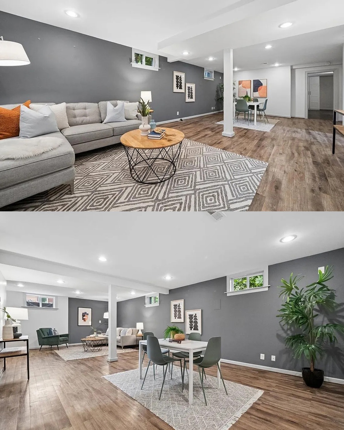
The home also includes a more casual living space with gray walls, a sectional sofa, and a dining or work area nearby. This darker palette gives the room a different mood from the bright main floor. It feels suited to movie nights, games, or relaxed family time.
A gray wall can help a large room feel cozy. The key is to balance it with light furniture, a pale rug, and enough lighting. Here, the light sofa stands out against the darker wall. Wood-look flooring adds warmth and can make the room feel more finished.
If a room serves several purposes, use furniture to mark each zone. A rug can define the seating area. A table and chairs can create a separate place to eat or work. Keep the route between zones open so the room feels easy to use.
Design cues
- Gray accent wall
- Light sectional sofa
- Pale rug with a simple pattern
- Dining or work area near the lounge
- Warm flooring and layered lighting
Conclusion
This 1938 Tudor House blends storybook character with a relaxed, modern feel. Blue-gray siding, brick, and steep gables give the exterior its charm. Curved paths, layered gardens, and a wood deck make the outdoor spaces feel welcoming. Inside, fireplaces, wide windows, pale finishes, and warm wood create rooms that feel bright and comfortable.
The design offers a simple idea: keep the features that make an older home special, then update the parts that help it work better today.