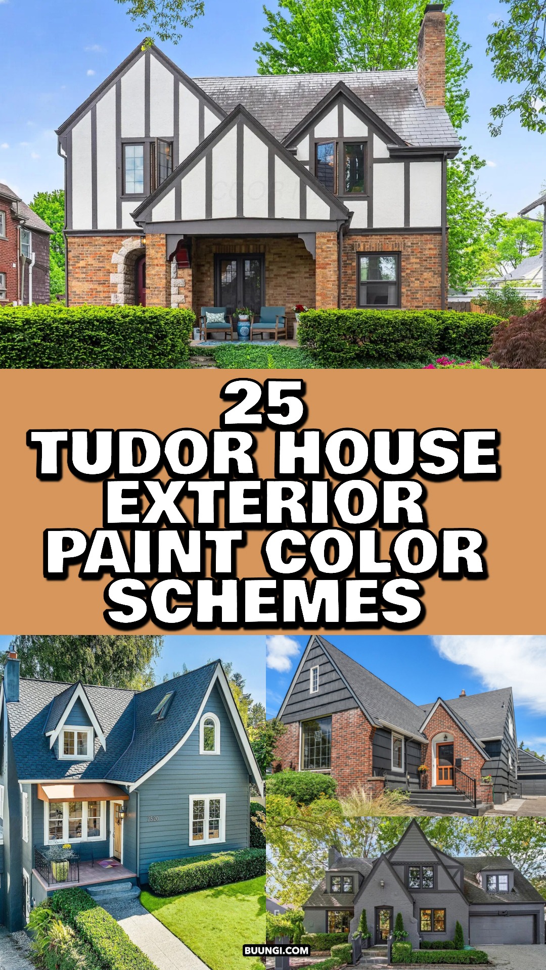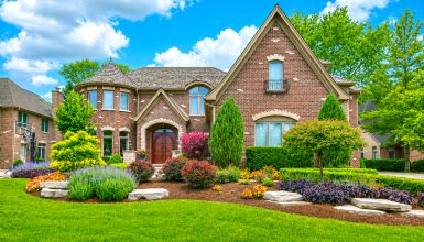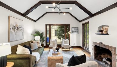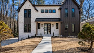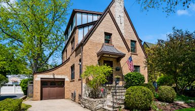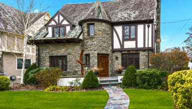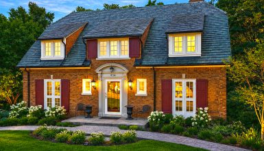
Can a Tudor home feel both historic and fresh? Color can do just that. A soft white wall can make dark beams stand out. A red door can bring a gray facade to life. And a deep charcoal exterior can give a familiar roofline a bold new look.
These 25 homes show how paint, stone, brick, trim, and doors work together. Use each palette as a starting point, then test colors in your own light. A shade can look warmer in the sun and cooler in the shade.
1. Charcoal Gray with a Red Door
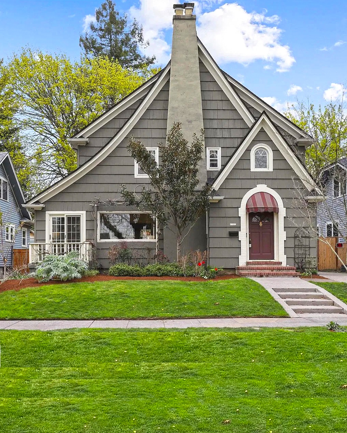
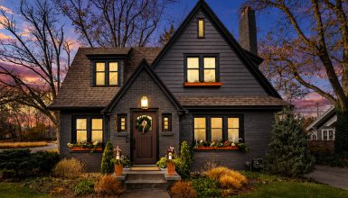
A deep gray exterior gives this home a strong, settled look. The dark wall color also makes the Tudor rooflines and pale trim easy to see. A muted red door adds a warm note at the entry. It draws the eye without taking over the whole facade.
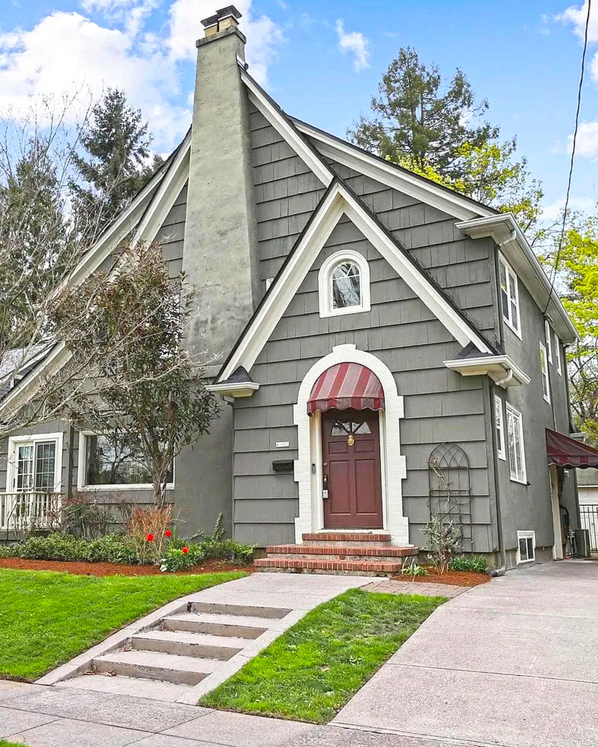
This palette works well when a home has several gables or a busy roof. The gray ties the many shapes together. Pale trim helps windows and beams stay clear. If you try this look, choose a red with a little brown in it. That can feel more at home with old brick, stone, or wood.
Cues to notice:
- Deep charcoal-gray siding
- Light trim around windows and roof edges
- A muted red front door
- Dark shingles that blend with the walls
- Simple planting that lets the entry stand out
2. Warm Taupe, Cream, and Natural Wood
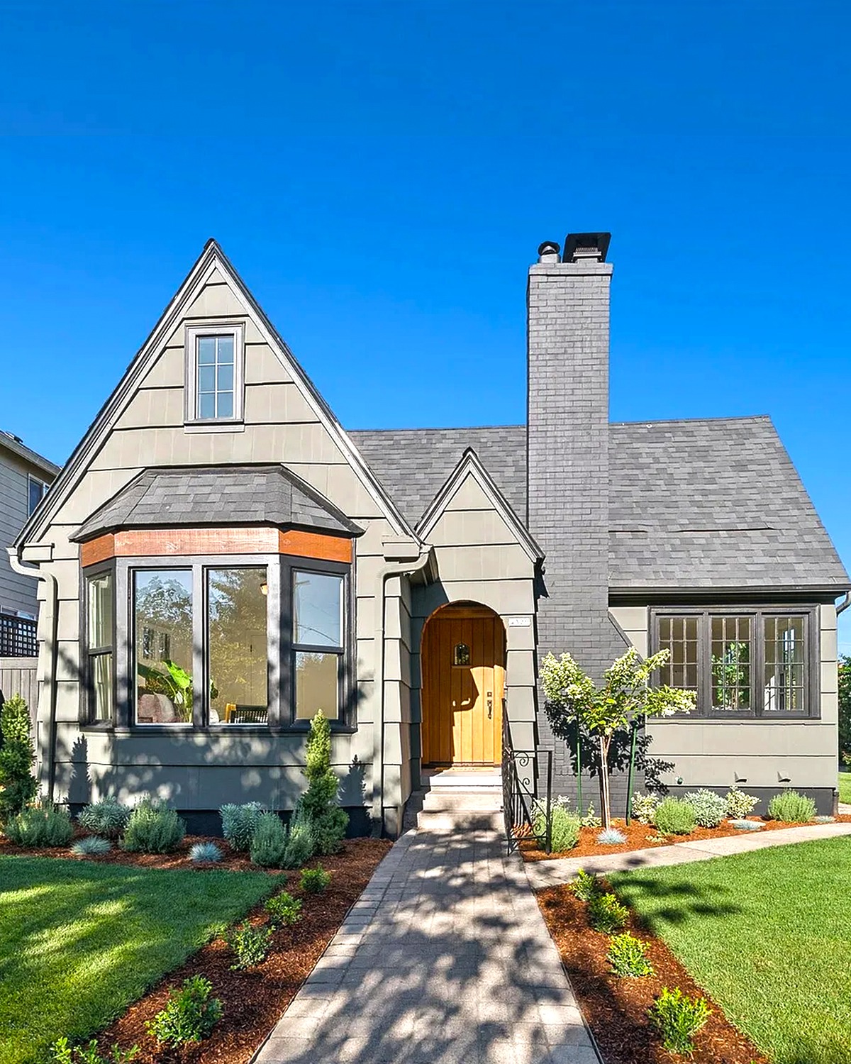
This palette feels calm and welcoming. Warm taupe covers the main walls, while cream trim softens the edges. The natural wood door adds a sunny accent. Together, these colors bring warmth without making the home feel too dark.
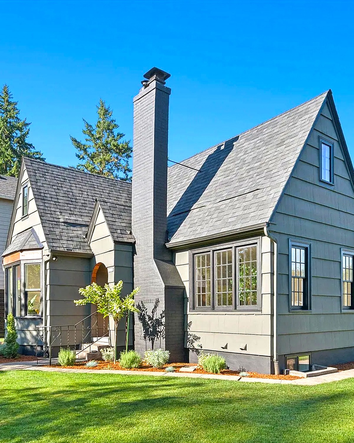
The roof and stone chimney add gray tones. Those cooler shades balance the tan walls and wood door. This mix works well on homes with stone, stucco, or a few different wall materials. To get a similar look, keep the wall color warm and quiet. Then let one wood feature provide the strongest contrast.
Cues to notice:
- Warm taupe walls
- Cream trim around windows and gables
- A natural wood front door
- Gray roof shingles and chimney
- Small dark accents at the windows
3. Cream Walls, Dark Beams, and Brick
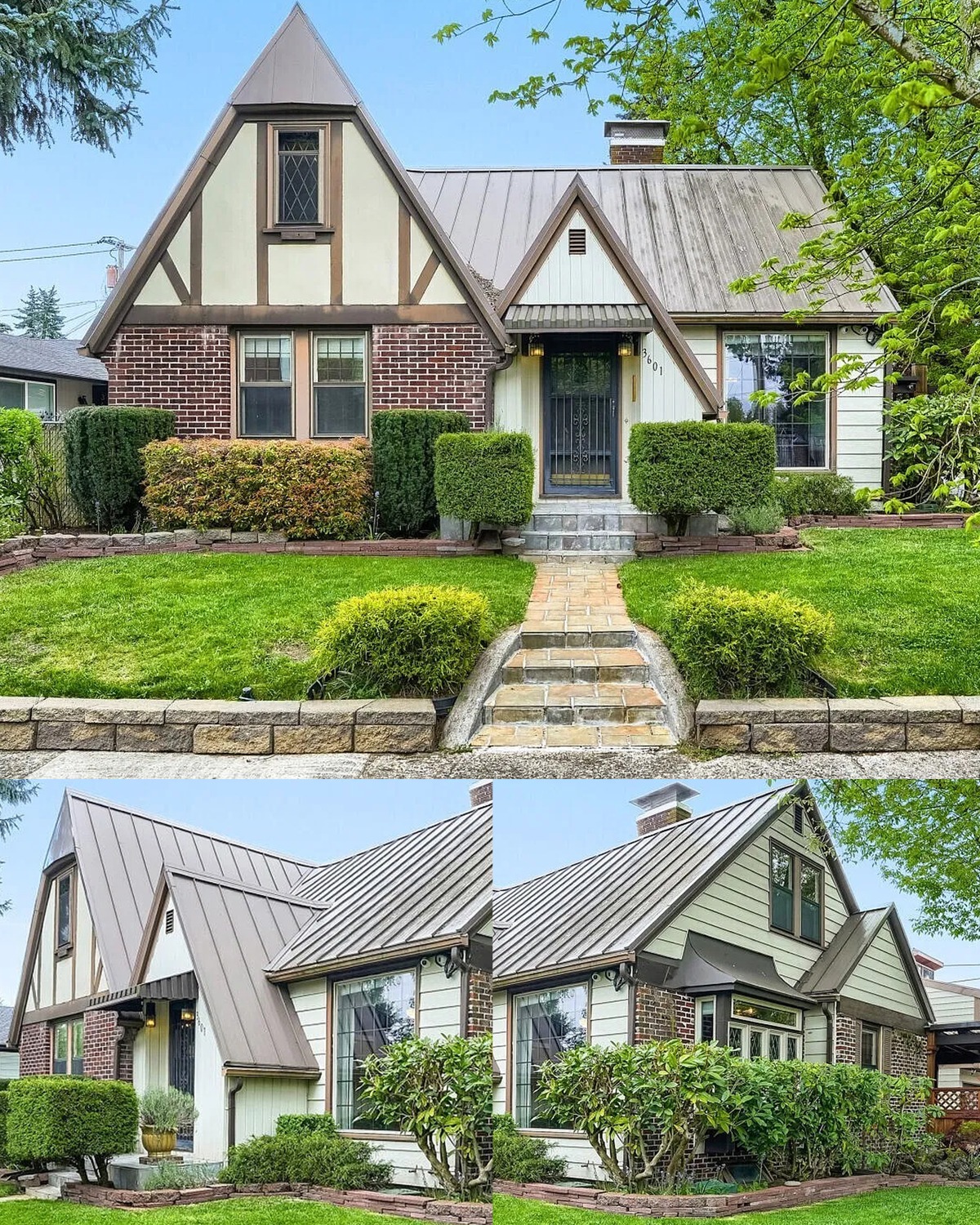
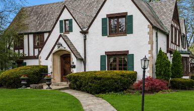
Cream walls give the Tudor timber pattern room to shine. Dark beams form clear lines across the front gables. Below, red-brown brick grounds the home and adds an earthy tone.
This scheme feels rooted in Tudor design. The light walls show the timber work, while the brick links the home to the garden and path. The dark green entry adds a quiet, natural accent. If your home already has brick, pick paint colors that bring out its warm tones. Cream often blends more gently than bright white.
Cues to notice:
- Cream or ivory wall sections
- Dark brown or black timber beams
- Red-brown brick near the entry and lower walls
- A deep green front door
- Green shrubs that echo the door color
4. Soft White, Black, and Warm Wood
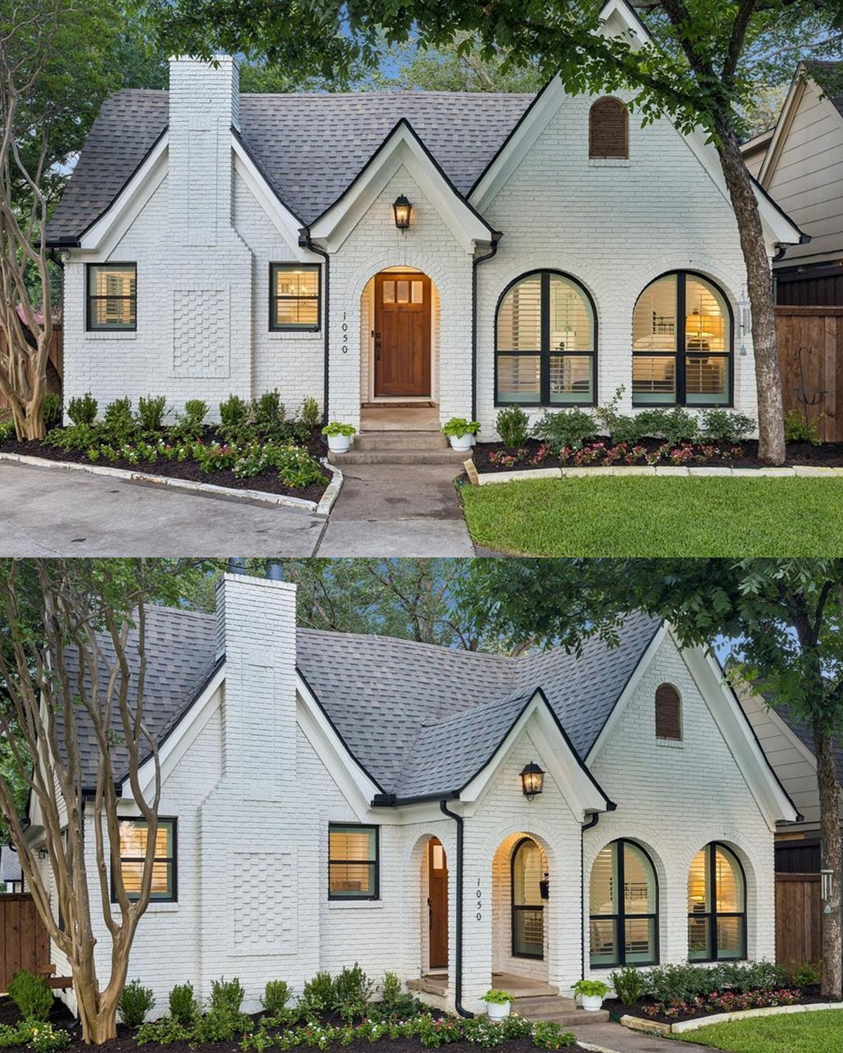
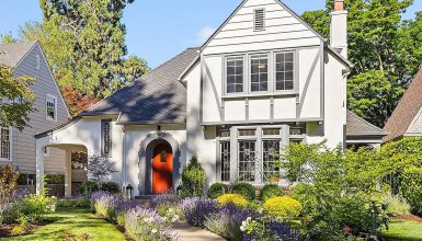
This home uses a clean, simple palette. Soft white walls brighten the facade. Black window frames and roof edges add crisp contrast. A wood door brings in warmth and keeps the scheme from feeling stark.
The look feels modern while keeping the steep gables that make a Tudor home easy to spot. It suits homes with large windows and simple wall details. Choose a white with a warm base if the house sits among trees or has a stone path. A stark white may look too cool beside those natural materials.
Cues to notice:
- Soft white walls
- Black window frames and roof details
- A natural wood front door
- Dark gray roof shingles
- Low green planting along the foundation
5. White Walls with Charcoal Trim
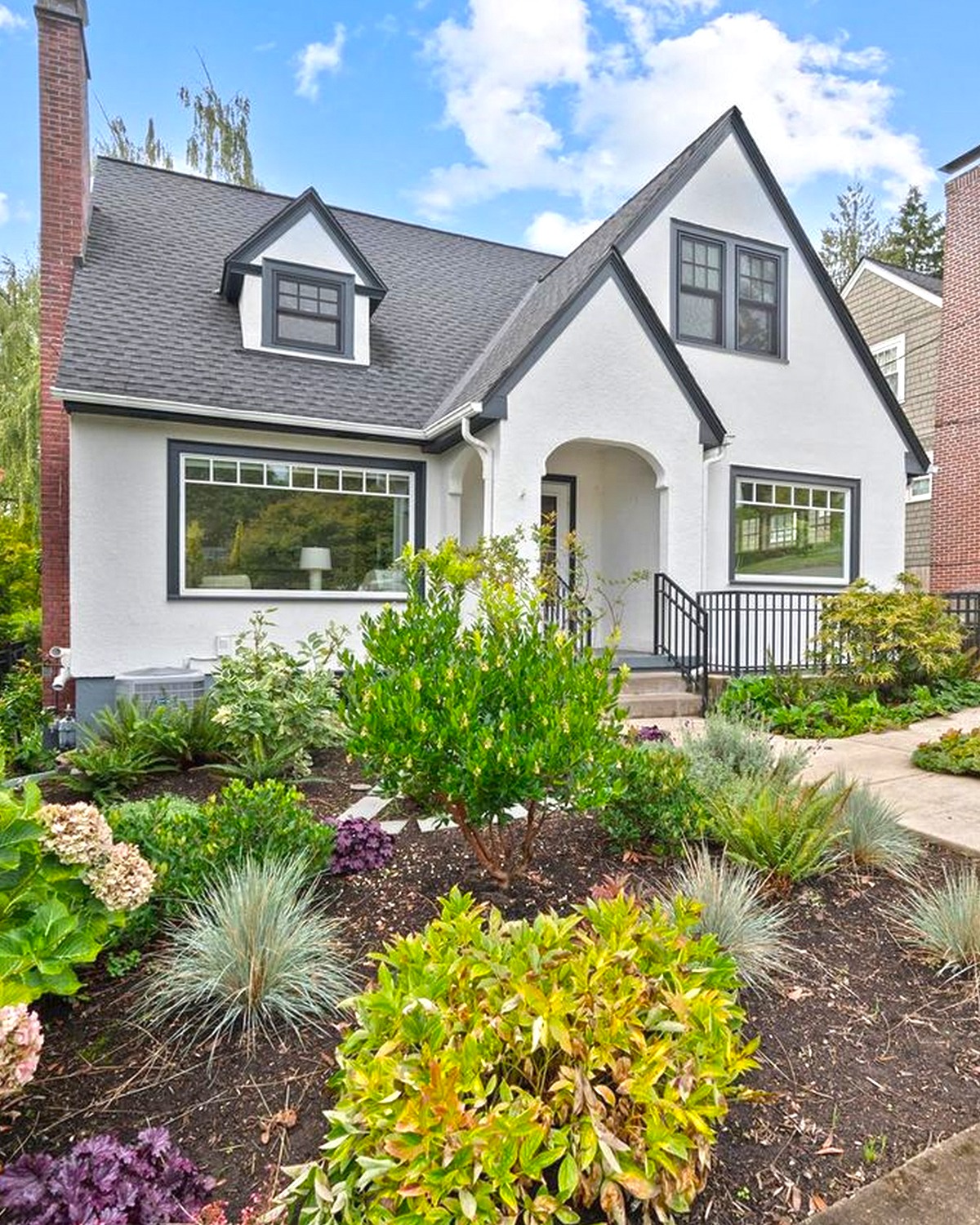
White walls and charcoal trim create a classic Tudor contrast. The dark trim marks each gable and window. It helps the home’s shape read clearly from the street. The garden adds color, so the house does not need a bright paint accent.
This scheme works on homes with a mix of gables and dormers. White paint keeps the facade light, while charcoal gives it structure. A gray roof can bridge the two colors. For a softer result, choose a warm white and a charcoal with a hint of brown. That pairing can look less sharp than pure white and black.
Cues to notice:
- White or warm-white wall surfaces
- Charcoal beams and window trim
- A matching dark roof
- Green shrubs and pink flowers
- Pale stone or concrete paths
6. Bright White with Dark Timber
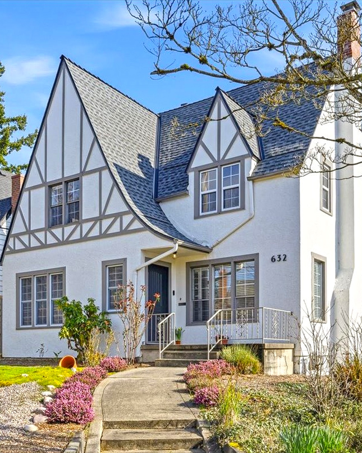
This Tudor exterior shows how strong the half-timber pattern can look against white walls. Dark beams form a bold grid across the gables. The roof and window frames repeat those deep tones. The result feels crisp and neat.
The pale walls help the house stand out among trees and shrubs. At the same time, the dark beams keep the design from feeling plain. This palette suits homes where the timber detail is a key feature. If you paint the beams, test the finish first. A soft black or deep brown can show more warmth than a blue-black shade.
Cues to notice:
- Bright white wall panels
- Dark timber framing
- Dark roof shingles
- Matching dark window frames
- A landscape with soft green and pink tones
7. Charcoal Exterior with a Stone Chimney
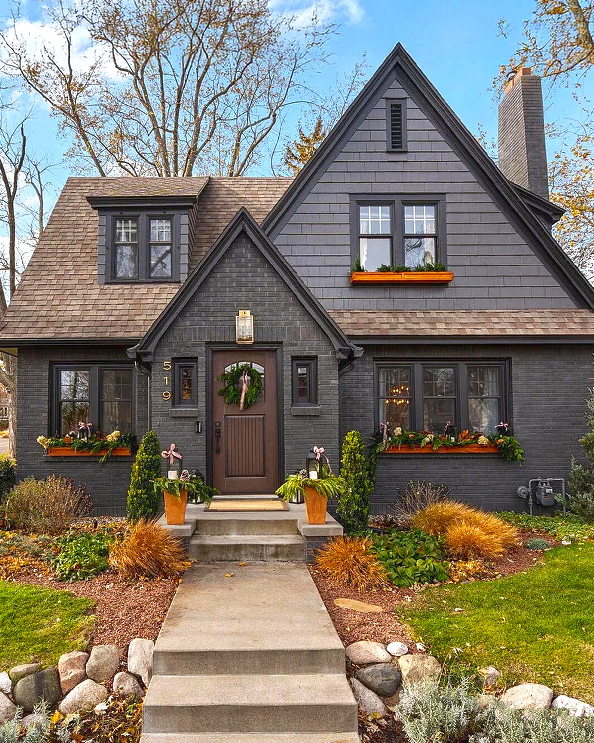
A dark charcoal exterior makes this home feel bold and cozy. White trim outlines the windows and gables. The stone chimney brings in natural color and texture. A warm wood door adds another point of contrast.
Dark paint can make a house feel smaller if every surface has the same tone. Here, the stone, pale trim, and front door break up the dark walls. The lawn and open setting help, too. If you like a dark scheme, keep at least one large feature lighter. Stone, cream trim, or a wood entry can all do the job.
Cues to notice:
- Charcoal siding
- White trim around windows and roof edges
- A stone chimney with mixed gray and brown tones
- Warm wood at the front door
- Simple lawn and low garden beds
8. White and Soft Gray with a Hint of Color
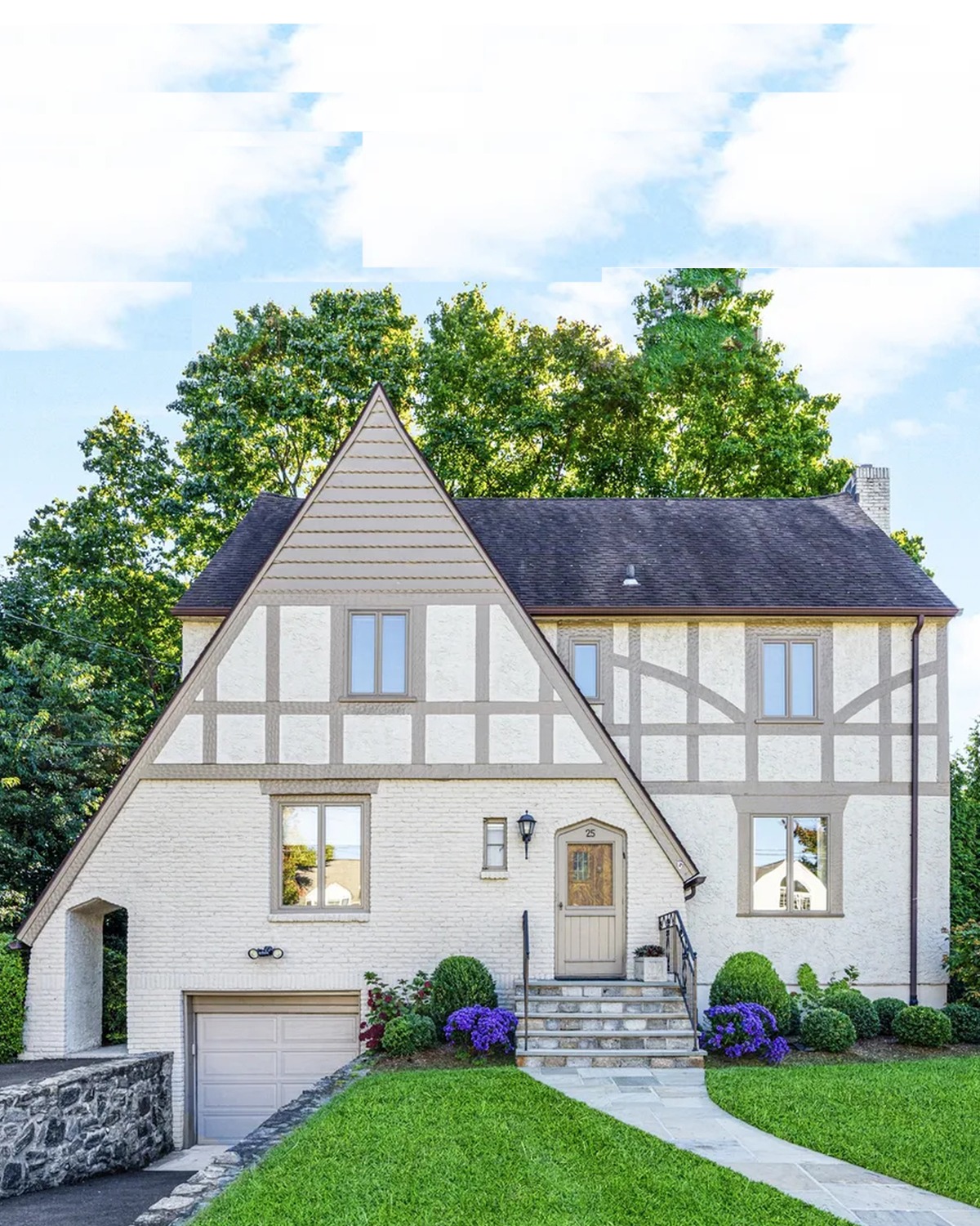
This palette feels light and quiet. White walls keep the exterior bright. Gray beams add contrast without the sharp look of black. The dark roof gives the home a clear outline.
Small touches of garden color bring life to the scheme. That makes this a good choice for anyone who wants a Tudor home to feel fresh but not flashy. Soft gray works well on painted timber or trim. It can also tie in with a slate roof or stone path. Pick a gray that suits the roof, then use white on the larger wall areas.
Cues to notice:
- White walls
- Soft gray timber and trim
- A dark gray roof
- A restrained front garden
- Small purple flowers near the entry
9. White Walls with Red Trim
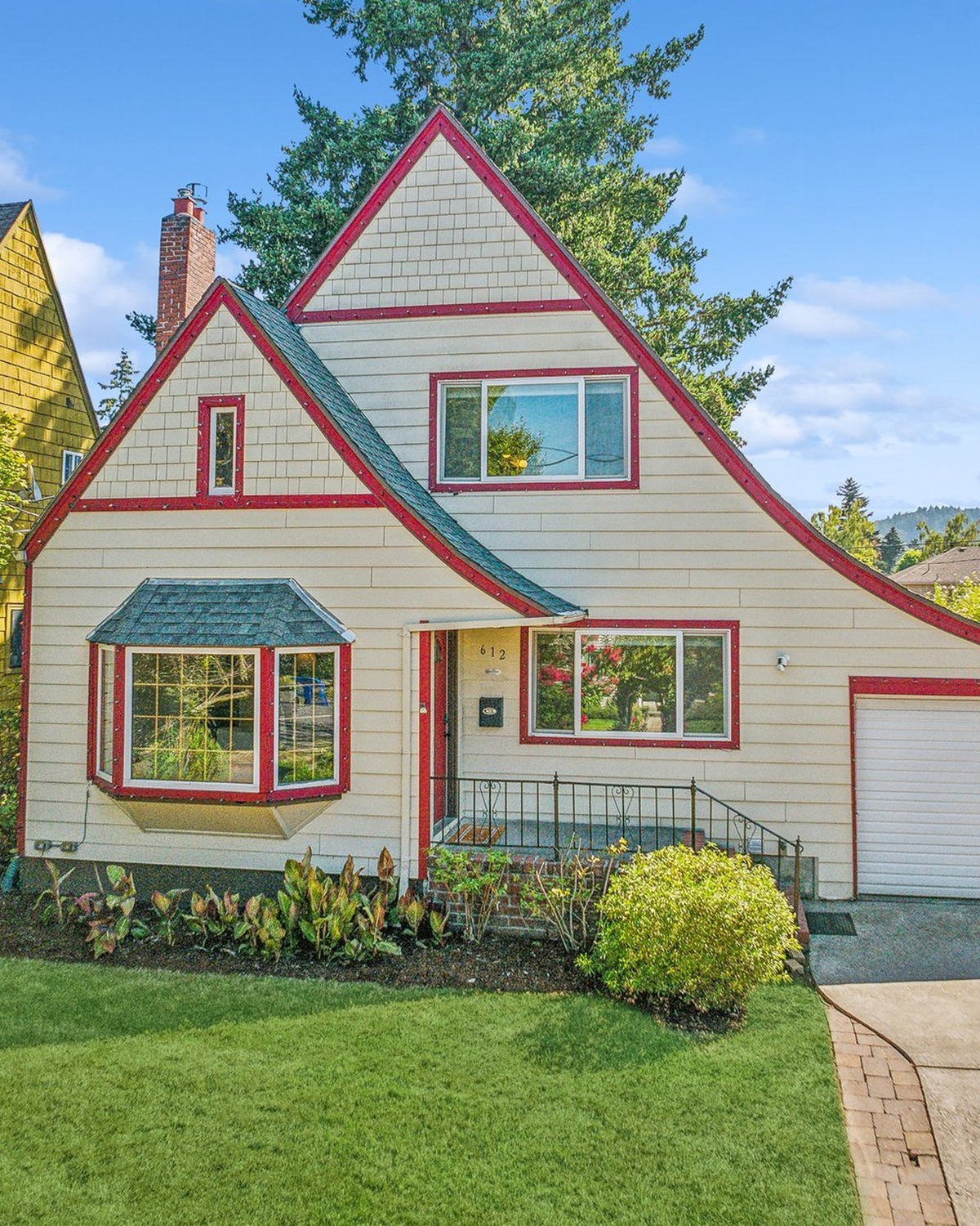
Red trim makes this home stand out. It frames the gables, windows, and garage, so the color feels tied to the house rather than added at random. White walls keep the strong red from feeling too heavy.
This is a playful take on Tudor style. It may suit a home in a sunny setting or a homeowner who enjoys a brighter exterior. Since red can dominate, use it on selected details. Keep the main walls light and the roof neutral. You could also test a deeper brick red for a softer, more traditional feel.
Cues to notice:
- White wall panels
- Red trim around gables, windows, and doors
- A light gray roof
- Clean landscaping with bright flowers
- A simple driveway that leaves the facade in view
10. Cream, Dark Timber, and Golden Yellow
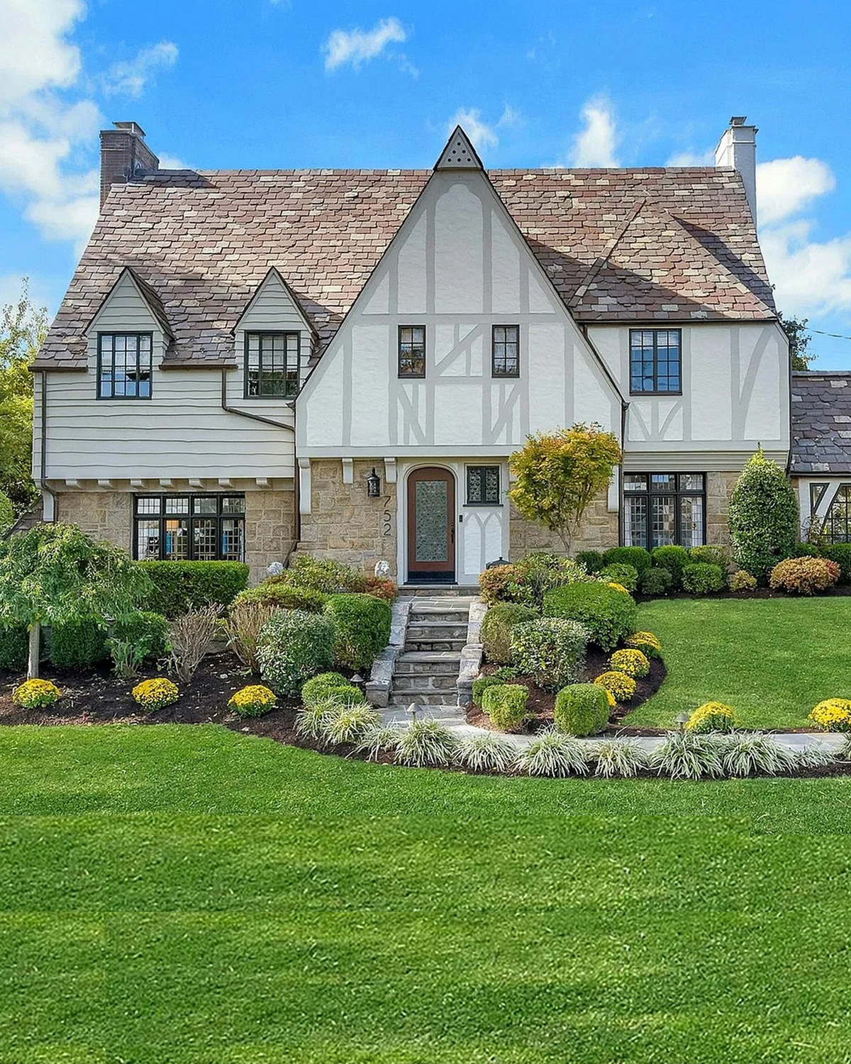
Cream walls and dark timber give this home a classic Tudor look. Stone around the base and chimney adds texture. A golden yellow door brings a sunny touch to the entry.
The yellow stands out, but it still feels natural beside the warm stone and cream walls. This is a useful way to add color without changing the whole exterior. Try a golden or ochre shade on the door first. It can look warm in daylight and welcoming at dusk. Keep the other trim colors simple so the entry remains the focal point.
Cues to notice:
- Cream wall panels
- Dark timber framing
- Stone at the lower walls and chimney
- A golden-yellow front door
- Green lawn and low shrubs
11. White, Dark Beams, and a Red Door
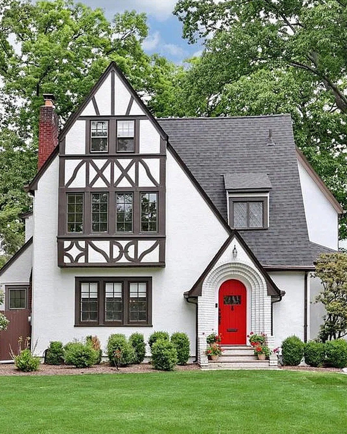
Here, the red door is the clearest accent. White walls make the Tudor beams stand out, while the dark roof repeats their color. The bright entry gives the home a friendly, memorable feel.
A red door can work with many Tudor palettes. It pairs well with white, cream, gray, and brown. The key is to keep the rest of the colors in balance. Use a red that suits the brick or stone nearby. Add black or dark bronze hardware for a neat finish. If the home has little natural detail, a wood planter can bring in another warm note.
Cues to notice:
- White or warm-white walls
- Dark beams and roof
- A vivid red front door
- Dark window frames
- Green lawn that keeps the entry clear
12. Gray Stone, Dark Timber, and Bronze
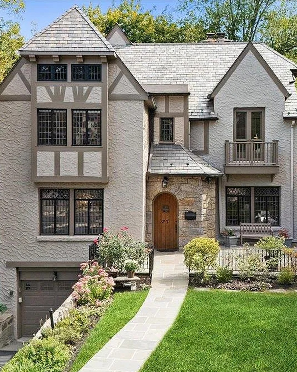
This home leans on texture as much as color. Gray stone covers much of the facade. Dark timber frames the upper sections. Bronze-toned windows and a wood door warm the cooler stone.
The mix feels rich but not busy because each material has its own role. Stone forms the base. Timber adds strong lines. The windows and door bring in softer brown tones. This palette can work well on homes with stone walls or a wooded setting. Let the stone guide your paint choices. Pick a trim shade that sits well beside its lightest and darkest pieces.
Cues to notice:
- Gray and taupe stone walls
- Dark timber trim
- Bronze or brown window frames
- A natural wood entry door
- Green planting around the stone base
13. Natural Stone with Dark Timber
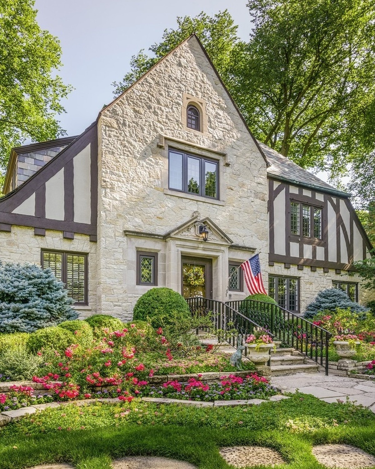
Stone gives this Tudor home an earthy, old-world feel. Dark beams add shape to the upper gables. The roof stays close to charcoal, so it frames the stone without competing with it.
The palette works because the stone already holds several shades of gray, tan, and brown. The timber picks up the darker tones. That creates contrast without a painted wall color. If your home has stone, use it as the starting point. Choose trim and door colors that echo tones in the stone. This helps the exterior feel like one complete design.
Cues to notice:
- Natural stone across the facade
- Dark beams around the upper gables
- Charcoal roof shingles
- Earthy brown and gray tones
- A garden with soft green plants and red flowers
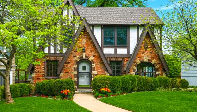
14. Brick, Cream, and Dark Timber
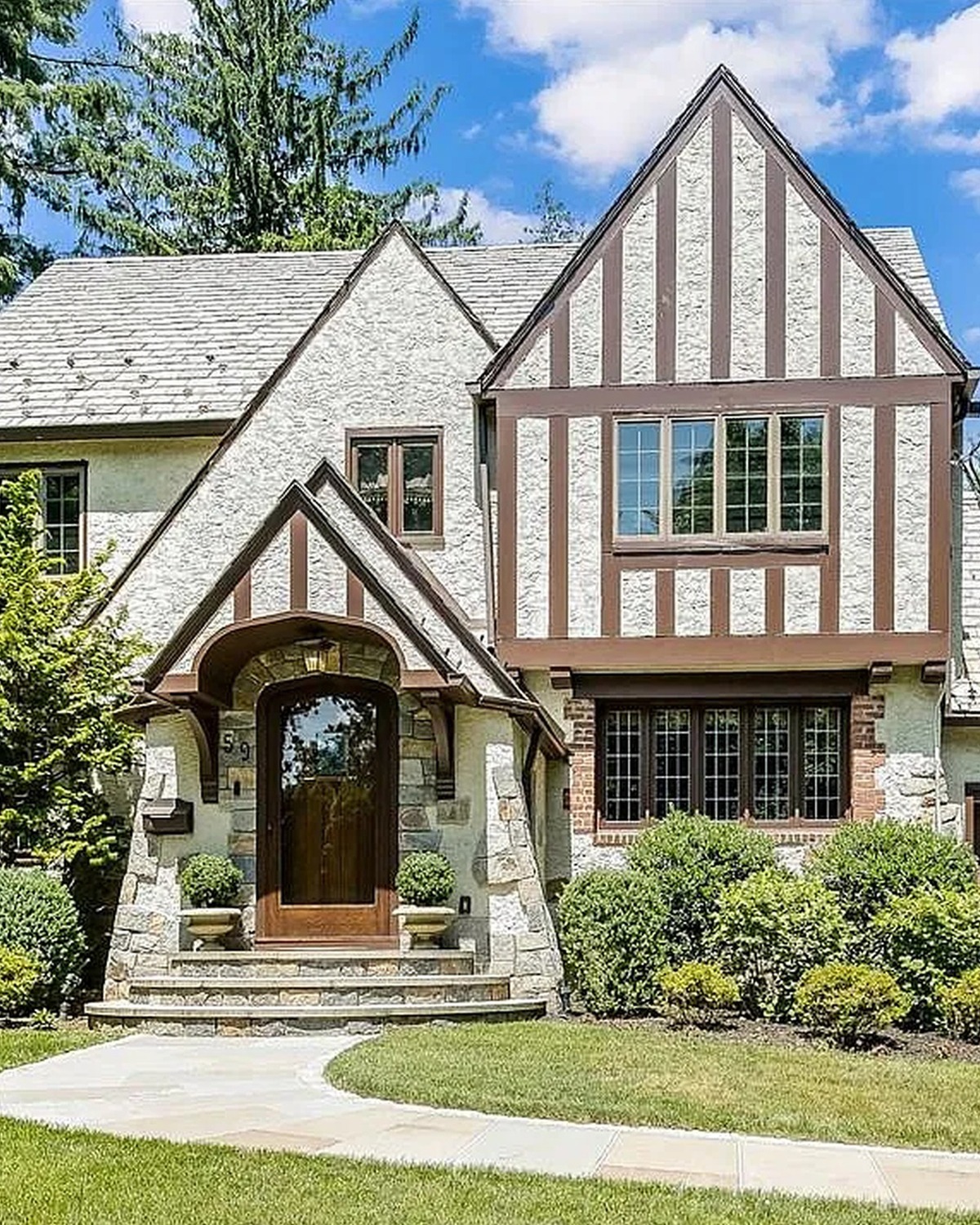
This scheme blends red brick with cream wall sections and dark timber. Brick warms the lower part of the home. Cream panels brighten the gables. Dark beams connect the two materials and highlight the Tudor shape.
The palette feels balanced because each color repeats in more than one place. The brick appears near the entry and on the chimney. Dark trim frames the windows and beams. A wood door adds one more warm tone. When you work with brick, avoid choosing a trim color in isolation. Look at the brick in sun and shade, then select a cream or brown that feels at home beside it.
Cues to notice:
- Red-brown brick at the entry and chimney
- Cream wall sections
- Dark timber and window trim
- A wood front door
- Green shrubs that soften the brick
15. White Walls, Brown Beams, and Stone
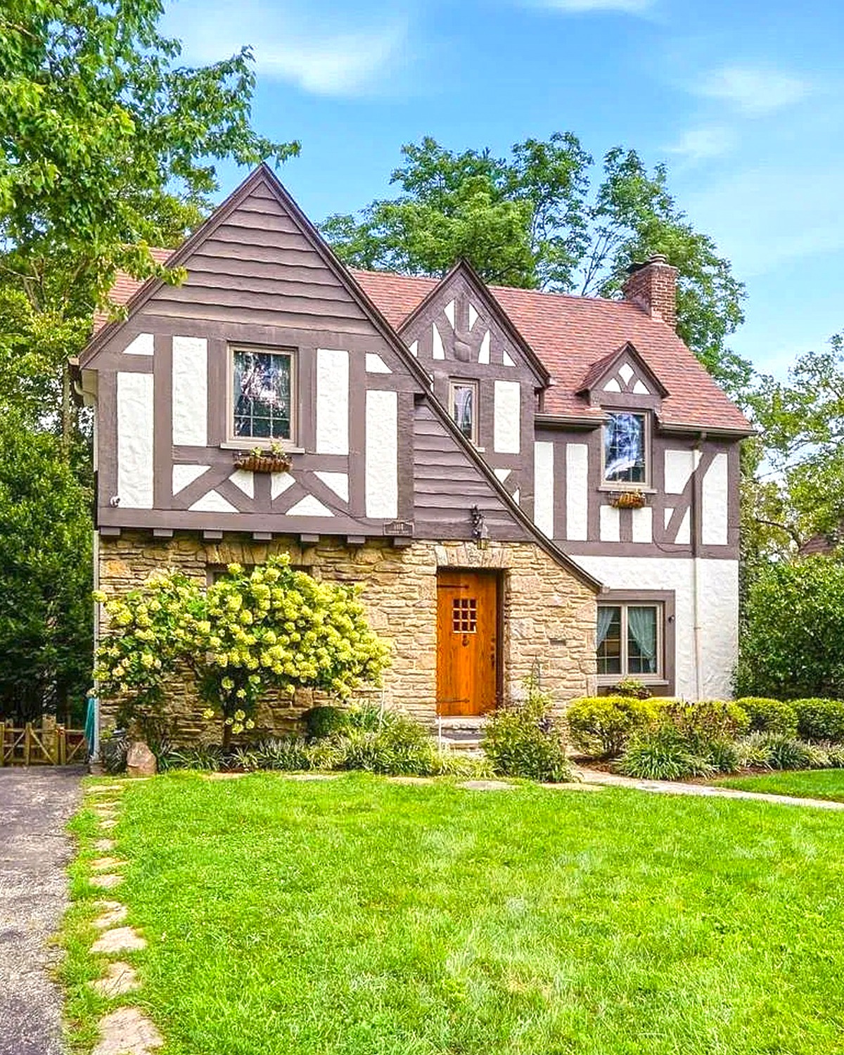
White walls create a bright backdrop for the dark brown timber. Stone near the entry and lower facade adds depth. The wood door repeats the warm tones in the stone and beams.
This palette gives the house a traditional look without making it feel heavy. The light walls balance the dark roof and timber. Stone adds a natural bridge between them. Use this approach if your home has both masonry and painted surfaces. Keep the whites warm, especially if the stone has tan or cream notes. A cool white can make warm stone look dull.
Cues to notice:
- White wall panels
- Dark brown timber framing
- Stone near the entry and lower walls
- A warm wood door
- Dark roof shingles and green foundation planting
16. White, Black, and Brick
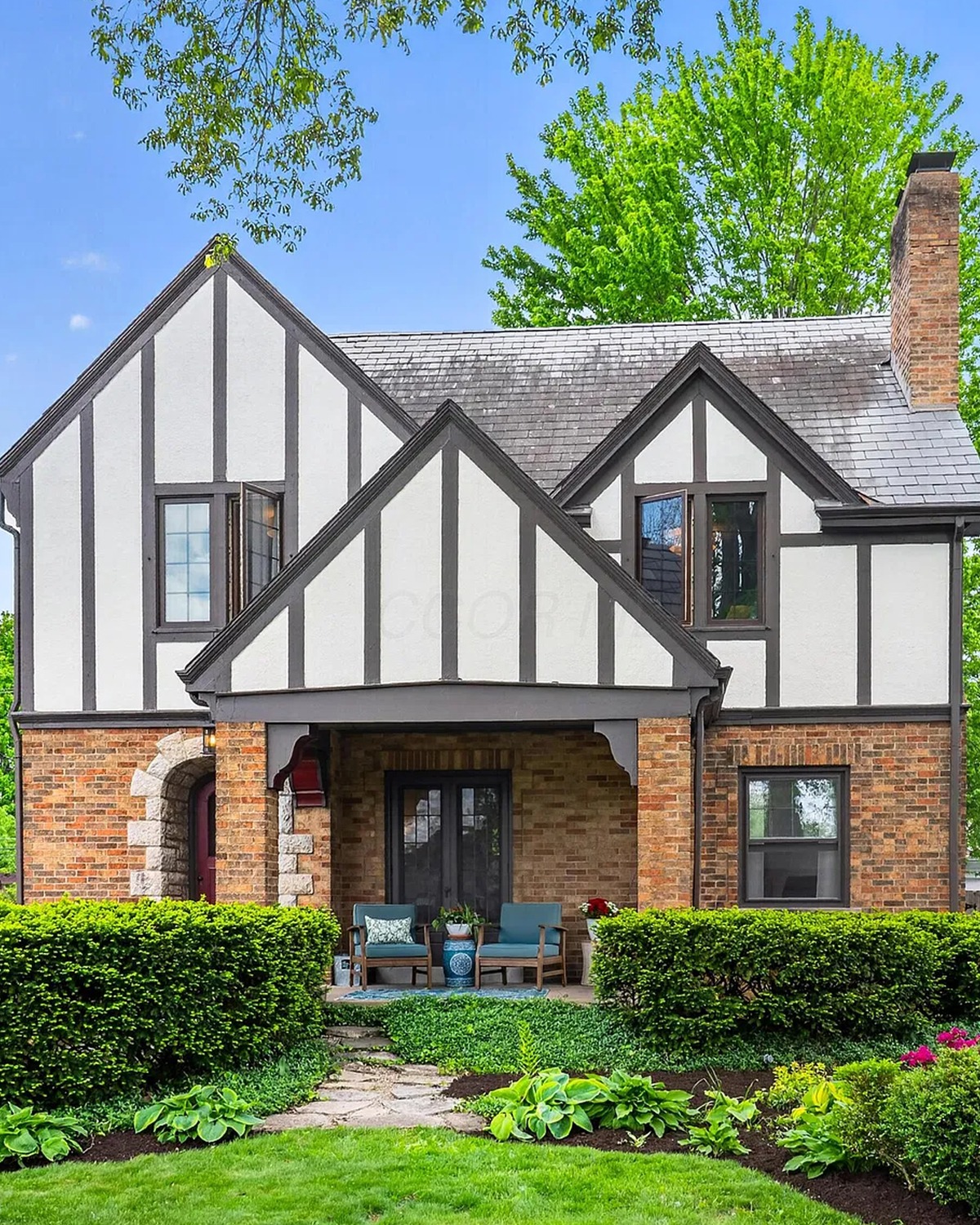
This home pairs white wall panels with strong black beams. Brick adds a warm accent near the entry and on part of the facade. The mix keeps the home crisp while still giving it a historic feel.
Black beams define the gables. White walls keep the pattern easy to read. Brick brings color and texture so the contrast does not feel too sharp. This is a good palette for a Tudor home with a large front entry or tall windows. Repeat the brick in one or two areas. That helps it feel like part of the plan.
Cues to notice:
- White walls
- Black timber and window trim
- Red-brown brick near the entry
- Dark roof shingles
- Neat green shrubs along the front wall
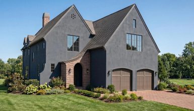
17. Charcoal, Brick, and White Trim
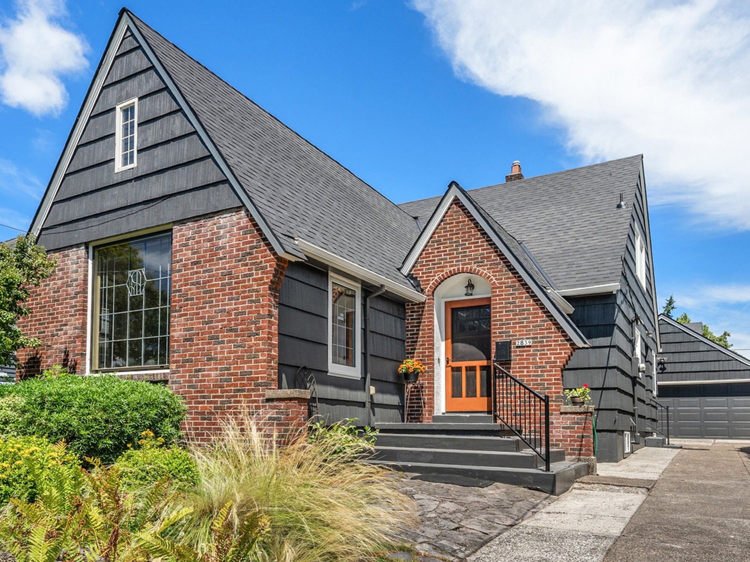
Dark charcoal siding gives this home a modern edge. Red brick adds warmth and connects the house to traditional Tudor materials. White trim outlines the windows and doors, so the darker colors stay easy to read.
This mix works because it uses three colors with clear jobs. Charcoal covers the walls. Brick adds texture. White trim creates a clean border. A dark roof blends into the upper gables. If you use this scheme, check how much brick your home already has. Let the brick take the lead where it exists, then use paint to support it.
Cues to notice:
- Charcoal siding and roof
- Red brick on one section of the facade
- White window and door trim
- Simple grasses and shrubs
- A pale walkway for contrast
18. Soft Sage Green with Cream Trim
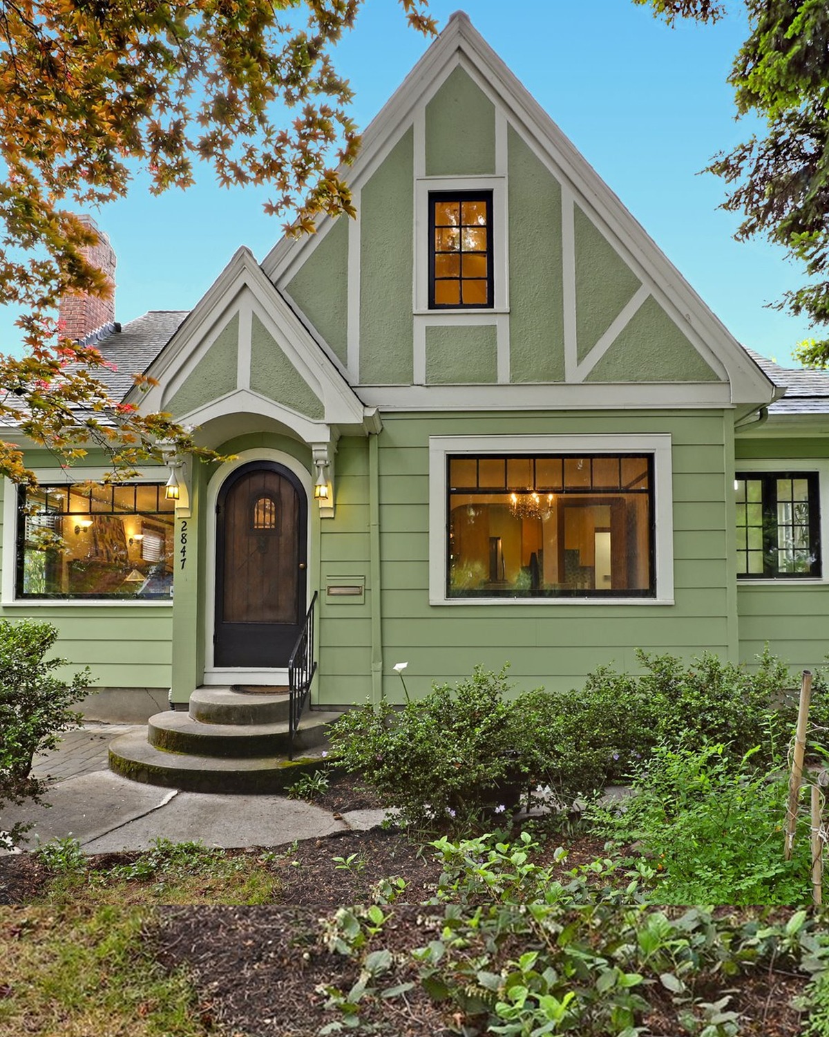
Soft sage green gives this Tudor home a gentle, nature-inspired look. Cream trim outlines the windows and gables. The warm door and window details add a soft glow against the green.
Sage is a useful choice for homeowners who want color without a bold, bright effect. It changes with the light. In full sun, it can look fresh and pale. In shade, it may feel more gray. Pair it with cream rather than bright white for a softer edge. Add darker green shrubs nearby to make the wall color stand out.
Cues to notice:
- Muted sage-green walls
- Cream trim and timber details
- Warm wood around the entry and windows
- Dark roof shingles
- Garden plants in deeper green shades
19. Blue-Gray with White Trim

Blue-gray siding gives this home a cool, calm look. White trim marks the windows and roof edges. A dark roof adds weight at the top, while the pale front door keeps the entry bright.
This color scheme can feel classic or modern, depending on the shade. A muted blue-gray often works well with stone paths and green lawns. It also makes white trim easy to see. Before painting, test a sample on several sides of the house. Blue can shift in different light. Choose a shade that looks balanced next to the roof and any masonry.
Cues to notice:
- Blue-gray wall color
- White trim around windows and gables
- Charcoal roof shingles
- A pale front door
- Stone or concrete paths with green planting
20. Dark Gray with Black Trim and Warm Light
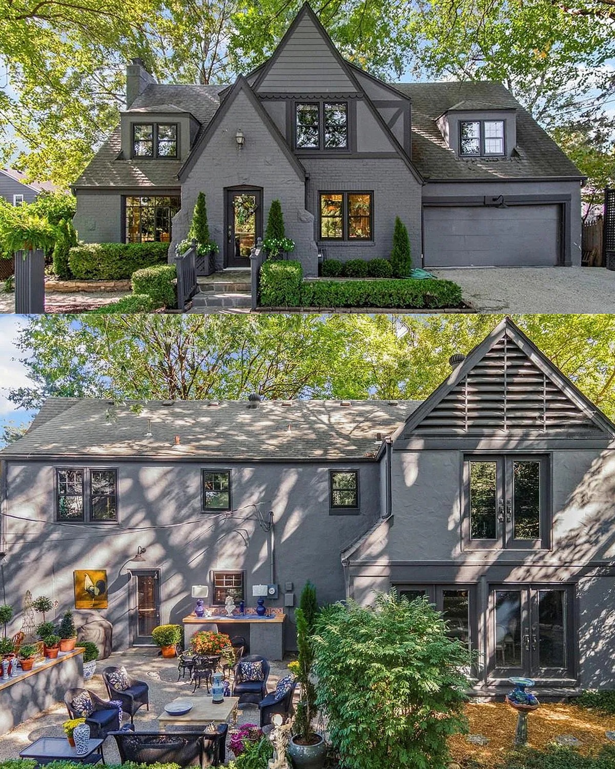
Dark gray walls and a charcoal roof give this home a dramatic look. Black trim sharpens the windows and gables. Warm light from the windows and entry makes the dark exterior feel inviting at night.
A dark exterior can show off the home’s shape, especially when it has steep gables and a clear front path. The warm wood door and soft window light bring balance. If you choose dark paint, look at the home from the street during the day and after sunset. Good exterior lighting can make the color feel rich and welcoming.
Cues to notice:
- Deep gray walls
- Black or charcoal roof and trim
- Warm wood at the front door
- Amber light in the windows
- Simple planting that keeps the entry open
21. White Walls with Dark Tudor Beams
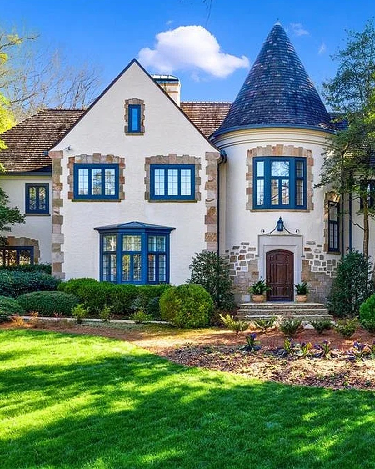
White walls make the dark beams stand out on this home. The contrast draws the eye to the gables and the tall windows. Dark roof shingles echo the beams and give the roofline a strong frame. A deep-colored front door adds a small note of warmth.
This palette feels classic and neat. It works well when a home has clear timber details and several roof peaks. Use a warm white if the house sits near trees or stone. A warmer shade can feel softer than a crisp, cool white.
Cues to notice:
- White wall panels
- Dark beams across the gables
- Matching dark roof shingles
- Tall windows with dark frames
- A deep-colored entry door
22. Pale Stone, Charcoal Trim, and Brick
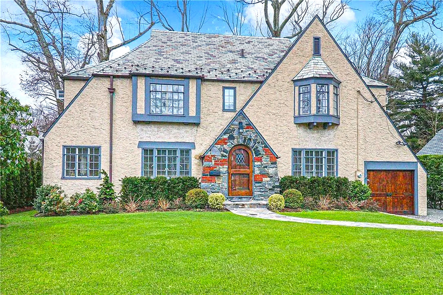
Pale stone gives this home a soft, natural base. Charcoal trim outlines the windows and roof edges. Brick around the entry adds a warm red-brown note. Together, the colors feel calm and grounded.
This scheme works because each material has a clear role. The pale walls brighten the facade. Dark trim adds shape, and brick helps the entry feel warm and easy to find. If you want to use a similar palette, let your stone guide the other colors. Look for a trim shade that picks up one of its gray tones.
Cues to notice:
- Pale stone or stone-look walls
- Charcoal window and roof trim
- Red-brown brick near the front door
- A gray roof
- Low green shrubs along the base
23. Sage Green with White Trim
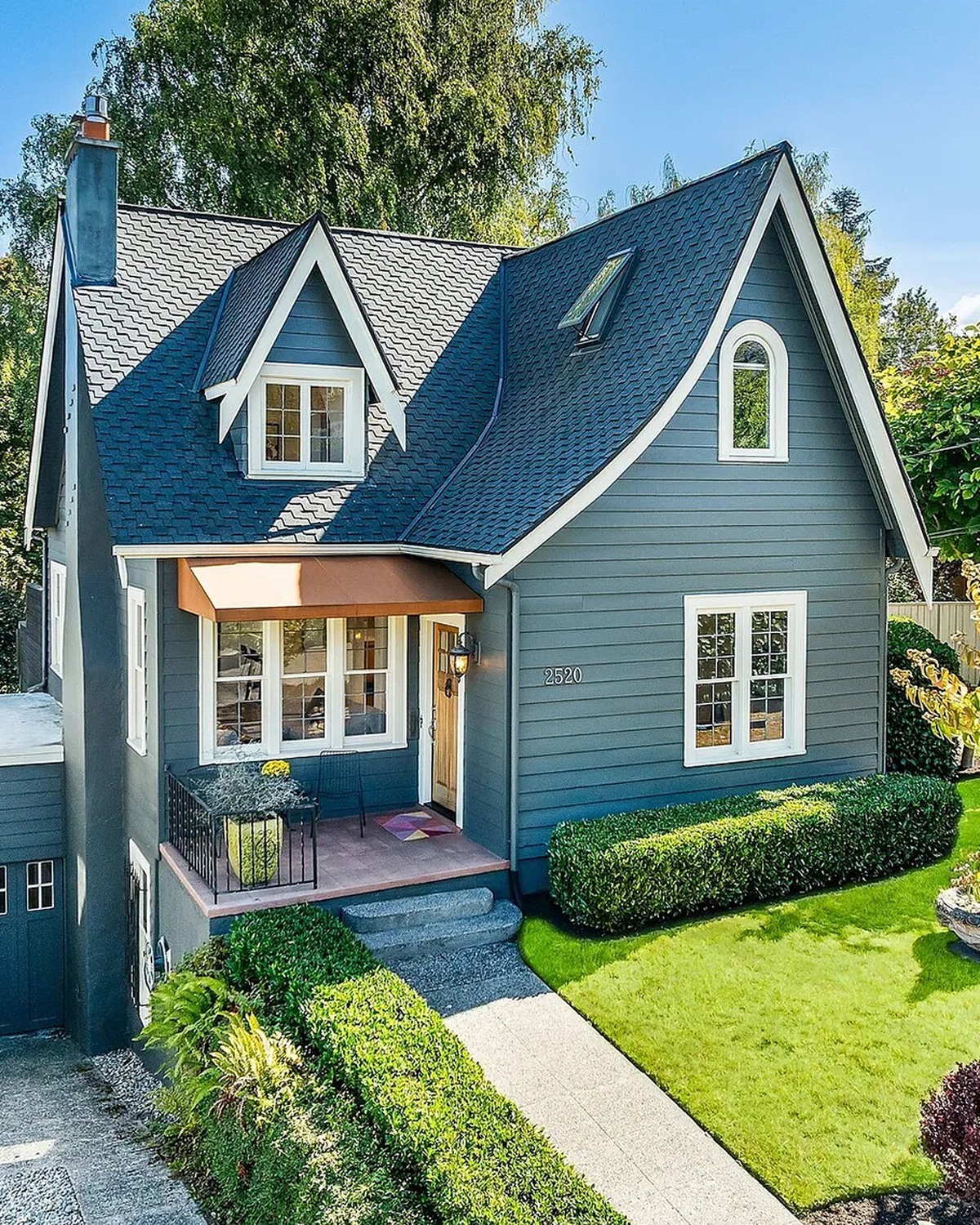
Muted sage green gives this Tudor-inspired home a fresh, gentle look. White trim outlines the gables and windows. The dark roof adds contrast, while the light porch keeps the entry bright.
Green paint suits a home with leafy surroundings. It can blend with the garden while still making the house easy to spot. Sage also pairs well with white, cream, and natural wood. Test the color on more than one wall before painting. Sun and shade can make green look quite different.
Cues to notice:
- Sage-green siding
- White trim around the gables and porch
- A dark gray roof
- A light-colored front porch
- Green plants that echo the wall color
24. Blue Siding with White Trim and Brick
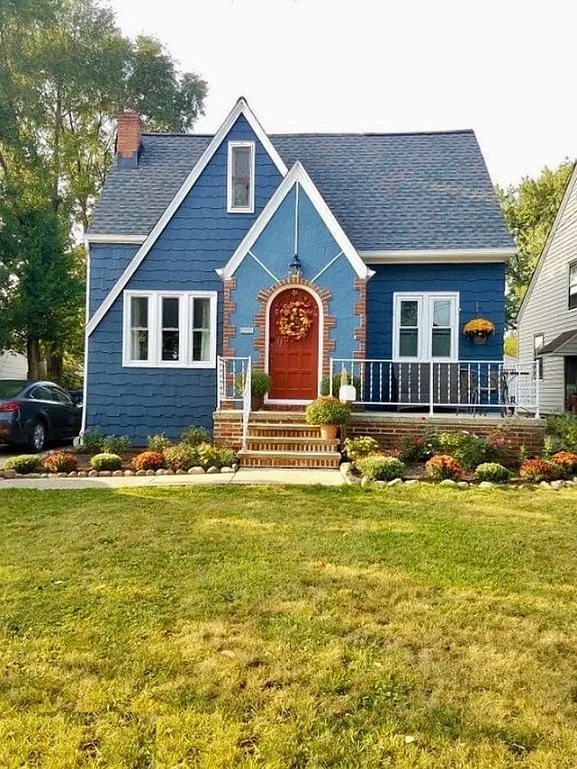
Blue siding makes this home feel cheerful and bright. White trim gives the windows and gables a crisp edge. The red-brown brick chimney adds warmth, and the reddish front door creates a clear focal point.
Blue can look classic when you keep the trim simple. Here, white helps balance the rich wall color. Brick adds texture and keeps the palette from feeling too cool. If you try blue, check how it looks in full sun. Bright light can make some blues appear much stronger than they do on a paint chip.
Cues to notice:
- Blue exterior siding
- White gable and window trim
- A red-brown brick chimney
- A warm red or orange front door
- A dark gray roof
25. Deep Blue with Brick and Wood
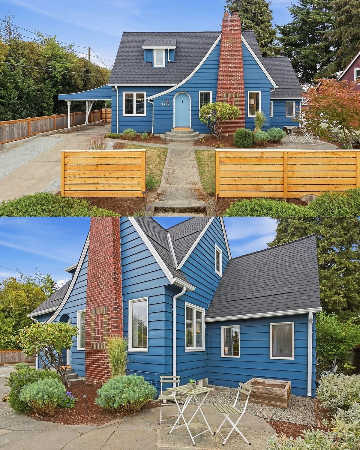
Deep blue gives this home a strong, welcoming look. White trim frames the roof and windows. The brick chimney adds a warm, earthy accent. Wooden planters and fencing bring a natural touch to the front yard.
This palette mixes cool and warm colors in a simple way. Blue covers the main walls. Brick and wood add warmth without competing with it. Raised planters also help define the entry and add color near the ground. For a similar look, use a deep blue with a little gray in it. Then repeat the wood tone in a door, bench, or planter.
Cues to notice:
- Deep blue siding
- White trim around windows and roof edges
- A red brick chimney
- Natural wood planters and fencing
- A simple garden with low shrubs and grasses
Conclusion
Tudor homes can wear a wide range of colors. Cream and dark timber bring out their classic lines. Sage, blue-gray, and taupe offer a softer look. Charcoal, brick, and red doors add more drama.
Start with the materials that already belong to your home. Look at the roof, brick, stone, and timber in both sun and shade. Then choose paint colors that work with those fixed features. Small test patches can help you see how the color changes through the day.