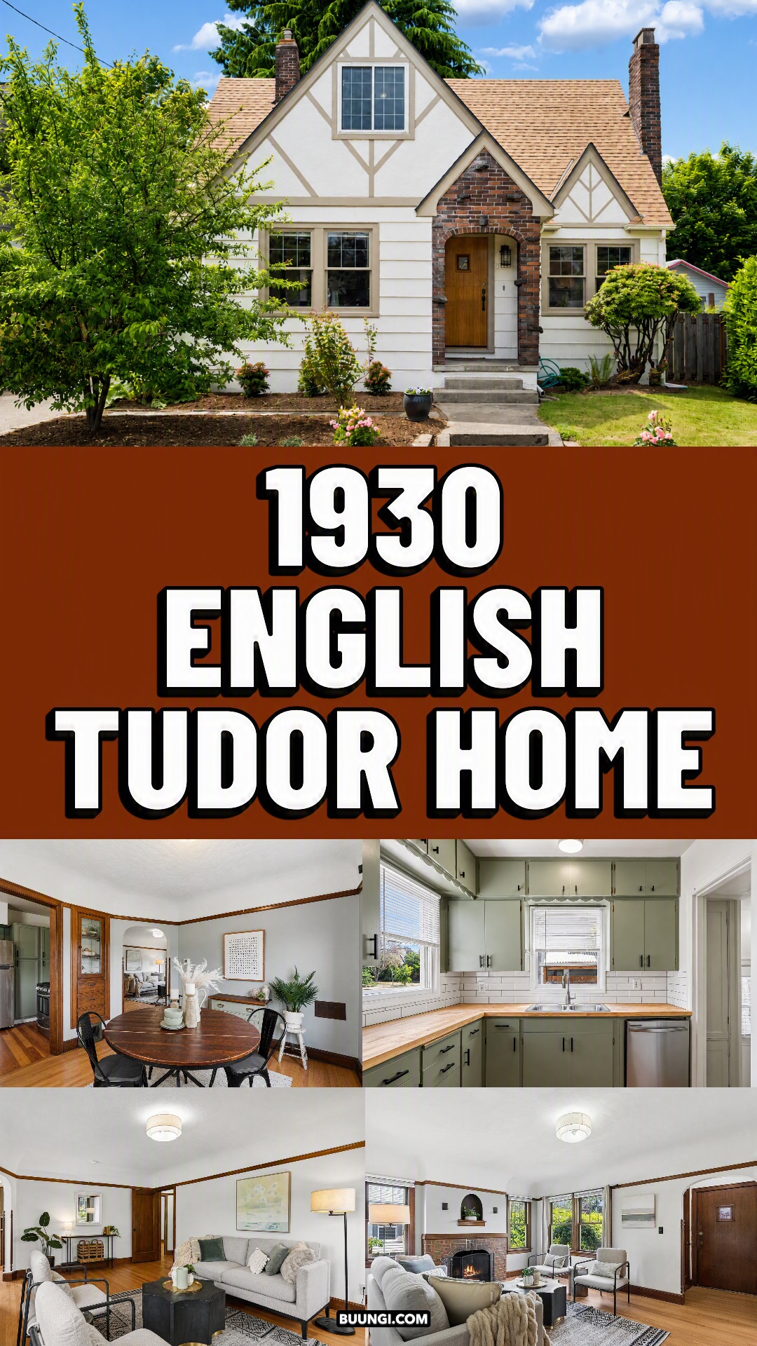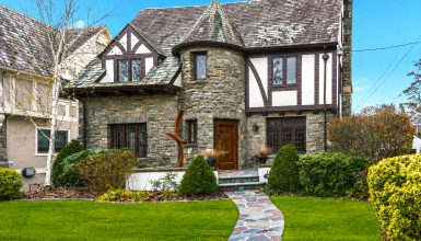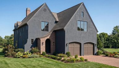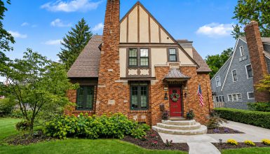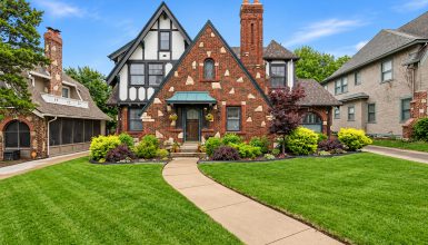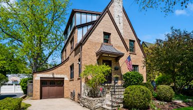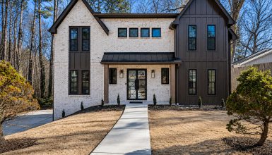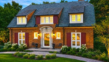
What gives a 1930 English Tudor home its timeless charm? Steep gables, warm brick, decorative timbering, and rich wood details create a storybook look from the street. Inside, hardwood floors, arched openings, built-ins, and a cozy brick fireplace keep the historic character alive while soft colors and simple updates make the home feel fresh.
A Small Tudor Exterior With Big Personality
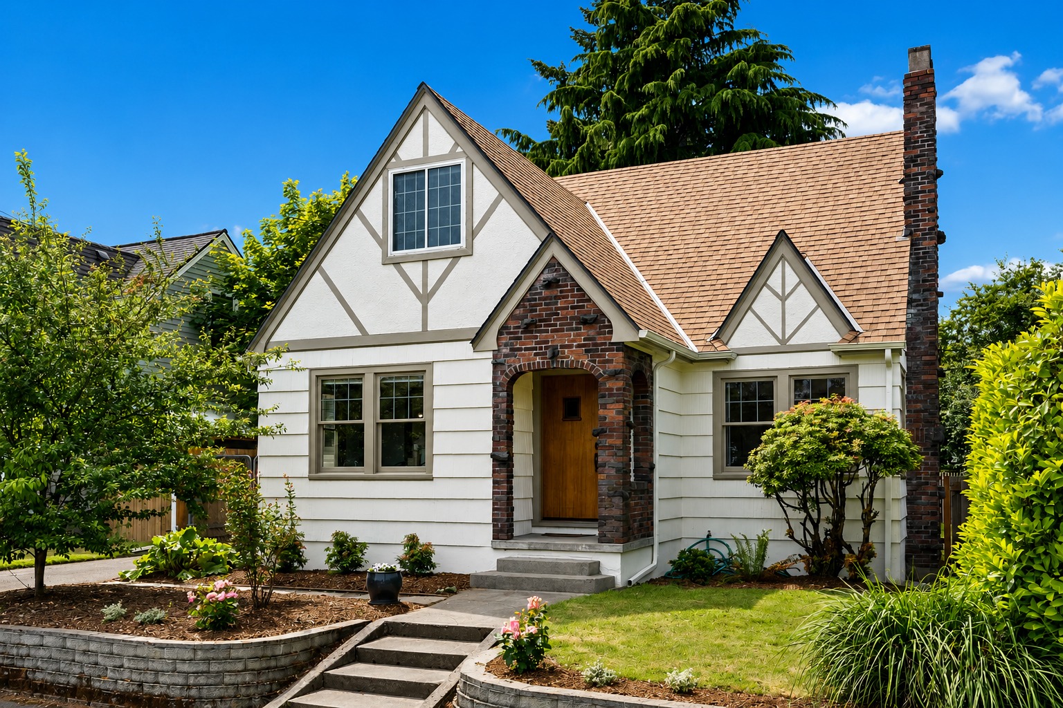
The first thing that stands out is the roof.
Traditional Tudor Revival homes often use steep roof pitches and strong front-facing gables. This house follows that idea on a smaller scale. The large front gable creates height. A second smaller gable sits to the right. Together, they break up the front of the house and give it a layered shape.
That shape matters.
A plain rectangular house can feel flat from the street. Here, each roof section steps forward or back. The entry also projects from the main wall. These changes create shadow and depth.
The result feels much richer than the home’s modest footprint might suggest.
The warm tan roof also softens the exterior. It works well with the white walls and aged red brick. Nothing looks too sharp or new.
Exterior Tudor cues
- Steep roof pitches
- Front-facing gables
- Uneven, asymmetrical massing
- Decorative half-timber details
- White stucco-style gable surfaces
- Red brick accents
- Tall masonry chimney
- Recessed front entrance
- Arched brick opening
- Multi-pane windows
- Deep roof edges
- Compact storybook scale
Decorative Half-Timbering Gives the Gables Their Tudor Look
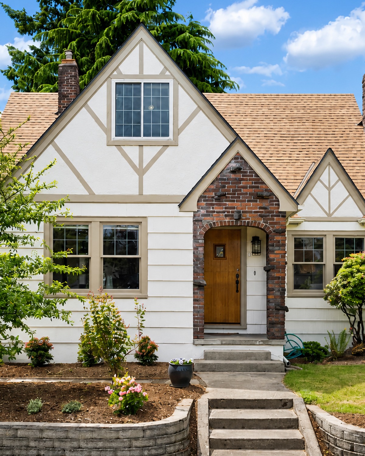
The half-timber details are one of the clearest Tudor cues on the home.
Thin gray-brown trim pieces divide the white upper gables into geometric sections. Vertical strips meet diagonal pieces to create simple patterns.
These boards do not dominate the facade. That is part of their charm.
On some Tudor Revival homes, dark timbering can create a bold black-and-white look. Here, the softer trim color keeps the exterior calm. The contrast is still clear, but it feels gentle.
This treatment also draws your eye upward.
Without those lines, the upper gables would feel like wide blank areas. The trim gives them shape and rhythm. It also helps the tall central gable feel more connected to the smaller one.
Half-timber design cues
- Light stucco-like background
- Thin contrasting battens
- Vertical and diagonal patterns
- Timbering concentrated in the gables
- Low-contrast earthy paint
- Symmetry within each gable
- Simple patterns rather than heavy ornament
Brick Turns the Front Door Into a Focal Point
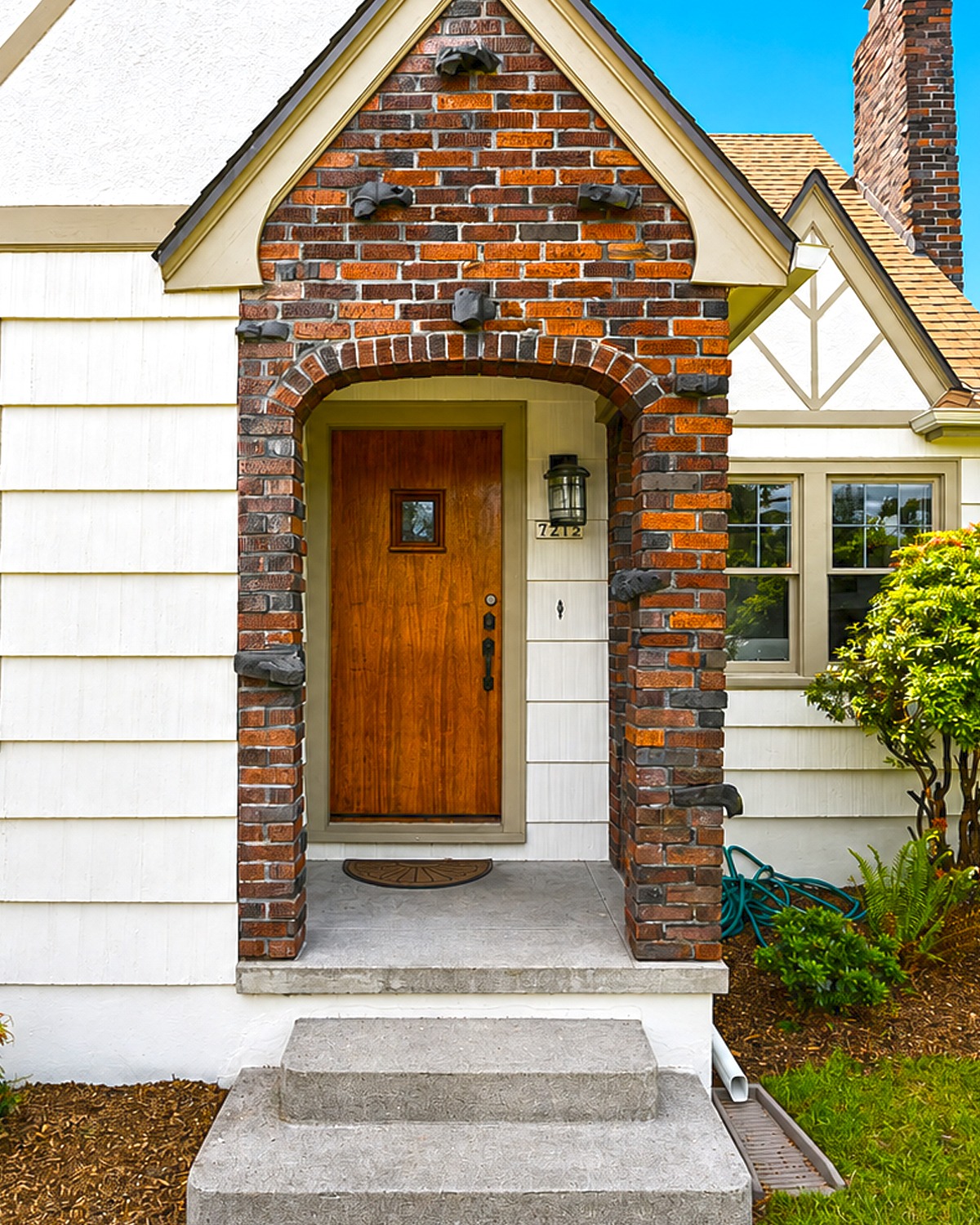
The front entry may be the most charming exterior detail.
Instead of placing the door flat against the siding, the design gives it a small brick porch. Thick brick columns rise on each side. A rounded brick arch stretches over the opening.
That one move gives the entrance weight.
The red and brown brick also adds rich color to the mostly white house. Its rough surface creates contrast against the smoother wall finish.
Notice how the brick forms a small gable above the porch as well. This repeats the roof shape used across the rest of the house.
The entry feels tucked in and protected. That sense of shelter fits Tudor design very well.
A plain wood door finishes the look. Its warm brown tone feels natural beside the brick. The small square window gives the door a handmade, cottage-like touch.
Tudor entry cues
- Projecting entrance
- Brick porch surround
- Rounded arch
- Deep doorway recess
- Warm natural wood door
- Small decorative door window
- Simple dark hardware
- Masonry used as a focal point
- Small entry steps rather than a large porch
The Tall Brick Chimney Adds Classic Tudor Drama
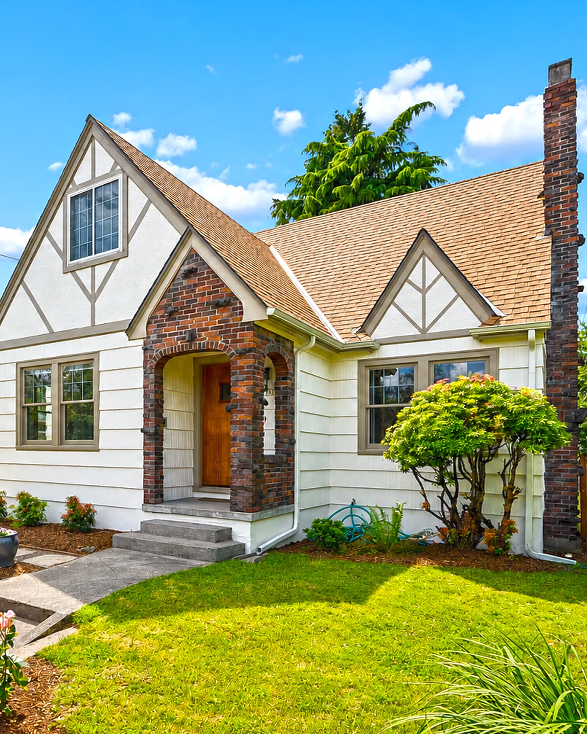
A Tudor home almost seems to ask for a tall chimney.
Here, a narrow brick chimney rises high above the roof on the right side. Its height makes the home look more vertical.
This feature also balances the tall front gable.
The brick is not perfectly uniform in color. Dark brown, red, and gray tones mix together. That variation gives the masonry an aged look.
The chimney also connects the home visually to the brick around the front door and fireplace. That repeated material makes the exterior and interior feel tied together.
Chimney cues
- Tall narrow profile
- Exterior wall placement
- Red and dark brown brick
- Visible masonry texture
- Strong vertical emphasis
- Brick repeated at the entrance and fireplace
A Simple Landscape Lets the Architecture Lead
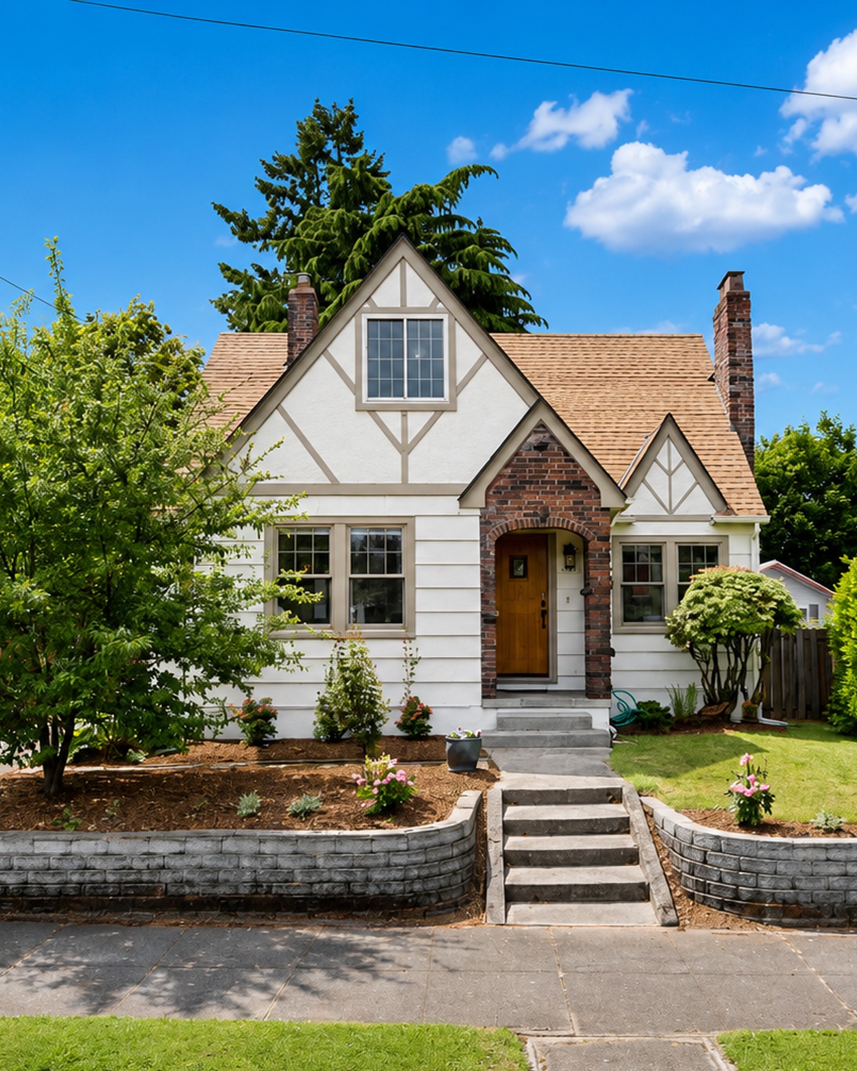
The front yard does not compete with the house.
That is a smart choice.
A low retaining wall runs along the sidewalk. Small planting beds soften its hard edge. A mature tree sits to one side of the front walk. Trimmed shrubs frame the house without hiding its windows or brickwork.
The narrow path leads straight toward the front steps.
This keeps the view of the house open.
Tudor-style homes often look best with landscaping that feels a little lush but still controlled. Too many plants can hide the lower walls and entry. Too little landscaping can make the house feel exposed.
This yard finds a good middle ground.
Landscape cues
- Low retaining wall
- Straight front path
- Simple lawn
- Mature shrubs
- Small flowering plants
- Mulched planting beds
- Trees placed away from the main facade
- Clear view of the brick entry
The Living Room Keeps the Best Old-House Features
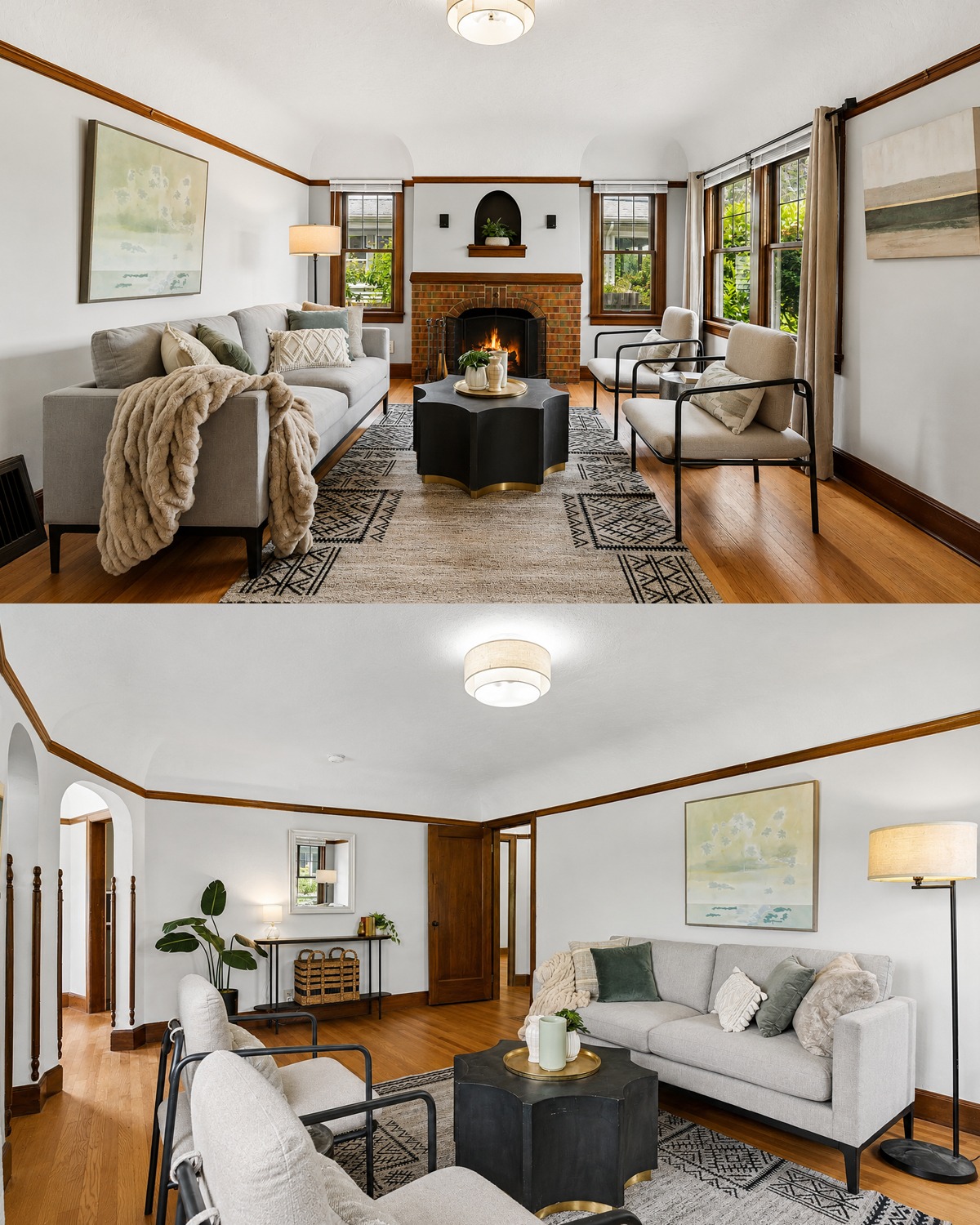
Inside, the mood changes from storybook Tudor to light, relaxed, and comfortable.
Still, the older details remain easy to see.
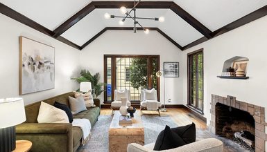
The living room has white walls and a pale neutral sofa. Those lighter surfaces help sunlight move through the room. Yet dark wood trim still outlines every window and doorway.
This contrast is important.
Painting all of the trim white might have made the room feel newer, but it also would have erased much of its character. Keeping the wood gives the space warmth and helps explain the age of the house.
The hardwood floor continues that feeling.
Its golden brown tone matches the window trim, doors, and fireplace mantel. As a result, all the wood elements feel related.
Living room cues
- Original-style hardwood floors
- Dark wood window trim
- Wide wood baseboards
- Wood picture molding near the ceiling
- Rounded wall transitions
- Arched openings
- Brick fireplace
- Built-in wall niche
- Multi-pane windows
- Simple neutral furnishings
The Brick Fireplace Is the Heart of the Room
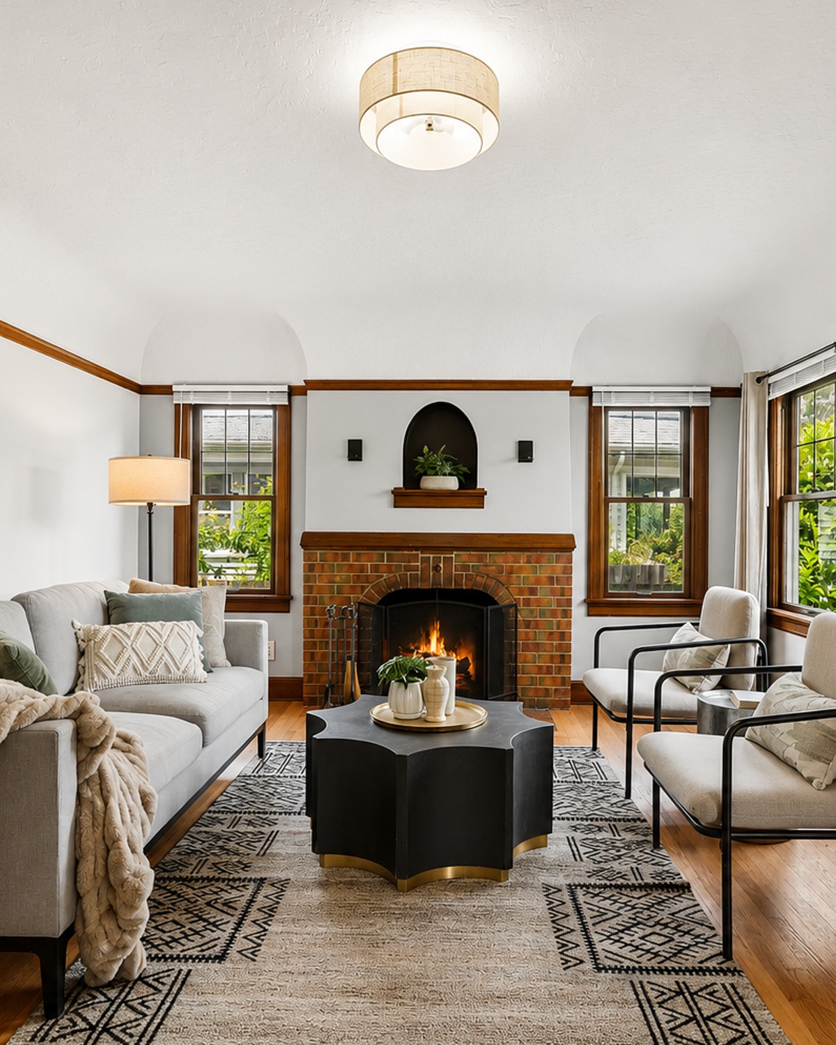
The fireplace is the room’s natural anchor.
Its brick surround uses warm red, brown, and muted green tones. An arched firebox adds another classic shape.
Above it, a small recessed niche creates an unusual focal point.
The niche has a rounded top, much like the room’s door openings. A small wood shelf at its base creates a place for a plant or art object.
This detail feels very much at home in a house from this period.
It is decorative, but it is not flashy.
The fireplace also shows why older materials can work so well with modern furniture. The room does not need heavy antique pieces. Clean-lined chairs and a simple sofa keep the space current.
Meanwhile, the brick gives the room texture and history.
Fireplace cues
- Full brick surround
- Arched firebox
- Warm mixed brick colors
- Simple wood mantel ledge
- Rounded display niche above
- Symmetrical windows around the fireplace area
- Strong central placement
Rounded Openings Soften the Floor Plan
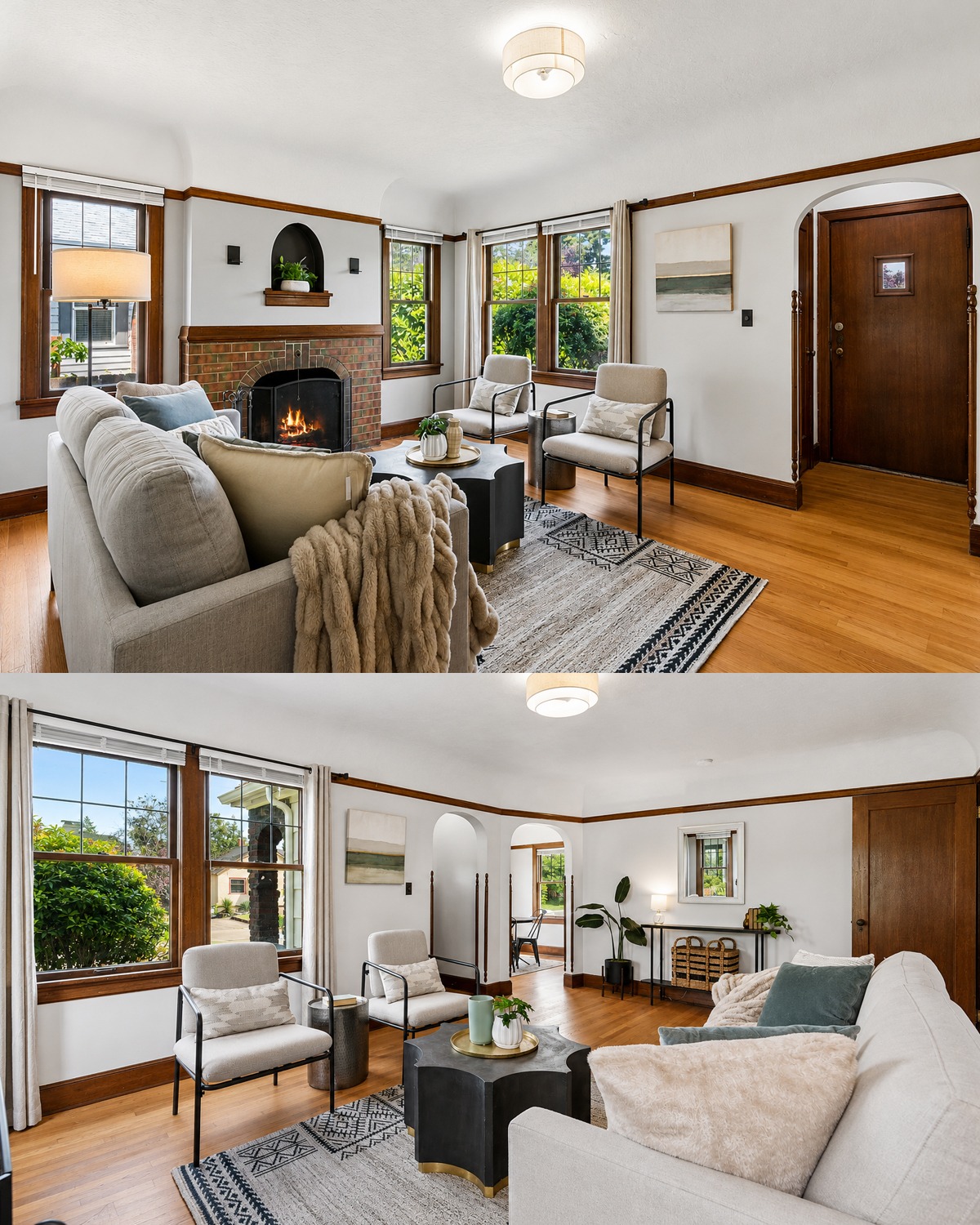
Arches appear throughout the house.
Some are wide doorway openings. Others are smaller wall cutouts. Their curves soften the many straight lines created by wood floors, doors, windows, and trim.
This is one of the home’s best details.
An arch can make a simple doorway feel special without taking up any extra floor space. It also creates a gentle transition between rooms.
In the living area, the rounded openings lead toward the dining room and other parts of the house. They give you a glimpse into the next space while still keeping each room separate.
That layout feels very different from a modern open-concept home.
Instead of one huge space, you get a series of connected rooms.
Archway cues
- Soft rounded corners
- Wide cased openings
- Repeated curved shapes
- Clear room separation
- Long sight lines between spaces
- Wood trim used as an accent around nearby openings
Neutral Decor Lets the Architecture Stand Out
The living room furnishings stay simple.
A pale gray sofa sits across from two upholstered metal-frame chairs. The dark coffee table adds contrast. A patterned rug helps define the seating area.
The palette is mostly white, gray, beige, black, and soft green.
That quiet mix works well because the room already has strong architectural features.
The wood trim, brick fireplace, arches, and windows provide plenty of visual interest. There is no need for bold wallpaper or heavy layers of decor.
Soft blankets and textured pillows make the room feel comfortable without making it feel crowded.
This is a useful lesson for any older home.
You do not always need period furniture to respect period architecture. Sometimes the best approach is to let the permanent details take center stage.
The Dining Room Feels Bright and Intimate
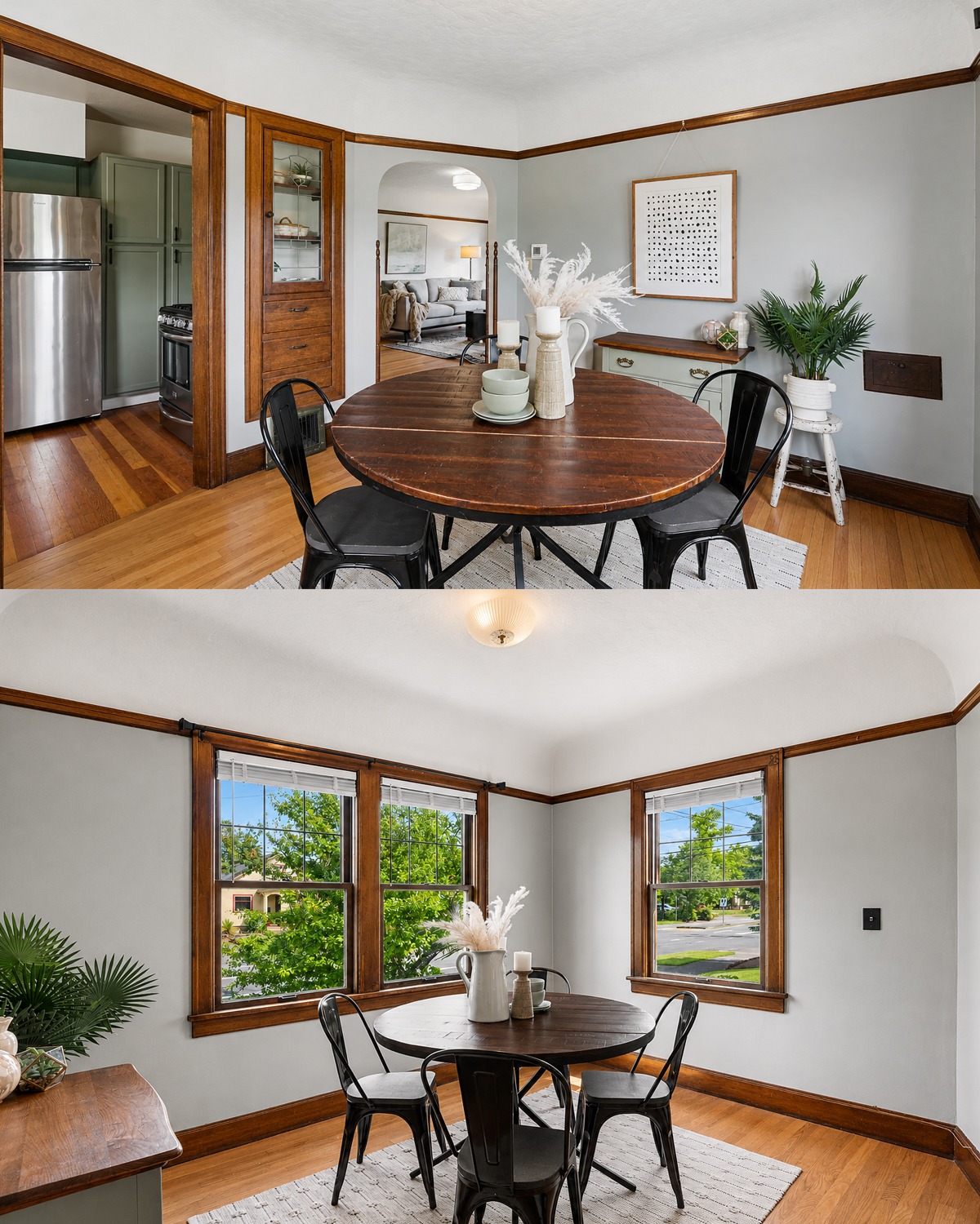
The dining room continues the same mix of old and new.
Three large windows bring in a lot of natural light. Their dark wood casings create strong frames against the pale walls.
A round wood dining table sits in the center.
The table shape works well here. It keeps the room easy to walk through and echoes the curved door openings nearby.
Black metal chairs add a more modern edge. Their thin frames keep the dining area from feeling heavy.
A small vintage-style built-in or cabinet along the wall brings back some older character.
Dining room cues
- Bay-like grouping of windows
- Original-style wood casings
- Hardwood floors
- Soft gray wall color
- Round wood table
- Black metal chairs
- Arched connection to living room
- Traditional wood details mixed with simple modern decor
The Kitchen Blends Cottage Color With Practical Updates
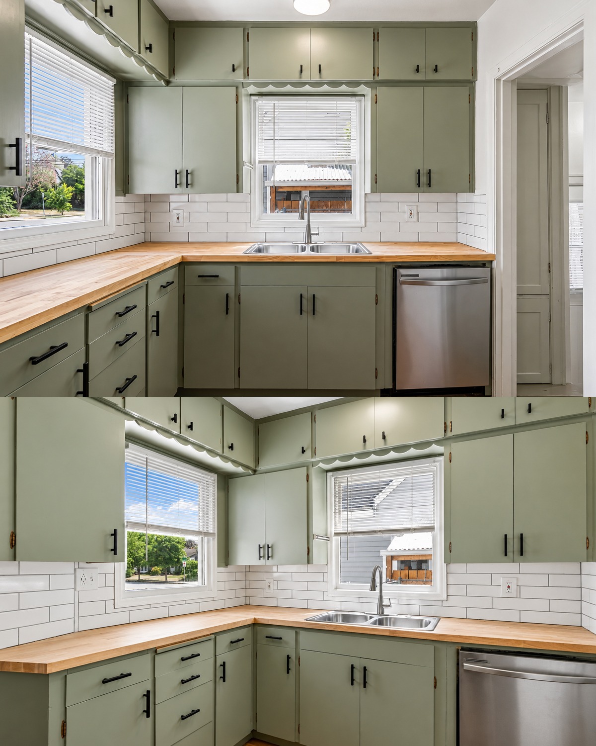
The kitchen has a softer, more casual look.
Muted sage-gray cabinets wrap around the room. Black pulls give them a crisp outline. Warm wood counters add natural color.
White subway tile keeps the backsplash bright.
This palette works well in a Tudor home because it feels earthy. Green-gray, cream, brown, brick red, and black all sit comfortably beside natural wood.
The cabinets also reach high toward the ceiling. That makes good use of a compact kitchen.
The room still has older touches too. Some cabinet sections have simple vintage-style doors and visible hinges. Decorative scalloped trim appears above the window.
These details keep the kitchen from feeling like a completely new room dropped into an old house.
Kitchen cues
- Muted sage-green cabinetry
- Black metal hardware
- Warm wood countertops
- White subway tile
- Stainless steel appliances
- Double-bowl sink below a window
- Upper cabinets extended high
- Vintage-style exposed hinges
- Scalloped trim above the window
- Compact U-shaped workspace
Built-Ins Add Craft and Character
One of the most special details appears beside the kitchen and bedroom areas.
A built-in wood cabinet has glass-front upper doors and lower drawers. The rich wood finish matches much of the home’s trim.
Built-ins like this make an older house feel custom.
They also offer useful storage without requiring a separate piece of furniture.
In the bedroom, a much larger built-in cabinet covers part of a wall. Leaded or patterned glass fills the upper doors. Wood panels and drawers sit below.
That feature gives the room instant character.
Rather than hiding it or replacing it with a modern closet system, the design lets the old woodwork become a focal point.
Built-in cues
- Wall-integrated storage
- Stained wood finish
- Glass cabinet doors
- Decorative glass patterns
- Small brass or dark knobs
- Drawers below upper cabinets
- Trim that matches doors and windows
- Furniture-like craftsmanship
The Bedroom Feels Simple, Warm, and Quiet
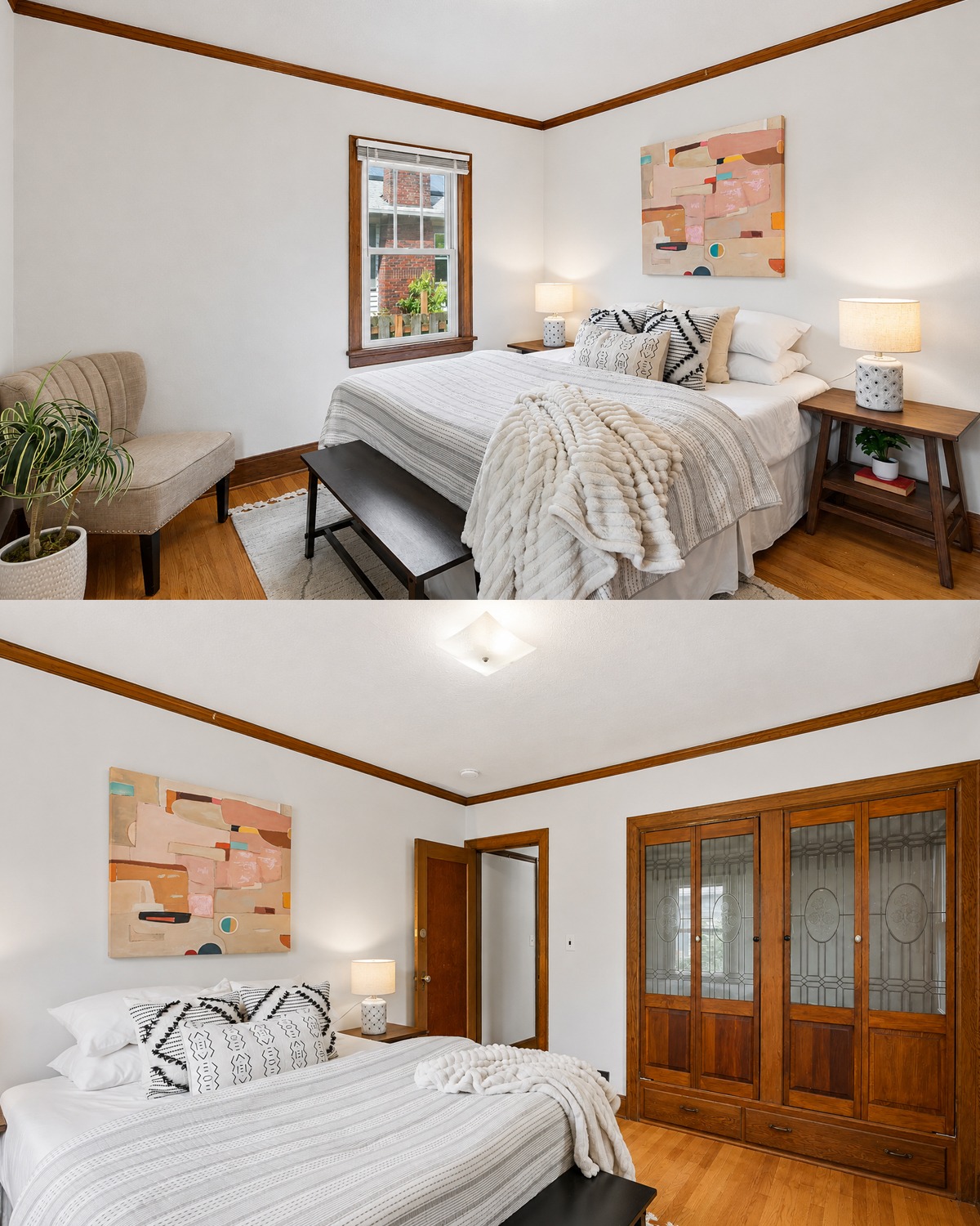
The bedroom shows how well restraint can work in a historic home.
White walls keep the space calm. Dark wood trim outlines the windows, doors, baseboards, and ceiling line.
The bed uses soft white and gray bedding.
A chunky cream throw adds texture. Black-and-white accent pillows create a little contrast.
A warm abstract painting above the bed brings in muted pink, tan, orange, and blue tones.
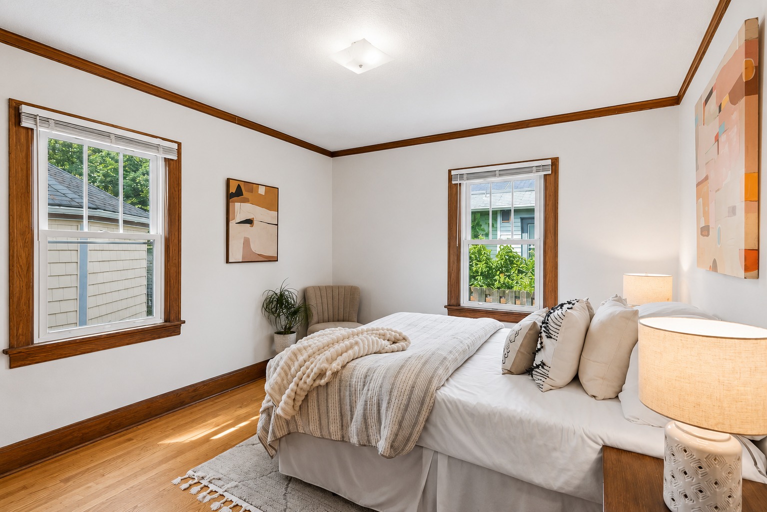
The furniture stays light and simple, so the original woodwork still gets attention.
Natural light enters from two windows. Their wood frames add warmth even before any furniture enters the room.
Bedroom cues
- Dark original-style wood trim
- Hardwood flooring
- Soft white walls
- Neutral bedding
- Simple wood nightstands
- Warm table lamps
- Large built-in wardrobe
- Decorative glass cabinet fronts
- Limited, soft accent colors
The Bathrooms Show Two Different Update Styles
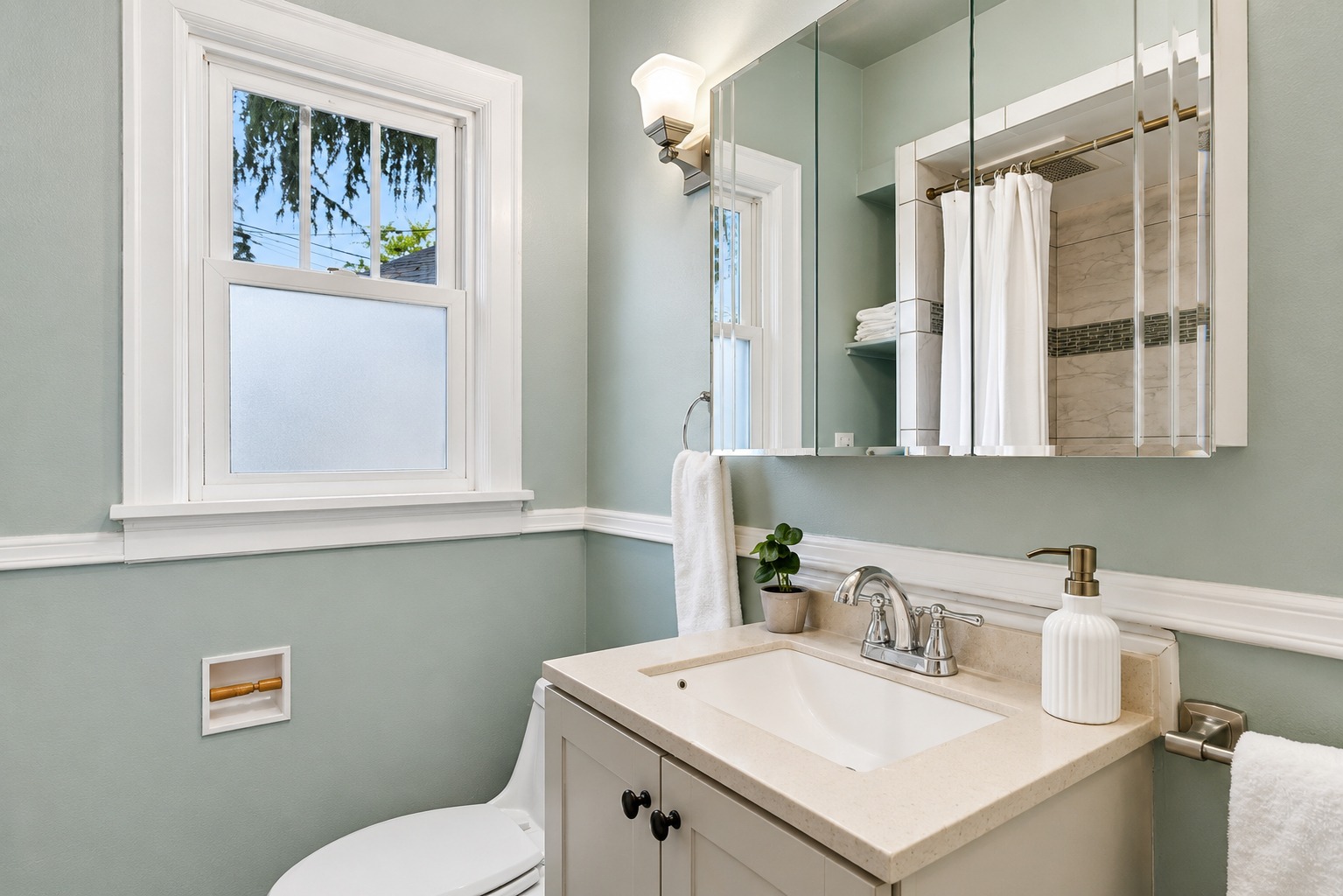
The bathrooms appear more updated than the main living areas.
One bath uses pale blue-green walls, white trim, and a white vanity. A large mirrored medicine cabinet helps the small room feel brighter.
A frosted window brings in daylight while still giving privacy.
This bathroom feels gentle and cottage-like.
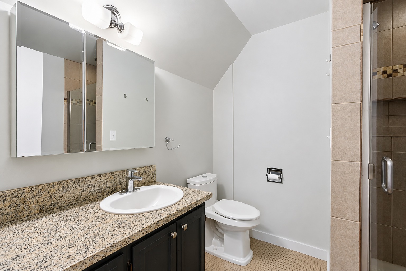
The second bath takes a more modern route. It uses a dark vanity, granite-style counter, large mirror, and tiled shower. The sloped ceiling adds visual interest and may reflect the home’s upper-level roof shape.
Both rooms show a practical way to update an old Tudor.
They do not try too hard to copy the 1930s. Instead, they use clean finishes that sit quietly beside the older parts of the house.
Bathroom cues
- Light wall colors
- White sanitary fixtures
- Compact vanities
- Large mirrors
- Frosted window glass
- Simple chrome fixtures
- Tile shower surround
- Neutral stone-look surfaces
- Minimal decor
- Sloped ceiling in the upper bath
Conclusion
This 1930 English Tudor home proves that old-house charm does not need a heavy makeover. Its brickwork, wood trim, arches, steep rooflines, and built-ins give it a strong sense of history. Meanwhile, light walls and modern furnishings keep each room bright and comfortable. It is a beautiful example of how classic Tudor details can still feel warm, useful, and inviting today.