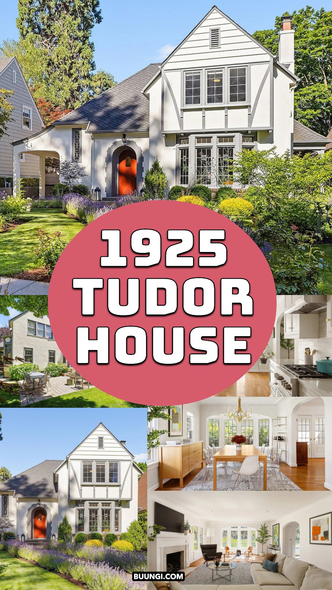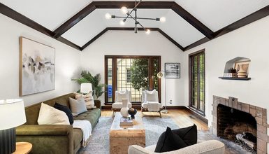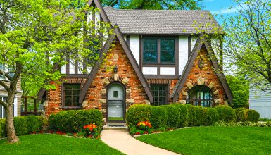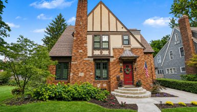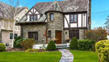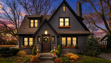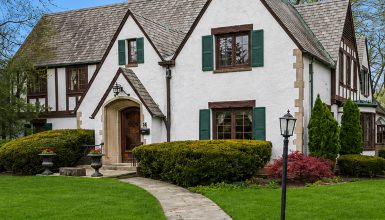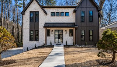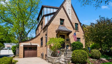
How does a 1925 Tudor Revival keep its storybook charm and still feel bright and easy to live in? This home offers a lovely answer. Its steep front gable, dark timber trim, stone-framed arch, and vivid red door give it a strong historic look. Inside, white walls, warm wood floors, and simple furnishings make the rooms feel calm and fresh.
Tudor Revival homes became popular in the United States during the 1920s and 1930s. Many have steep roofs, cross gables, brick or stucco walls, and decorative half-timbering. This home uses those classic shapes with a light, updated palette.
The design feels balanced because it gives each feature room to stand out. Outside, dark trim frames the white gable. A bright door draws the eye to the entry. Inside, arched openings echo the front door, while wood floors link the rooms. The result feels historic without feeling heavy.
1. A Storybook Exterior With a Fresh White Finish
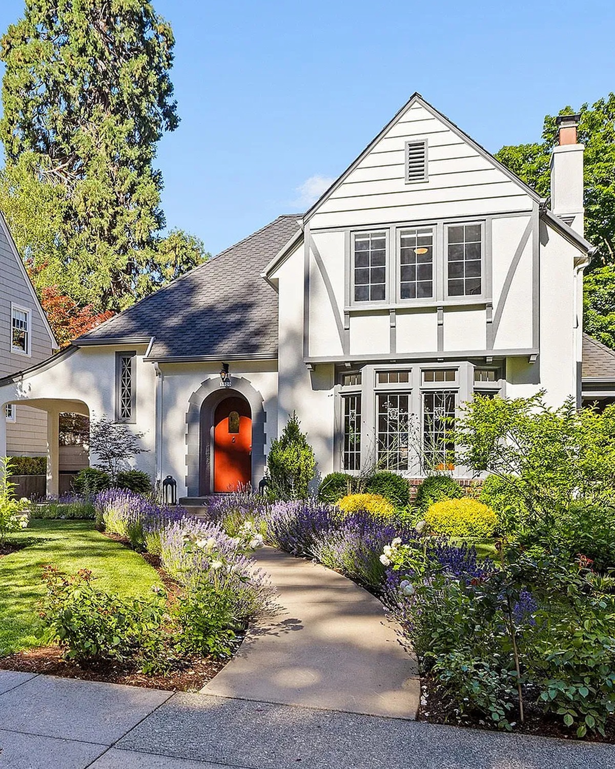
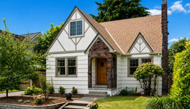
The front of the home makes a strong first impression. White siding or stucco gives the walls a light, clean look. Dark trim outlines the steep gable and its half-timber pattern. This contrast makes the house’s shape easy to see from the street.
The tall center gable brings height to the front. Its narrow windows sit in a neat row, while simple dark lines divide the upper wall into sections. The mix recalls old English homes, yet the bright finish keeps it from feeling dark or formal.
The home also has lower wings that spread out from the main section. These shorter rooflines give the house a wide, settled stance. A lower arch near the side adds another layer of shape and makes the front feel less rigid.
White exterior walls can suit an older home when they let the original forms shine. Here, the white works like a quiet background. It allows the roof, trim, windows, and door to take center stage.
Design cues:
- White exterior walls
- Steep front gable with dark trim
- Decorative half-timber pattern
- Lower wings that balance the tall center section
- A light finish that lets the home’s shape stand out
2. A Red Door Set in a Stone Arch
The front door brings color and personality to the exterior. Its red finish stands out against the pale walls. A pale stone arch frames the door and gives the entry a sense of depth.
That arch is more than a border. It marks the shift from the garden to the house. The shape also repeats inside, where curved openings soften the clean lines of the rooms. This simple link helps the whole home feel planned as one design.
The red door adds a lively note to a quiet palette. It gives visitors a clear focal point from the street. The dark trim and gray roof help ground the bright color, so the door feels bold but still in place.
You can use this idea in other Tudor Revival homes, too. Pick one strong entry color, then keep the trim and wall colors simple. A warm red, deep green, or dark blue can work well. The key is to let the door be the main accent.
Design cues:
- A red front door
- Pale stone around the entry arch
- A recessed, sheltered entrance
- Dark trim that frames the doorway
- One strong color against a soft exterior palette
3. Multi-Pane Windows With a Classic Shape
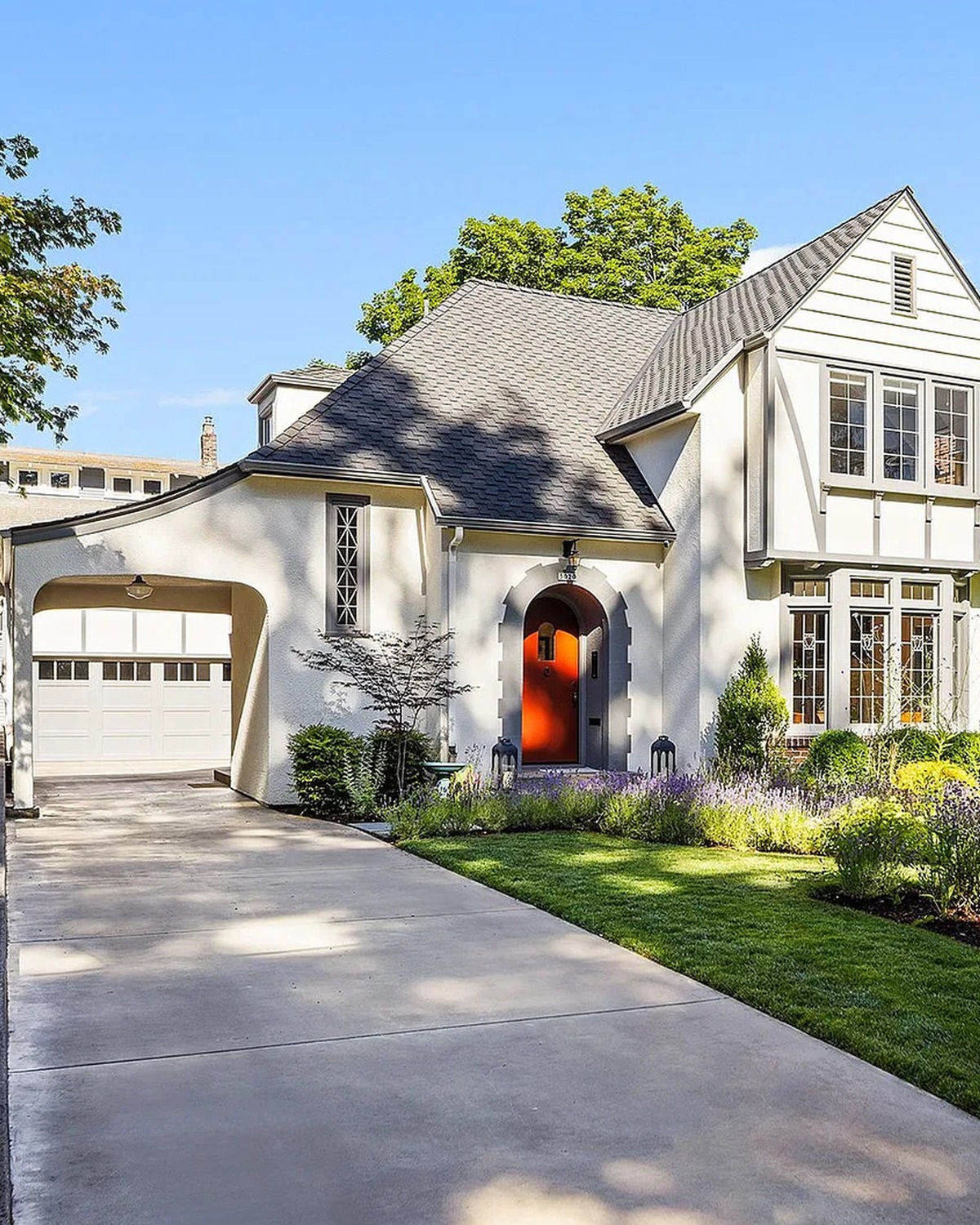
The front windows add rhythm to the home. Narrow panes break up the glass and echo the vertical lines of the gable. The upper row sits beneath the peak, while the lower windows bring light to the main rooms.
The home uses dark window frames and muntins to keep the exterior details clear. Against the white walls, each window reads as a crisp shape. These dark lines also connect with the timber trim, so the gable feels like one complete design.
Large windows on the first floor help bring in daylight. Their size makes the rooms feel open, even though the exterior still has a cozy, traditional look. This balance suits a Tudor Revival well. The home keeps its old-world outline while letting light reach the rooms.
Inside, simple window treatments help preserve that brightness. Thin curtains or understated shades can add privacy without hiding the window frames. When a window has a strong shape, it often looks best when the fabric stays quiet.
Design cues:
- Tall, narrow window proportions
- Multi-pane glass
- Dark frames that echo the exterior trim
- Bright first-floor windows
- Simple interior treatments that let light through
4. A Garden Path That Leads the Eye
The front garden makes the approach feel warm and relaxed. A curved path leads toward the red door. It guides the eye through the lawn and gives visitors a clear route to the entrance.
Low flowers and shrubs line both sides of the path. Their purple, yellow, and white blooms soften the straight lines of the house. Rounded shrubs add shape, while taller trees create shade and frame the home.
The planting feels full but does not hide the architecture. The front gable and windows remain in view. That matters because the home’s roofline is a key part of its charm. Plants add color and texture, then step back so the house can be seen.
A garden like this works best with a mix of heights. Low flowers suit the path. Mid-height shrubs fill the space near the walls. Trees provide a leafy backdrop. A tidy lawn keeps the planting from feeling too busy.
Design cues:
- A curved path to the front door
- Low flowers along the walkway
- Neatly shaped shrubs
- Mature trees that frame the house
- Plantings that leave the gable and windows visible
5. A Side Arch That Adds More Than Curb Appeal
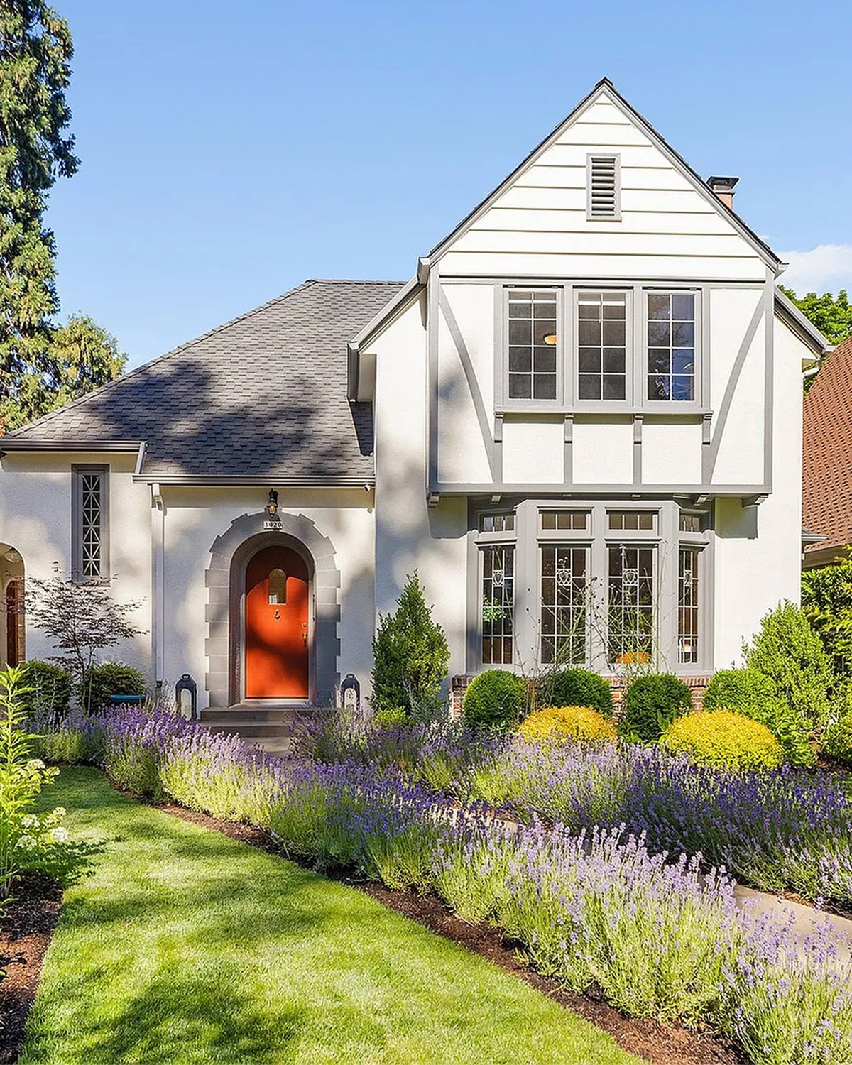
The side of the house has an arched opening beneath a low roof. This passage links the front approach to the side yard and garage area. It adds an inviting detail while helping people move through the property.
The arch also repeats the curved entry shape. Repeated forms make a home feel cohesive. Even when the arch serves a practical purpose, it adds a gentle visual link between parts of the house.
The lower roof and pale wall keep this section from competing with the tall front gable. Instead, it acts as a transition between the main home and its side spaces. This helps the house feel like a group of connected forms, a common trait in Tudor Revival design.
A side passage can be useful in daily life. It can create a sheltered walk, a spot to move garden tools, or a protected route to an attached garage. When planning one, keep the opening wide and the path clear.
Design cues:
- A low side wing
- An arched passage or breezeway
- Pale walls that match the main exterior
- A sheltered link to the side yard
- Repeated arches that connect the design
6. A Welcoming Entry With Warm Wood Floors
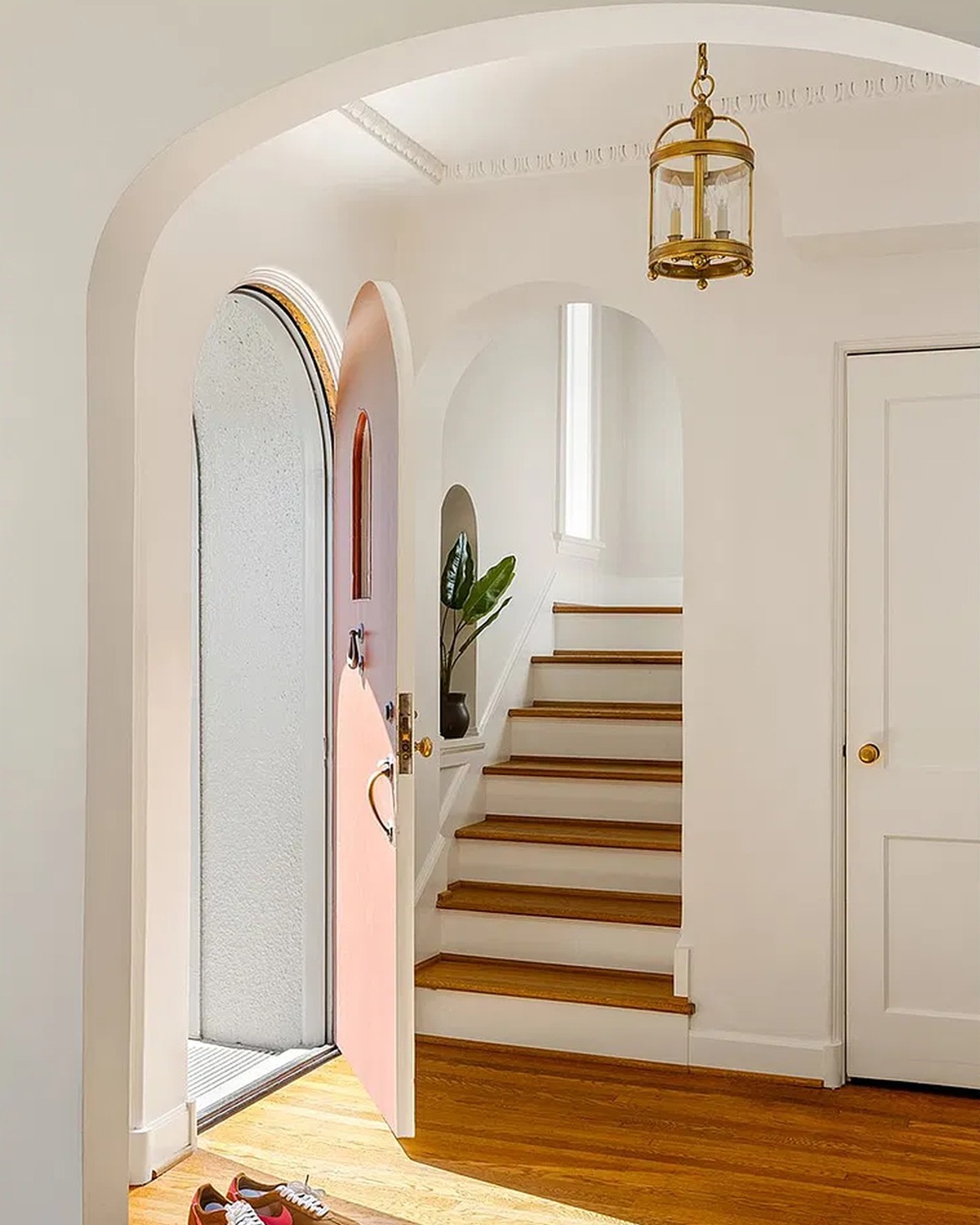
Inside, the entry feels light and open. White walls reflect daylight, while the warm wood floor adds color and texture. The arched opening continues the shape seen at the front door. A short run of stairs leads up to the next level.
This small area sets the tone for the rest of the home. It feels simple and bright, but the wood floor keeps it from feeling plain. A brass pendant adds a soft gleam overhead. A small plant brings in a touch of green.
The entry does not need much furniture. A slim bench or a narrow console could provide a place for keys and bags. Keep the path to the stairs clear. The arched doorway and the wood floor already give the room enough character.
This is a useful lesson for older homes: let the best details guide the layout. Here, the arch, stairs, and floor create the main view. A few practical items can support those features without crowding them.
Design cues:
- White walls and trim
- Warm wood flooring
- An arched opening
- A simple pendant light
- Minimal furniture near the stairs
7. A Living Room With a Bright, Calm Palette
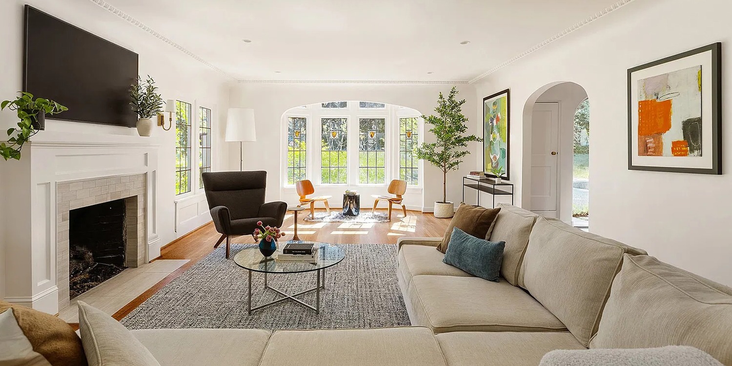
The living room pairs a white fireplace wall with soft, neutral furniture. A cream sofa sits opposite a dark armchair. A round coffee table and a pale rug help define the seating area.
The fireplace gives the room a strong center. Its light surround blends with the walls, while the dark firebox adds contrast. A large black television hangs above it. The two features share the same focal wall, keeping the room easy to read.
Large windows and glass doors bring in daylight. Their dark grids add structure and tie back to the exterior windows. The soft sofa and pale rug keep the space from feeling too formal. The mix makes the room feel ready for daily use.
A balanced living room needs open walkways. Here, the furniture leaves room to move between the seating area and the doors. The layout invites people to sit and talk, while the fireplace gives the room a clear anchor.
Design cues:
- White fireplace surround
- Cream or pale neutral sofa
- Dark accent chair for contrast
- Round coffee table and light rug
- Large windows that bring in daylight
8. Fireplace Details That Make the Room Feel Grounded
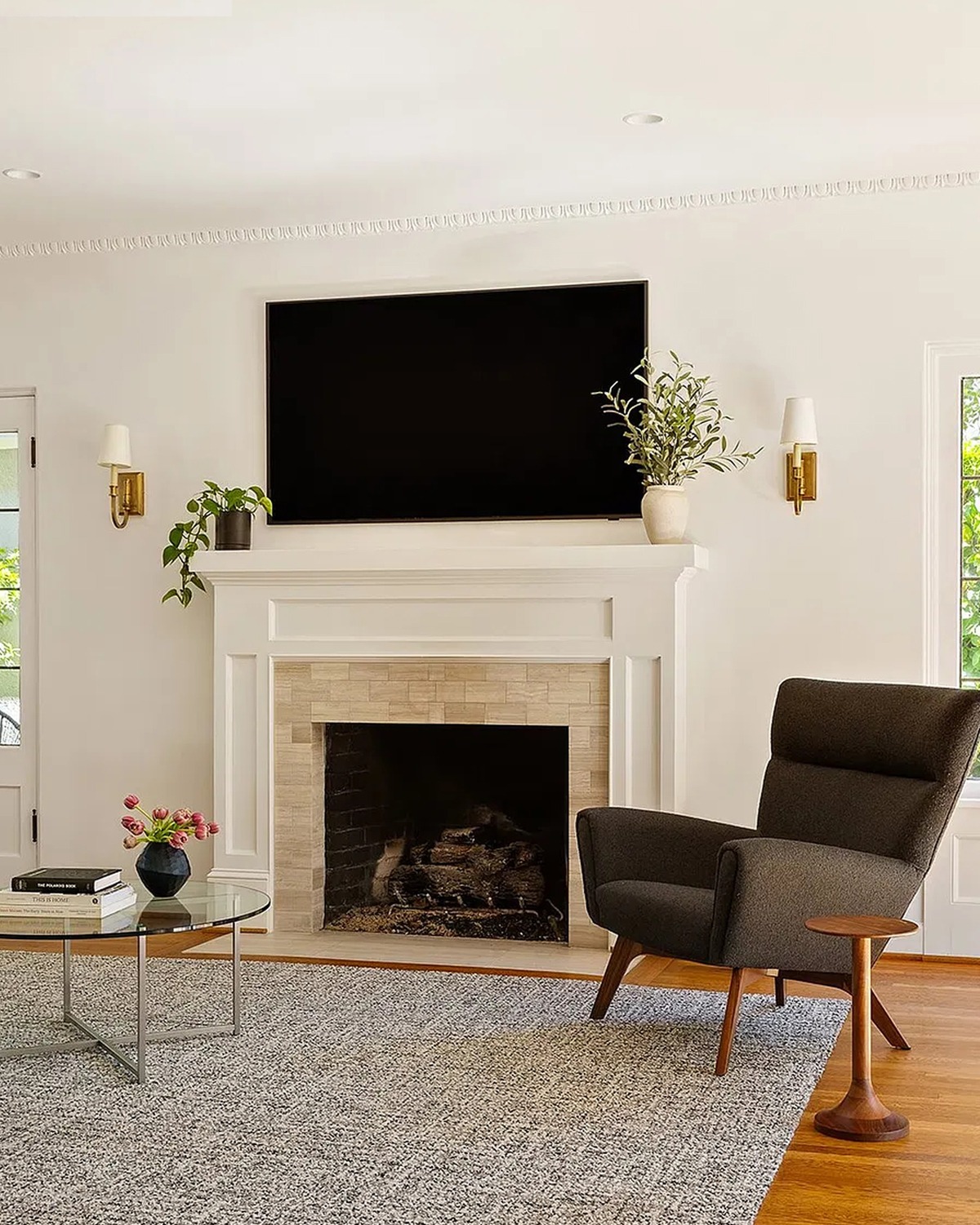
The second view of the living room gives a closer look at the fireplace. A pale mantel and surround create a clean frame. The dark firebox draws the eye, while small objects and greenery add a lived-in touch.
The fireplace works because it brings contrast to the pale room. The white walls and floor-to-ceiling light tones make the space feel bright. The dark firebox and chair add weight, so the room does not look washed out.
Decor on a mantel works best in small groups. A framed piece, a pair of vases, or a few branches can make the fireplace feel personal. Keep some open space, too. A mantel covered with many small items can distract from the shape of the fireplace.
If you update an older fireplace, retain its scale and position when possible. A new mantel can be simple and still suit the house. The aim is to let the fireplace feel like part of the home, not a new feature added without thought.
Design cues:
- Pale mantel and surround
- Dark firebox as a focal point
- A few simple mantel objects
- Greenery for a fresh touch
- Clean styling that leaves the fireplace visible
9. A Dining Room That Opens to the Garden
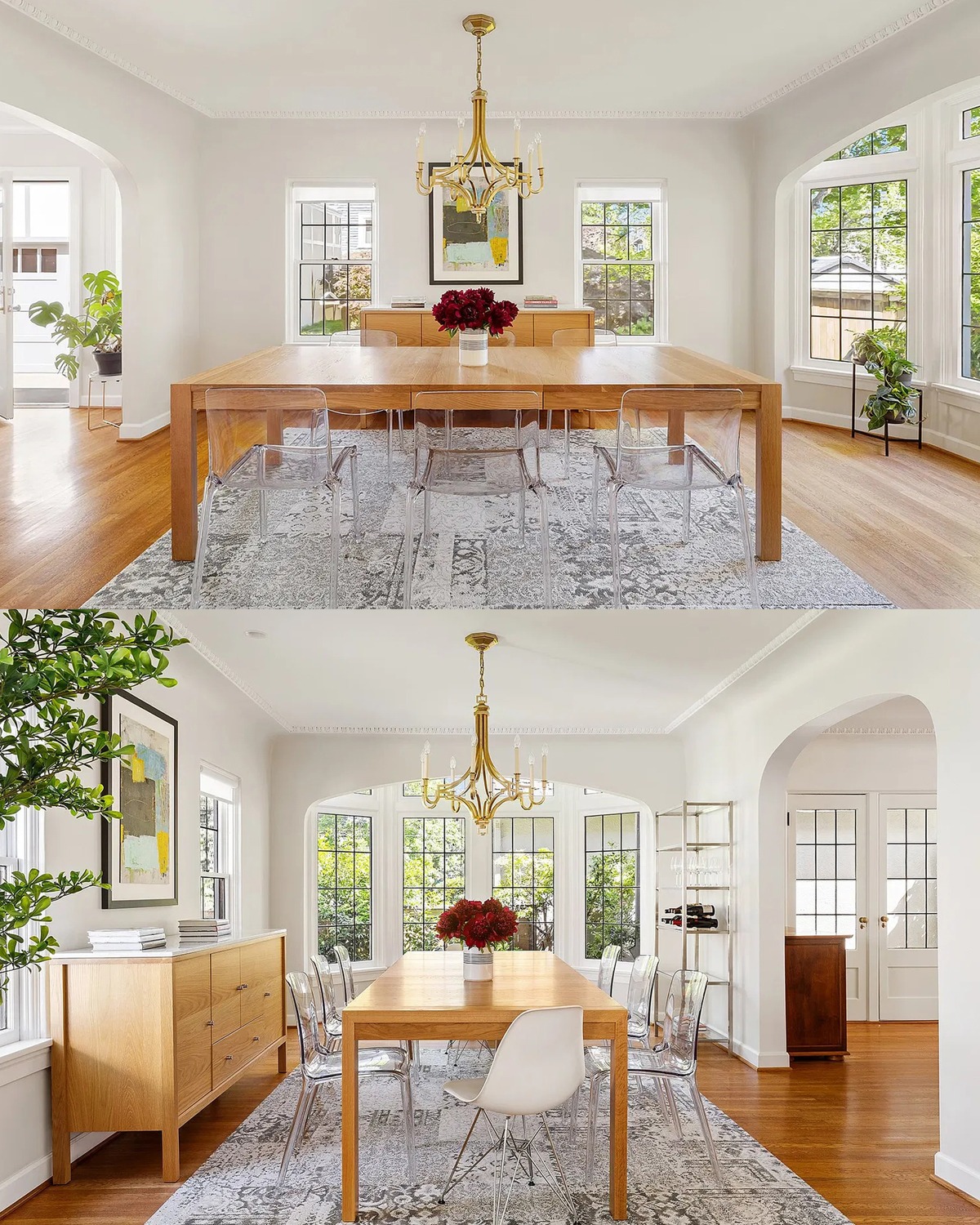
The dining area sits near a wall of windows and glass doors. This brings the garden into view and fills the room with light. A wood table and chairs bring warmth to the mostly white space.
A long, narrow table suits the room’s shape. It leaves space around the edges and can seat a group without blocking the doors. A chandelier hangs above the table and gives the dining area its own center.
Built-in storage along the wall keeps dishes and serving pieces close at hand. Its pale finish blends into the room. This helps the storage feel useful without making the wall look heavy.
The dining room also links indoor and outdoor living. On a sunny day, open doors can connect the table to the garden or patio. Choose a rug that can handle daily use. A low-pile weave is easier to clean and lets chairs slide with ease.
Design cues:
- Wood dining table and chairs
- Large windows or glass doors
- A chandelier centered over the table
- Built-in storage with a light finish
- A clear route to the outdoor area
10. A White Kitchen With Warm Wood Floors
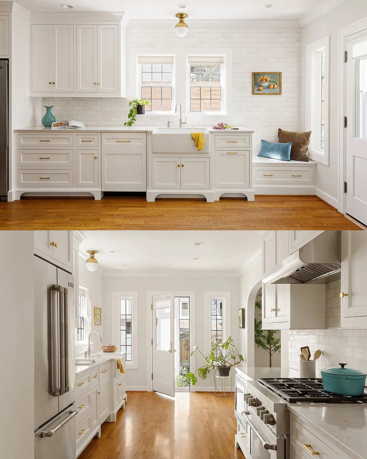
The kitchen feels clean and bright. White cabinets, pale counters, and a light backsplash keep the room open. Stainless steel appliances add a modern touch, while the wood floor brings warmth.
The cabinets have simple fronts, so they do not compete with the home’s older details. A long work surface gives plenty of room for meal prep. A window near the sink brings in natural light and offers a view outside.
The kitchen is practical as well as pretty. Storage sits above and below the counters. A central area gives people room to work without crowding one another. Small accents, such as a kettle or a bowl of fruit, add color without adding clutter.
This balance helps a renovated kitchen fit an older home. The finishes feel current, but the colors stay quiet. If you want to add more character, use warm metal hardware, a wood shelf, or a patterned runner. Keep the main surfaces simple.
Design cues:
- White cabinets with simple fronts
- Pale counters and backsplash
- Stainless steel appliances
- Warm wood floors
- Clear counters with a few useful accents
11. A Kitchen That Feels Open and Easy to Use
Another view shows how the kitchen connects to nearby rooms. A wide opening keeps the space from feeling cut off. The cabinet run and appliances sit along the walls, leaving a clear path through the center.
That open path matters. It makes the room easier to use and keeps people from bumping into one another. The kitchen can feel social without losing its work zones. Someone can cook while another person passes through or sits nearby.
The cabinet layout also makes good use of wall space. Tall cabinets provide storage, while lower drawers keep everyday tools within reach. A small pendant or flush-mount fixture adds light without taking up too much visual space.
In an older home, an open kitchen can feel fresh while the arches and trim keep it connected to the rest of the design. The goal is not to erase the home’s age. It is to make the kitchen work well within it.
Design cues:
- A wide opening to nearby rooms
- Clear walking space through the kitchen
- Tall cabinets for extra storage
- Everyday tools kept within easy reach
- Lighting sized for the room
12. Bedrooms With Soft Color and Natural Light
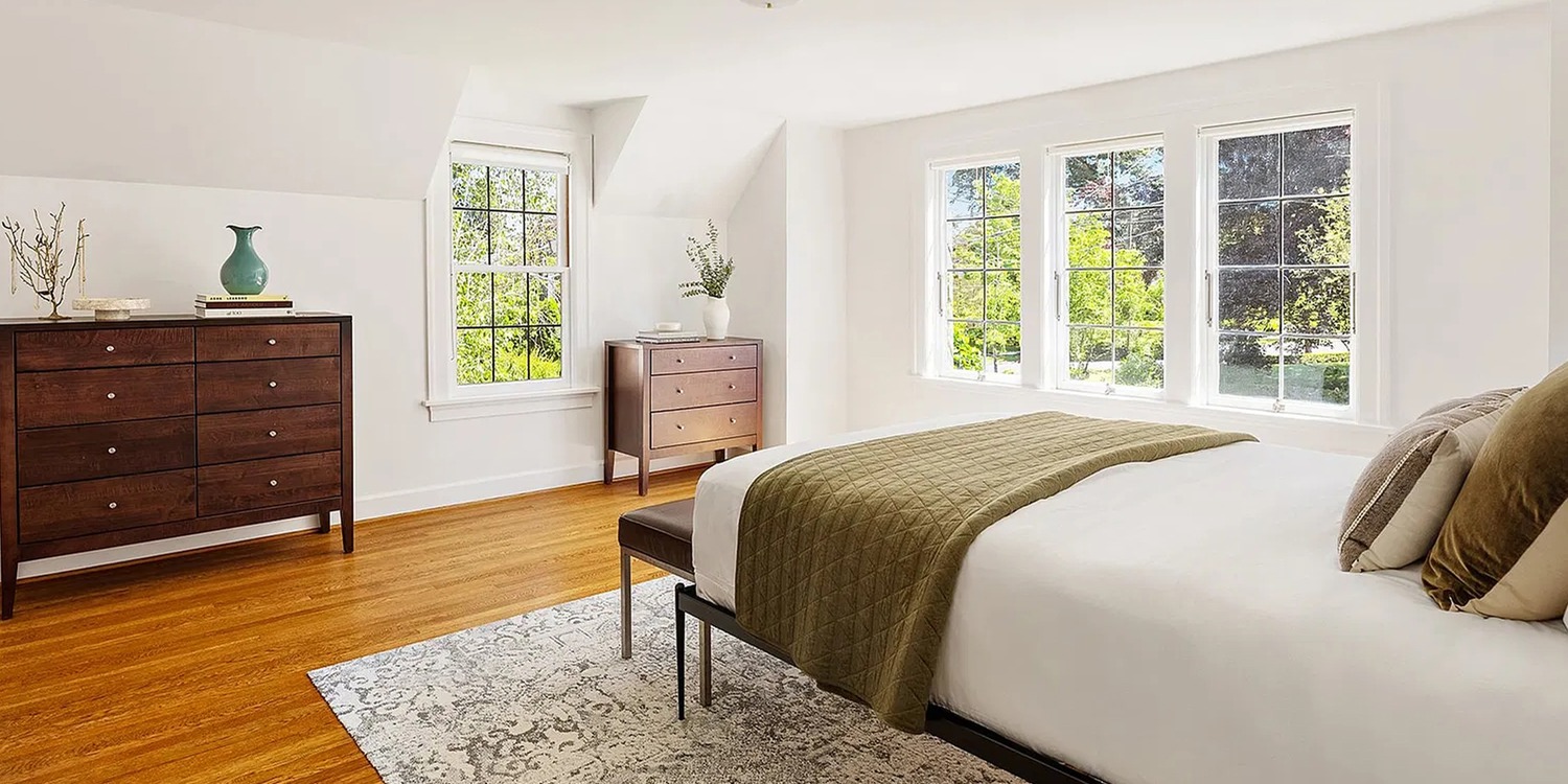
The bedrooms use pale walls, warm floors, and simple furniture. Large windows let in daylight. Bedding adds soft color, with touches of blue, green, and gray.
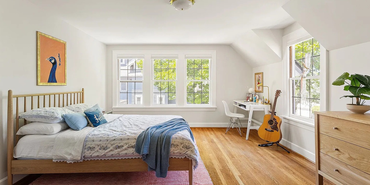
The furniture stays low and light. A wood bed or a simple upholstered headboard gives the room a calm center. Dressers sit near the walls, leaving floor space open. This makes each room feel easy to move through.
Color comes from bedding, art, and small objects. One room uses a pale blue quilt. Another adds a muted green coverlet and an upholstered bench. These accents bring personality without changing the room’s quiet base.
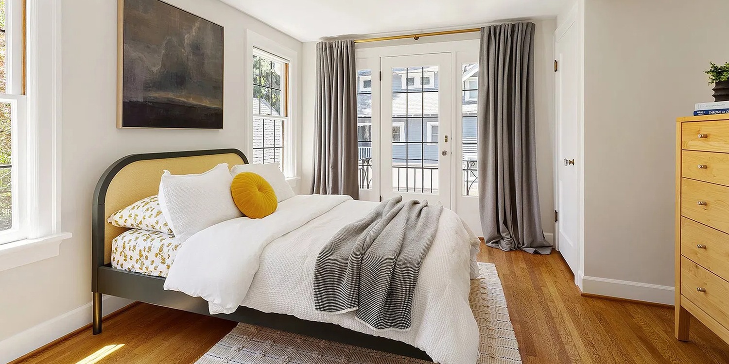
Keep bedroom lighting gentle. A pair of bedside lamps makes reading easier and gives the room a warm glow at night. Curtains can soften the windows and provide privacy. Choose fabrics that still let daylight through when they are open.
Design cues:
- Pale walls and warm wood flooring
- Simple beds and low furniture
- Soft blue, green, or gray bedding
- Large windows with light curtains
- Bedside lamps for a warm evening glow
13. Bathrooms With Clean Lines and Bright Finishes
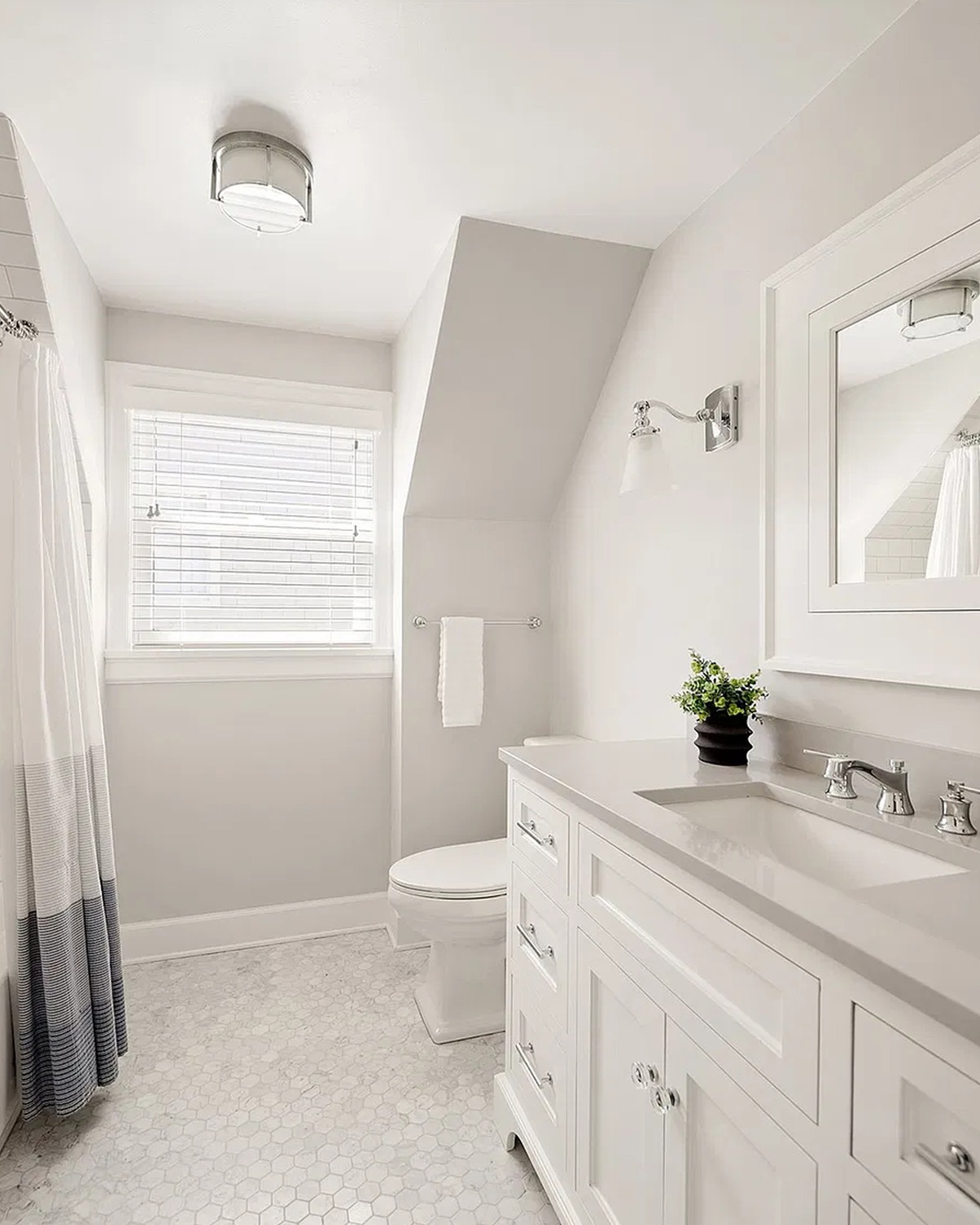
The bathrooms use white tile, pale counters, and simple fixtures. A clear glass shower keeps the room from feeling boxed in. White cabinetry gives storage without adding visual weight.
A bright bathroom can still feel warm. The wood floors in nearby rooms help balance the cool tile. Small touches, like a plant, a towel, or a dark-framed mirror, can add contrast. Keep the surfaces easy to clean and the counter mostly clear.
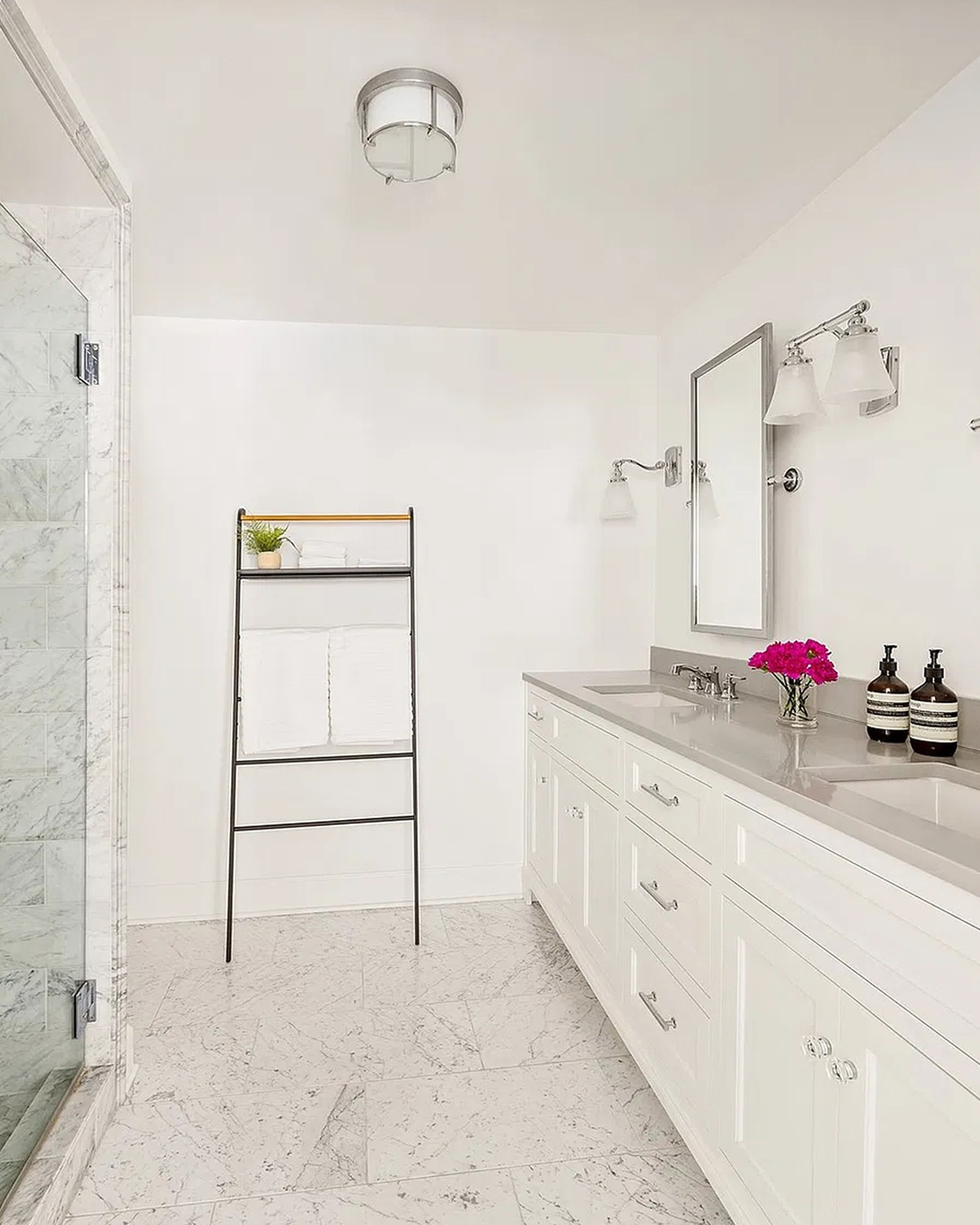
In the larger bathroom, the shower and vanity sit side by side. Glass panels allow light to move through the space. In the smaller bathroom, a compact vanity and bright walls help the room feel open.
These rooms show how a newer finish can sit comfortably in an old home. The lines are simple, but the shapes remain soft and classic. White tile and polished hardware do not compete with the arches and warm wood in nearby spaces.
Design cues:
- White tile and pale counters
- Glass shower panels
- Simple vanity cabinets
- Bright mirror lighting
- A few small accents for warmth
14. A Lower-Level Lounge for Casual Time
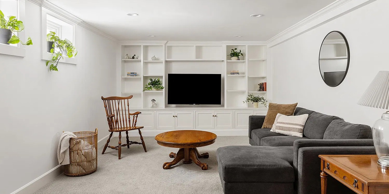
The lower-level room has a different mood from the bright main floor. A dark sectional, pale carpet, and built-in shelves make it feel relaxed and ready for movie nights or family time.
The built-in shelving frames the television and gives the room useful storage. Open shelves hold books, plants, or baskets. The cabinet sections below hide items that do not need to stay on display.
A round wood coffee table softens the straight lines of the sofa and shelves. A small game table adds another place to sit. This room can serve many purposes: a media room, a play space, or a quiet spot to read.
The strongest idea here is comfort. Not every room needs the same level of formality. The main rooms feel light and polished, while this lower-level lounge feels more casual. The contrast helps the home work for different needs.
Design cues:
- Dark sectional sofa
- Built-in shelves around the television
- Pale carpet for a soft feel
- Round coffee table in warm wood
- Extra seating for games or reading
15. Outdoor Rooms for Dining and Relaxing
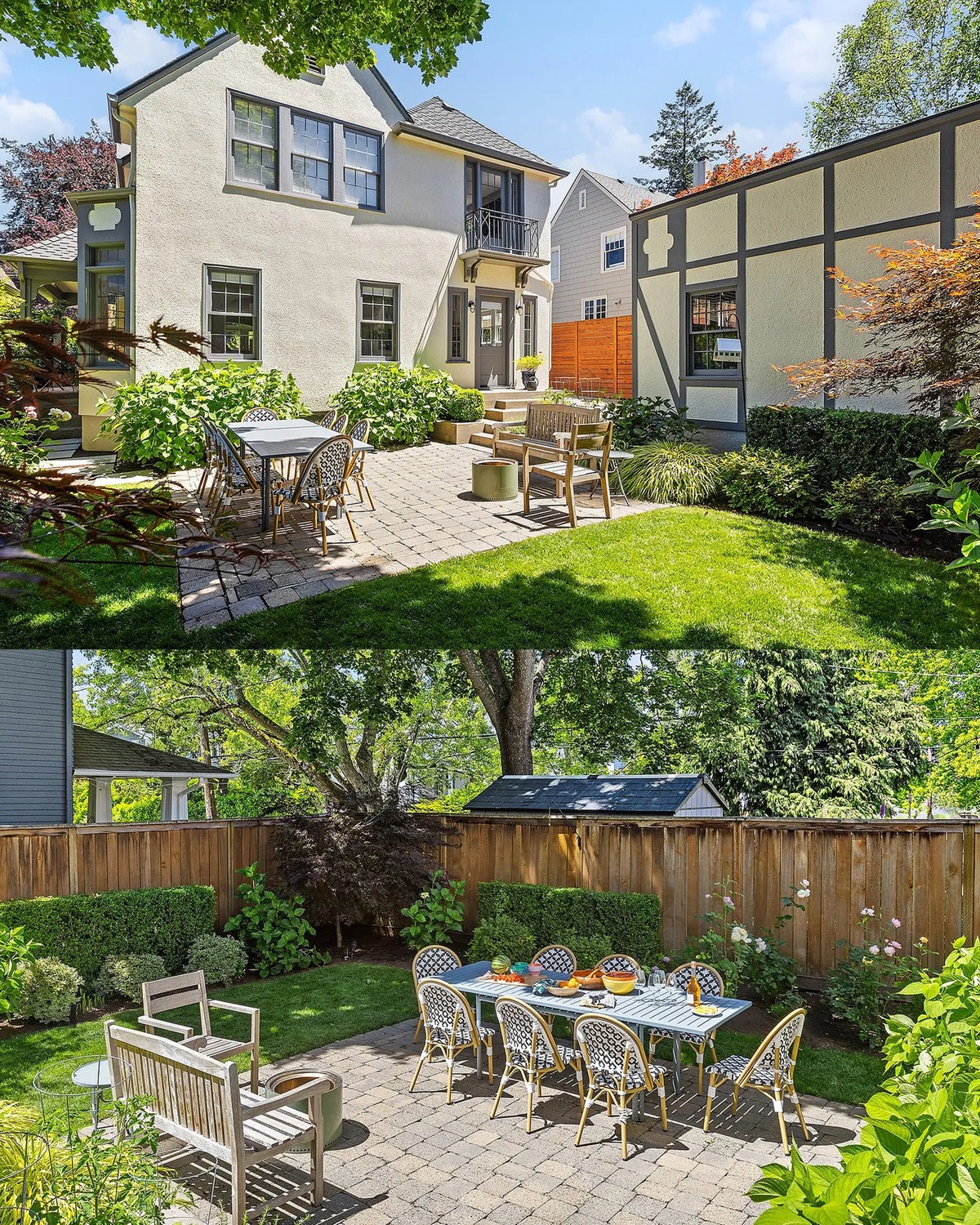
The back garden creates space for meals and quiet afternoons. A paved patio holds a long dining table with simple chairs. A separate seating area gives people another place to relax.
The yard feels private because of the fence and mature trees. Green plants soften the edges of the paving. A grill and dining setup make the patio useful for everyday meals, not just special events.
The home also opens to a more modern-looking glass addition at the back. Dark window frames contrast with the pale walls. This creates a clear link between the old house and its newer outdoor-facing space.
When designing a patio, think about how people will move. Leave room to pull out chairs and walk around the table. Add shade with trees or an umbrella. A few planters can bring color, but keep the main path open.
Design cues:
- A paved area for outdoor dining
- A separate lounge spot
- Mature trees and garden plants
- Dark-framed glass doors at the rear
- Clear routes between house, table, and seating
Conclusion
This 1925 Tudor Revival brings together two appealing ideas: storybook detail and simple, bright rooms. Outside, the steep gable, dark timber trim, stone arch, and red door give the home a memorable face. Inside, white walls, wood floors, and soft furnishings make daily life feel easy.
The design works because it keeps a steady balance. Historic shapes give the house its character. Light finishes and open views keep it fresh. Warm wood and garden color connect the two.
For your own Tudor Revival update, begin with the features that already make the home special. Keep the roofline, arches, windows, or fireplace in view. Then add comfort with calm colors, useful lighting, and furnishings that leave room to move.