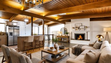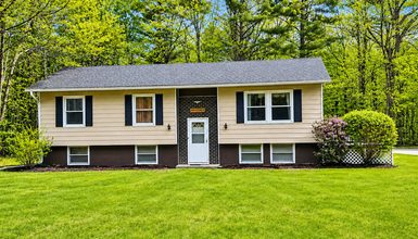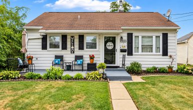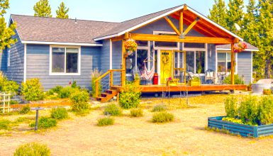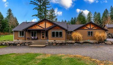
What makes a Mid-Century Modern Ranch feel fresh decades after the style first became popular? The answer is simple: clean lines, warm wood, wide windows, and an easy link to the outdoors. This home brings those classic ideas into the present with bright rooms, open living spaces, modern finishes, and a calm neutral palette.
1. A Long, Low Exterior Sets the Mid-Century Tone
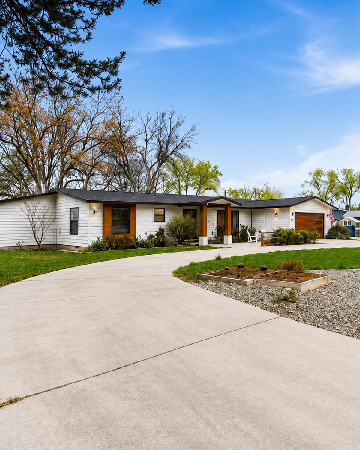
The first clue appears before you even reach the front door.
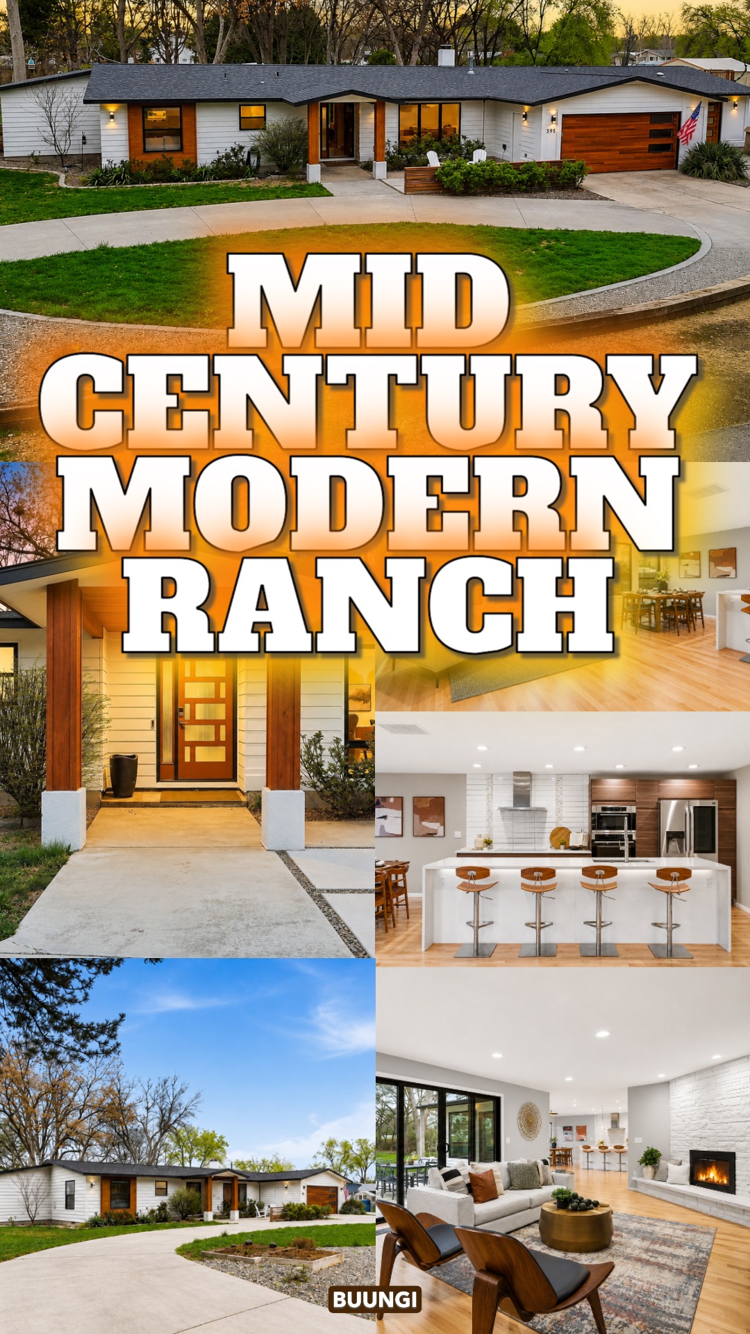
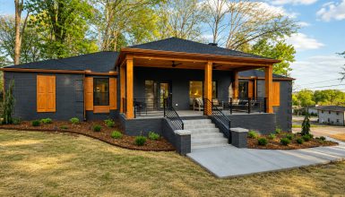
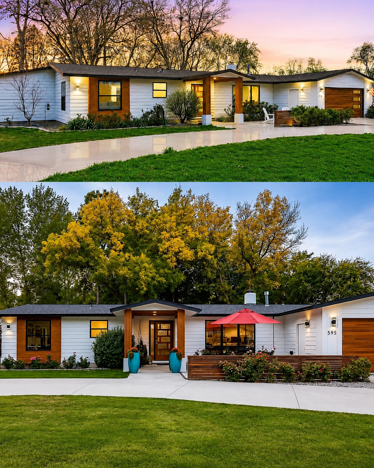
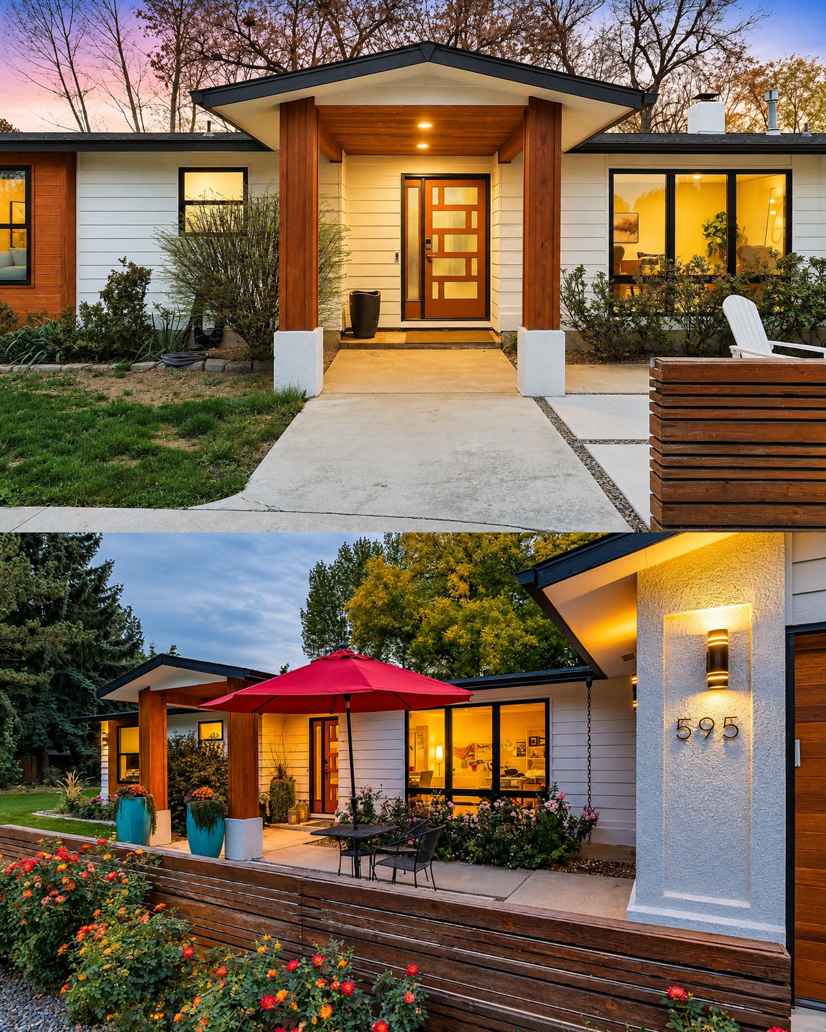
This home has a long horizontal shape. That low profile is one of the strongest traits of ranch design. Rather than reaching up with steep roofs and tall walls, the house seems to hug the land.
The roof helps a lot. Its shallow pitch keeps the silhouette simple. Wide roof sections move across the house in long lines. Dark roofing also gives the pale exterior a neat frame.
White horizontal siding updates the look. At the same time, it does not hide the home’s ranch roots. In fact, the siding adds even more horizontal movement.
That matters.
Mid-century homes often used long lines to make buildings feel calm and connected to the site. Here, the siding, roof, driveway, low retaining walls, and broad lawn all move in the same general direction.
The attached garage also blends into the main structure. It does not feel like a large box added to the side. Its low roof and matching siding help it stay part of the full design.
Design cues:
- Long, one-story footprint
- Low roofline
- Shallow roof pitch
- Wide horizontal siding
- Attached garage
- Simple exterior shape
- Strong horizontal lines
- Minimal trim
- Broad connection to the yard
2. Warm Wood Keeps the White Exterior from Feeling Cold
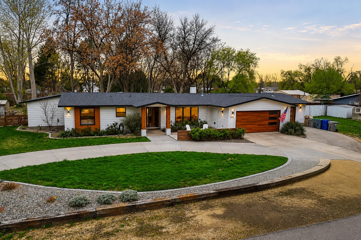
A white ranch can look flat if every surface uses the same finish.
This home avoids that problem with wood.
Warm wood appears around the front windows, near the entry, and across the garage door. These accents break up the white siding and bring a rich natural tone to the facade.
The contrast works because it stays simple.
There are no heavy shutters or fancy trim boards. Instead, the wood acts almost like blocks of color. One section frames a window. Another marks the garage. Vertical wood near the entry draws attention to the front door.
This mix feels very true to mid-century style. Designers of that era often paired simple modern shapes with natural materials. Wood softened glass, masonry, steel, and plain wall surfaces.
The same idea works here.
Black trim adds one more layer. It outlines the windows, roof edges, and exterior lights. As a result, the house gains depth without needing many colors.
The palette is easy to read: white, black, warm brown, gray, and green from the landscape.
That is all it needs.
Design cues:
- White exterior walls
- Warm wood accent panels
- Wood garage door
- Black window frames
- Dark roof edges
- Limited color palette
- Natural finishes used as focal points
- Clean contrast instead of ornate detail
3. The Entry Feels Open, Graphic, and Light
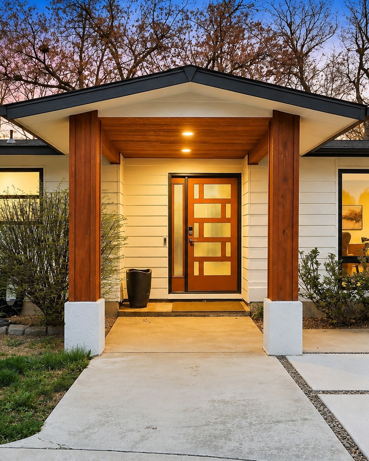
The front entry gives the first real hint of what waits inside.
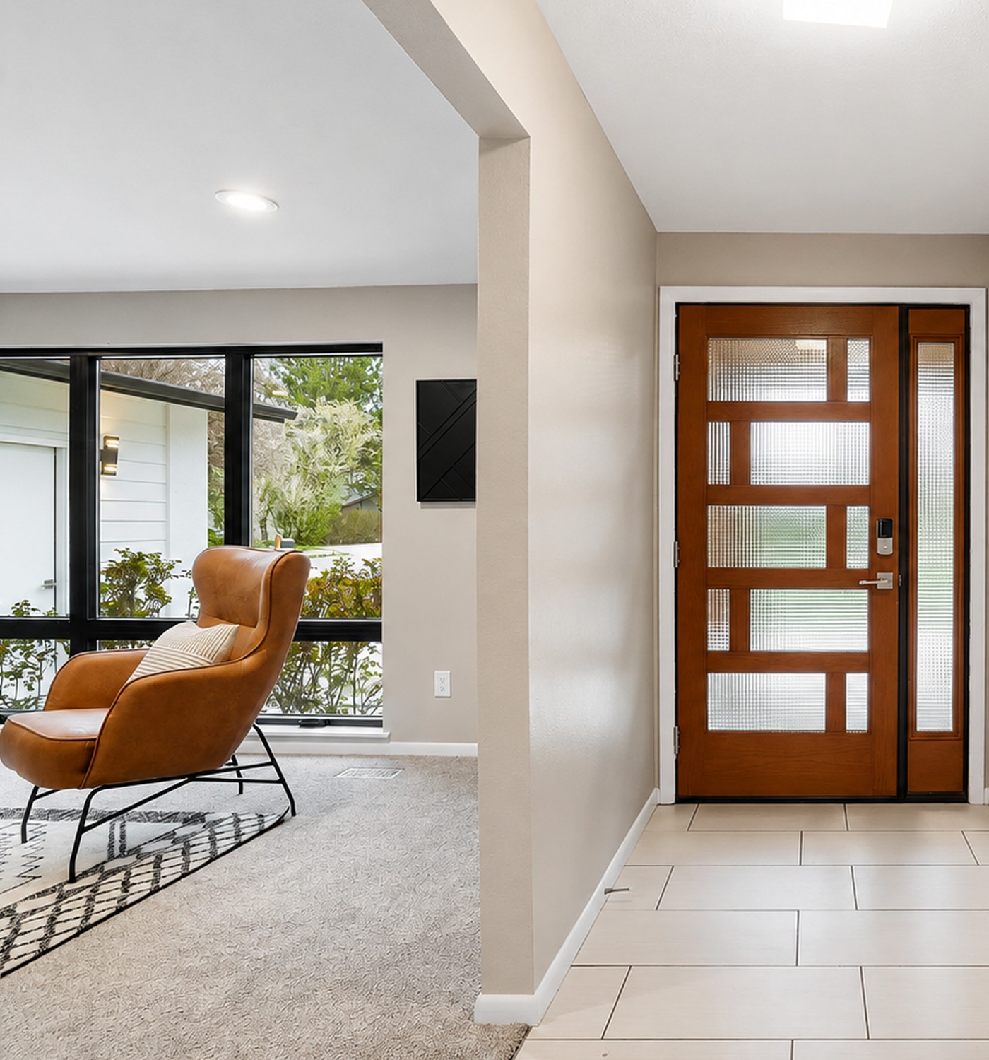
The wood front door has a strong geometric pattern. Frosted glass panels break the door into simple blocks. A narrow glass sidelight makes the entry brighter.
This detail feels especially fitting for a mid-century modern ranch.
The door becomes art without needing extra decor.
Inside, pale floor tile creates a clean path through the entry. Soft gray walls and white trim keep the space quiet. Just off the hall, a sitting area opens toward a large black-framed window.
That window is key.
It turns the front garden into part of the room. The view adds life, color, and movement. It also gives the small seating area a much larger feel.
A caramel-colored lounge chair brings in the same warm brown tone seen on the exterior.
That link is subtle, but it helps the house feel whole.
Design cues:
- Geometric wood front door
- Frosted glass panels
- Narrow sidelight
- Pale tile flooring
- Soft neutral walls
- Black-framed windows
- Simple trim
- Warm leather accent furniture
- Clear sight lines
4. Black-Framed Windows Give the Ranch a Modern Edge
Windows may be the strongest feature in this home.
Many rooms have large black-framed windows. Some sit in groups. Others stretch almost from the floor toward the ceiling.
The black outlines make each window look sharp and graphic.
Yet the main purpose goes far beyond style.
These windows bring the outdoors close.
From the living room, dining space, bedroom, and sitting areas, you can see mature trees, lawn, shrubs, and patios. The home rarely feels cut off from the yard.
That indoor-outdoor bond is one of the most important ideas in mid-century residential design.
Older ranch homes often featured broad windows because the single-story form made it easy to connect rooms directly with the landscape. This renovation builds on that strength.
The windows also help the neutral interior feel lively.
When walls, ceilings, and sofas stay pale, the outdoor view becomes a kind of moving artwork.
Design cues:
- Large picture windows
- Black frames
- Grouped windows
- Wide outdoor views
- Minimal window trim
- Strong indoor-outdoor link
- High levels of natural light
- Green landscape used as part of the decor
5. The Main Living Room Mixes Old Texture with New Simplicity
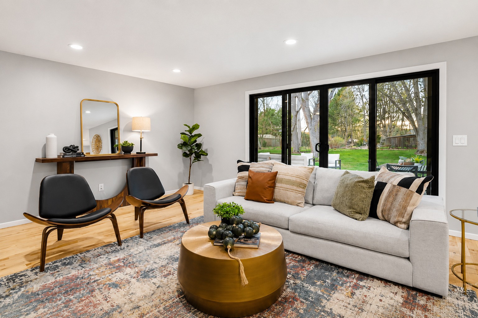
The living room has a clean, open feel, but it is not cold.
A long stone fireplace wall gives the space texture and weight. The stone appears to have been painted white, which helps it fit the updated palette.
This is a smart choice in a remodel.
Instead of tearing out an older feature, the design gives it a fresh role.
The fireplace still acts as the room’s main anchor. However, the white finish makes it lighter and less rustic.
The furniture follows the same idea.
A pale sofa keeps the room bright. Wood lounge chairs bring sculptural mid-century curves. A round coffee table softens all the straight lines.
Then there is the rug.
Its muted colors add pattern without stealing attention from the fireplace or windows.
Large sliding glass doors sit beside the seating area. When you look through them, the patio feels like another room.
That easy flow is a huge part of the design.
Design cues:
- Long masonry fireplace wall
- White-painted stone
- Simple black firebox
- Low furniture
- Sculptural wood lounge chairs
- Neutral sofa
- Round coffee table
- Large area rug
- Sliding glass doors
- Open view toward kitchen
6. An Open Floor Plan Makes the House Feel Much Larger
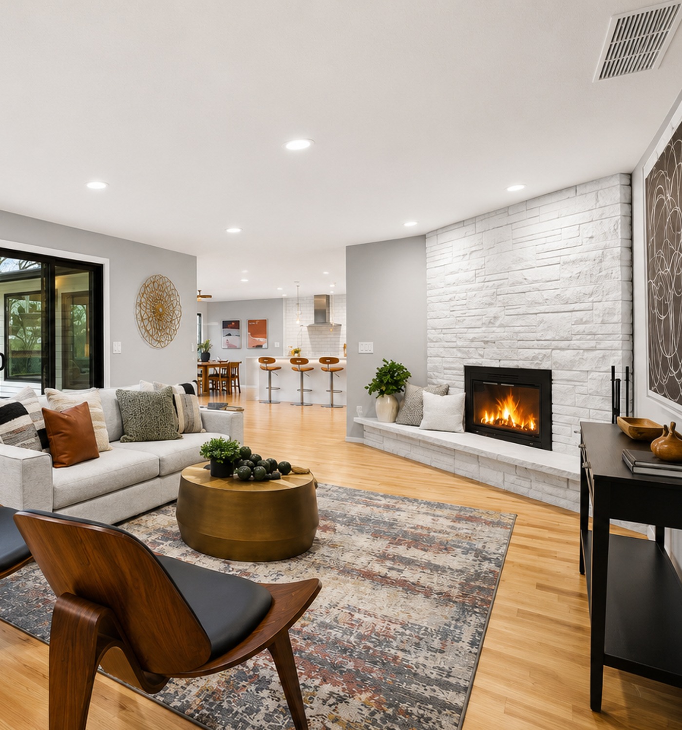
Ranch homes can sometimes feel long and broken into many small rooms.
This one does the opposite.
The main living spaces flow together with few visual breaks. The living room opens toward the kitchen. The kitchen connects with the dining area. A second sitting zone also shares the open space.
As a result, light can move across a large part of the home.
The flooring helps too.
Light natural wood runs through the main spaces. Because the material stays consistent, your eye reads several zones as one large room.
Furniture creates the boundaries instead of walls.
A sofa marks one sitting area. A dining table creates another. The long kitchen island becomes the center of the cooking zone.
This feels casual and easy.
People can cook, eat, talk, or relax while still sharing the same space.
That social quality suits the ranch style very well.
Design cues:
- Open kitchen
- Connected living areas
- Shared wood flooring
- Few interior barriers
- Wide walkways
- Furniture-defined zones
- Clear sight lines
- Simple circulation
7. Walnut-Tone Cabinets Bring Mid-Century Warmth to the Kitchen
The kitchen may be the clearest mid-century-inspired room in the house.
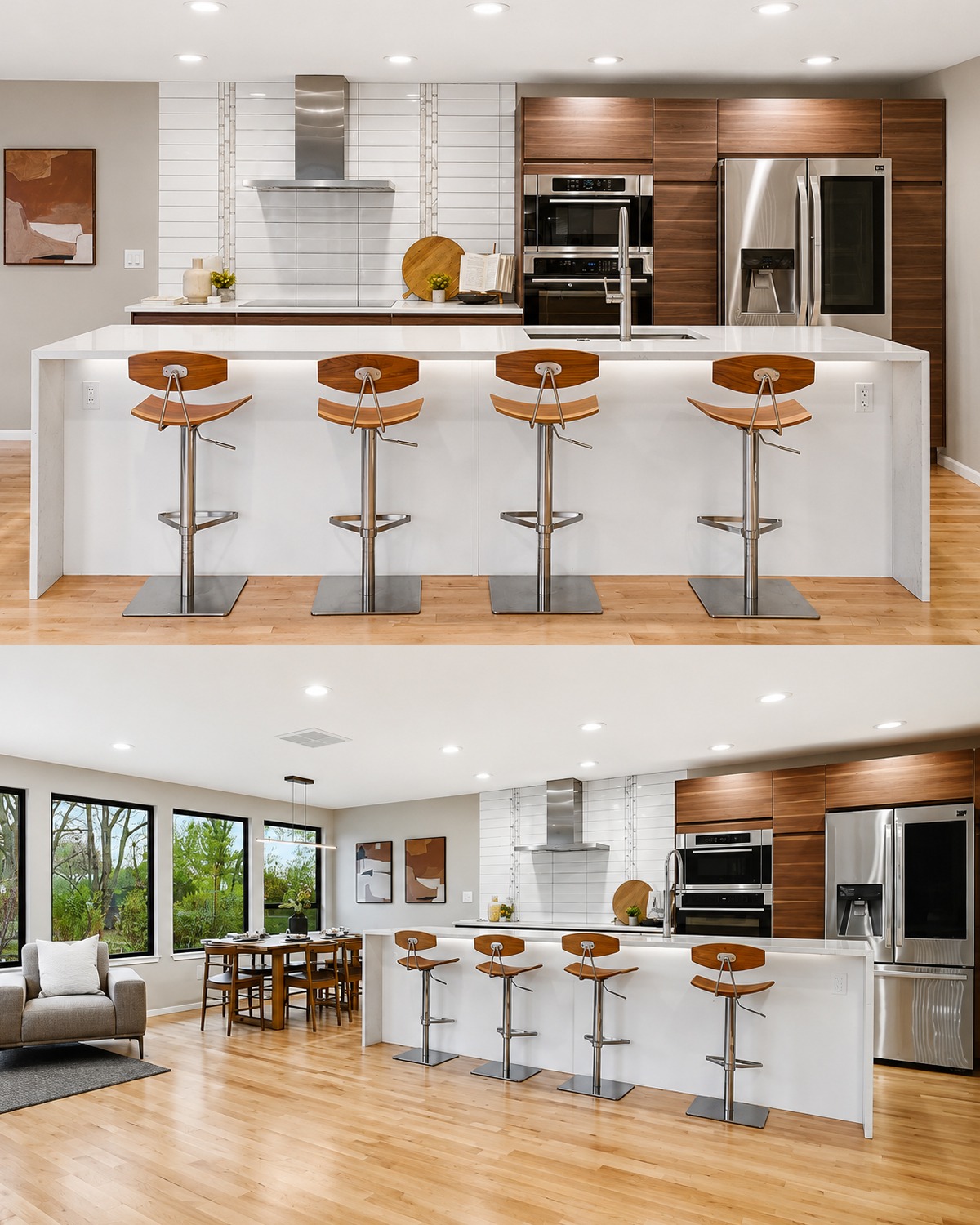
Flat-front wood cabinets create a warm, smooth wall behind the island. Their rich brown grain stands out against white tile and pale counters.
There is very little decoration on the cabinet fronts.
That clean face is important.
Mid-century kitchens often favored simple slab-style cabinets because they matched the era’s love of clean shapes and useful design.
The wood also gives the room a natural focus.
Without it, the white tile, white island, stainless appliances, and pale walls could feel too cool. Instead, the wood adds depth.
Stainless steel appliances bring in a current touch. They also work well with the simple style.
A full wall of white rectangular tile sits behind the cooking zone. Thin vertical accent strips break up the wide tile field. That small detail adds rhythm without making the wall busy.
Design cues:
- Flat-front wood cabinetry
- Walnut-like finish
- Minimal hardware
- White tile backsplash
- Stainless steel appliances
- Simple range hood
- Clean cabinet layout
- Mixed warm and cool finishes
8. The Oversized Island Turns the Kitchen Into a Social Space
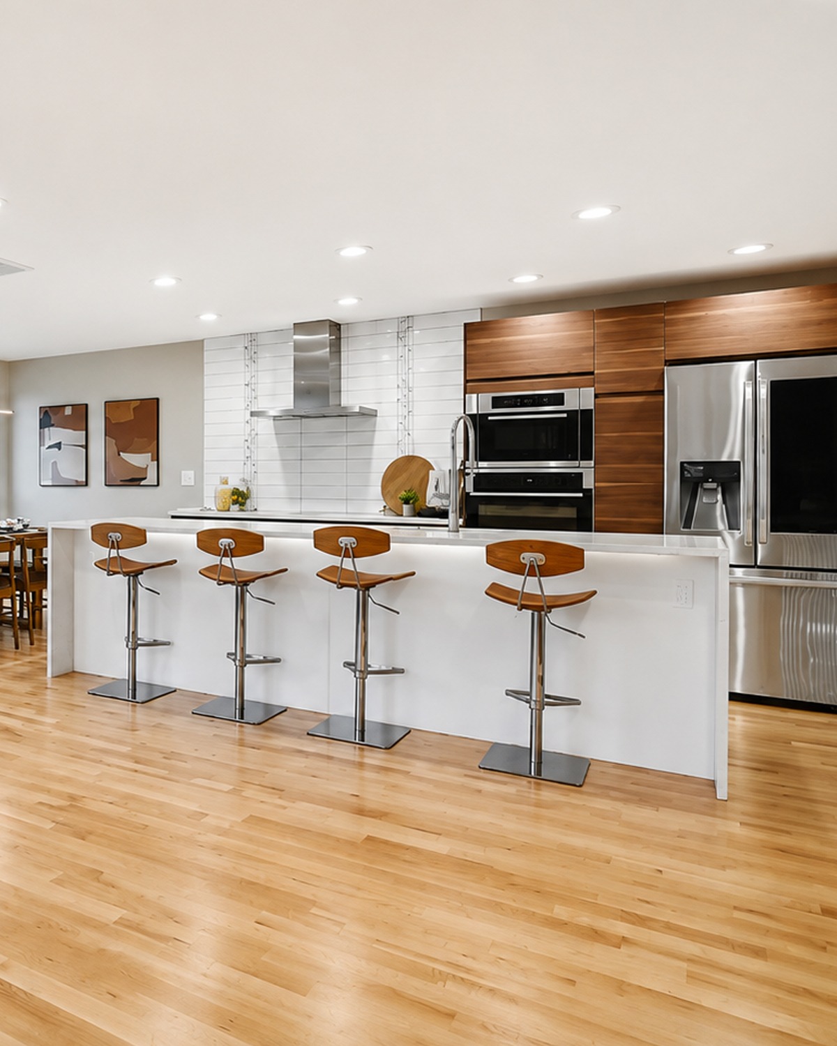
A large white island stretches across the front of the kitchen.
It is not just a prep surface.
It works as a bar, serving area, gathering spot, and visual divider.
Four stools sit along the outer edge. Their curved wood seats repeat the tone of the cabinets behind them.
That small match makes the kitchen look planned rather than pieced together.
The island itself stays very simple. Its pale surface forms one long clean line. There are no fussy panels or heavy corbels.
Again, the design relies on shape.
The island also helps the open floor plan make sense. Without it, the kitchen might blend too much into the living area. The island gives the room a clear boundary without adding a wall.
Design cues:
- Long waterfall-style island
- Seating for several people
- White countertop
- Wood-accent stools
- Integrated sink
- Simple island face
- Open view to nearby rooms
- Multi-use layout
9. The Dining Room Puts the Backyard on Display
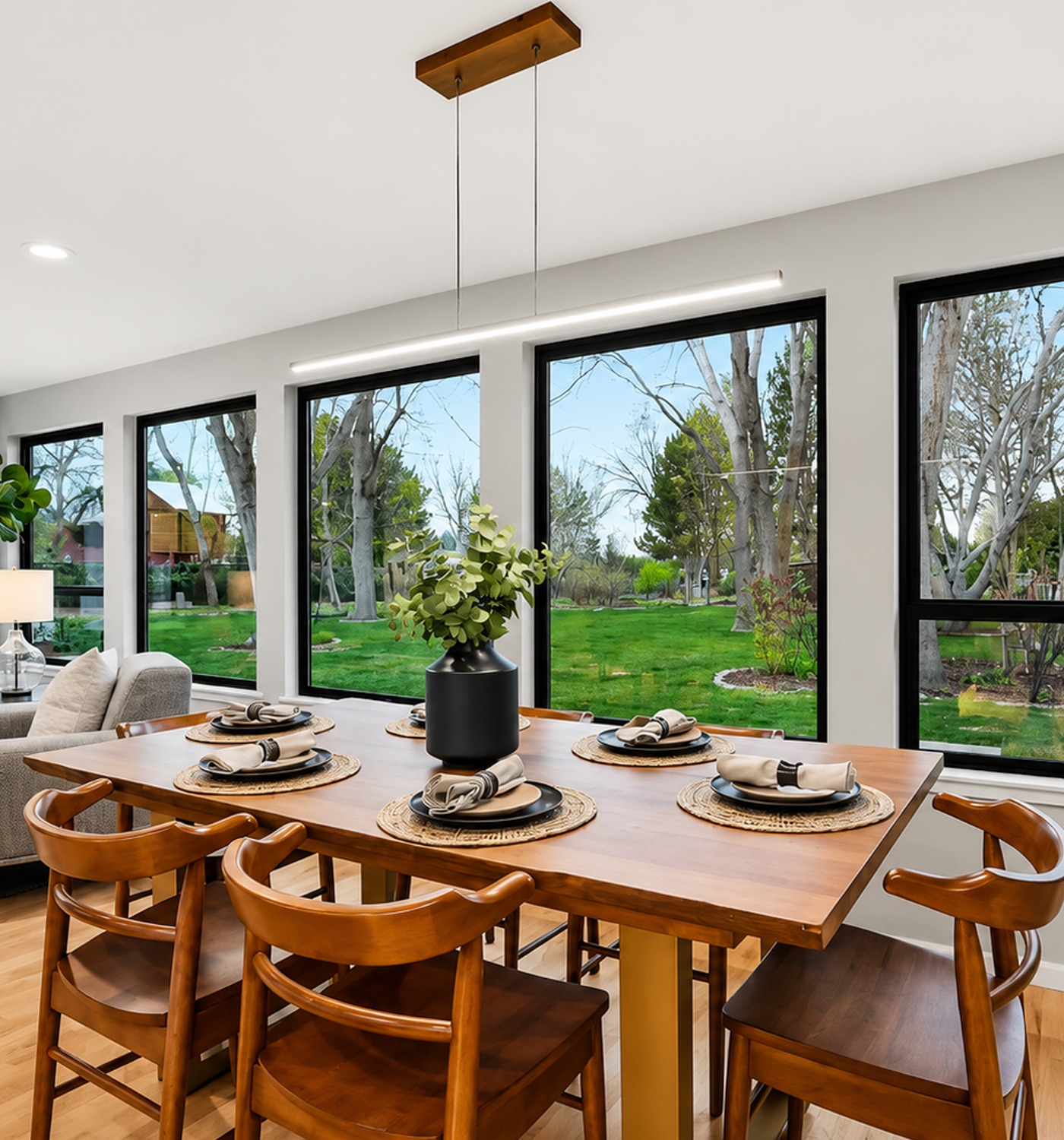
The dining area feels more like a garden room than a formal dining room.
A wall of large black-framed windows looks directly into the yard.
This creates a strong sense of place.
The dining table itself uses warm wood, which echoes the kitchen cabinets and exterior accents. Curved wooden chairs add another mid-century note.
A narrow linear pendant hangs overhead.
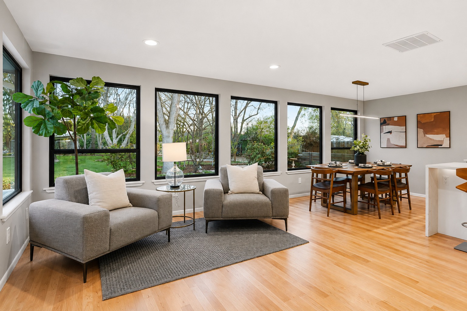
It is modern, but quiet.
That is an important theme throughout the home. The lighting does not fight for attention. Instead, fixtures support the architecture.
The dining area also sits close to the kitchen, so serving meals stays simple.
Yet the windows make the space feel special enough for long dinners and gatherings.
Design cues:
- Wall of large windows
- Backyard views
- Warm wood dining table
- Curved wood chairs
- Slim linear pendant
- Open kitchen connection
- Minimal wall decor
- Natural light as a focal point
10. A Second Sitting Area Adds Flexibility
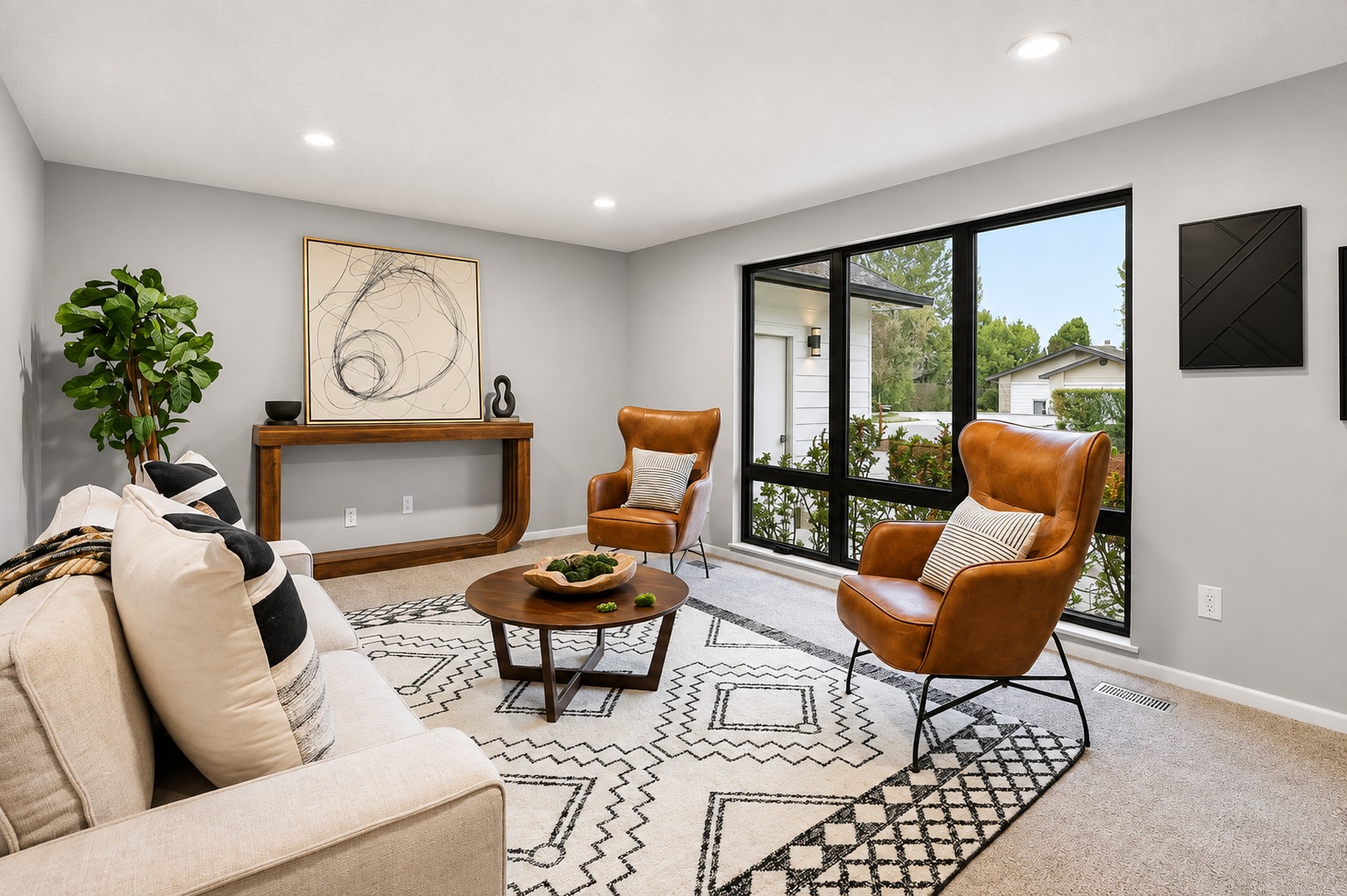
One of the smartest parts of the plan is the extra sitting room.
This area does not need a television or fireplace to work. Instead, it centers on conversation and the view outside.
Two caramel leather chairs face a pale sofa. A round wood coffee table sits between them.
The layout is balanced and easy.
A black-and-white patterned rug gives the room more energy. Simple abstract art keeps the walls modern.
Most of all, the large window makes this room feel connected to the front garden.
A space like this could work in many ways.
It could be a reading room, quiet lounge, music room, or casual place for guests.
That flexibility fits the ranch lifestyle well.
Design cues:
- Conversation-based layout
- Leather accent chairs
- Pale sofa
- Round coffee table
- Graphic rug
- Simple abstract artwork
- Large front-facing window
- Flexible use
11. The Main Bedroom Feels Calm Instead of Overdone
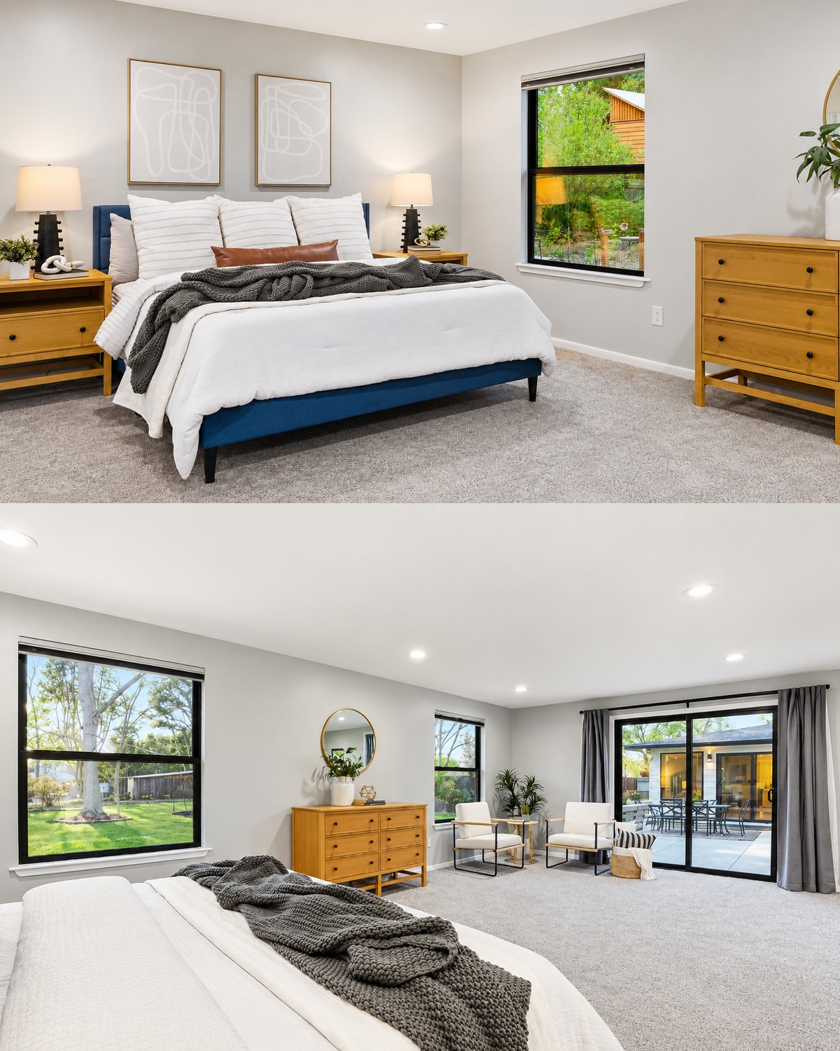
The main bedroom follows the same simple palette as the public rooms.
Soft gray walls create a quiet backdrop. Gray carpet makes the space feel softer underfoot.
A deep blue bed adds one strong note of color.
Then white bedding keeps the room fresh.
Wood nightstands and a matching dresser add warmth. Their simple shapes work with the rest of the home’s mid-century influence.
Nothing feels crowded.
There is open floor space around the furniture. Art stays light and simple. Black window frames add enough contrast on their own.
The bedroom also has direct access to the patio through large glass doors.
That feature changes the mood of the room.
Instead of feeling like a closed box, the bedroom becomes part of the garden.
Design cues:
- Soft gray walls
- Neutral carpet
- Deep blue upholstered bed
- White bedding
- Warm wood case goods
- Minimal artwork
- Black-framed windows
- Glass patio doors
- Small sitting area
- Uncluttered layout
12. The Bathrooms Use Mid-Century Ideas in a Fresh Way
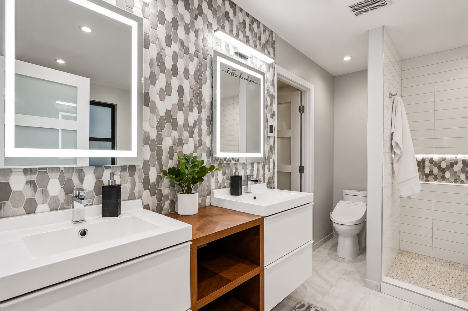
The bathrooms feel modern, but they still share the home’s warm, simple look.
One bath uses two white floating-style vanities with a wood cabinet between them. The mix is especially effective.
The white units feel crisp and modern. The center wood section adds warmth and makes the whole wall feel less clinical.
Geometric wall tile creates the strongest pattern in the room.
The shape feels playful, which fits the mid-century theme. Still, the soft gray, white, and beige tones keep it easy to live with.
Large lighted mirrors add a current touch.
The shower stays bright with simple white tile.
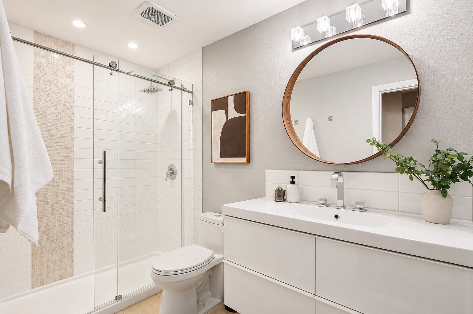
Another bathroom follows an even quieter plan. A long white vanity sits below a large round mirror with a wood frame. A glass shower enclosure makes the room seem larger.
These bathrooms prove that a mid-century look does not require orange tile or vintage fixtures.
You can use the ideas behind the style instead.
Think simple forms, warm wood, strong shapes, clean lines, and useful layouts.
Design cues:
- Floating-style vanities
- White cabinetry
- Natural wood details
- Geometric tile
- Large mirrors
- Round mirror shapes
- Simple chrome fixtures
- Glass shower enclosures
- White wall tile
- Minimal visual clutter
13. The Freestanding Tub Adds a Soft Sculptural Shape
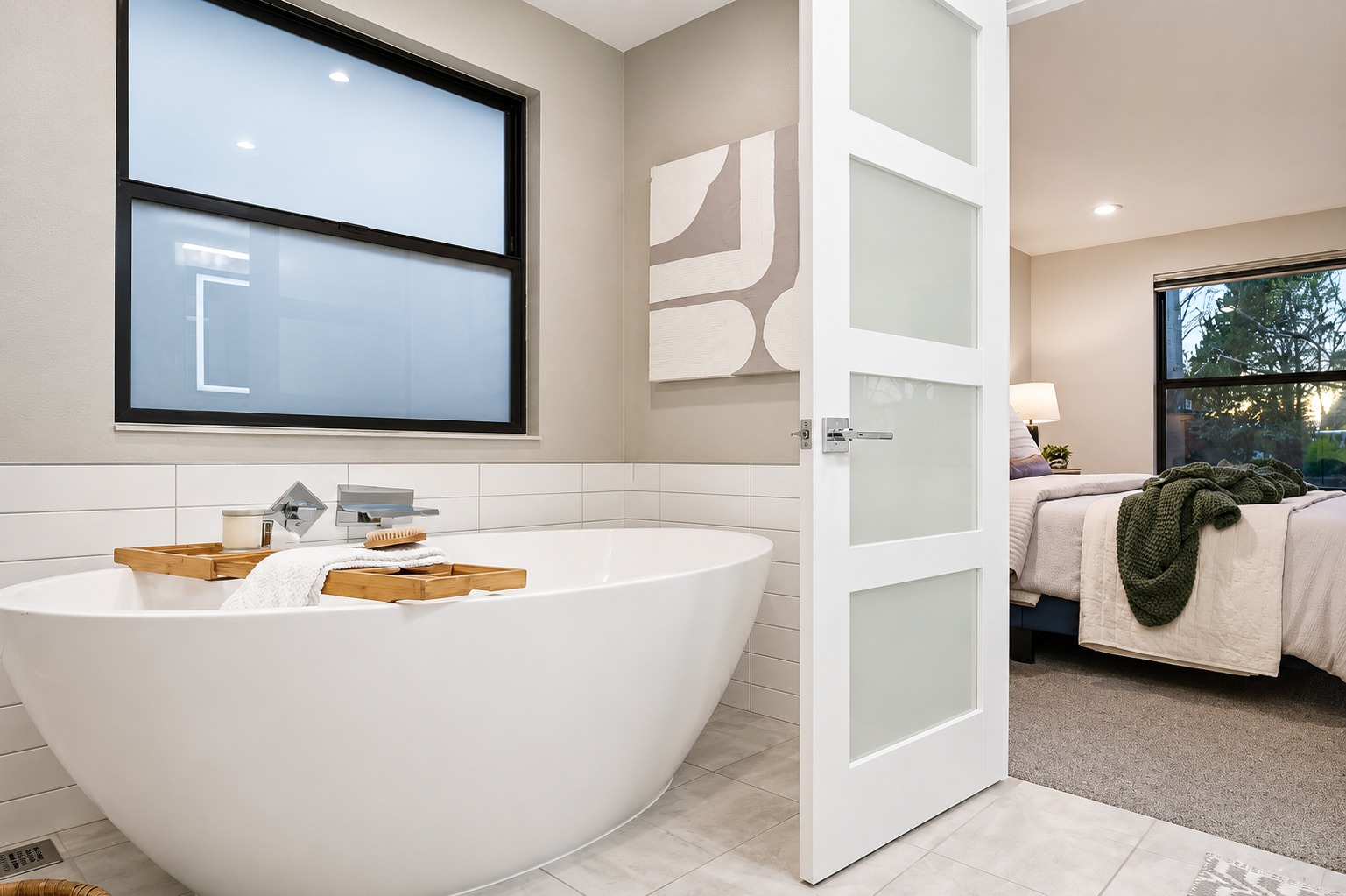
One of the most striking bathroom details is the white freestanding tub.
Its curved form stands out against the straight tile lines and boxy room shape.
That contrast matters.
Mid-century interiors often mixed strong geometric lines with softer organic shapes. Here, the tub fills that role.
A large frosted window sits above it. The window brings in light while keeping the bath private.
The simple white wall tile does not compete with the tub.
Even the wood bath tray adds to the warm material story seen throughout the house.
Design cues:
- Sculptural freestanding tub
- Curved organic form
- Frosted window
- White tile
- Minimal hardware
- Warm wood accessory
- Soft neutral palette
- Clean surrounding surfaces
14. The Backyard Continues the Indoor-Outdoor Story
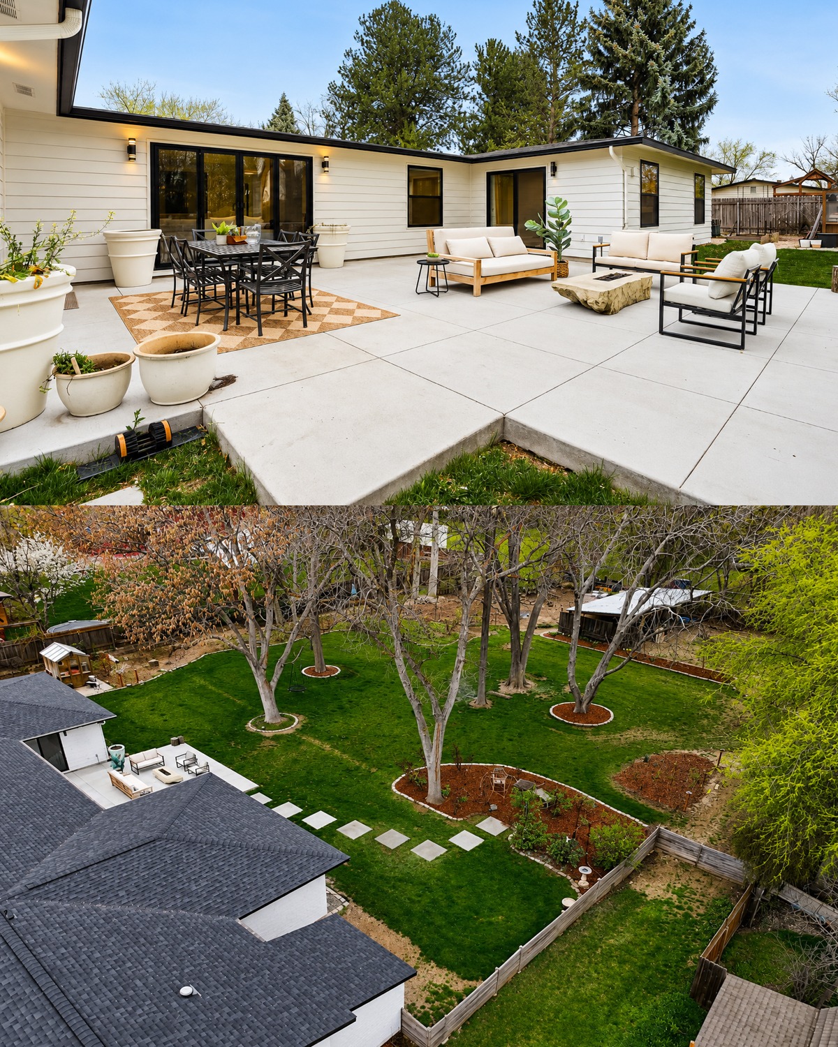
The back of the home may be just as important as the front.
A broad concrete patio creates a true outdoor living room.
There is room for dining, lounging, and gathering around a low fire feature. Sofas and chairs sit in small groups rather than one large set.
This makes the patio feel relaxed.
Large glass doors connect the patio to several interior rooms. So moving from inside to outside feels natural.
Beyond the concrete is a wide lawn with mature trees.
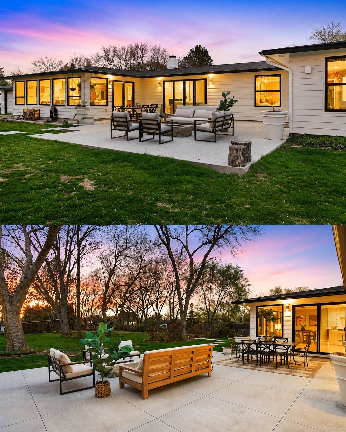
Those trees give the property a settled feel that new landscaping cannot copy.
Simple stepping stones cross the grass. Mulched beds curve around trunks and garden zones. A few planted areas add structure while much of the yard stays open.
This balance feels right for the house.
The yard does not try to become a formal garden. It remains casual, green, and useful.
Design cues:
- Large concrete patio
- Outdoor dining area
- Outdoor lounge furniture
- Fire feature
- Large sliding doors
- Mature shade trees
- Open lawn
- Simple garden beds
- Stepping-stone paths
- Strong indoor-outdoor flow
15. Simple Landscaping Supports the Architecture
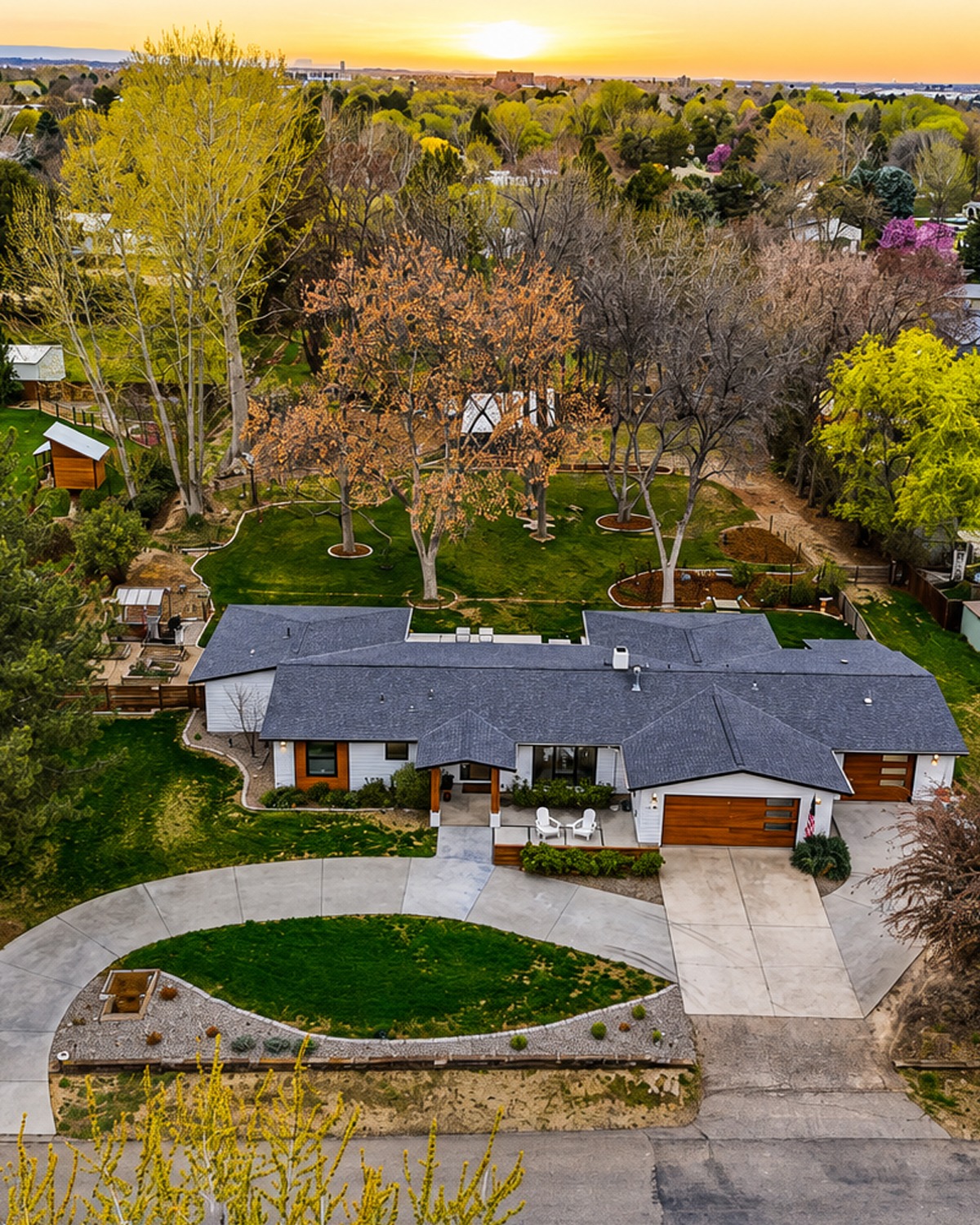
The front yard follows the same rule as the interior: keep it simple, but not empty.
A curved driveway sweeps toward the garage and front door.
The curve softens the house’s long straight shape.
Low planting beds sit near the foundation. Gravel and rock reduce the amount of lawn while adding texture.
Wood retaining edges bring another natural material into the landscape.
Nothing grows tall enough to hide the house.
That point matters.
A low ranch usually looks best when landscaping supports its horizontal shape. Huge shrubs can block windows and make the facade seem smaller.
Here, open lawn and low plants allow the architecture to remain clear.
Design cues:
- Curved driveway
- Open lawn
- Low foundation plants
- Gravel beds
- Wood landscape edging
- Simple garden shapes
- Minimal visual clutter
- Mature trees as the main vertical feature
16. The Color Palette Holds Every Room Together
One reason this remodel feels so calm is its limited color palette.
The same shades appear again and again.
White brightens walls, tile, counters, and exterior siding.
Soft gray creates a quiet background.
Black adds thin lines around windows, furniture, lighting, and hardware.
Warm wood appears on cabinets, doors, furniture, and exterior panels.
Caramel leather brings in a richer brown.
Green comes mostly from plants and the landscape.
Because the colors repeat, each room feels related to the next.
You can move from exterior to entry, living room, kitchen, bedroom, and bath without a sudden style shift.
That is one of the easiest lessons to take from this home.
You do not need a different color idea for every room.
A small, well-planned palette can make a whole house feel larger and more polished.
Design cues:
- Warm white
- Soft gray
- Matte black
- Natural wood
- Caramel brown
- Small blue accents
- Green plants
- Repeated finishes
17. Modern Lighting Stays Quiet and Useful
Lighting throughout the house is simple.
Recessed ceiling lights provide much of the general light. This keeps ceilings neat and open.
In the dining room, a slim pendant creates a focal point without blocking the view through the windows.
Outside, modern cylindrical sconces add black accents along the pale walls.
Bathroom lighting also follows clear geometric forms.
None of the fixtures are huge or ornate.
That restraint lets the home’s stronger features stand out.
The windows, fireplace, wood cabinets, doors, and furniture get the attention instead.
Design cues:
- Recessed ceiling lights
- Slim pendant lights
- Modern wall sconces
- Simple geometric forms
- Black and metal finishes
- Even room lighting
- Few decorative fixtures
- Lighting that supports architecture
Conclusion
This Mid-Century Modern Ranch shows how well classic ranch design can work for modern life. Its low roofline, natural wood, black-framed windows, open layout, and large outdoor spaces create a home that feels warm and relaxed. Best of all, the renovation keeps the ranch character intact while giving every room a cleaner and more current look.