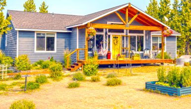
Can a simple one-story ranch feel bold, warm, and fresh at the same time?
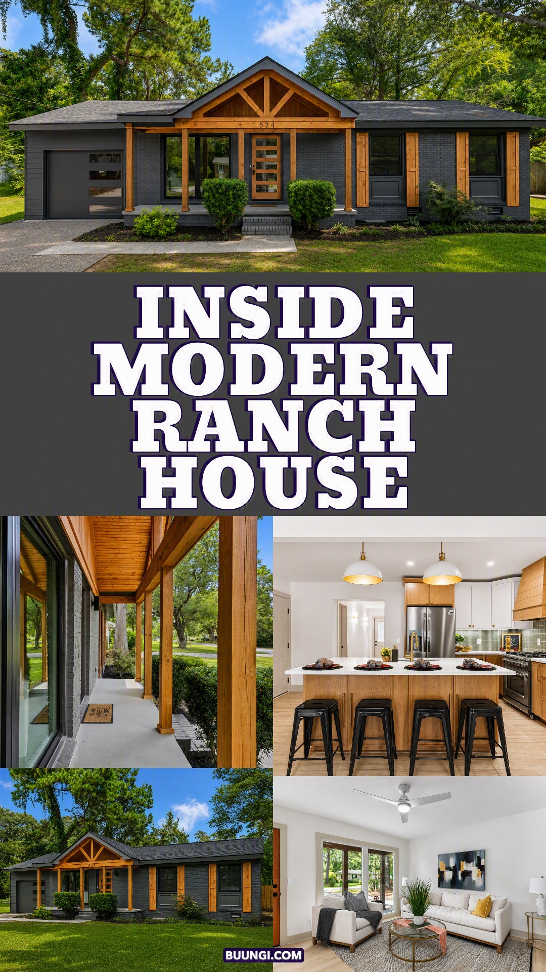
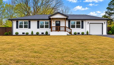
This home proves it can. From the street, dark brick gives the low ranch shape a strong new look. Natural wood posts soften the deep color. A peaked porch adds height and draws the eye to the front door. Then, inside, pale wood floors, clean white walls, and warm oak cabinets create a bright and easy mood.
The whole house feels modern, but it does not feel cold. It also keeps the honest shape and simple flow that make ranch homes so loved. Every update supports the home’s original form instead of trying to hide it.
That balance is the real design lesson here.
A Classic Ranch Shape Gets a Modern Identity
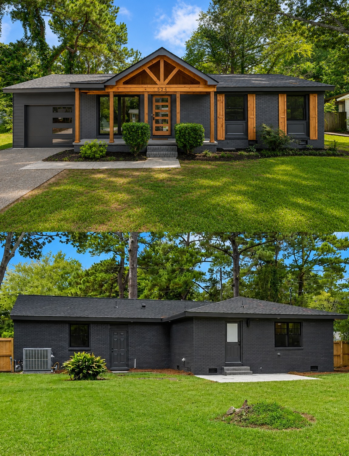
The house starts with a familiar ranch form. It has one main level, a long front wall, and a low roof. The attached garage also fits the classic suburban ranch plan.
Yet the exterior now feels far more custom.
Dark charcoal paint covers the brick and siding. This single color makes the mixed materials look calm and tied together. It also helps the house appear longer and lower. That effect suits ranch design because the style has always focused on wide, grounded forms.
The new porch changes the front view in a smart way. Its peaked roof breaks up the long roofline. It also marks the entry from a distance. Without it, the door might blend into the dark wall. With it, the front door becomes the clear center of the house.
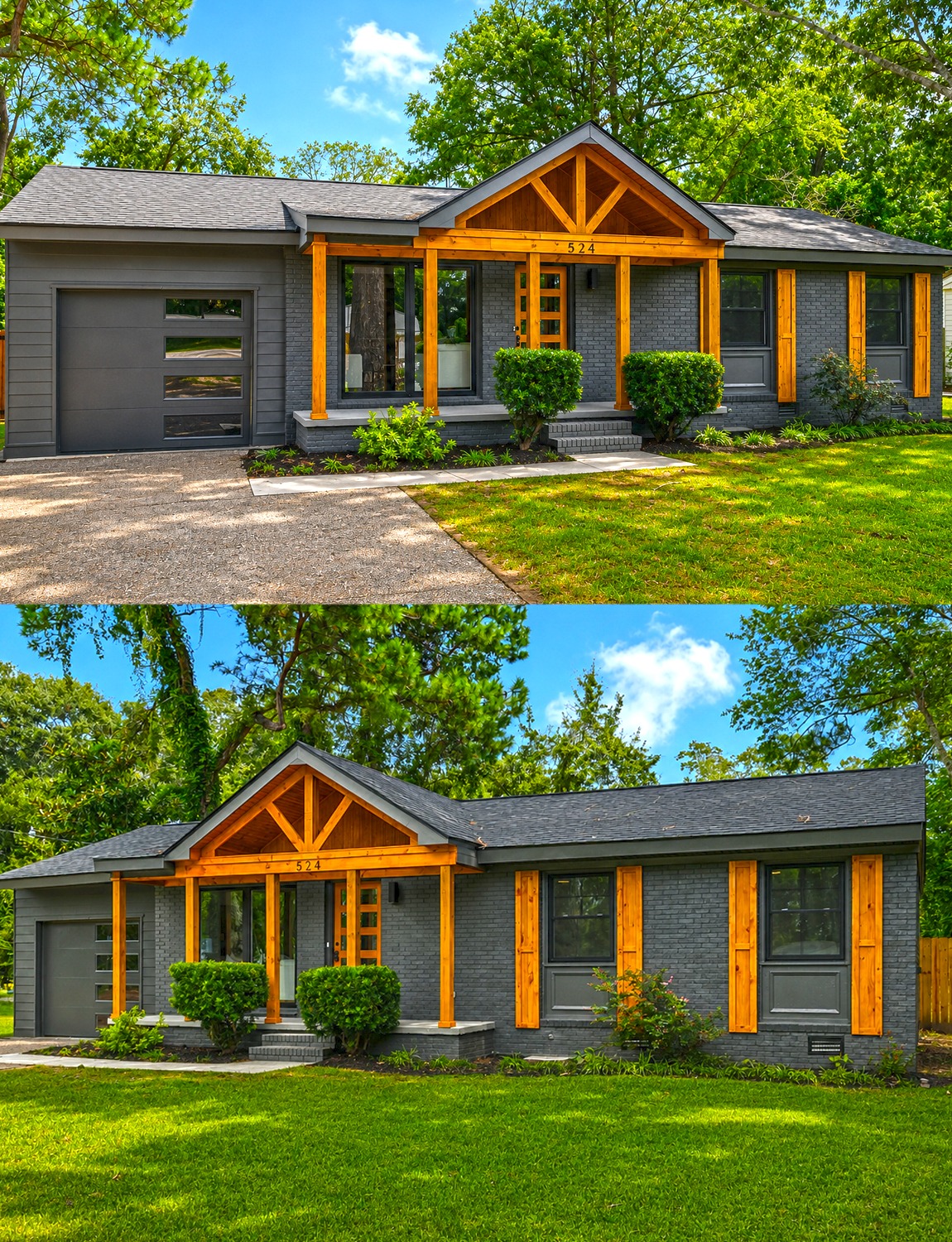
Natural wood adds the next layer. Square posts frame the porch. Wood braces fill the gable. Matching shutters sit beside the front windows. These warm pieces stand out against the black brick without looking too sharp.
The result feels rustic, modern, and welcoming.
Exterior Design Cues
- Long and low one-story ranch shape
- Simple rooflines with modest pitches
- Attached single-car garage
- Dark painted brick and siding
- Natural wood porch posts
- Open timber detail in the front gable
- Wood shutters used as warm accents
- Black window frames and exterior doors
- Simple foundation plantings
- A wide lawn with mature shade trees
A Small Porch With Strong Curb Appeal
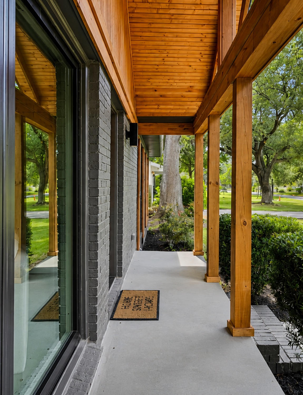
The front porch does not need a large floor area to make a big impact. Its power comes from shape, material, and placement.
Four wood posts create a clear frame. Their straight lines suit the simple house. Above them, exposed beams add weight and craft. A wood-plank ceiling brings warmth overhead. Meanwhile, the centered gable points right toward the front door.
This creates a visual path. Your eye moves from the lawn to the steps, then up the posts, and finally to the entry.
The porch also adds useful shade. It protects the door and the large front window from direct sun and rain. Just as important, it creates a soft gap between the public yard and the private living room.
The concrete floor keeps the porch simple. Dark brick steps connect it to the house. Trimmed shrubs add a green screen near the glass, yet they do not block the view.
Nothing feels fussy. Every detail has a job.
Porch Design Cues
- Small footprint with a clear purpose
- Peaked roof placed over the main entry
- Exposed wood beams and braces
- Warm tongue-and-groove ceiling
- Square posts with simple bases
- Concrete porch floor
- Short brick steps
- Low shrubs along the porch edge
- Wide window beside the front door
- Strong contrast between wood and black brick
A Front Door That Connects Indoors and Out
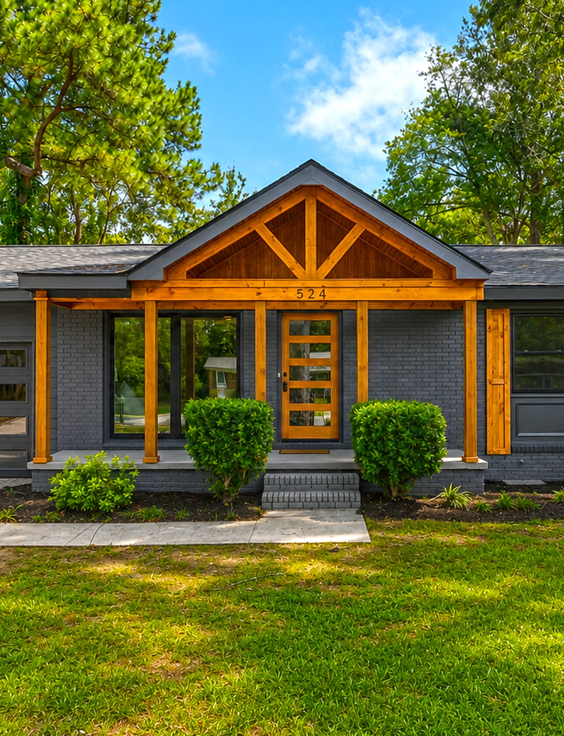
The front door repeats the natural wood used on the porch. This choice ties the whole front elevation together.
Horizontal glass panels run down the door. They give the design a clean, modern look. They also pull daylight into the living room. Because the glass sections are narrow, the door still feels solid and private.
Black hardware creates a sharp finish. It matches the dark window frames, roof, and exterior paint. This small link keeps the entry from feeling like a separate design idea.
The door becomes an accent, but it does not fight with the porch. Both use the same warm wood tone. Together, they form one clear focal point.
This is a useful trick for any ranch update. Repeat one key material in two or three places. The home will feel more planned, even when the changes are simple.
A Bright Living Room Behind a Dark Exterior
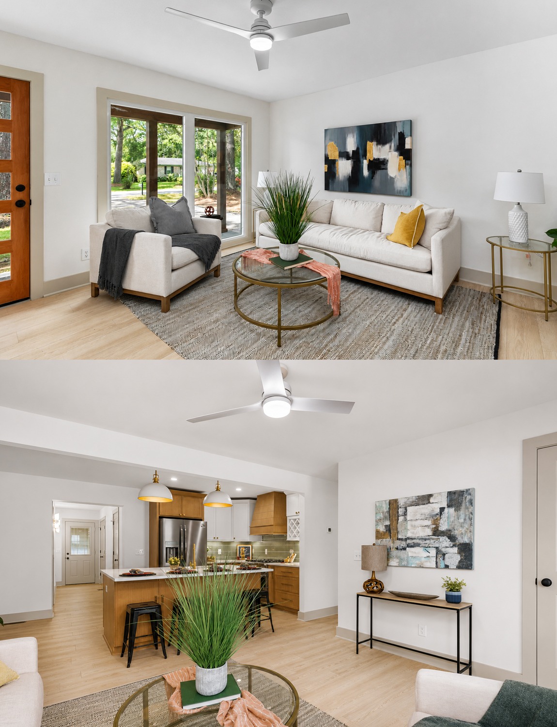
The deep exterior color creates a surprise when you step inside. The living room feels light, open, and calm.
White walls reflect the daylight that pours through the large front window. The pale floor adds more brightness. Soft gray trim gives the doors and windows a neat edge without creating harsh contrast.
This room shows how a light palette can make a compact ranch feel larger. The colors do not stop the eye. Instead, they flow from one surface to the next.
The furniture follows the same idea. A white sofa and chair keep the main pieces quiet. A gray rug defines the seating area. Black, gold, and wood accents then add depth in small amounts.
The room does not rely on many colors. It uses texture instead.
The woven rug has a strong grain. The throw blanket adds a soft layer. The glass coffee table feels light and open. A tall plant adds movement and life. Abstract art brings in black, gray, blue, and small touches of gold.
Each piece has enough space around it. That breathing room matters in a ranch house, where rooms may be modest in size.
Living Room Design Cues
- White walls and ceiling
- Pale wood flooring
- Soft gray trim
- Large front window
- Light neutral sofa and chair
- Textured gray area rug
- Glass and metal coffee table
- Abstract wall art
- Small touches of gold
- Green plants for height and softness
- Simple white ceiling fan
- Open path from the front door to the kitchen
The Open Plan Makes the House Feel Larger
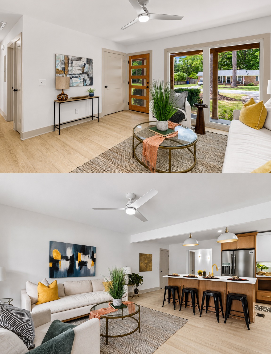
The living room opens straight into the kitchen. A wide ceiling beam marks the change between the two areas, but no wall blocks the view.
This gives the home a larger feel. It also makes daily life easier. People can cook, talk, eat, and relax in one shared zone.
The design still gives each space its own role.
The living room sits on a large rug. This creates a soft border around the seating area. The kitchen island forms another clear edge. Its row of stools faces the living room, so it acts as both a work zone and a social hub.
The ceiling lights also guide the plan. A simple fan serves the living area. Large pendant lights hang over the island. Recessed lights brighten the work surfaces.
These visual clues organize the open room without closing it off.
That is a key part of good open-plan design. A wide room still needs zones. Rugs, lighting, furniture, and ceiling changes can define them with ease.
Open-Plan Cues
- One clear view from the living room to the kitchen
- Wide opening instead of a full wall
- Ceiling beam used as a soft divider
- Area rug that anchors the seating zone
- Long island that anchors the kitchen
- Pendant lights over the island
- Recessed lights over work areas
- Matching floors across both spaces
- Repeated wood and brass finishes
- Clear walking paths around the furniture
A Kitchen Built Around a Large Island
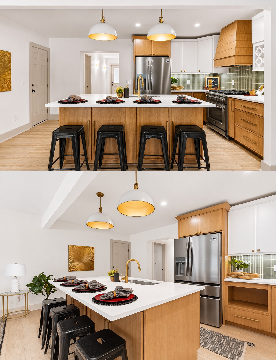
The island is the heart of the kitchen. It gives the room storage, seating, work space, and a place to gather.
Its broad white counter creates a bright surface in the center of the room. A sink sits within the island, so the cook can face the living area instead of a wall. This keeps the kitchen social.
Four black metal stools line the outer side. Their slim shape saves visual space. Their dark finish also connects with the range, refrigerator, window frames, and exterior color.
The island base uses pale oak. This warm wood softens the white walls and counters. It also echoes the porch posts outside. That link helps the interior and exterior feel like parts of the same home.
Storage fills the island base. Cabinets and drawers keep daily items close to the sink and dishwasher. An outlet on the side makes the island more useful for small tools and devices.
Although the kitchen is not huge, the island makes it work like a much larger room.
Kitchen Island Cues
- Large rectangular shape
- Thick white worktop
- Sink placed in the island
- Dishwasher set beside the sink
- Pale oak cabinet fronts
- Long brass hardware
- Four backless black stools
- Wide seating overhang
- Electrical outlet on the side
- Clear space around all sides
Two-Tone Cabinets Add Depth
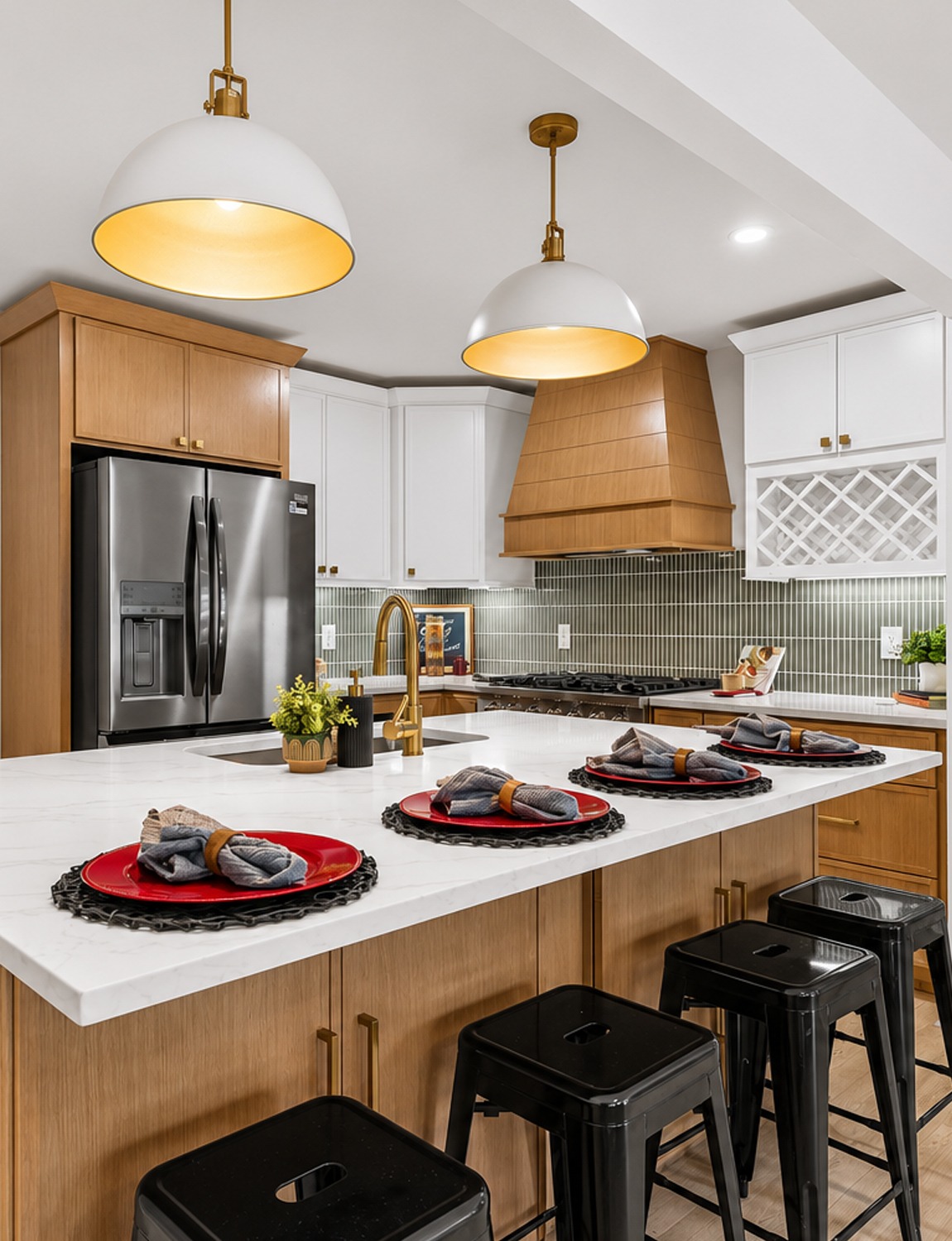
The kitchen mixes white upper cabinets with natural wood lower cabinets. This two-tone plan gives the room depth while keeping it bright.
White cabinets fade into the walls. As a result, the upper part of the kitchen feels open. The oak base cabinets add warmth below eye level. They also ground the stainless steel appliances.
Small brass knobs and long pulls add a refined touch. Their warm tone works well with the oak. Brass also appears on the faucet and pendant lights, which helps the room feel consistent.
The cabinets have simple fronts. Some appear flat, while others have slim framed edges. The style feels clean but not too plain.
A built-in wine rack adds a custom feature near the range. Its white lattice design blends with the upper cabinets. This small detail gives the kitchen charm without adding clutter.
Cabinet Design Cues
- White upper cabinets
- Natural oak lower cabinets
- Simple slab or slim-frame doors
- Brass knobs and bar pulls
- Full-height storage around the appliances
- Built-in wine rack
- Clean cabinet lines
- Minimal crown detail
- Warm and cool finishes used together
- Storage placed close to each work zone
A Wood Range Hood Becomes the Focal Point
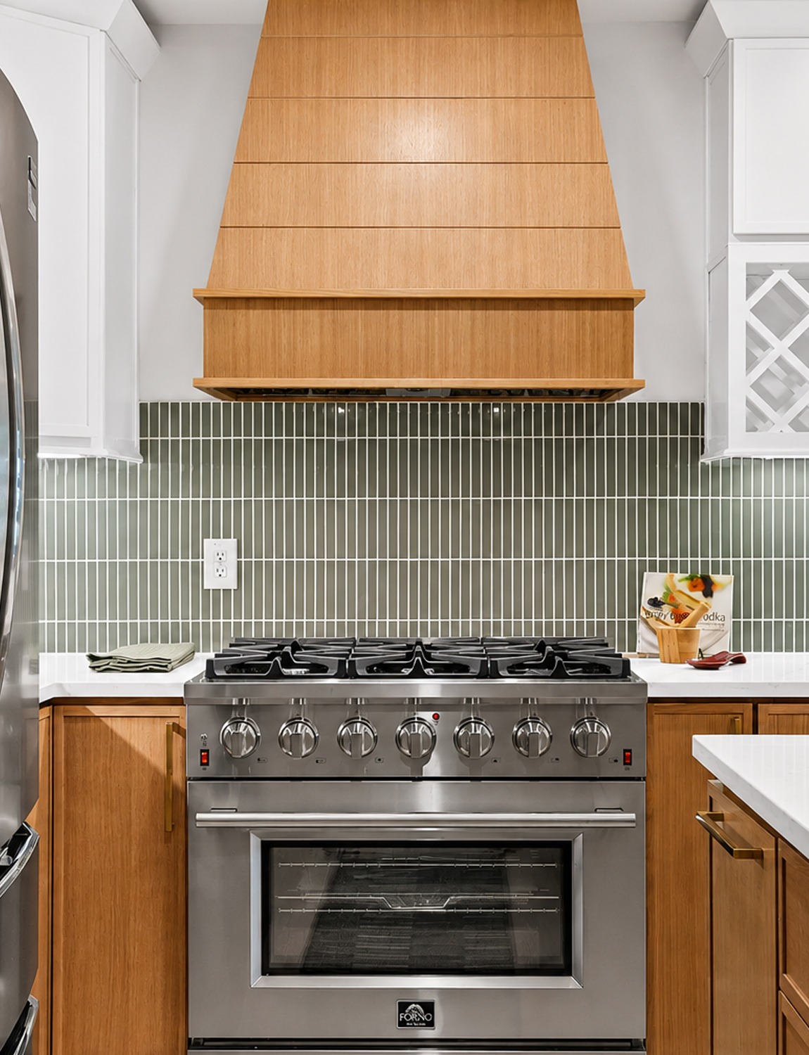
The wood range hood is one of the strongest features in the house.
It rises above the stainless steel range and brings warmth to the cooking wall. Its broad shape feels solid, yet the pale wood keeps it from looking heavy.
Horizontal bands add subtle detail. A small ledge at the base creates a finished edge. Because the hood uses the same wood tone as the lower cabinets, it feels tied to the room.
The hood also balances the large refrigerator on the other side. Without it, the metal appliances might dominate the view. The wood creates a soft center point.
This feature shows how one custom detail can raise the look of a simple kitchen. You do not need carved trim or bold color. A strong shape and a warm material can do the work.
Range Wall Cues
- Oversized stainless steel range
- Custom wood hood
- Horizontal panel detail
- Slim ledge above the cooktop
- Vertical tile backsplash
- White cabinets on both sides
- Built-in wine storage
- Task lights beneath the cabinets
- Clear counter space near the stove
- Balanced mix of wood, white, and metal
Vertical Tile Gives the Backsplash New Energy
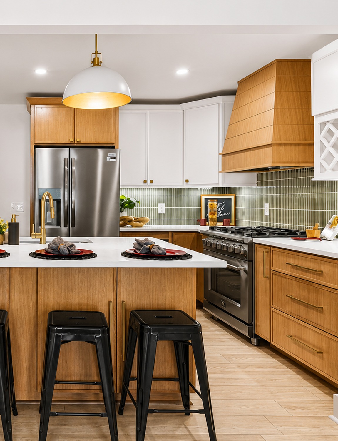
The backsplash uses slim tiles set in a vertical pattern. This small change gives the kitchen a fresh look.
Most tile backsplashes run side to side. Here, the vertical lines pull the eye upward. They make the wall feel taller and add rhythm behind the range and counters.
The muted green-gray tone brings soft color into the room. It works as a middle shade between the warm oak and cool white cabinets. Thin white grout lines keep the tile pattern crisp.
Under-cabinet lighting brings out the tile’s slight shine. This adds depth at night and makes the work area easier to use.
The pattern looks modern, but the soft color keeps it easy to live with.
Pendant Lights Bring Warmth Overhead
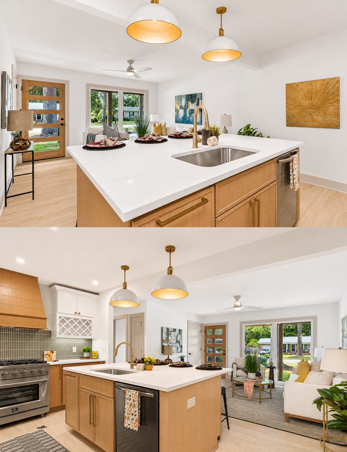
Two large dome pendants hang over the island. Their size gives the open room a clear center.
The outside of each shade looks soft and neutral. Inside, a warm gold finish reflects light down onto the counter. This glow makes the white surface feel less stark.
Brass stems link the lights to the faucet and cabinet hardware. Their rounded shape also softens the kitchen’s many straight lines.
The pendants hang high enough to keep views open. From the living room, you can still see the cabinets and work zone. Yet the lights remain low enough to define the island.
This balance matters. Lights should frame an island, not block the room.
Lighting Cues
- Oversized dome pendants
- Warm metal interior finish
- Brass hanging stems
- Recessed ceiling lights
- Under-cabinet task lighting
- Ceiling fans with built-in lights
- Globe-style bathroom vanity lights
- Light fixtures sized to each zone
- Warm accents within a cool palette
A Calm Bedroom With Simple Layers
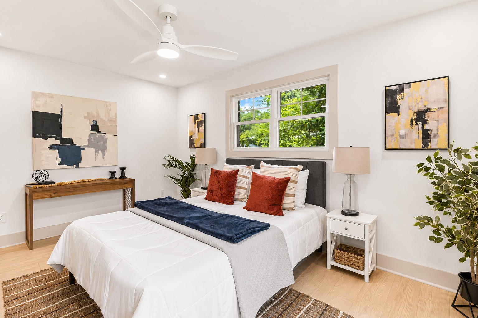
The bedroom carries the same light palette into a more private space.
White walls make the room feel fresh. Pale wood floors continue from the main living area. Soft gray trim frames the windows, doors, and closet.
The bed sits below a wide window. This placement creates a natural focal wall and keeps the rest of the room open. A dark upholstered headboard adds contrast. White bedding keeps the main look crisp.
Rust-colored pillows bring warmth. A navy throw at the foot of the bed adds depth. These colors are rich, but they appear in small amounts. As a result, the room still feels calm.
Different side tables create a relaxed look. One is white and compact. The other side uses a light-toned table with a clear lamp. Matching lamps are not required because their similar scale creates balance.
Large abstract art fills the open walls. The pieces repeat the black, cream, rust, and gray colors used on the bed.
Bedroom Design Cues
- White walls and ceiling
- Pale oak floor
- Gray trim and doors
- Dark upholstered headboard
- White bedding
- Rust accent pillows
- Navy throw blanket
- Large abstract art
- Simple table lamps
- Indoor plants
- Ceiling fan with a light
- Wide windows with open views
Storage Blends Into the Walls
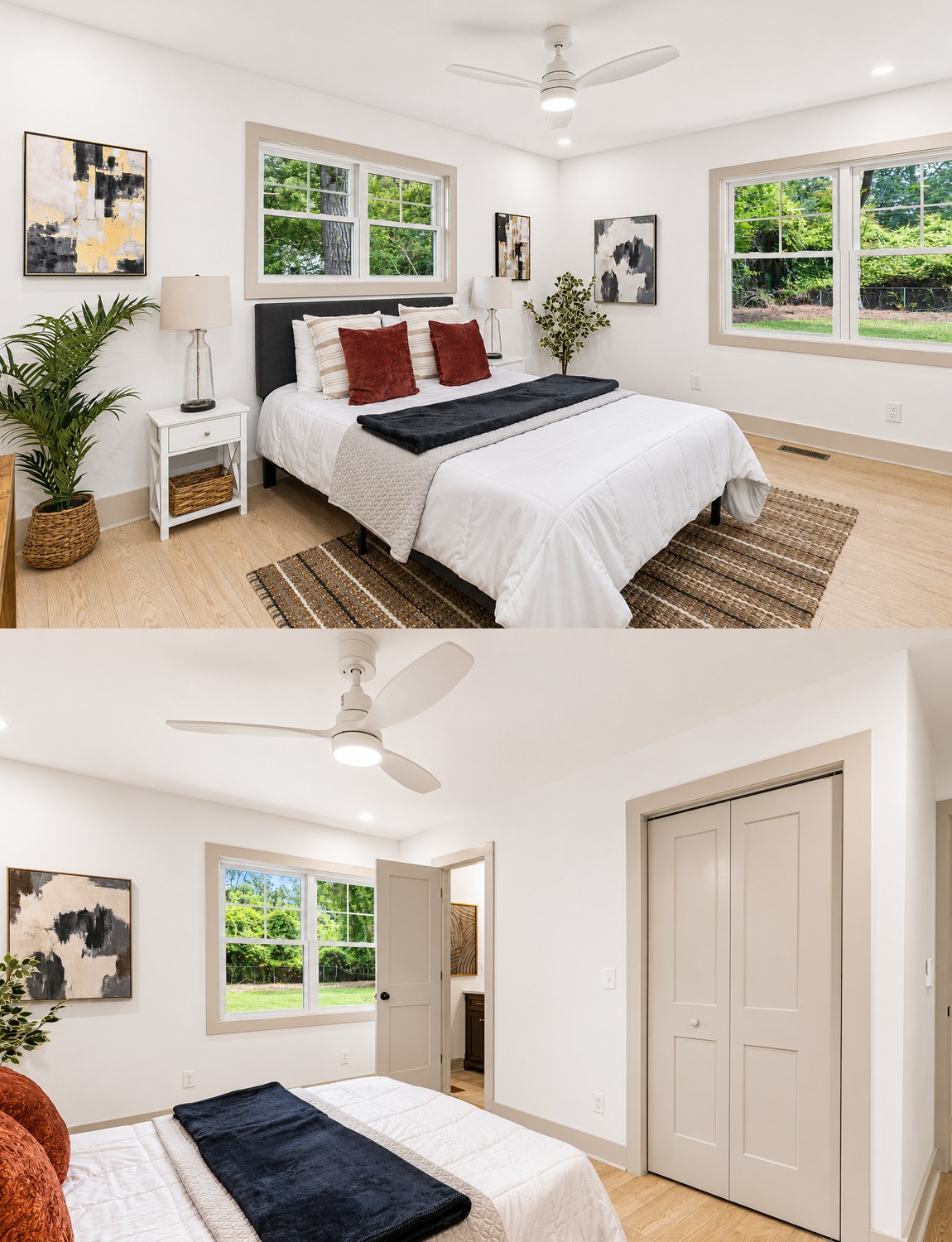
The bedroom closet uses simple double doors painted in the same soft gray as the trim. This helps the storage feel like part of the architecture.
The doors have shallow panels. Their design adds detail without drawing too much attention. Small round knobs keep the look quiet.
A nearby door leads toward the bathroom. Because both doors share the same color and style, the room feels orderly.
This is a smart idea for a small or mid-size ranch. Too many door colors can chop up the walls. One trim shade creates a smooth flow from room to room.
A Bathroom With Mid-Century Warmth
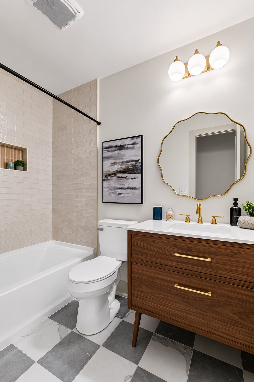
The bathroom mixes clean modern finishes with a strong mid-century style vanity.
The vanity has a rich walnut tone, long drawers, slim legs, and brass pulls. Its furniture-like shape makes the bathroom feel less basic. The raised legs also expose more of the floor, which helps the room feel open.
A white counter keeps the vanity fresh. Brass taps repeat the warm metal found in the kitchen. Above them, a curved mirror adds a playful shape.
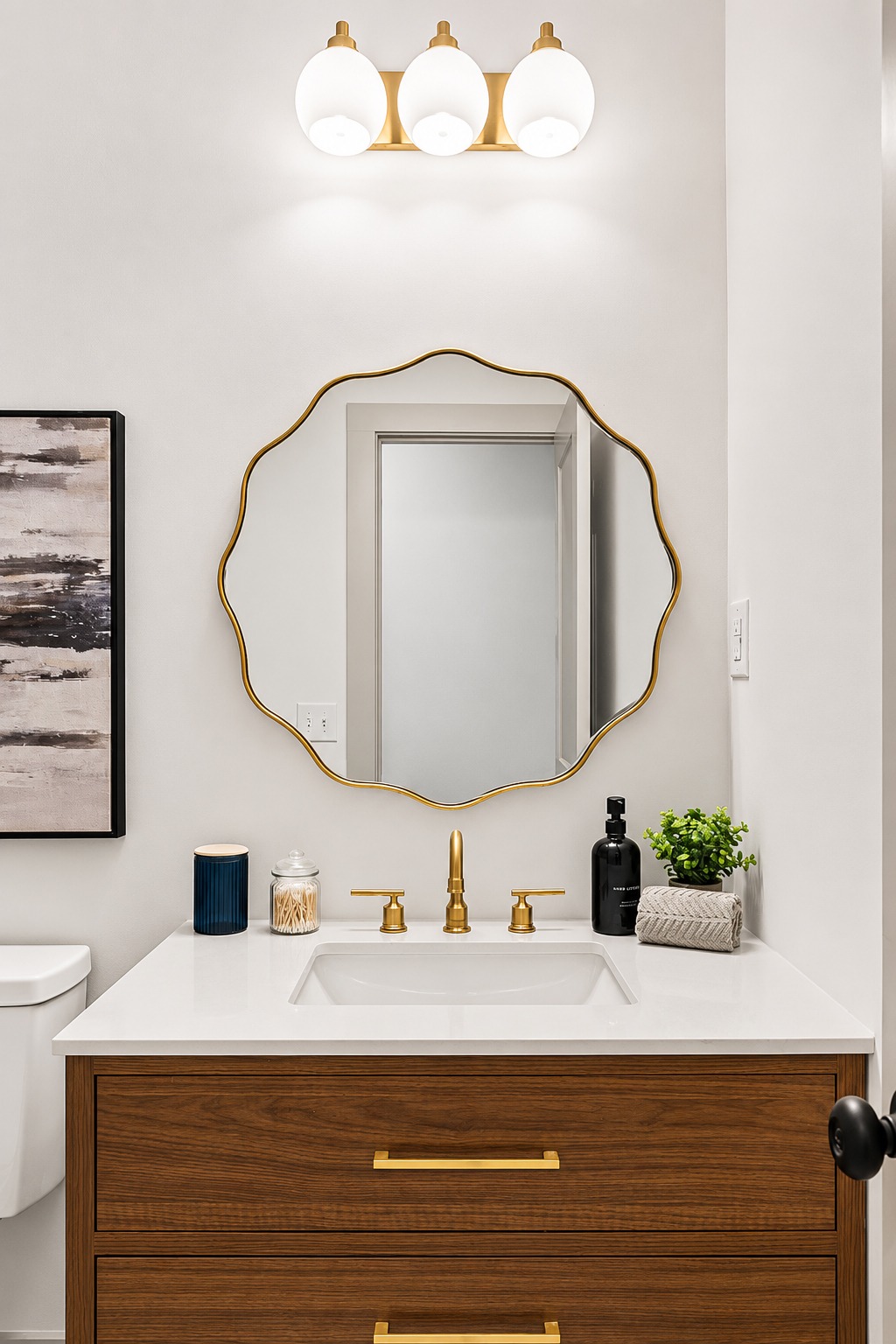
The mirror’s wavy brass frame breaks up the room’s straight lines. It also brings personality without using a bold wall color.
Three round globe lights sit above the mirror. Their simple shape feels both classic and modern.
The floor uses large black, white, and gray squares in a checkerboard layout. This pattern gives the room energy. Still, the muted colors keep it from feeling too busy.
Bathroom Design Cues
- Walnut furniture-style vanity
- Slender raised legs
- Long brass drawer pulls
- White vanity top
- Brass widespread faucet
- Curved statement mirror
- Three globe vanity lights
- Checkerboard floor tile
- Soft gray walls
- White toilet and tub
- Black shower rod
- Built-in shower niche
A Simple Tub Surround Gets More Texture
The tub and shower area uses pale rectangular tile. The soft finish adds texture while keeping the space bright.
A recessed niche offers storage for soap and bottles. Its slim accent tile adds a small change in pattern. Because the niche sits within the wall, it keeps the tub ledge clear.
A black shower rod brings a sharp contrast. It also links the bathroom to the black details used throughout the house.
The tub itself stays simple and white. This helps the tile, floor, mirror, and vanity remain the main features.
The design works because it does not ask every surface to stand out. Some pieces lead. Others support them.
The Backyard Keeps the Ranch House Simple
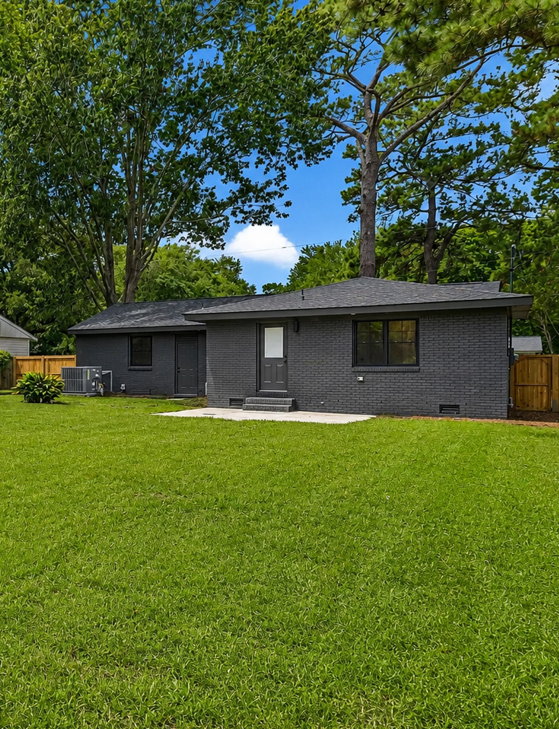
At the back, the house returns to a quieter ranch look.
The dark painted brick wraps around the exterior, so the home feels complete from every side. A low roof continues the long shape. Simple black doors and windows blend into the wall.
The yard is wide, flat, and open. Mature trees create a natural border. A wood fence adds privacy while matching the warm accents at the front.
There is no complex landscaping. The large lawn leaves room for a future patio, garden, play area, or outdoor dining space.
This simple setting suits the house. The front carries the strongest design moment. The back stays useful and easy.
Backyard Design Cues
- Wide open lawn
- Mature shade trees
- Wood privacy fence
- Dark painted brick
- Black doors and windows
- Low ranch roofline
- Minimal hardscape
- Clear space for future outdoor zones
- Simple foundation planting
- Private and flexible layout
Conclusion
This modern ranch house blends strong curb appeal with easy indoor comfort. Black brick gives the exterior a bold edge, while warm wood keeps it inviting. Inside, pale floors, oak cabinets, brass accents, and clean white walls create a bright and relaxed home that still honors its classic ranch roots.