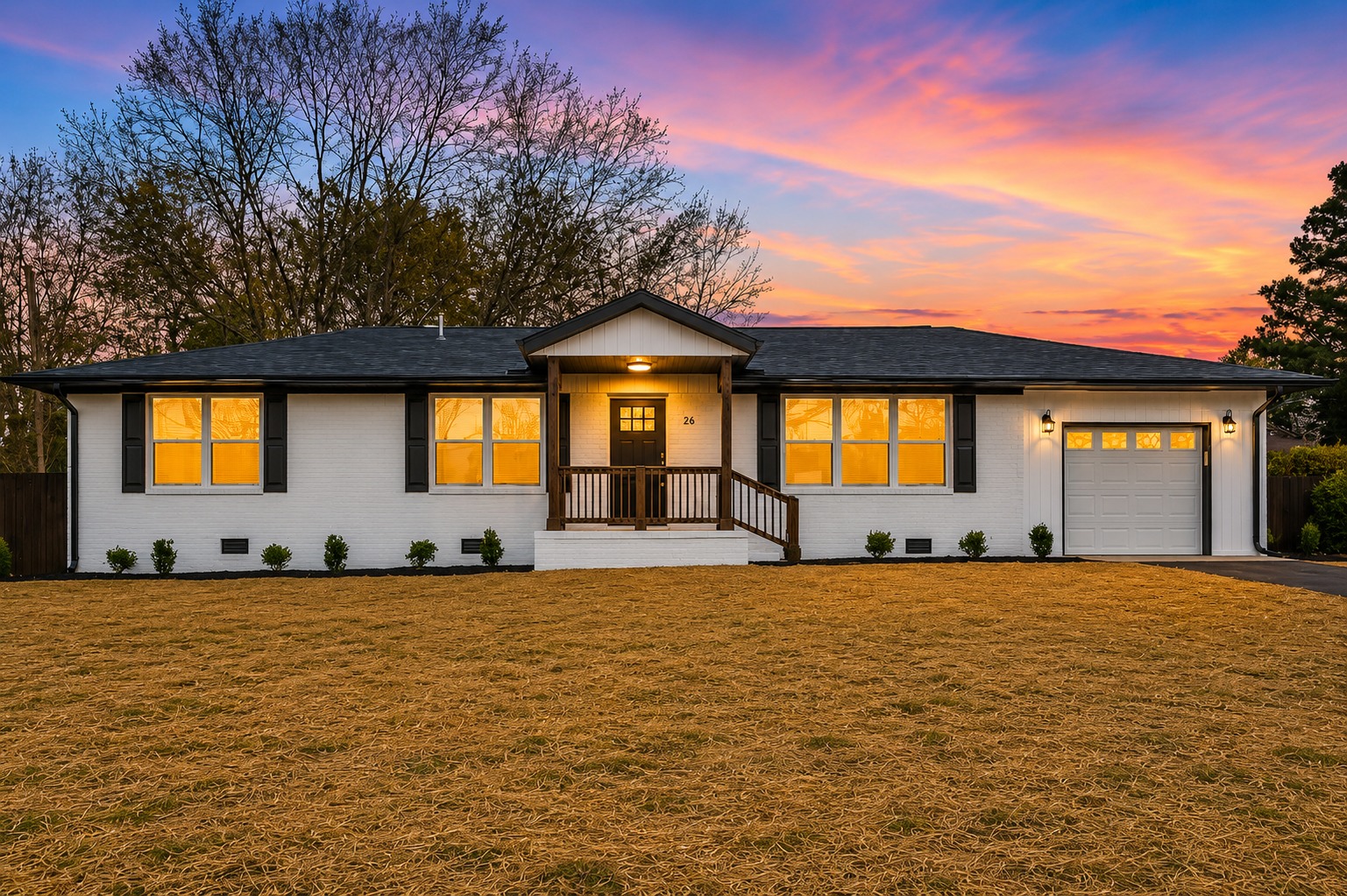
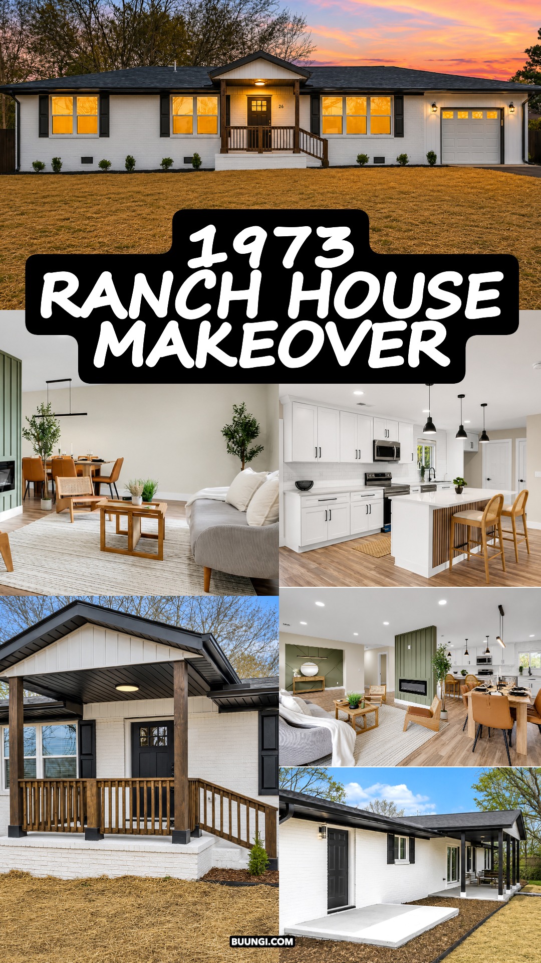
A 1973 ranch home has a special kind of charm. It sits low. It stretches wide. It feels easy to live in. But with the right updates, it can feel bright, fresh, and brand new without losing that simple ranch spirit. This home is a great example. It keeps the long one-story shape, the deep roofline, and the practical layout. Then it adds crisp paint, warm wood, soft green accents, clean black details, and open rooms that feel calm from the first step inside.
This makeover works because it does not try too hard. It feels simple, but not plain. It feels modern, but not cold. It feels cozy, but still open. That balance is what makes this 1973 ranch style home stand out.
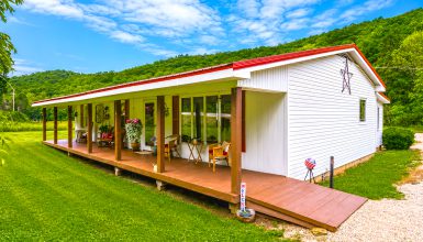
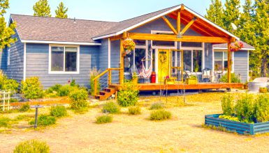
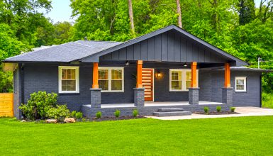
1. The Long, Low Ranch Exterior
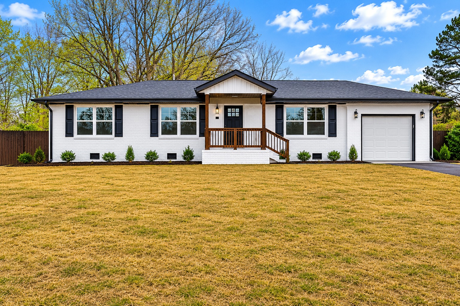
The front of this home has that classic ranch shape. It is wide, low, and simple. The roofline runs across the whole house in one clean sweep. That long shape gives the home a calm, grounded look.
The white painted brick gives the exterior a fresh face. It softens the age of the home and makes the whole front feel brighter. At the same time, the brick texture still adds depth. So the home does not look flat or too new.
The dark roof adds contrast. It gives the house a strong top line. Then the black shutters and trim tie the look together. These dark accents make the white brick feel crisp.
The garage blends in with the rest of the home. It does not steal attention. That is a smart move for a ranch home, since the front can feel wide. Keeping the garage door light helps the whole exterior feel balanced.
Design cues to notice:
- White painted brick for a clean, fresh look
- Dark roof for sharp contrast
- Black shutters for simple detail
- Long horizontal shape that feels classic
- Low roofline that keeps the home grounded
- Light garage door that blends into the front
- Small shrubs that soften the base of the home
2. A Front Porch That Gives the Ranch More Personality
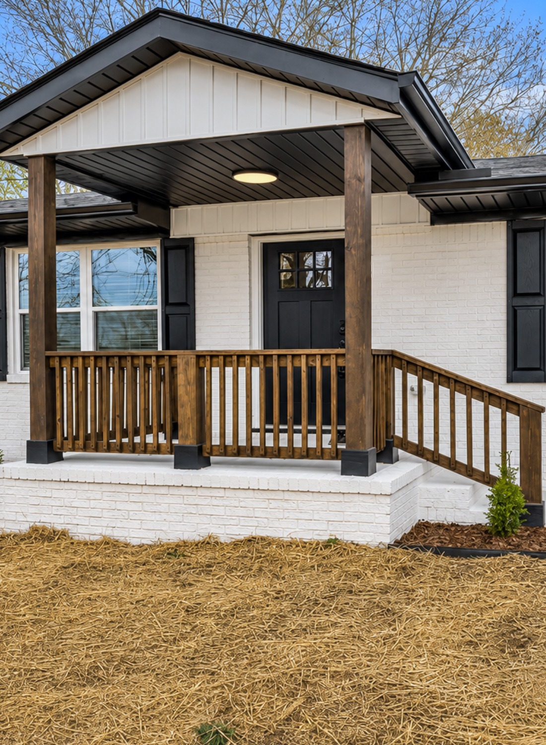
The front porch is one of the best updates on this home. Many older ranch homes have a flat or plain entry. Here, the porch adds depth and charm. It makes the front door feel more important.
The gabled porch roof gives the entry a clear focal point. It breaks up the long line of the house. That small change makes a big visual impact. It gives the home a center.
The porch columns add weight. They feel sturdy and simple. The wood railing warms up the white and black color scheme. This keeps the exterior from feeling too stark.
The front door is soft gray. It feels calm and modern. It works well with the white brick, black trim, and natural wood railing. This door color also makes the porch feel more relaxed.
The covered porch adds function too. It gives guests a place to pause. It also makes the entry feel more welcoming.
Design cues to notice:
- Gabled porch roof that creates a focal point
- Wood railing for warmth
- Thick porch posts for structure
- Soft gray front door
- White brick porch base
- Simple black hardware
- Covered entry for comfort and curb appeal
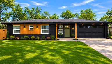
3. Clean Landscaping That Lets the House Breathe
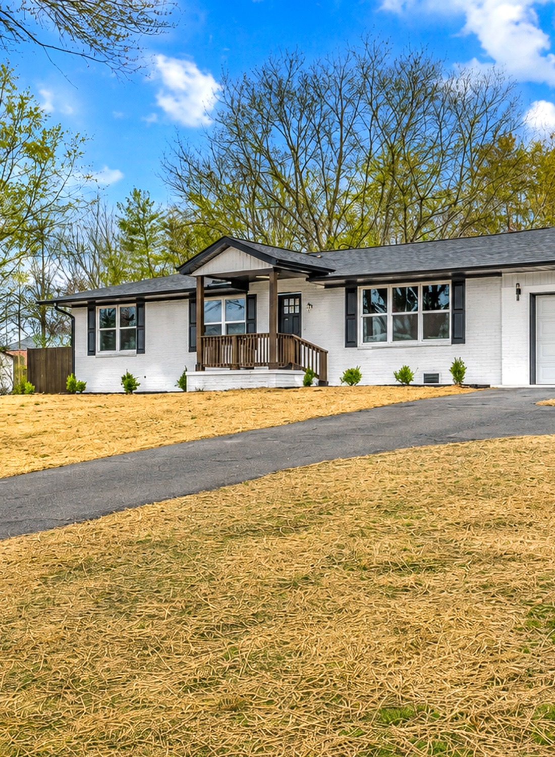
The landscaping is simple, and that is a good thing. A ranch home looks best when the yard does not fight with the long shape of the house. Here, the low shrubs sit neatly along the front. They add life without blocking the brick or windows.
The mulch beds frame the house in a clean way. They create a dark line at the base of the white exterior. This helps the home feel finished.
The open yard keeps the focus on the house. Since this home has a wide front, the open lawn gives the eye room to take in the full view. Once the grass grows in, the curb appeal will feel even softer.
The front yard also leaves space for future layers. A few rounded shrubs, ornamental grasses, or small flowering plants could add more texture later.
Design cues to notice:
- Low shrubs placed under windows
- Dark mulch for contrast
- Clean bed edges
- Open lawn that keeps the view wide
- Simple plant choices
- No clutter near the entry
- Room to add seasonal color later
4. The Backyard Keeps the Same Easy Ranch Feel
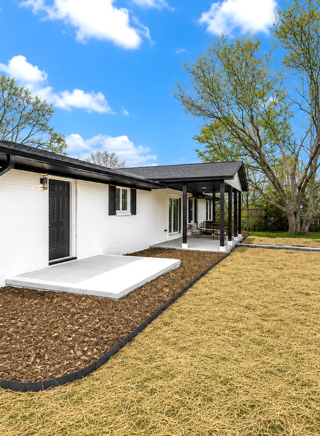
The backyard has a calm, open feel. It gives the home room to breathe. The covered patio extends the living space outdoors. That is one of the best parts of a ranch home. Since the layout stays on one level, indoor and outdoor spaces can flow with ease.
The back patio has a clean concrete pad. It feels simple and useful. There is space for seating, a grill, or a small dining set. The covered area adds shade and makes the yard more livable.
The large yard gives the home a relaxed family feel. It could work well for garden beds, a fire pit, a play space, or a casual outdoor lounge. The simple fence line adds privacy without making the space feel tight.
This backyard does not need much to shine. A few outdoor chairs, string lights, and planter pots would make it feel ready for weekend use.
Design cues to notice:
- Covered patio for outdoor living
- Clean concrete slab
- Large open yard
- Simple fence for privacy
- Easy access from the house
- Space for seating or dining
- Quiet, low-maintenance look
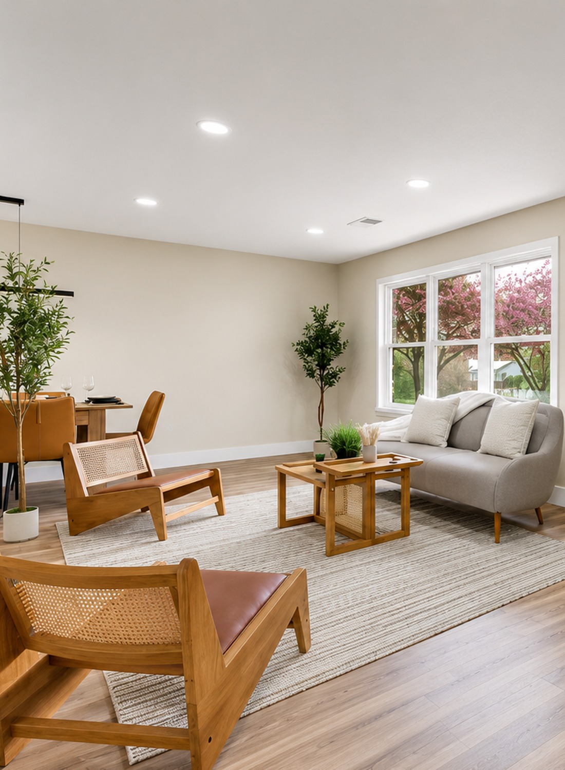
5. A Bright Open Layout That Feels New
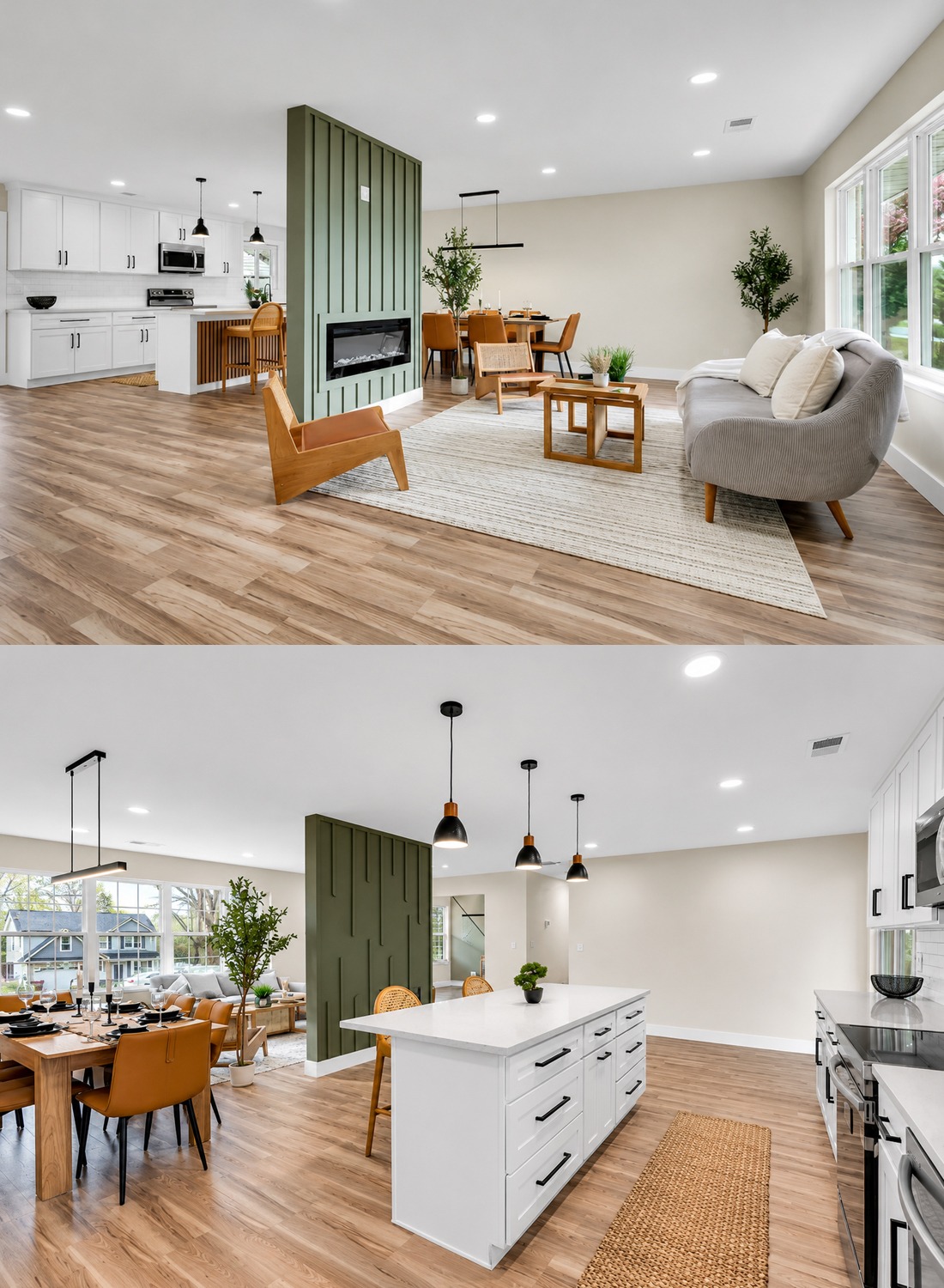
Inside, the home feels wide open. This is where the remodel really changes the mood. Older ranch homes often have chopped-up rooms. This design opens the main living areas and lets light move through the space.
The living room, dining area, and kitchen all share one large room. That makes the home feel bigger. It also suits modern life. People can cook, eat, talk, and relax in one easy space.
The pale flooring helps a lot. It reflects light and keeps the room airy. The soft wall color adds warmth without making the room feel dark. The white ceiling, recessed lights, and large windows all help the space feel fresh.
There is very little clutter. That makes each design choice stand out more. The room feels calm because every piece has room around it.
Design cues to notice:
- Open living, dining, and kitchen layout
- Pale wood-look flooring
- Soft neutral walls
- Large windows
- White ceiling
- Recessed lighting
- Light furniture with warm wood tones
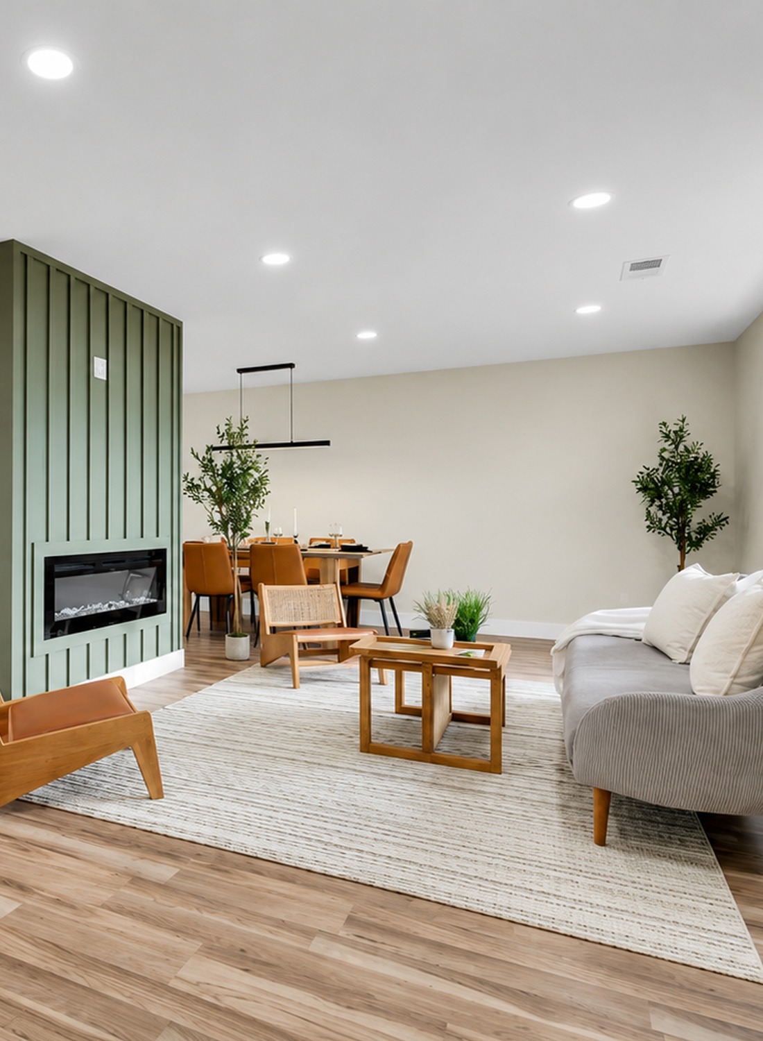
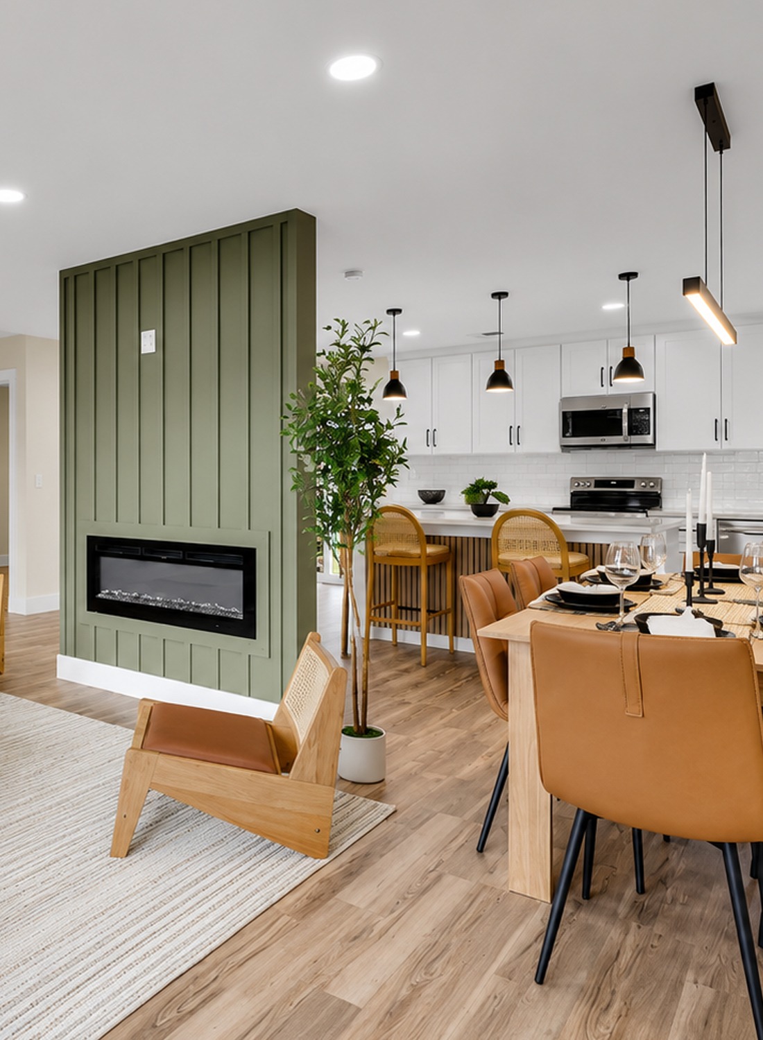
6. The Sage Green Fireplace Wall Steals the Show
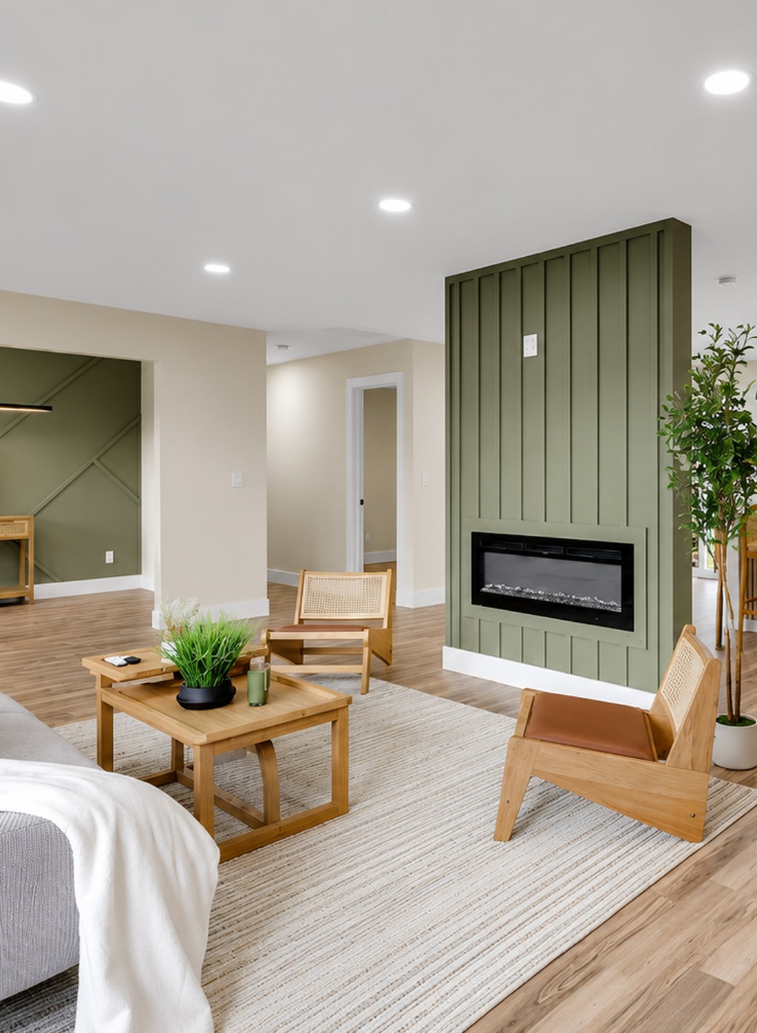
The sage green fireplace wall is the heart of the main room. It gives the open space a strong focal point. Without it, the room might feel too white and too wide. With it, the room feels styled and grounded.
The vertical panel detail adds texture. It draws the eye up and makes the wall feel taller. The soft green color brings in a natural feel. It also works well with the wood furniture and tan dining chairs.
The long electric fireplace adds a modern touch. It is sleek and simple. Its black frame ties in with the black lighting and hardware in the rest of the home.
This feature wall also helps divide the open space. It gives the living room its own zone without closing it off. That is a smart design choice for a ranch remodel.
Design cues to notice:
- Sage green accent wall
- Vertical board detail
- Long modern fireplace
- Black fireplace frame
- Strong focal point in an open room
- Soft color that feels calm
- Texture without visual clutter
7. The Living Room Feels Cozy But Still Airy
The living room keeps things simple. It uses light colors, clean shapes, and warm wood pieces. The gray curved sofa adds softness. Its rounded shape keeps the space from feeling stiff.
The wood lounge chairs add a midcentury touch. That fits a 1973 ranch home very well. The style feels fresh, but it also nods to the home’s era. The cane seats and light wood frames add texture without feeling heavy.
The striped rug grounds the seating area. It gives the room a clear zone inside the open floor plan. The coffee table stays light and simple. It works with the chairs instead of fighting them.
Plants bring in life. They help soften the new finishes. They also make the room feel more lived in.
Design cues to notice:
- Curved gray sofa
- Light wood lounge chairs
- Cane accents
- Pale striped rug
- Simple wood coffee table
- Potted plants for softness
- Open space around each piece
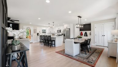
8. The Dining Area Adds Warm Color
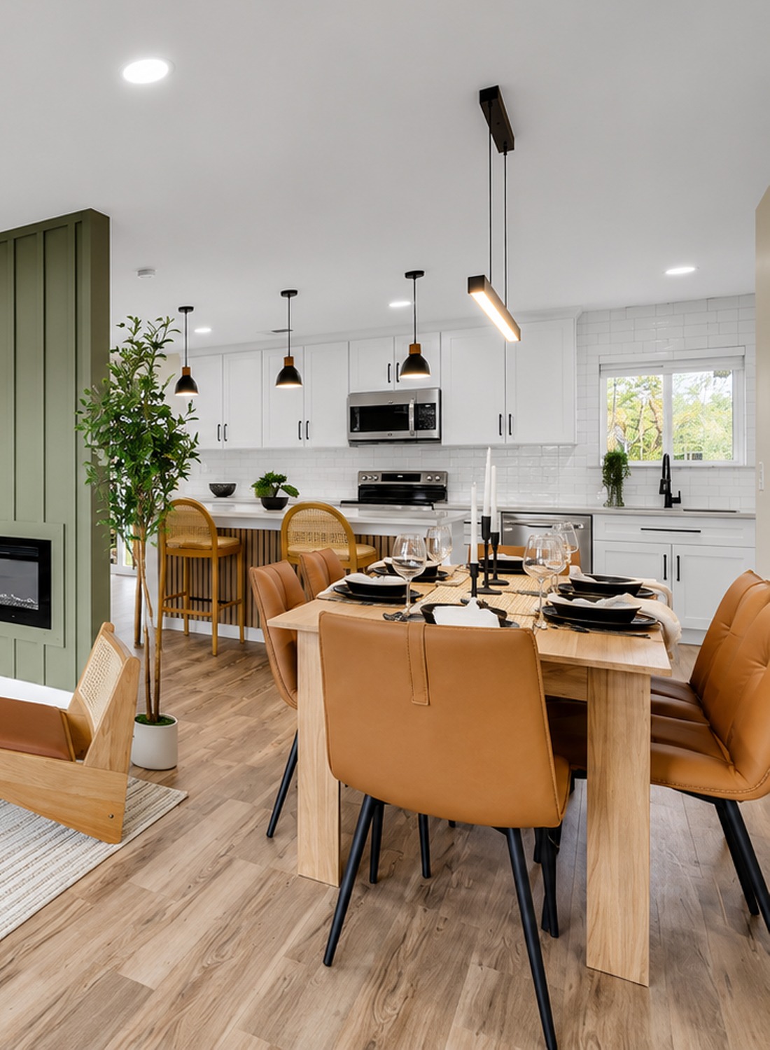
The dining area sits beside the kitchen and living room. It feels warm and modern. The tan chairs add a rich honey tone. This color keeps the white kitchen and neutral walls from feeling too cool.
The light wood table keeps the look casual. It is simple, but it has enough presence to hold the dining zone. The black linear pendant above the table gives the area a modern edge. It also connects with the black accents in the kitchen.
This dining space proves that a simple room can still feel special. The key is contrast. Light walls, warm chairs, black lighting, and a clean table all work together.
Design cues to notice:
- Warm tan dining chairs
- Light wood dining table
- Black linear pendant light
- Open placement near the kitchen
- Simple place settings
- Warm tones against white walls
- Clean modern lines
9. A White Kitchen That Feels Bright and Practical
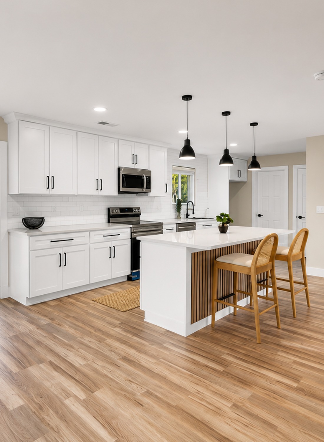
The kitchen is clean, bright, and easy to use. White shaker cabinets give it a timeless look. They feel classic, but still fresh. The black hardware adds contrast and keeps the cabinets from feeling too sweet.
The white subway tile backsplash adds shine and texture. It stretches across the wall, which makes the kitchen feel larger. The light counters blend with the cabinets and backsplash. This creates a bright, seamless look.
Stainless steel appliances bring in a practical modern touch. The black faucet adds a bold detail at the sink. It matches the cabinet pulls and pendant lights.
The kitchen also has a large island. This adds prep space, storage, and casual seating. The slatted wood detail on the island brings warmth to the all-white kitchen. That one detail makes the space feel custom.
Design cues to notice:
- White shaker cabinets
- White subway tile backsplash
- Light counters
- Black cabinet hardware
- Stainless steel appliances
- Black sink faucet
- Large island with wood slat detail
10. The Island Makes the Kitchen Feel Social
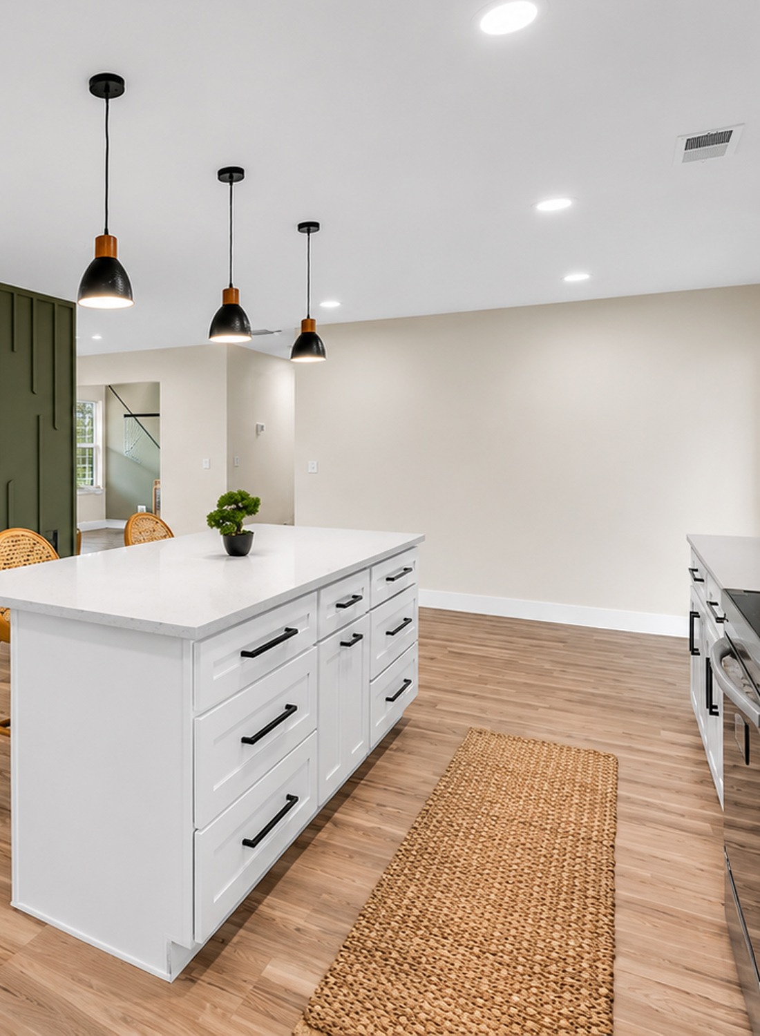
The island is more than a work surface. It creates a social center. Two stools fit neatly along one side. That gives the kitchen a casual spot for coffee, snacks, or quick meals.
The wood slat detail on the island is a smart design move. It adds warmth and pattern. It also links the kitchen to the wood furniture in the living and dining areas.
The island lights are simple and black. They give the kitchen a clean modern finish. They also help define the kitchen zone inside the open room.
This is a great lesson for ranch remodels. When the main floor opens up, one strong island can help organize the whole space.
Design cues to notice:
- Large island for prep and seating
- Warm wood accent panel
- Simple bar stools
- Black pendant lights
- Clear sightline to the patio
- Open connection to the dining space
- Extra storage below the counter
11. Sliding Doors Bring the Outside In
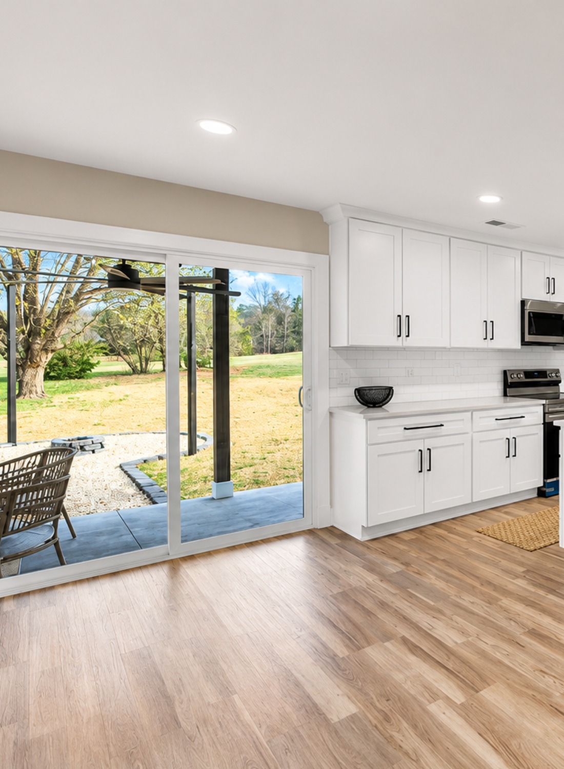
The large sliding glass doors are a major feature. They connect the kitchen to the covered patio. They also flood the room with natural light.
This detail matters in a ranch home. Since ranch homes sit low and long, big glass doors can make them feel more open. They also make the backyard feel like part of the home.
The view through the doors adds depth. It pulls the eye outside and makes the room feel larger. It also gives the kitchen a relaxed mood.
For daily life, this connection works well. You can cook inside and step right out to the patio. It is simple, practical, and perfect for casual living.
Design cues to notice:
- Wide sliding glass doors
- Direct patio access
- Natural light in the kitchen
- Indoor-outdoor flow
- Open view to the yard
- Clean white door trim
- Easy path for entertaining
12. The Entry Feels Simple and Clean
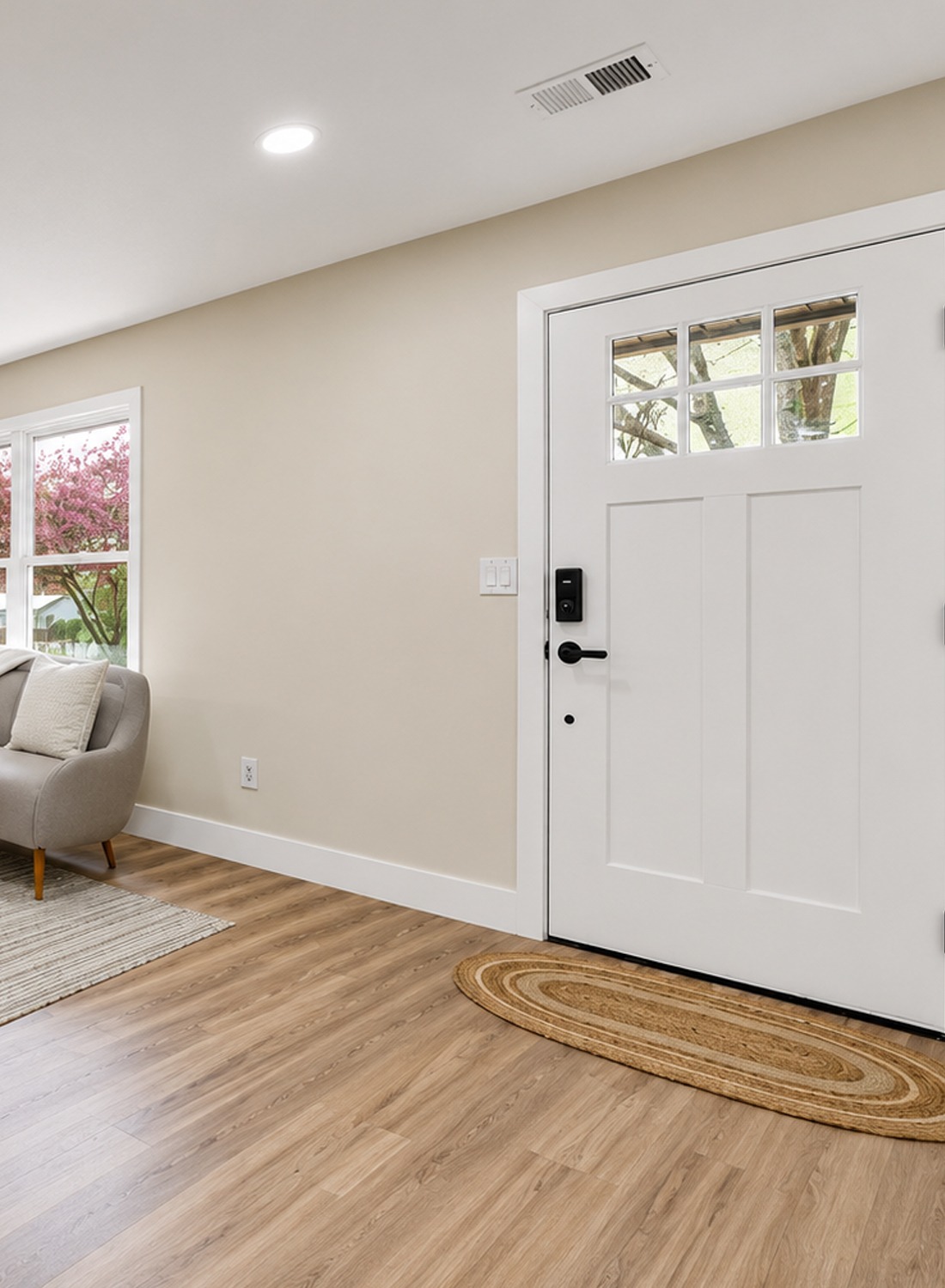
The entry area keeps the same calm style. The white front door has small top windows. These let in light while keeping privacy. The black door hardware adds contrast.
The small oval rug softens the floor near the door. It also adds a natural texture. This makes the entry feel less bare.
The living room sits right beside the entry. That means the first view matters. The simple furniture, pale flooring, and clean walls help the home feel open right away.
The entry does not need a lot of decor. In this space, less works better. A small bench, wall hooks, or a slim console could be added later. But the simple base already feels fresh.
Design cues to notice:
- White front door
- Small window panes for light
- Black hardware
- Natural oval rug
- Open view to living room
- Light floors
- Clean, simple wall space
13. A Soft Green Bedroom With a Custom Feel
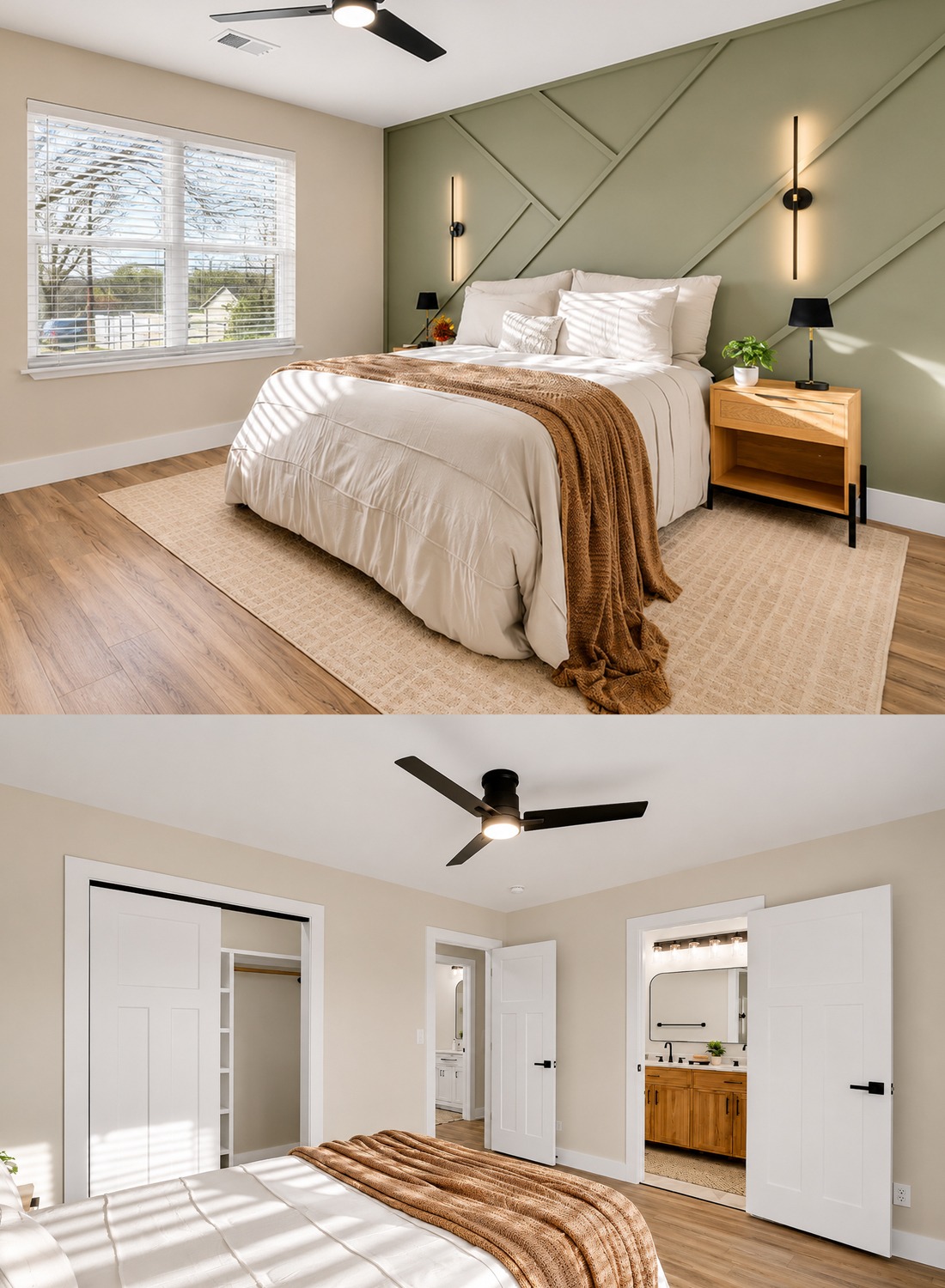
The bedroom brings back the sage green color. This creates a nice link to the living room fireplace wall. It makes the whole home feel connected.
The accent wall has geometric trim. This adds depth and style. It gives the bedroom a custom look without needing bold wallpaper or dark paint.
The bed stays simple with white bedding. This keeps the room calm. The rust-colored throw adds warmth and texture. It also pairs well with the wood nightstands.
Black sconces and a black ceiling fan add contrast. They make the room feel modern. The woven nightstand fronts bring in a soft, natural touch.
This bedroom feels peaceful. It has enough detail to feel designed, but not so much that it feels busy.
Design cues to notice:
- Sage green geometric accent wall
- White bedding
- Rust knit throw
- Light wood nightstands
- Woven drawer fronts
- Black wall sconces
- Black ceiling fan
14. The Bathroom Mixes Warm Wood and Sleek Black
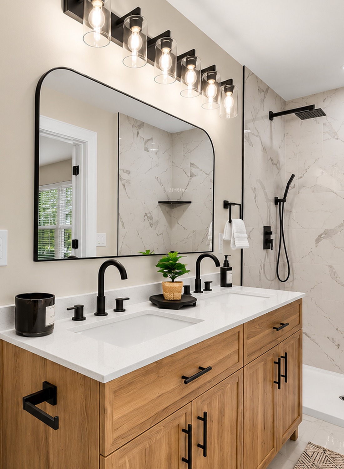
The bathroom feels fresh and polished. It uses a warm wood vanity, white counter, black faucets, and marble-look shower tile. The mix feels clean, but not cold.
The double sink vanity adds function. It also gives the room a strong furniture-style piece. The wood grain warms up the white and gray surfaces.
The black mirror frame, black faucets, black shower fixtures, and black hardware create a strong design line. They help the room feel crisp. They also match the black details seen through the rest of the house.
The shower uses large marble-look panels or tile. This creates a clean luxury feel. The simple black shelves add storage without making the shower look crowded.
The bathroom works because it repeats the home’s main design mix: white, wood, black, and soft natural texture.
Design cues to notice:
- Warm wood double vanity
- White vanity top
- Black faucets
- Black mirror frame
- Marble-look shower walls
- Black shower fixtures
- Simple open shower shelves
15. The Color Palette Feels Calm and Connected
This home uses a smart color palette. Outside, the main colors are white, black, gray, and natural wood. Inside, the palette shifts to white, warm wood, pale gray, sage green, tan, and black.
That mix feels modern, but warm. The green accents add personality. The wood tones stop the white spaces from feeling too plain. The black details give each room a clean edge.
The palette also makes the home feel larger. Light walls and floors reflect light. Meanwhile, the darker accents help define each space.
This is a great color plan for a 1970s ranch. It respects the simple shape of the home. Then it gives the rooms a brighter and more current feel.
Design cues to notice:
- White as the main color
- Sage green as the soft accent
- Black for contrast
- Warm wood for comfort
- Tan chairs and rust textiles for warmth
- Pale flooring for airiness
- Soft gray and beige walls for calm
16. The Lighting Keeps the Look Modern
Lighting plays a big role here. The recessed ceiling lights make the rooms bright and clean. They work well in the open layout because they spread light across the whole space.
The black pendant lights add style. They create focal points over the kitchen island and dining table. The bedroom sconces add a custom feel. The bathroom vanity lights add clear task light.
Most of the fixtures are simple and dark. That choice keeps the home consistent. It also gives the soft neutral rooms a sharper edge.
Good lighting helps this remodel feel finished. It also makes the simple design choices look more polished.
Design cues to notice:
- Recessed lights in main rooms
- Black kitchen pendants
- Linear dining pendant
- Black bedroom sconces
- Vanity lights over the bathroom mirror
- Ceiling fan with black blades
- Simple fixture shapes
Conclusion
This 1973 ranch home feels fresh because every update has a purpose. The white brick brightens the exterior. The porch adds charm. The open layout makes the inside feel larger. The sage green fireplace wall gives the living area a focal point. The white kitchen feels clean and useful. The bedroom feels calm. The bathroom feels sleek, warm, and modern.
Together, these choices turn a simple ranch home into a warm, stylish, and easygoing space. It feels updated, but still friendly. It feels polished, but still livable. And that is the real beauty of a great ranch makeover.
It proves that an older one-story home can feel new again with the right mix of light, texture, contrast, and warmth.