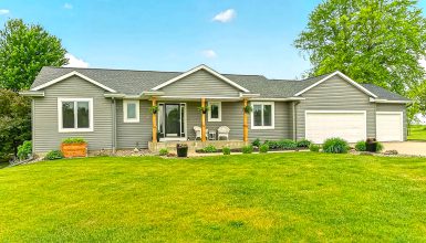
What makes a simple ranch house feel like a place you could settle into for years? It is rarely one fancy feature. Instead, it comes from the small choices that make daily life easy.
This ranch house is a great example.
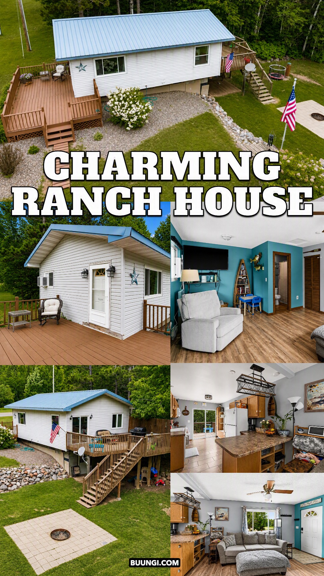
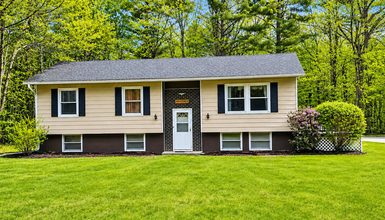
From the outside, the home feels quiet and practical. White siding keeps the shell clean and bright. A pale metal roof adds a crisp finish. Large wood decks make the yard more useful. Then a detached two-car garage gives the property plenty of extra space.
Inside, the mood becomes warmer and more personal. Gray walls mix with bold blue-green accents. Wood tones soften the cool colors. An open living room flows into a compact kitchen. Big windows and glass doors bring the wooded setting into the home.
There is nothing too formal here. That is part of its charm.
Instead, this ranch house exterior and interior design focuses on comfort, function, storage, and easy outdoor living. Here is a closer look at the design choices that make it work.
1. A Simple Ranch House Form That Fits the Wooded Setting
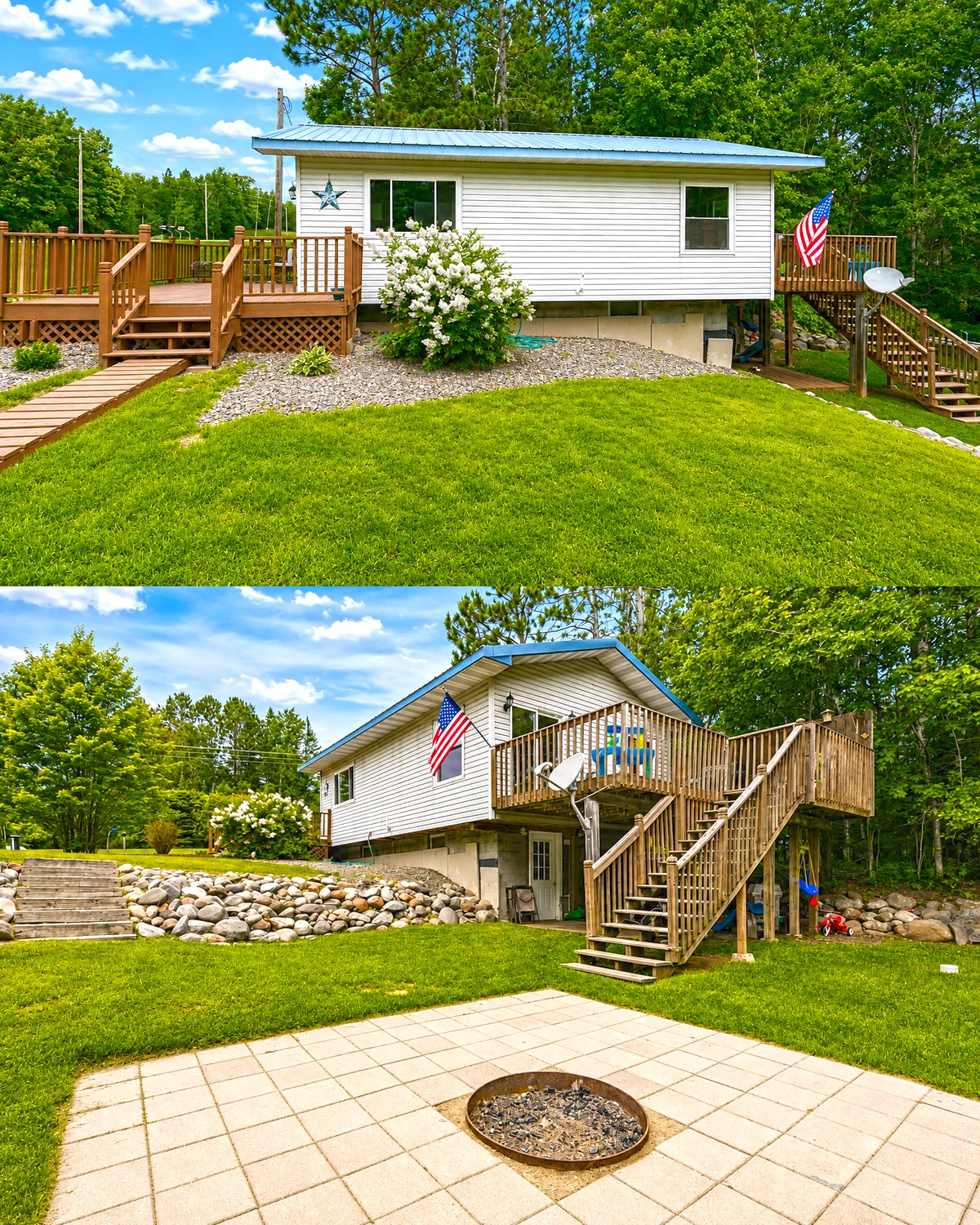
The first thing you notice is how naturally the house sits on the lot.
The design does not try to compete with the tall trees around it. The shape stays simple. Clean walls, a basic roofline, and a modest scale keep the home grounded.
That approach works very well in a rural or wooded area.
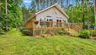
The white exterior also helps. It gives the house a fresh look without adding too much visual weight. Against all that green, the light siding stands out just enough.
Meanwhile, the wood decks create a soft link between the house and the land. Their warm brown tone feels right at home next to the trees.
The home also sits above parts of the yard. This raised position makes the decks even more useful. They create level outdoor areas even where the land changes height.
Design cues
- Simple rectangular house shape
- Clean ranch-style form
- White horizontal siding
- Low-key exterior details
- Light-colored roof
- Natural wood decks
- Raised foundation
- Mature trees around the lot
- Open lawn near the house
- Informal rural character
2. White Siding Gives the Exterior a Fresh, Easy Look
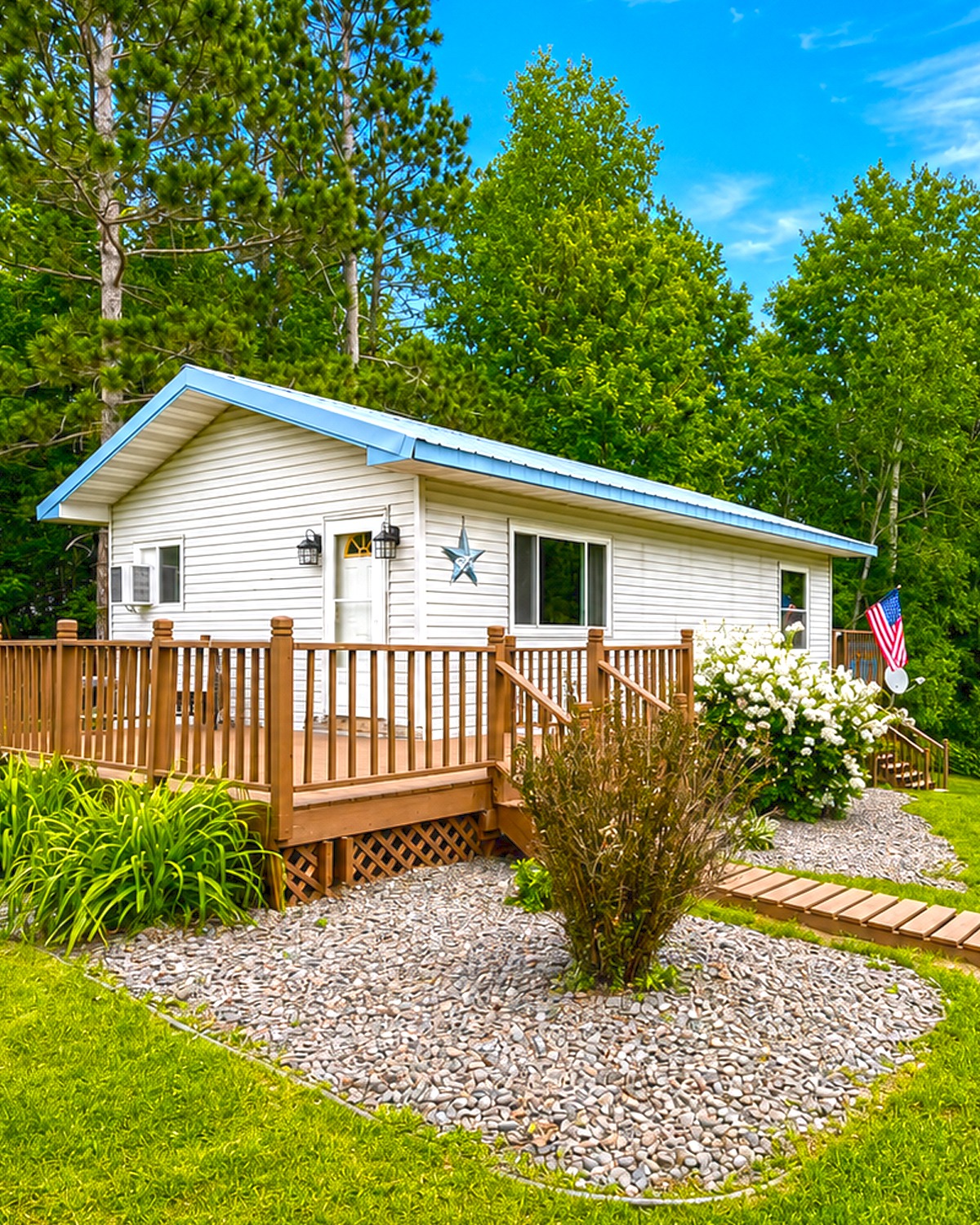
White is a smart choice for a small ranch house.
It reflects light and makes the exterior look larger. It also keeps a basic wall finish from feeling dull.
Here, the white siding works especially well because the home has so much green around it. Trees form a dark natural backdrop. As a result, the light walls stay easy to see.
The color also connects the home with the detached garage. Both buildings share a similar pale finish. That creates a clear visual link across the property.
There is another benefit. White leaves room for other materials to stand out.
The brown decks feel warmer. The gray-blue roof looks sharper. Black outdoor lights become small accent points.
So while the exterior palette is simple, it does not feel flat.
Design cues
- Bright white or soft white siding
- Limited exterior color palette
- Matching house and garage colors
- Dark outdoor light fixtures
- Natural brown wood accents
- White doors and windows
- Green landscape as the main color contrast
3. The Metal Roof Adds a Crisp Country Detail
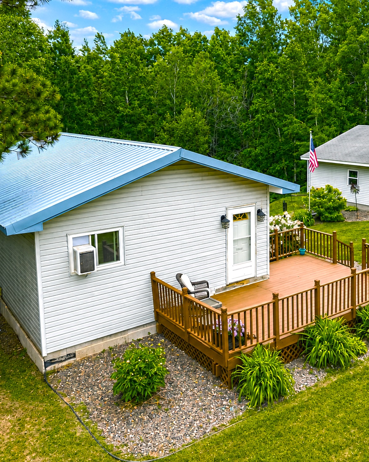
The roof brings a little more personality to the house.
Its light blue-gray tone gives the exterior a cool, clean finish. The metal panels also create strong vertical lines. That detail adds texture without making the house busy.
A metal roof feels right for this setting.
It suits a home near trees and open land. It also gives the ranch house a mild country feel without turning the design into a full farmhouse look.
The roof has generous overhangs as well. Those overhangs create deeper shadow lines around the walls. This makes the simple exterior look more finished.
Most important, the roof does not fight the rest of the design. It supports it.
Design cues
- Light metal roofing
- Simple gable roof
- Deep roof overhangs
- Pale blue-gray finish
- Clean roof edges
- Minimal trim
- Practical country character
4. A Detached Two-Car Garage Adds Major Function
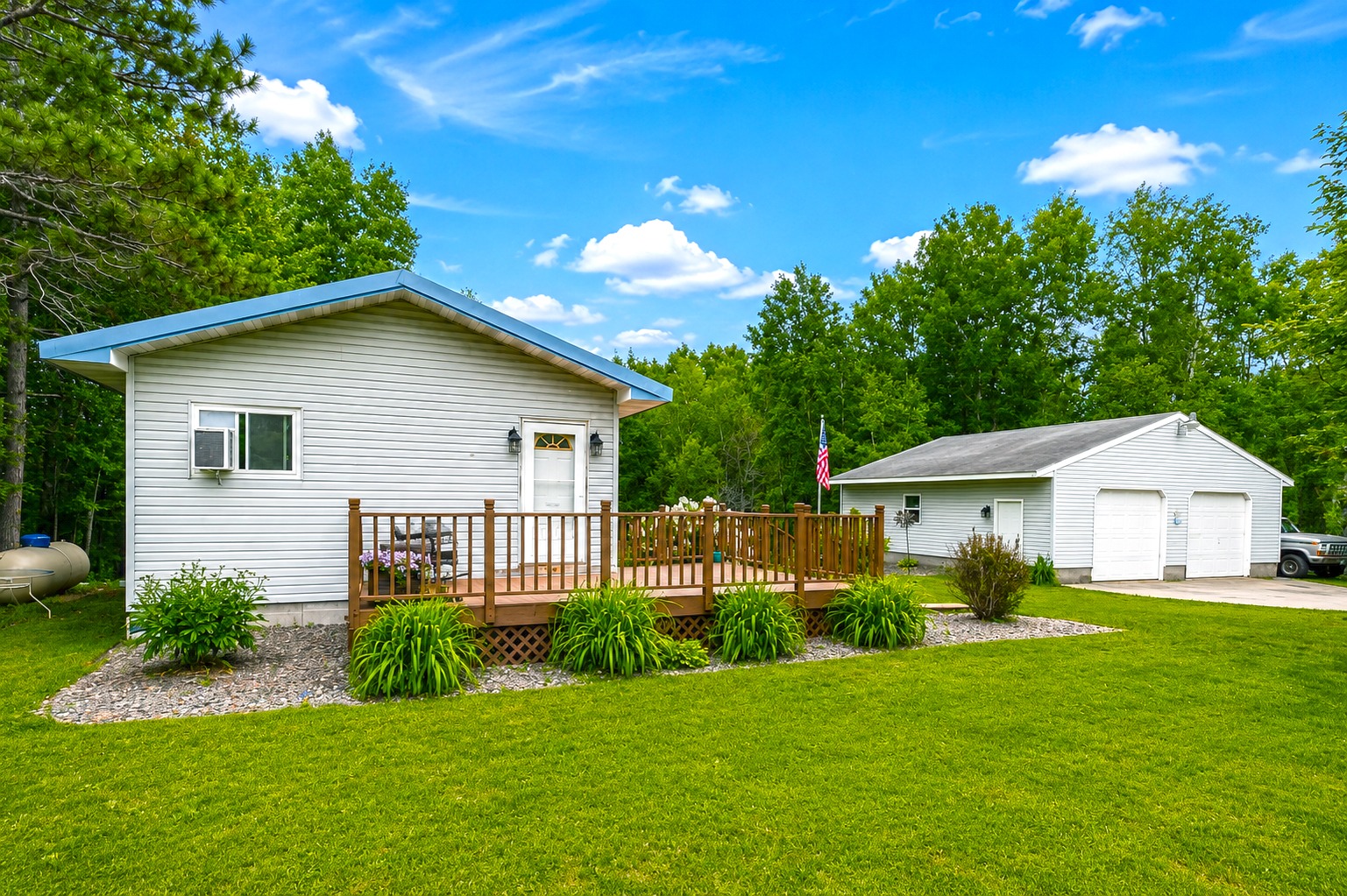
The large detached garage changes how the whole property works.
It gives the house extra storage without making the main building larger. Two garage doors provide room for cars, tools, lawn gear, outdoor equipment, or hobby space.
That is a huge benefit for a compact home.
The garage also sits close enough to feel connected to the house. Yet it has enough space around it to remain a separate work zone.
Visually, the matching white siding is key. Without it, the garage could feel like a random extra building. Instead, both structures read as one property.
The broad driveway in front of the garage also creates a useful hard surface. It can handle parking, loading, projects, or guests.
Design cues
- Detached two-car garage
- Matching exterior siding
- Two individual garage doors
- Wide driveway
- Simple gable roof
- Large storage potential
- Clear space between garage and house
5. Wood Decks Turn a Small House Into a Bigger Living Space
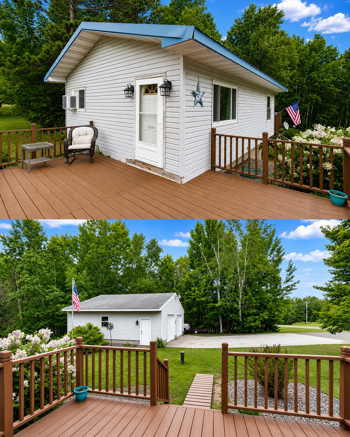
The decks may be the strongest feature of this ranch house.
There is more than one outdoor area. That matters because each space can serve a different purpose.
One deck works like an entry porch. Another larger deck sits off the back or side of the house. It holds seating and grilling space. Stairs then connect the elevated deck to the lawn below.
This setup makes the house feel larger than its indoor square footage might suggest.
The deck becomes a second living room during warm weather.
A sofa, chairs, table, and grill can all fit outside. Meanwhile, the wood railing gives the space a safe edge without blocking too much of the view.
The decks also make good use of the wooded setting. Instead of looking at trees through a window, you can step outside and sit among them.
Design cues
- Large raised wood deck
- Smaller secondary deck
- Wood railings
- Wide outdoor stairs
- Grill station
- Outdoor sofa
- Casual patio chairs
- Direct access from the house
- Views toward the woods
- Multi-level outdoor living
6. The Yard Keeps Landscaping Simple and Natural
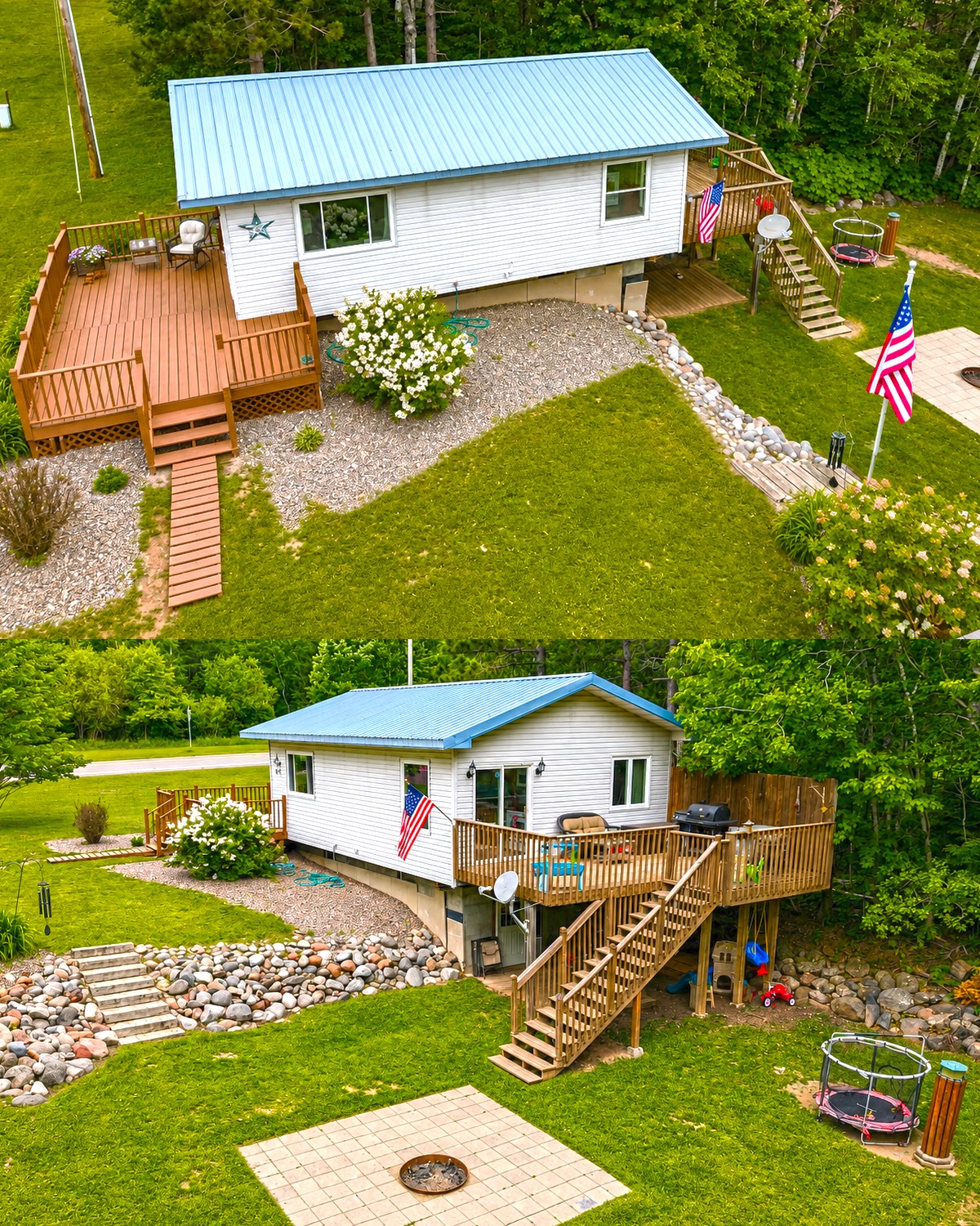
The landscape design feels relaxed.
There are no formal hedges or complex flower beds. Instead, grass covers most of the open area. Mature woods frame the edge of the property.
Near the house, gravel beds reduce the amount of lawn that needs care. They also help define the deck and foundation areas.
A few shrubs add shape without crowding the exterior.
The large white flowering shrub is especially effective. It adds a soft focal point beside all the straight lines of the siding and deck.
River rocks also appear around the sloped sections. These stones give the yard a natural look while helping define changes in grade.
The whole landscape feels suited to the house. It is useful, simple, and easygoing.
Design cues
- Open green lawn
- Mature woodland backdrop
- Gravel planting beds
- Large flowering shrubs
- Low-maintenance plants
- River rock accents
- Simple stepping paths
- Limited formal landscaping
- Open play space
7. A Bright Living Room Makes the Interior Feel Larger
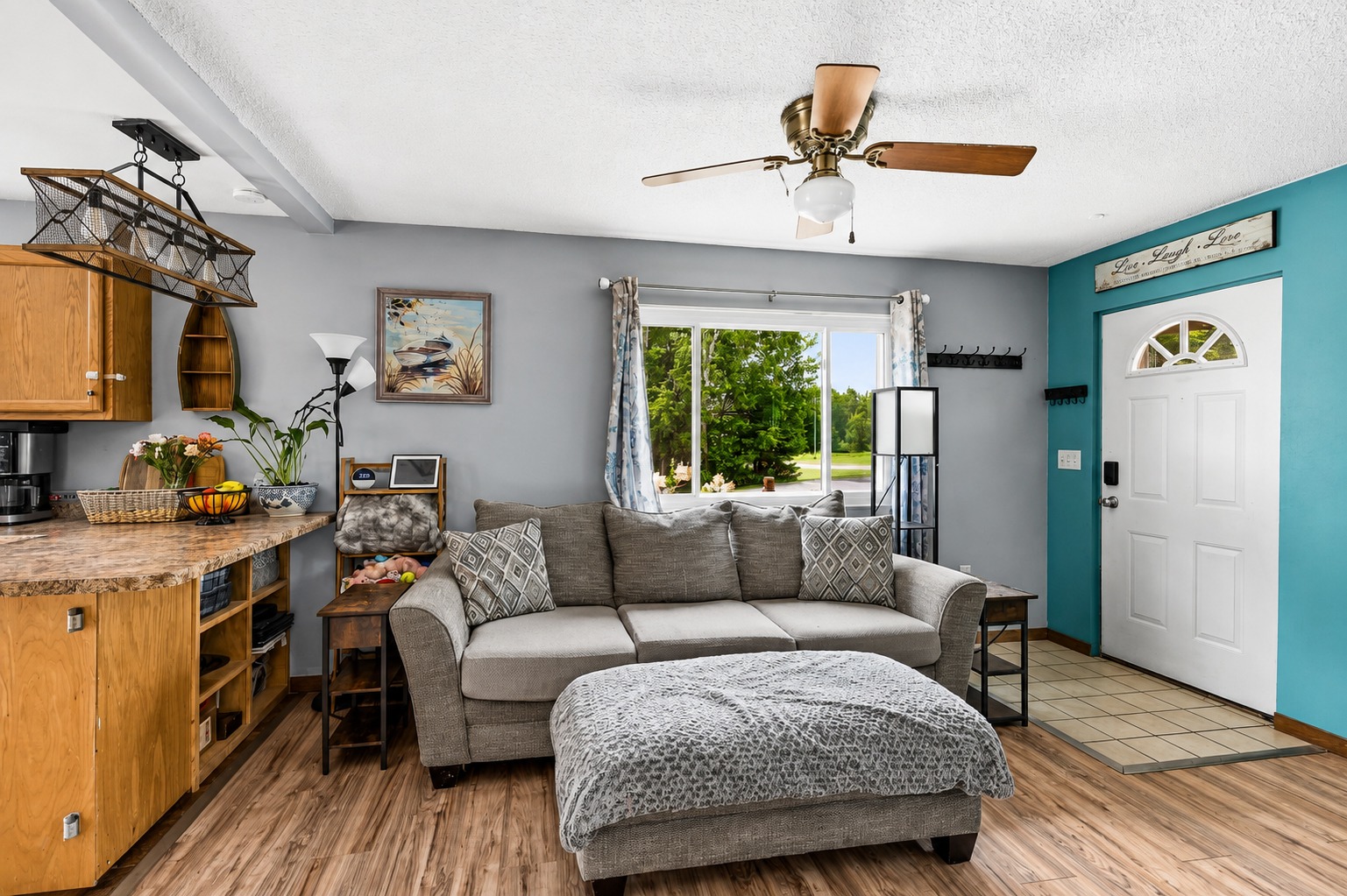
Step inside and the home feels much more open than the exterior may suggest.
The living room uses a simple furniture plan. A gray sofa sits near a large front window. A matching ottoman extends the seating area without adding a heavy coffee table.
This is a smart move in a compact room.
An ottoman gives you a place to put your feet up. It can also serve as a soft table with a tray. Plus, it has fewer hard corners.
The main window brings in plenty of daylight. Light walls on one side help bounce that light through the space.
Nothing feels too precious.
This is clearly a room meant for everyday use.
Design cues
- Large front window
- Gray upholstered sofa
- Oversized ottoman
- Small side tables
- Neutral patterned pillows
- Wood-look flooring
- Simple window curtains
- Ceiling fan
- Open sight lines
8. Blue-Green Accent Walls Give the Room Personality
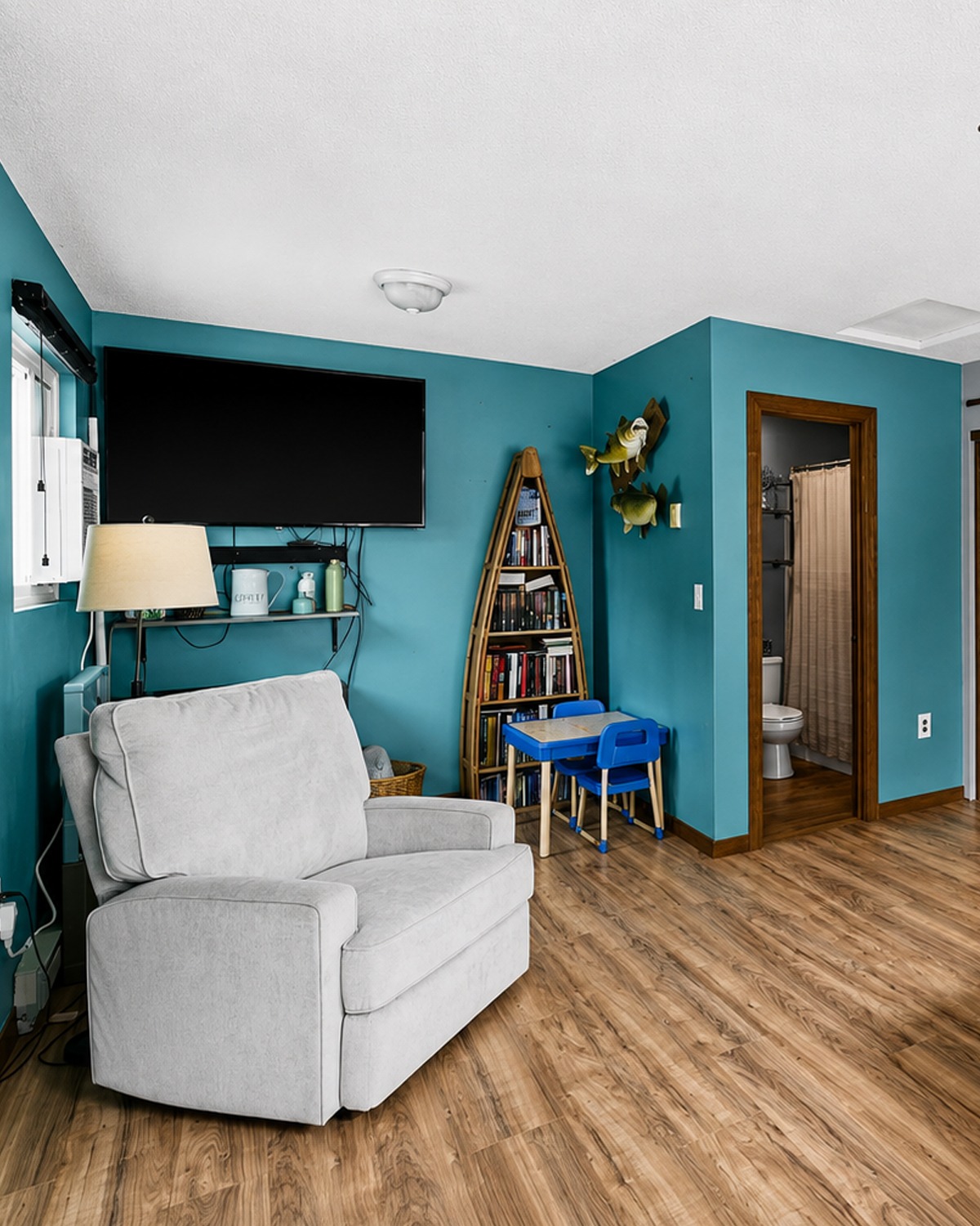
The bold blue-green paint is one of the most memorable interior features.
Rather than using it on every wall, the design pairs it with soft gray. This creates a clear contrast.
The blue-green walls define the entry and TV zone. Gray walls calm the rest of the room.
That balance is important.
A strong color can make a small room feel busy when it covers every surface. Here, the brighter shade becomes an accent instead.
White also appears in the front door and ceiling. These light surfaces keep the stronger wall color from taking over.
Then warm wood trim adds another layer. It keeps the palette from feeling too cold.
Design cues
- Blue-green accent paint
- Soft gray main walls
- White ceiling
- White exterior door
- Medium-tone wood trim
- Black wall accents
- Neutral furniture
- Strong but controlled color contrast
9. Wood-Look Flooring Connects the Main Living Areas
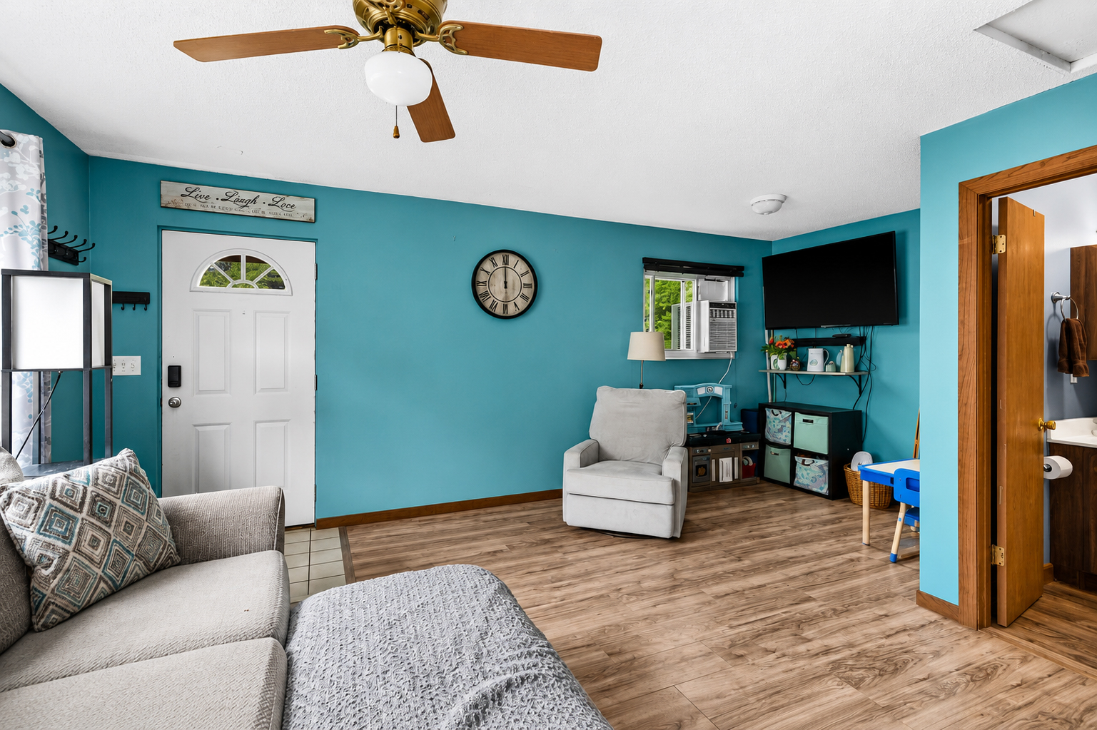
The flooring is another smart choice.
Long wood-look planks run through much of the main living space. Their brown and gray tones tie several parts of the design together.
They work with the gray sofa.
They also connect with the natural wood cabinets and darker wood trim.
Most important, using one main floor finish helps the living room feel wider. Too many flooring changes can divide a small home into even smaller visual zones.
Here, the continuous plank floor helps the spaces flow.
The entry uses tile, which makes sense for a high-traffic spot. That small change protects the area near the exterior door while still keeping the main room visually open.
Design cues
- Wide wood-look plank flooring
- Gray-brown wood tones
- Continuous living-area floor
- Tile near the entry
- Warm wood base trim
- Practical low-maintenance finish
10. The Open Living Room and Kitchen Make Better Use of Space
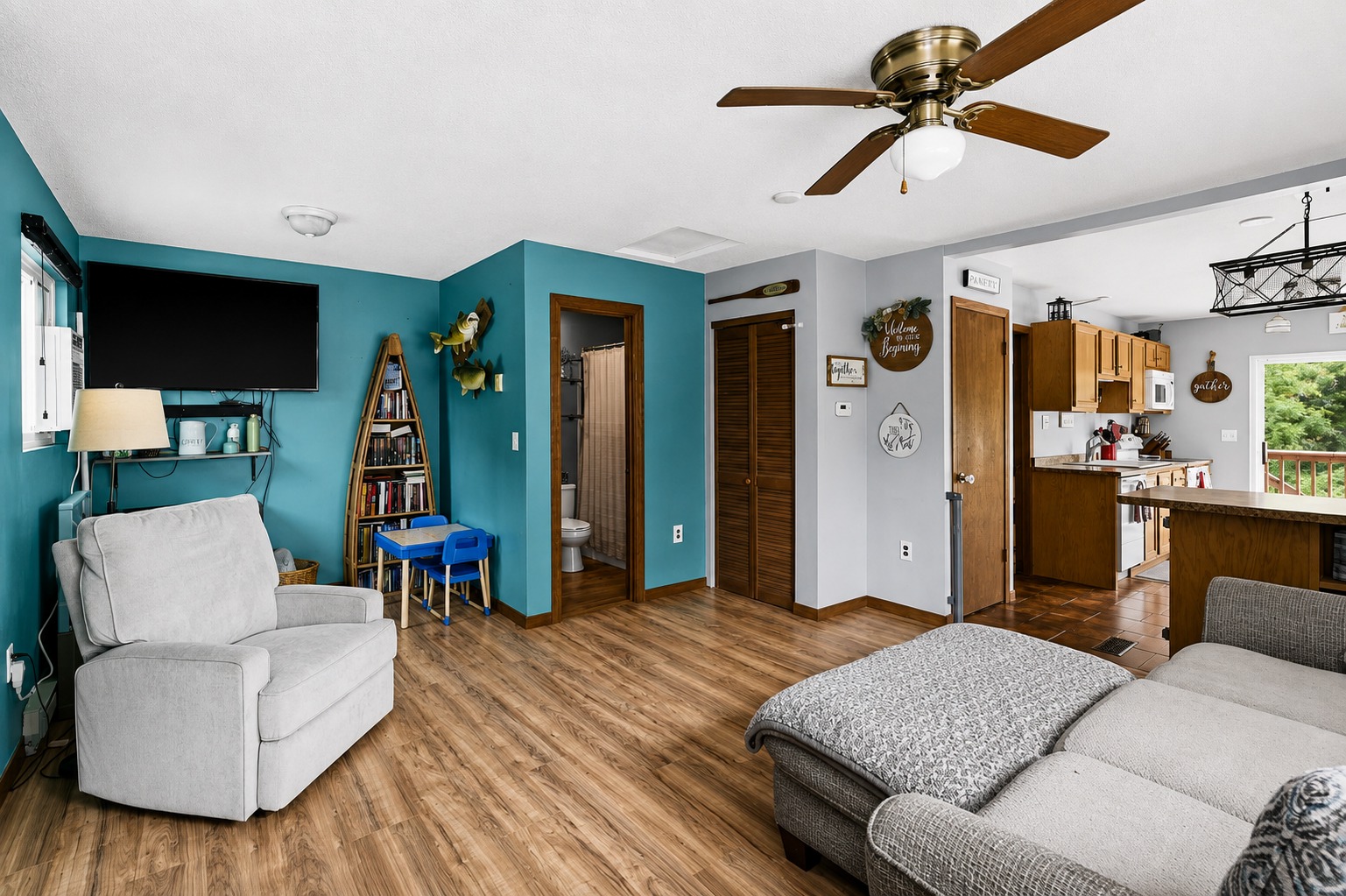
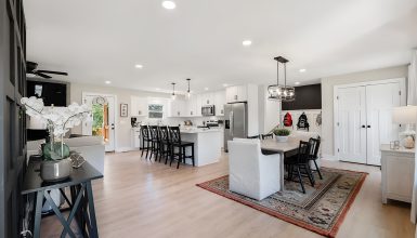
There is no large wall dividing the living room from the kitchen.
That simple choice changes the feel of the whole house.
You can see from one space into the next. Light travels farther. People can talk while they cook, eat, or relax.
A breakfast bar creates just enough separation.
This is a very useful tool in a small ranch house. The bar marks the edge of the kitchen without closing it off.
It can serve several jobs too. It can be a dining spot, food prep area, serving counter, homework station, or drop zone.
This type of flexible space is one reason modest ranch homes can work so well.
Design cues
- Open living and kitchen plan
- Wide visual connection
- Breakfast peninsula
- Few full-height divider walls
- Shared lighting
- Flexible countertop space
- Easy movement between zones
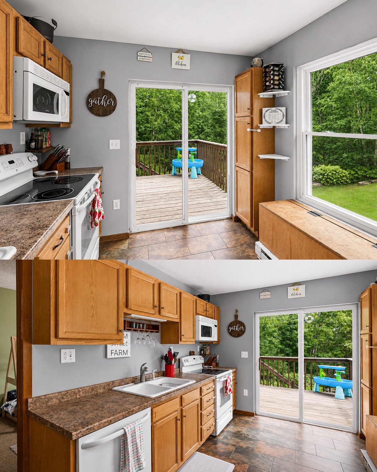
11. Natural Oak Cabinets Keep the Kitchen Warm
The kitchen does not chase a high-end modern look.
Instead, it uses warm wood cabinets with simple raised-panel doors.
That choice adds comfort.
The oak tone works well with the brown flooring and wood trim found through the rest of the house. So even though the walls are cool gray, the room never feels cold.
Brown counters continue that warm palette.
White appliances brighten the kitchen and keep the darker wood from becoming too heavy.
The cabinets also run along both sides of the room. This layout puts plenty of storage into a narrow footprint.
It is simple, but it works.
Design cues
- Natural oak cabinets
- Raised-panel cabinet fronts
- Brown laminate-style counters
- White appliances
- Double-bowl sink
- Wall-mounted microwave
- Full-height pantry storage
- Open breakfast bar
- Warm wood against cool gray walls
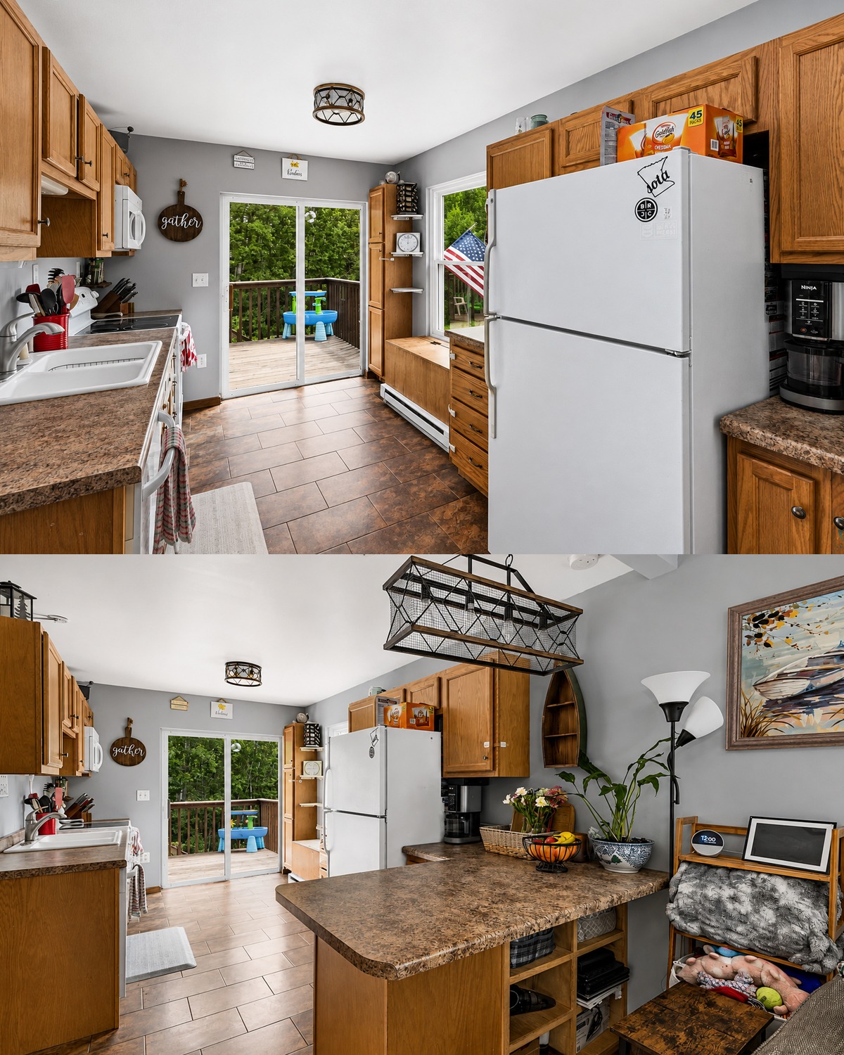
12. The Kitchen Uses Every Inch of Available Space
Small kitchens need smart storage more than they need decorative extras.
This room understands that.
Upper cabinets take advantage of wall space. Base cabinets provide work surfaces below. Shelves near the refrigerator fill an area that could have gone unused.
The breakfast counter adds even more surface space.
There is also open storage built into the living-room side of the peninsula. This is a useful idea for books, baskets, small appliances, or daily items.
At the far end, a sliding glass door brings in light and gives the kitchen direct deck access.
That door is more important than it may seem.
It keeps the end of the narrow kitchen from feeling closed in. Instead, your eye continues outside toward the trees.
Design cues
- Storage on both kitchen walls
- Upper and lower cabinets
- Tall storage units
- Open cubbies
- Breakfast peninsula
- Sliding glass door
- Outdoor view
- Narrow but efficient work zone
- Good use of vertical space
13. Sliding Doors Create an Easy Indoor-Outdoor Link
The glass doors may be one of the best planning choices in the home.
They connect the kitchen directly to the deck.
That makes outdoor meals easy. Food can move from the counter to the grill in seconds. Drinks can come straight from the refrigerator. Guests can move in and out without crossing the whole house.
The doors also make the room brighter.
More glass means more daylight. Plus, the green view becomes part of the interior.
This is a simple lesson that works for many ranch houses. When a home has a good yard, the floor plan should make it easy to use.
Design cues
- Wide sliding glass doors
- Deck beside the kitchen
- Clear path outdoors
- Strong natural light
- Direct grill access
- Forest views
- Indoor-outdoor entertaining flow
14. Simple Lighting Mixes Rustic and Practical Styles
The lighting has a casual rustic feel.
In the kitchen, black metal fixtures bring in a little farmhouse and industrial style. One large rectangular fixture creates a clear focal point over the peninsula.
Smaller cage-style ceiling lights repeat that look.
Meanwhile, the living area uses a basic ceiling fan with a light. It is not flashy, but it makes sense in a room built for daily comfort.
The mix feels collected rather than perfectly matched.
That suits the home.
Every fixture does not need to come from the same set. Repeating a few materials, such as dark metal and warm wood, is often enough to create a link.
Design cues
- Black metal light fixtures
- Cage-style shades
- Rectangular island light
- Simple ceiling fan
- Warm wood fan blades
- Functional task lighting
- Casual mixed-fixture approach
15. A Flexible Bedroom Shows the Value of Simple Design
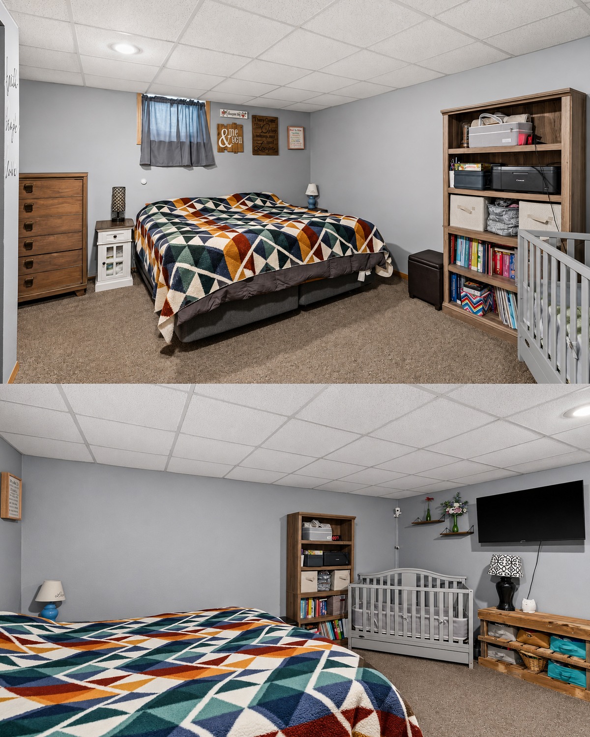
One bedroom has a much quieter look than the main living areas.
Gray walls create a calm base. Soft carpet makes the room feel warm underfoot.
The bed brings in most of the color through a bold geometric blanket. Deep blue, rust, cream, and green give the room life without the need for many decorations.
A tall bookcase uses vertical wall space for storage.
The room also shows how a bedroom can serve more than one role. The crib and storage pieces suggest that this space can adapt to family needs.
That flexibility matters in a smaller home.
A room may work as a main bedroom today, a nursery tomorrow, or a guest room later.
Design cues
- Soft gray walls
- Neutral carpet
- Bold geometric bedding
- Tall bookcase
- Simple wood storage
- Mixed-use furniture
- Limited wall decor
- Compact layout
- Flexible family use
16. The Lower Ceiling Creates a Cozy, Separate Feel
The bedroom ceiling is different from the main living space.
It uses a grid of ceiling panels. That detail, along with the smaller high window, gives the room a more enclosed feel.
Rather than trying to make the room grand, the decor keeps things simple.
Light gray paint helps brighten the walls. White ceiling panels reflect light. A colorful bed covering then keeps the room from feeling plain.
This approach works well when a room has a lower ceiling.
Light colors usually help the upper part of the room fade into the background. Taller storage should also stay limited so the room does not feel crowded.
Design cues
- Lower ceiling height
- White ceiling panels
- Small high window
- Pale gray walls
- Soft carpet
- Low-profile furniture
- Bright bedding
- Simple storage plan
17. The Bathroom Packs Useful Storage Into a Small Footprint
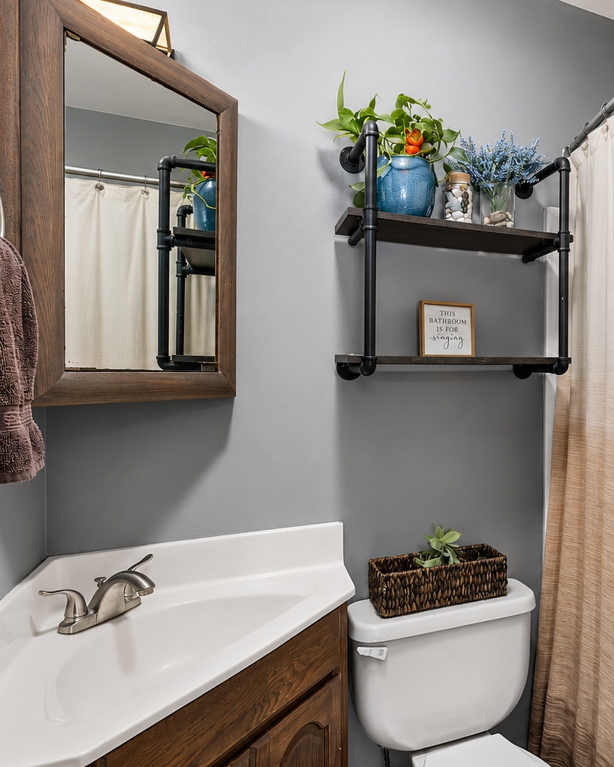
The bathroom is compact, yet it still has personality.
Gray walls create a clean backdrop. A dark-framed mirror gives the vanity more weight. Wood below the sink adds warmth.
The shower curtain introduces a soft neutral tone. It also hides the bathing area, which helps reduce visual clutter in a tight room.
The most useful detail may be the wall shelf.
It takes advantage of the space above the toilet. That area often goes to waste.
Here, open shelves hold plants and decor while leaving room for small daily items.
A woven basket adds another natural texture.
Design cues
- Gray bathroom walls
- White sink and toilet
- Wood vanity
- Dark framed mirror
- Neutral shower curtain
- Over-toilet shelves
- Black pipe-style shelf frame
- Woven storage basket
- Small plants
- Space-saving layout
Conclusion
This ranch house blends practical design with a relaxed, welcoming style. The white exterior feels fresh, while the wood decks create plenty of room to enjoy the outdoors. Inside, an open layout, warm wood details, bold accent walls, and useful storage make each room work harder. The result is a cozy ranch home that feels simple, personal, and easy to live in.